
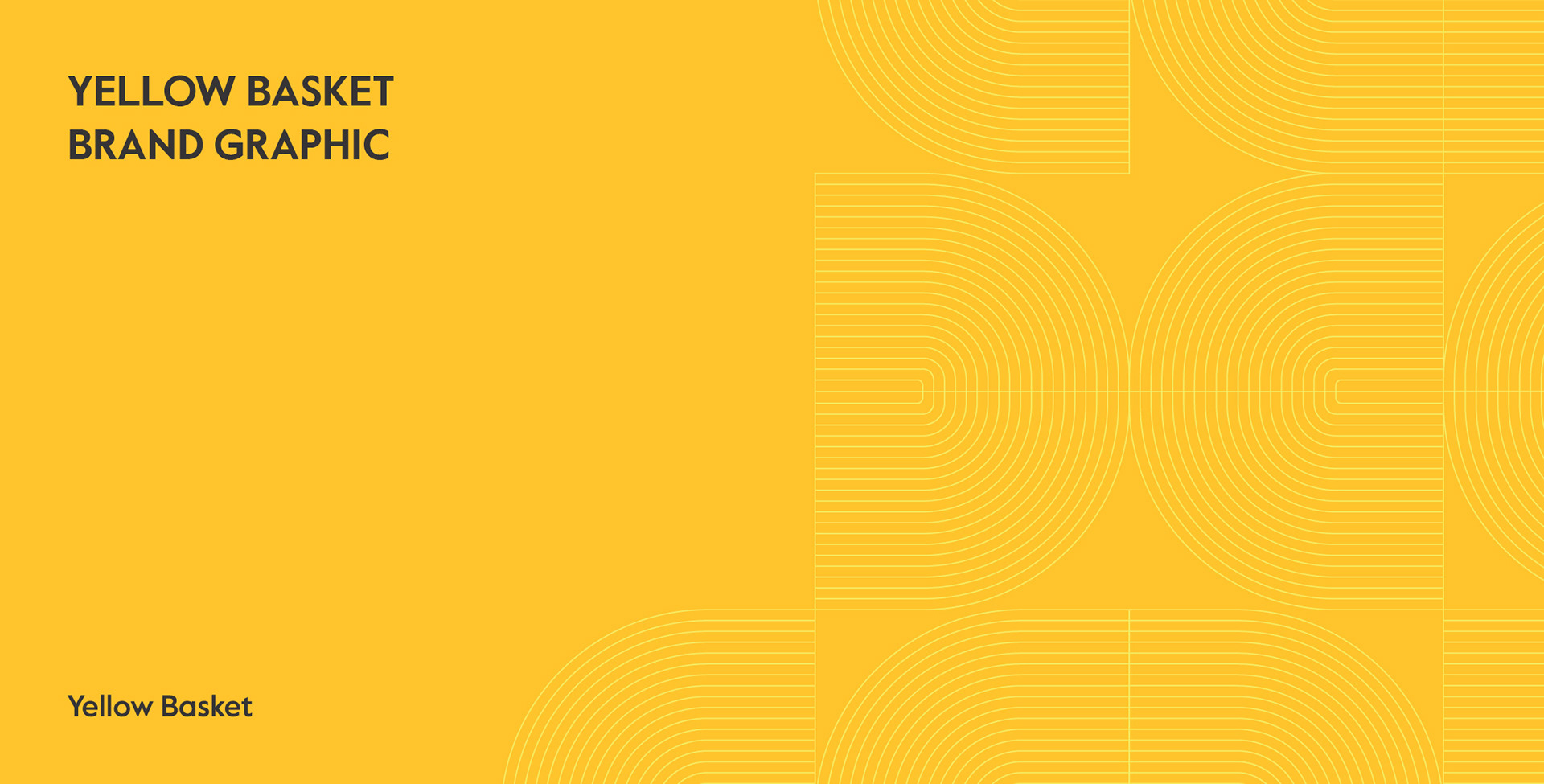
Yellow Basket Brand Graphic
옐로우바스켓 브랜드 그래픽
Client: Yellow Basket
Scope: Brand Graphic
Crew: Seyeong Jang, Saerom Park
Studio roam|2023
Scope: Brand Graphic
Crew: Seyeong Jang, Saerom Park
Studio roam|2023

신사동 가로수길에 위치한 팝업 운영 및 대관 전문 플랫폼 옐로우바스켓의 브랜드 그래픽을 작업했습니다. Yellow Basket은 다양한 브랜드와 소비자가 자유롭게 교류할 수 있는 체험형 팝업 플랫폼입니다.
Studio roam designed brand graphics for Yellow Basket, a pop-up store and rental platform on Garosu-gil in Sinsa, Seoul. It is an experiential pop-up platform where various brands and consumers can freely interact.
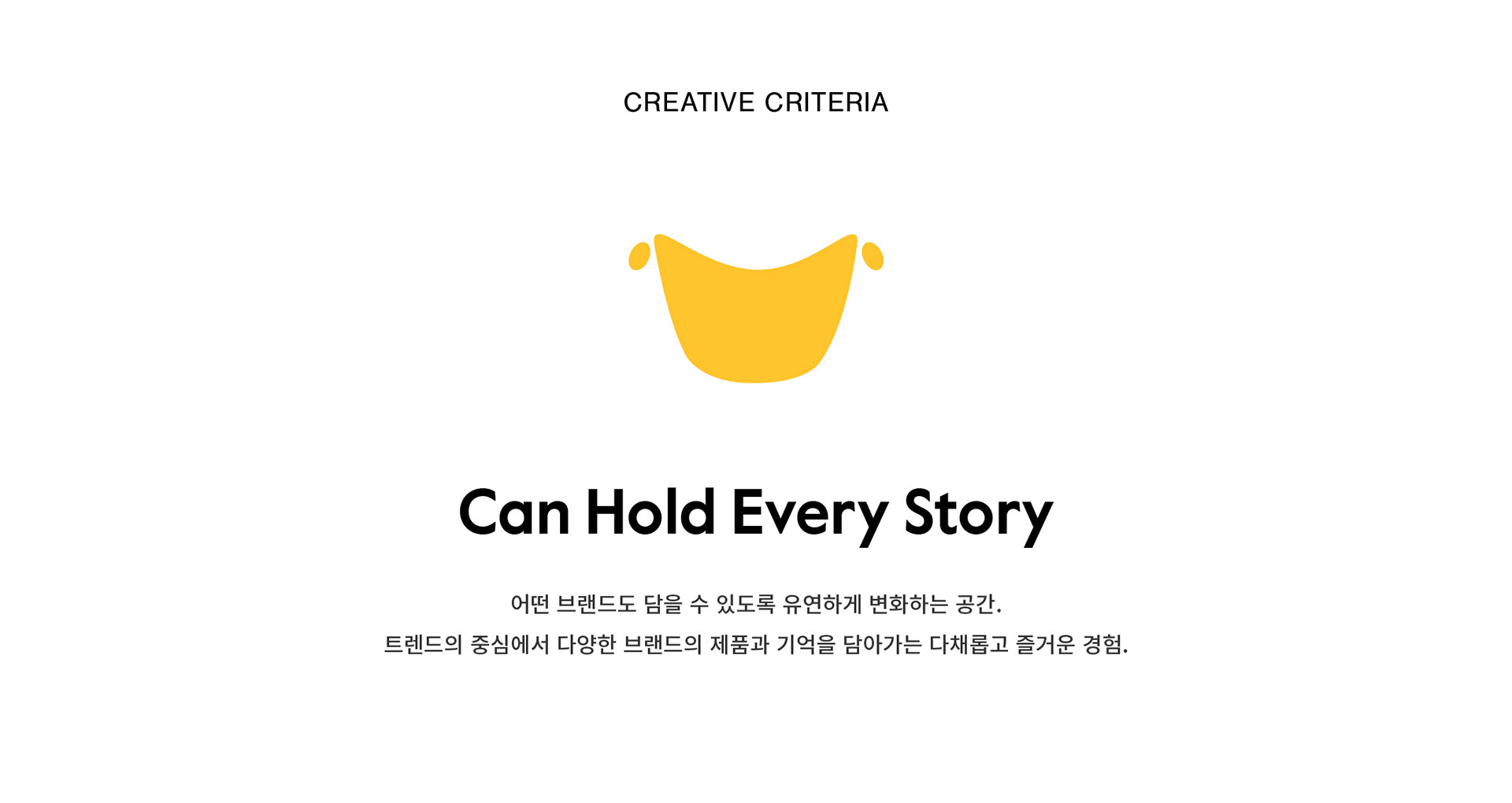

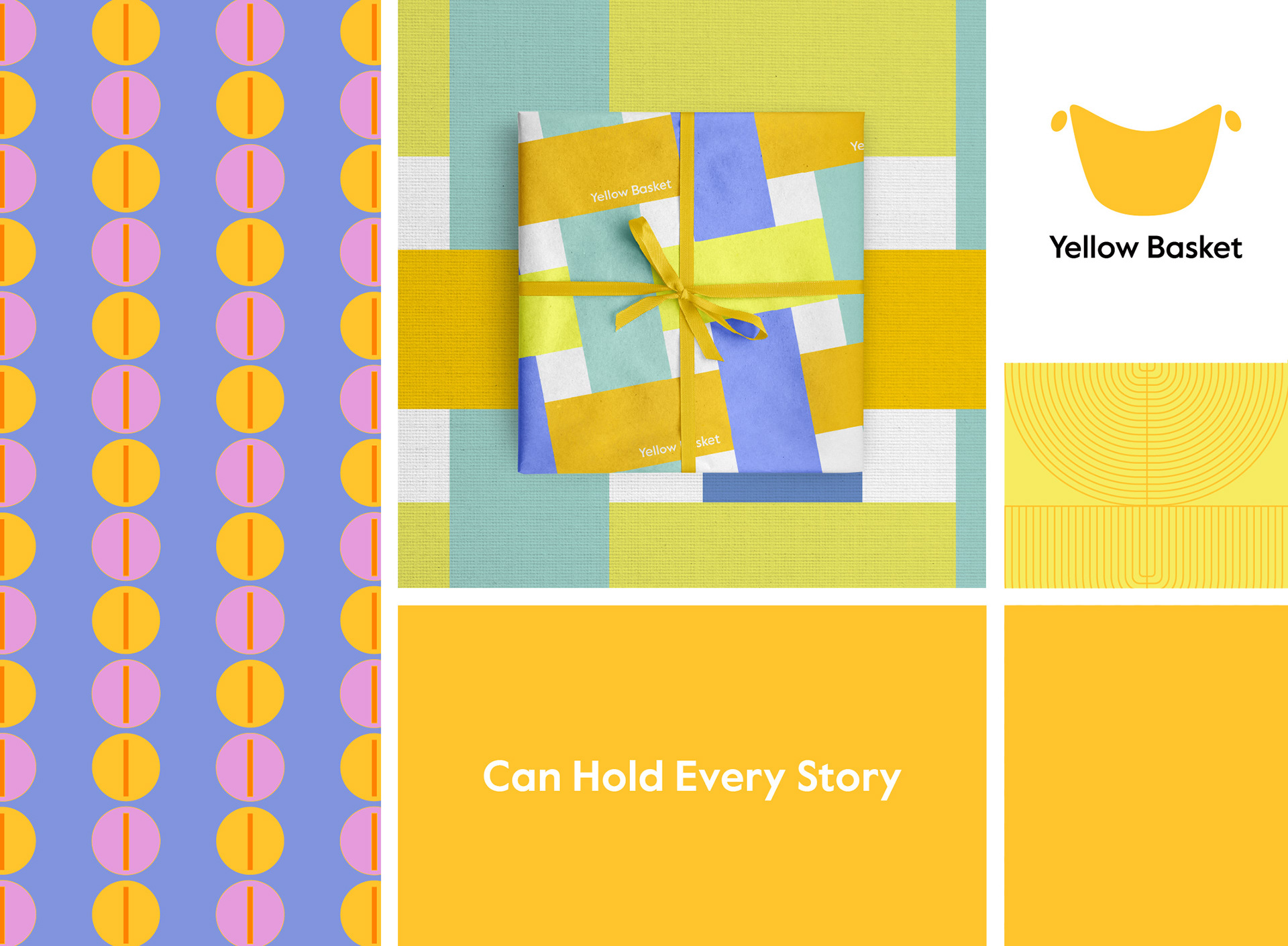
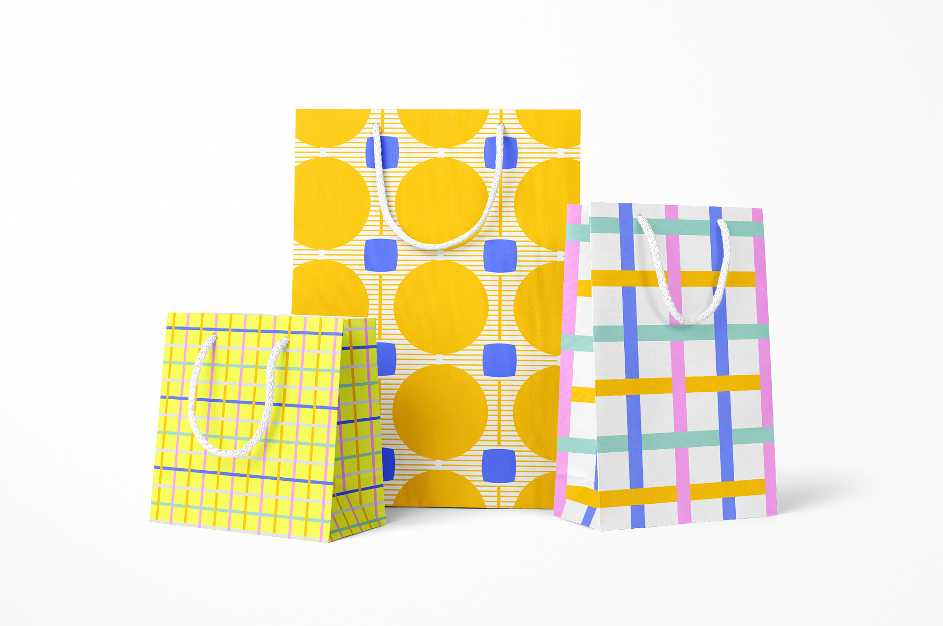
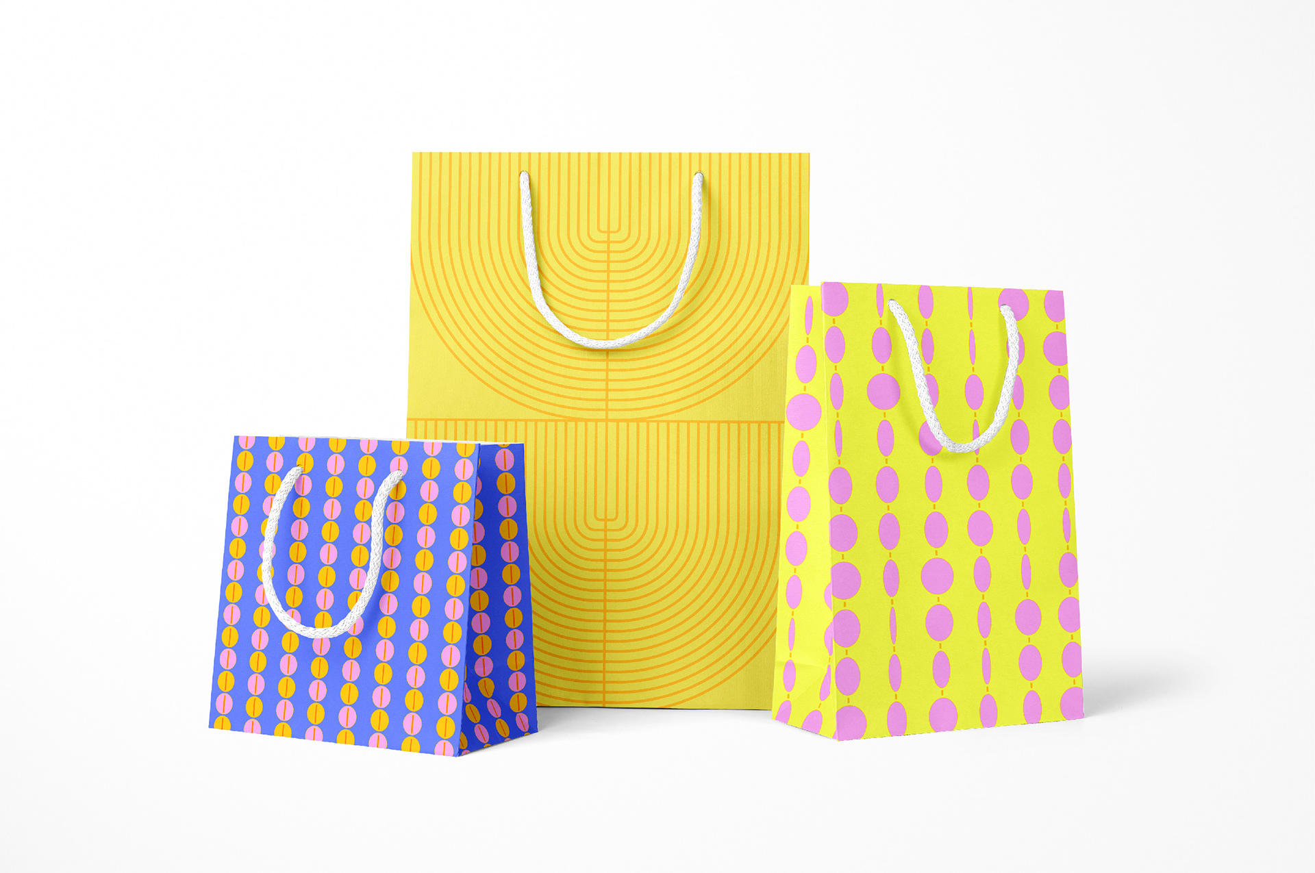
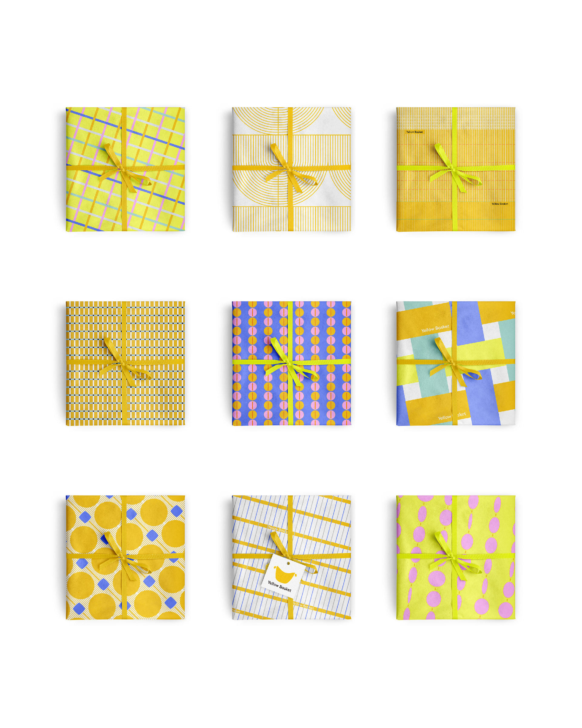
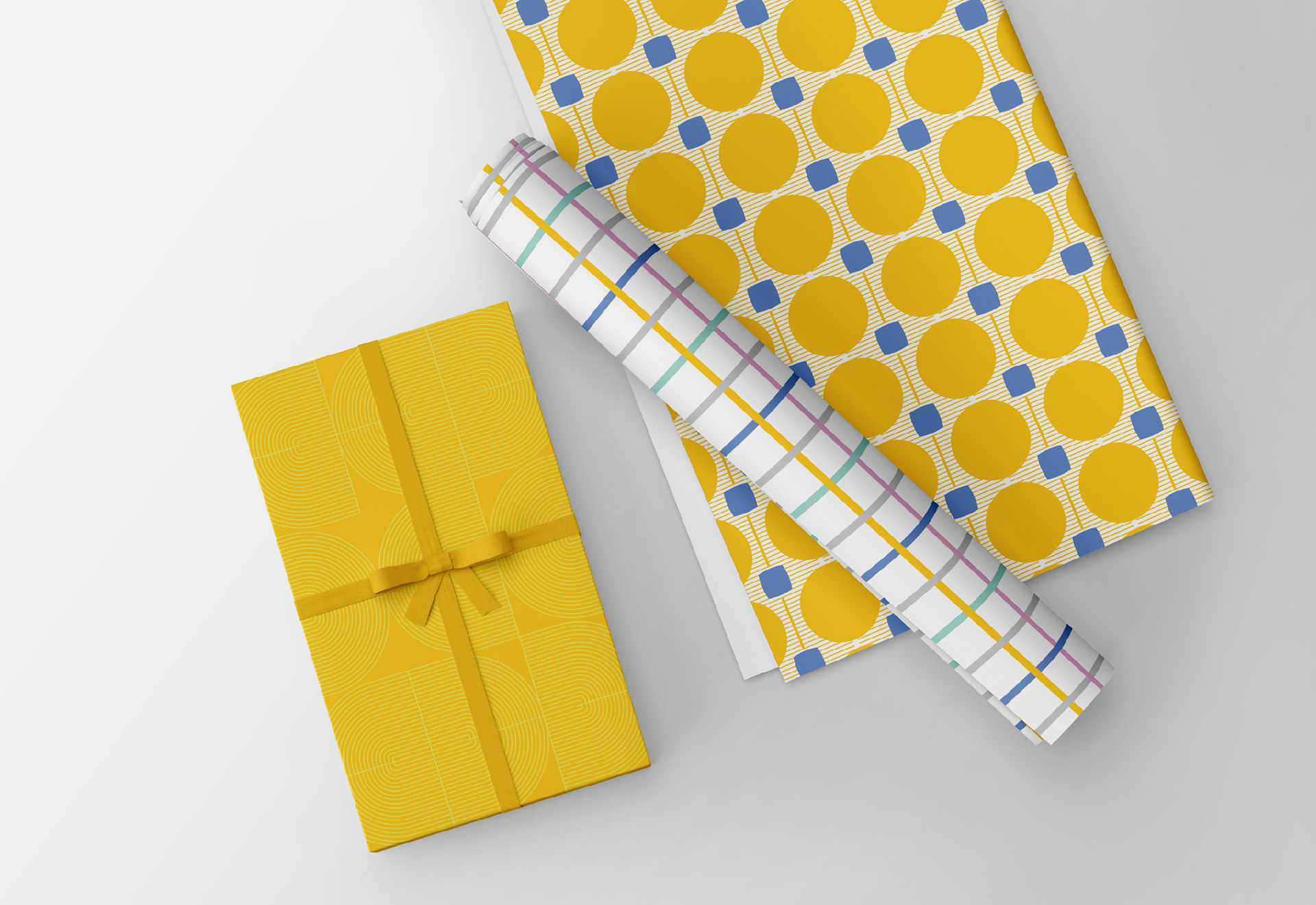
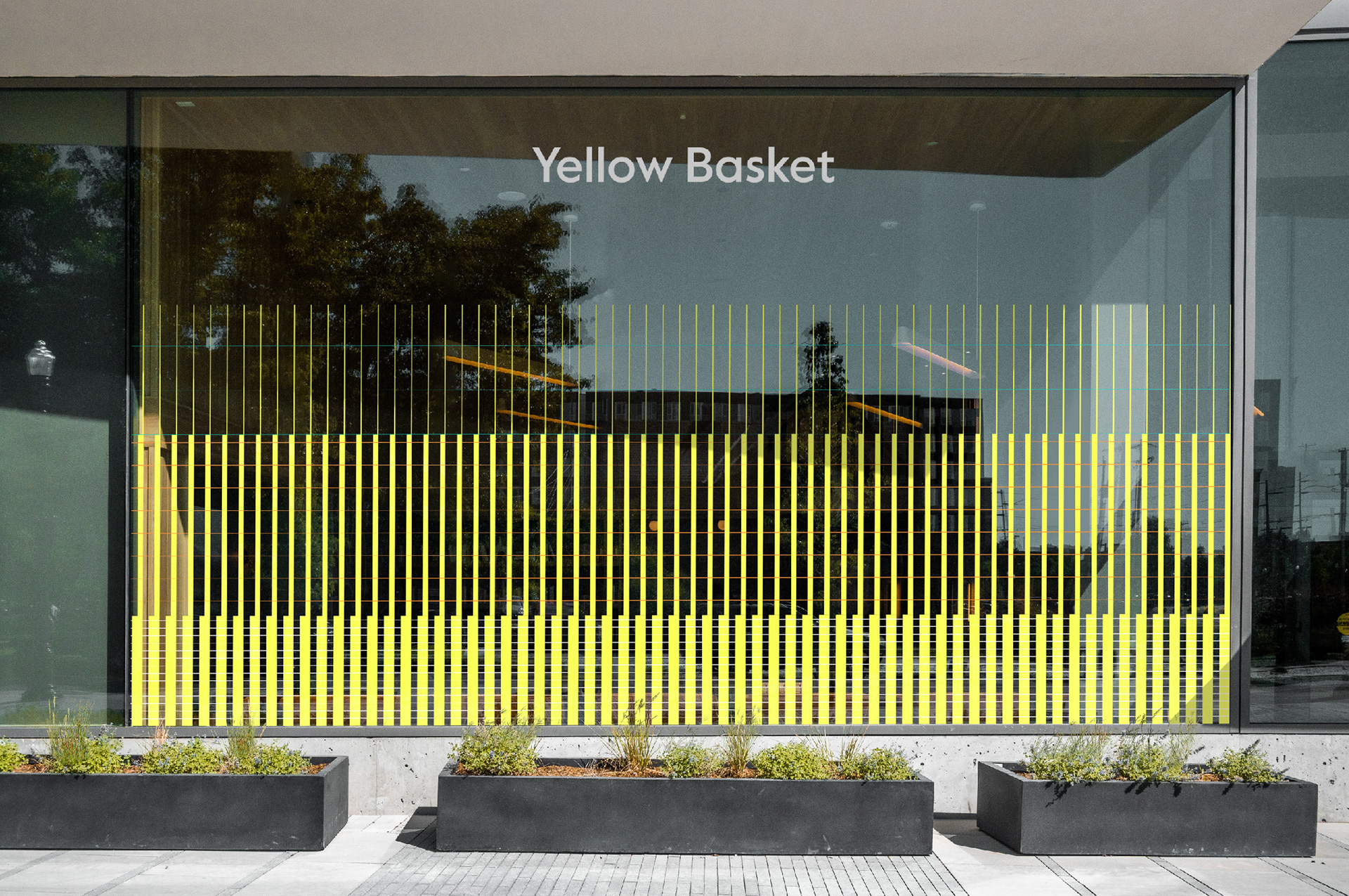
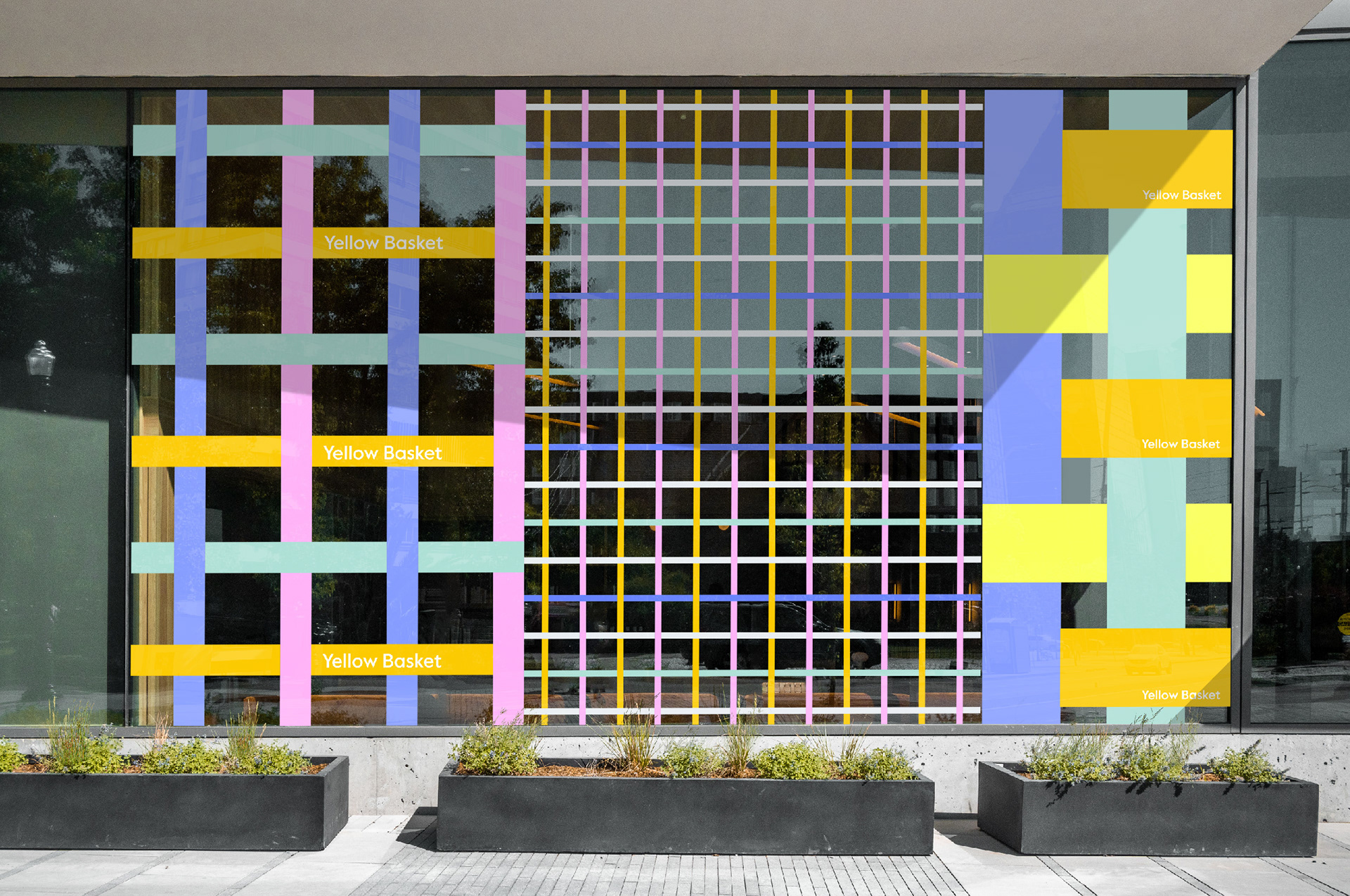
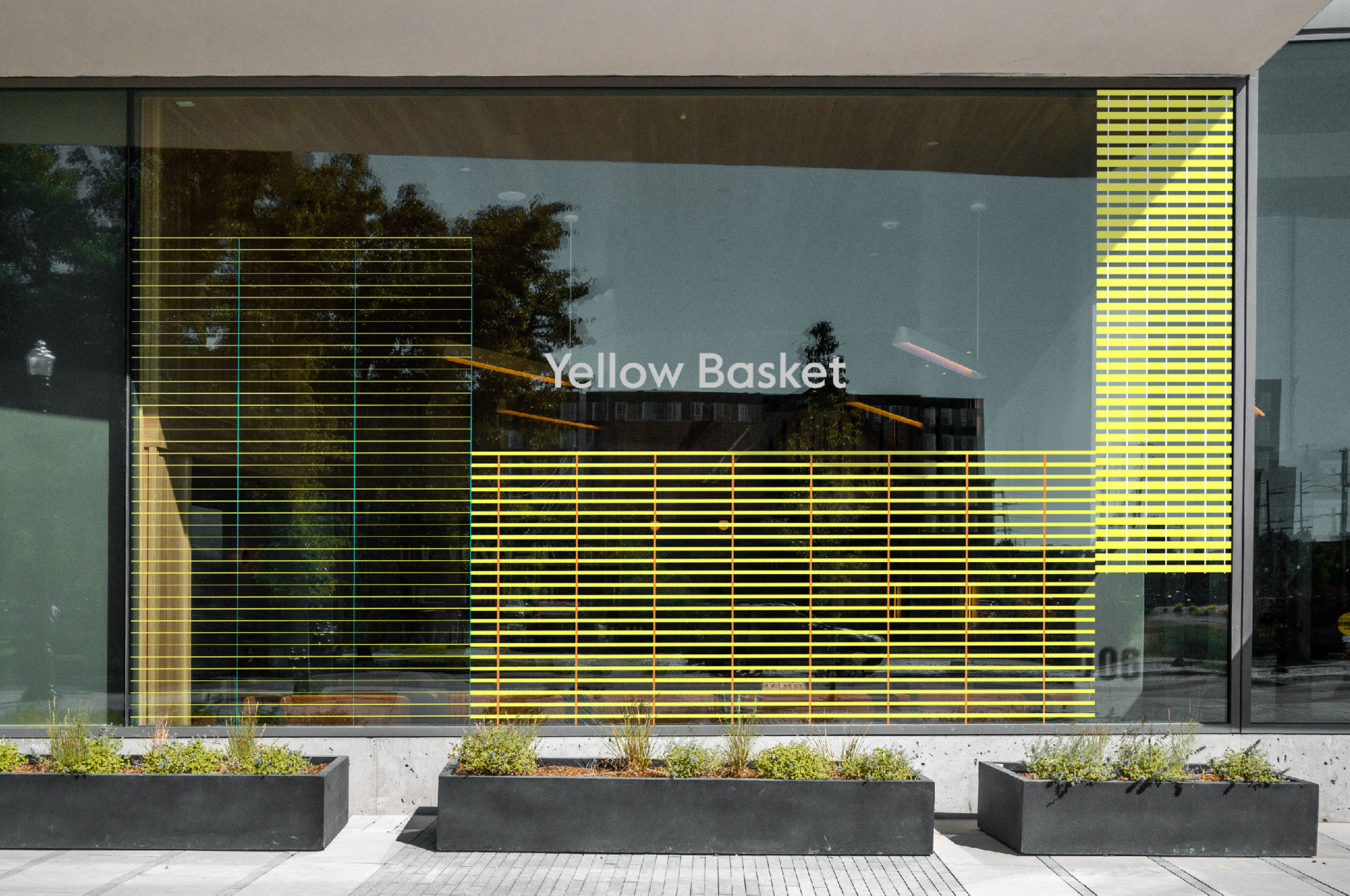
옐로우바스켓의 중요한 정체성인 ‘다양한 브랜드 스토리와 경험을 담아갈 수 있는 바스켓’ 을 표현하는 브랜드 그래픽 스타일을 개발하고, 일관성을 가지고 다채롭게 변주하여 오프라인 공간에서의 브랜드 경험을 더욱 풍부하게 만들 수 있도록 했습니다. ‘Yellow Baskets’ 를 디자인 컨셉으로 하여 원, 곡선, 직선, 사각형의 기하학적 요소를 사용하여 다양한 형태의 Basket을 은유적으로 표현하고, 유기적인 형태의 BI와 페어링했을때 조화를 이루도록 했습니다.
We developed a graphic style that represents the essential identity of Yellow Basket, which is to ‘contain various brand stories and experiences in a basket’. We provided consistency with diverse variations to enrich the brand narratives and offline experiences. Using ‘yellow baskets’ as a design concept, we played with the geometric elements of circles, curves, straight lines, and squares to metaphorically represent the different shapes of baskets and to create harmony when paired with the organic shape of the brand logo.

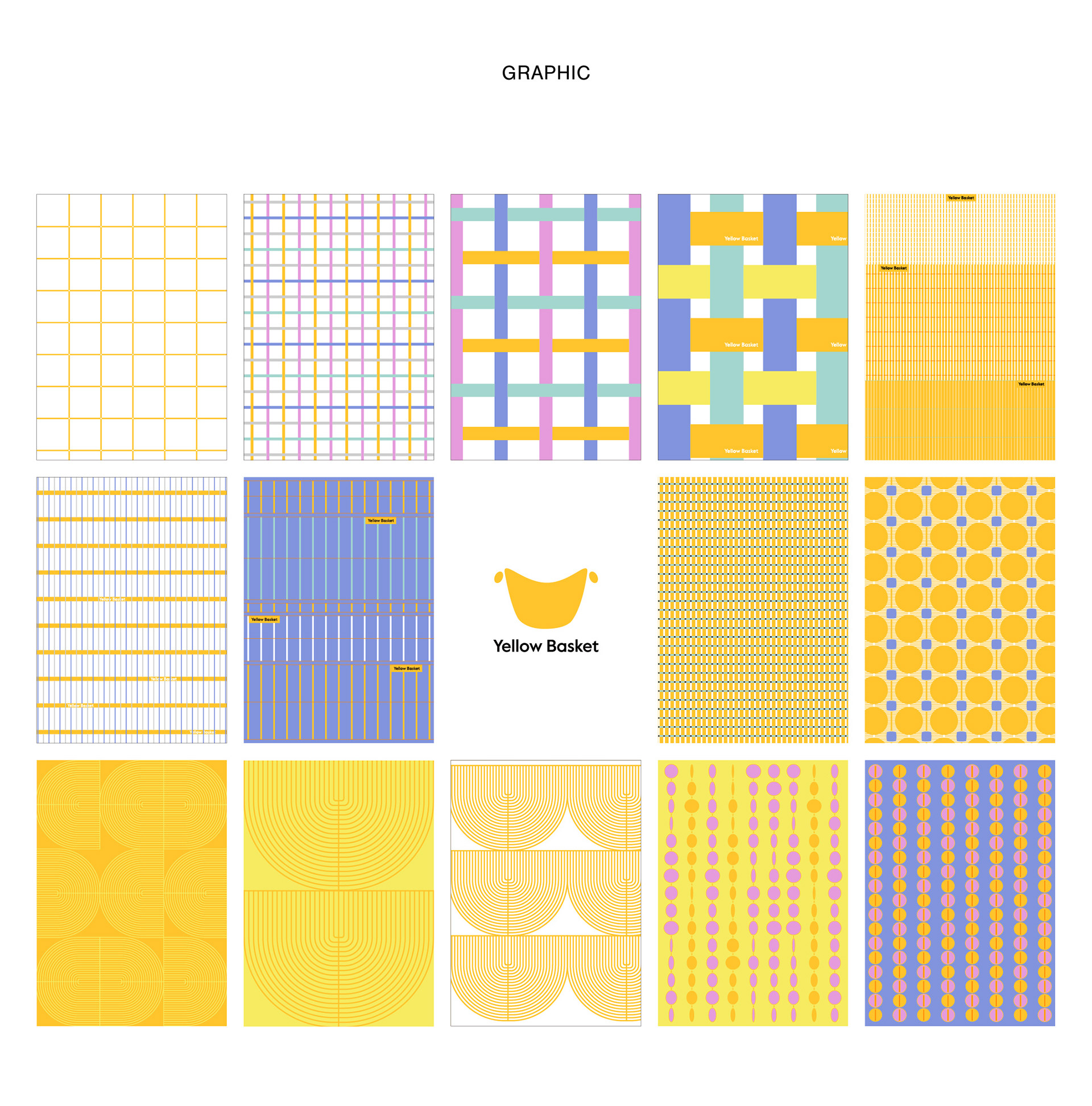
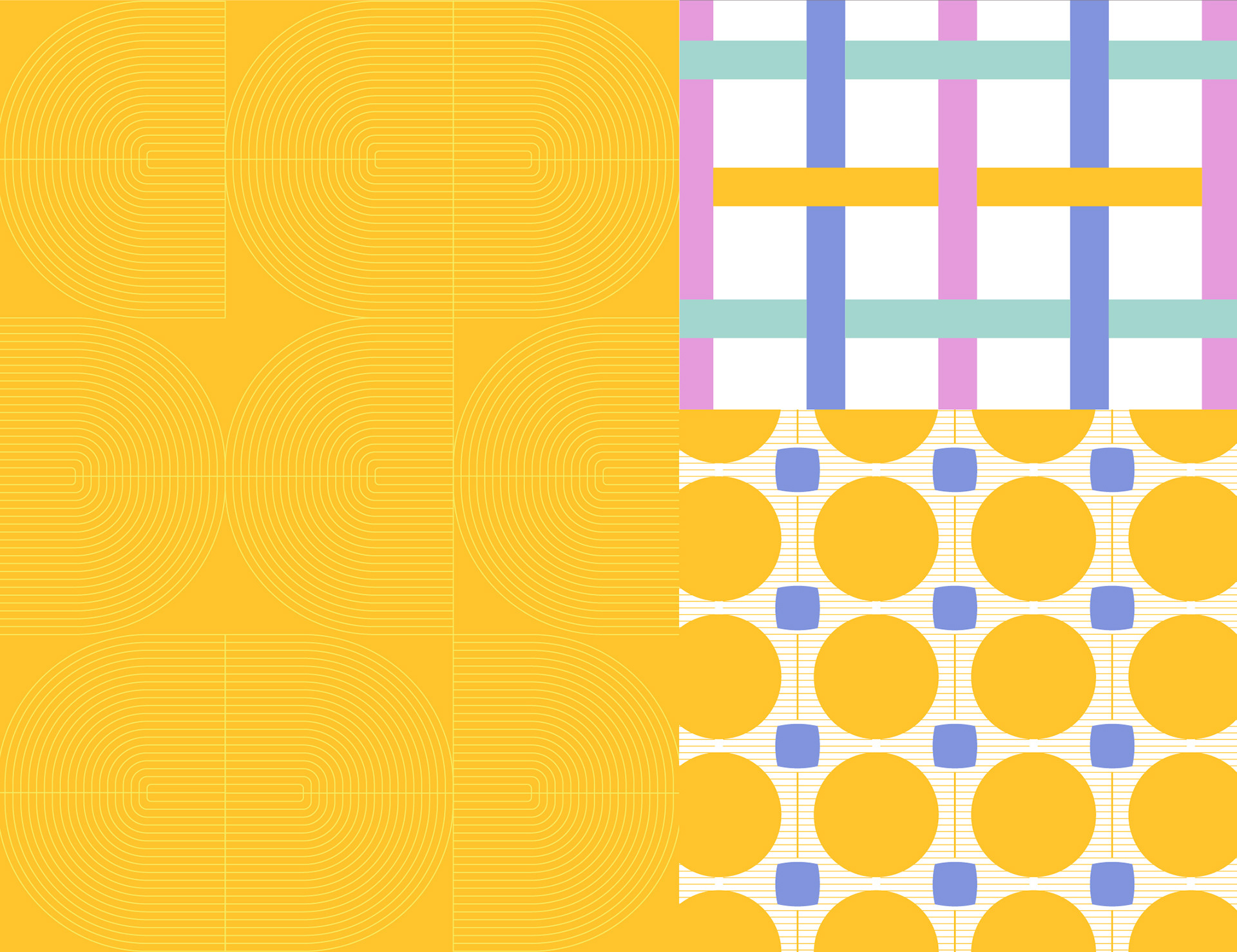
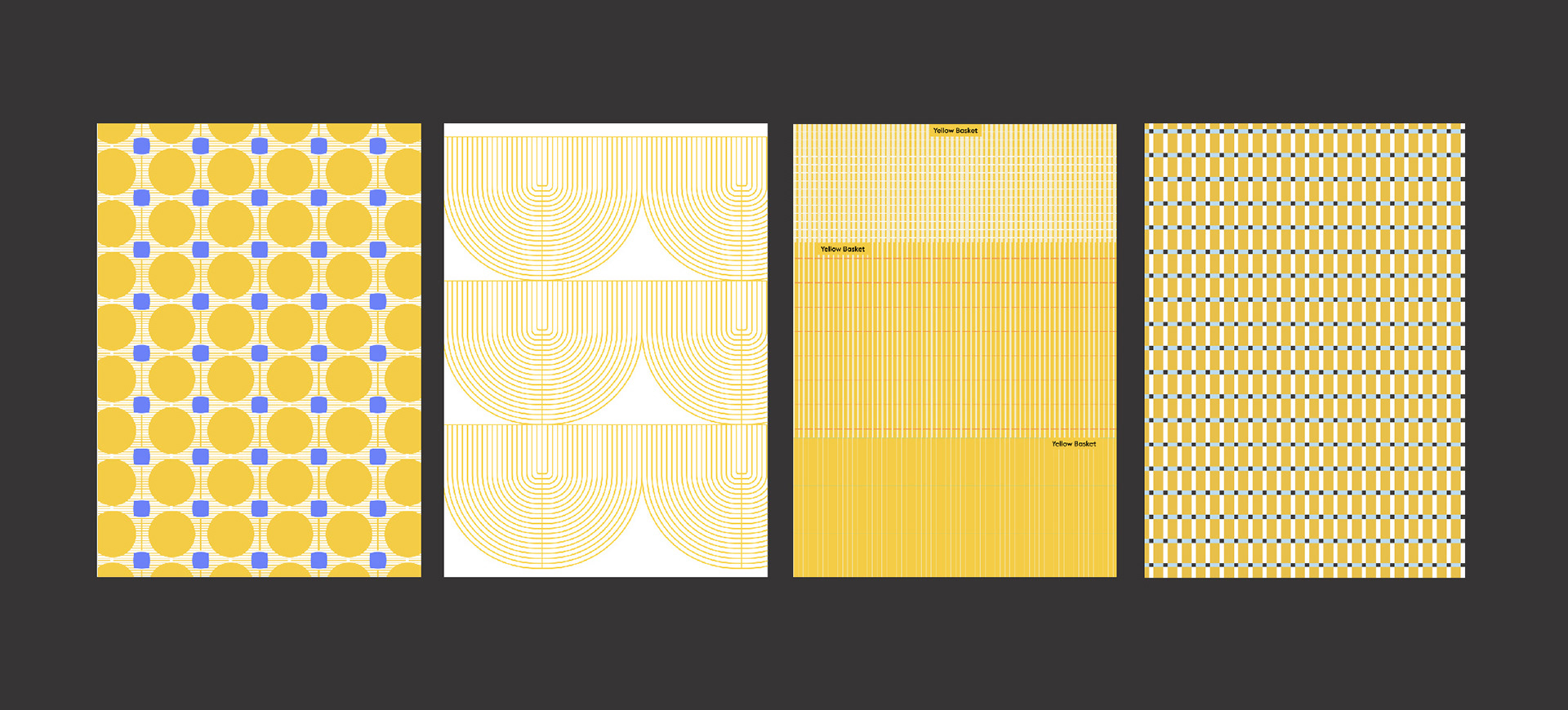
각 패턴은 확대, 축소, 변주를 통해 옐로우바스켓을 상징하는 다양한 그래픽으로 확장됩니다. 브랜드 컬러인 옐로우와 함께 상큼한 이미지를 전달하는 레몬 옐로우와 화이트를 메인 컬러로, 블루·민트·핑크·오렌지를 보조 컬러로 하는 컬러 팔레트를 구성하여 차분하면서도 다채로운 이미지를 전달하고, 그래픽을 일관성 있게 응용 가능하도록 했습니다.
Each pattern was scaled up, and down, and transformed into a variety of graphics to represent the Yellow Basket. We chose a color palette of lemon yellow and white as the main colors and blue, mint, pink, and orange as the secondary colors to convey a calm and colorful image alongside the brand color yellow, allowing for consistent graphic variations.


2023
studio roam
studio roam