
Woo! Ah! K-pop Girl Group Visual Identity
우아 비주얼 아이덴티티 디자인
Client: NV entertainment
Brand Identity: J&Brand
Visual identity: Studio roam
Studio roam | Apr 2020
Brand Identity: J&Brand
Visual identity: Studio roam
Studio roam | Apr 2020
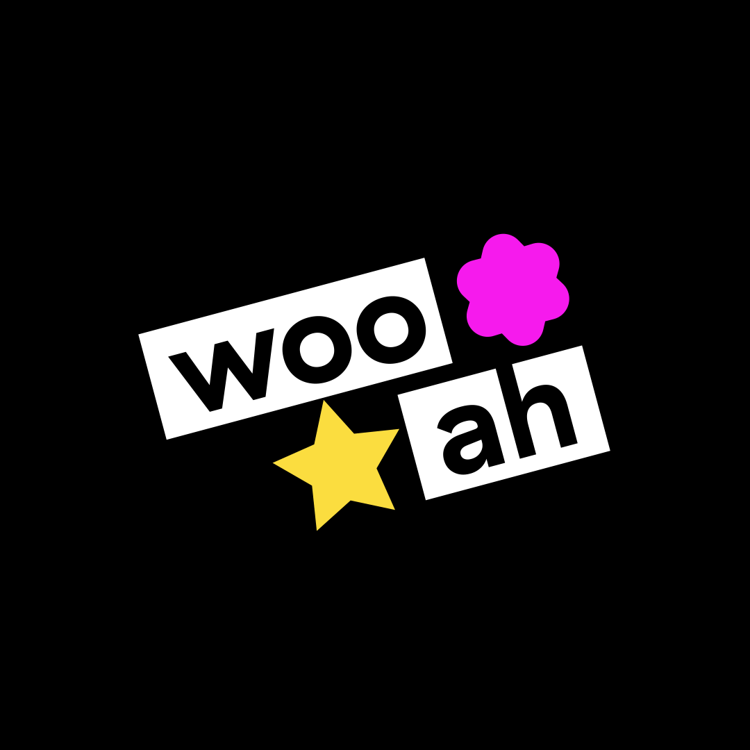
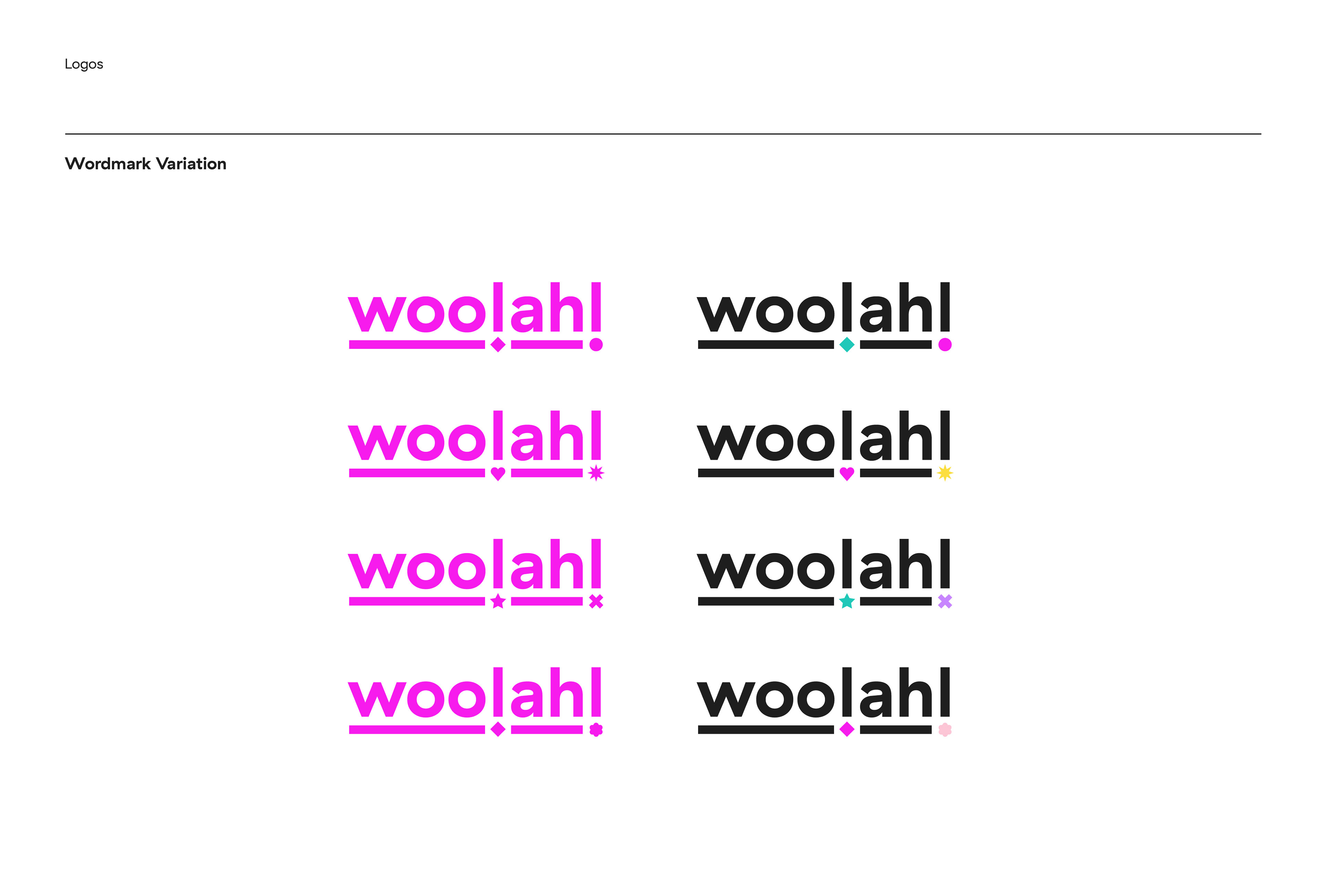
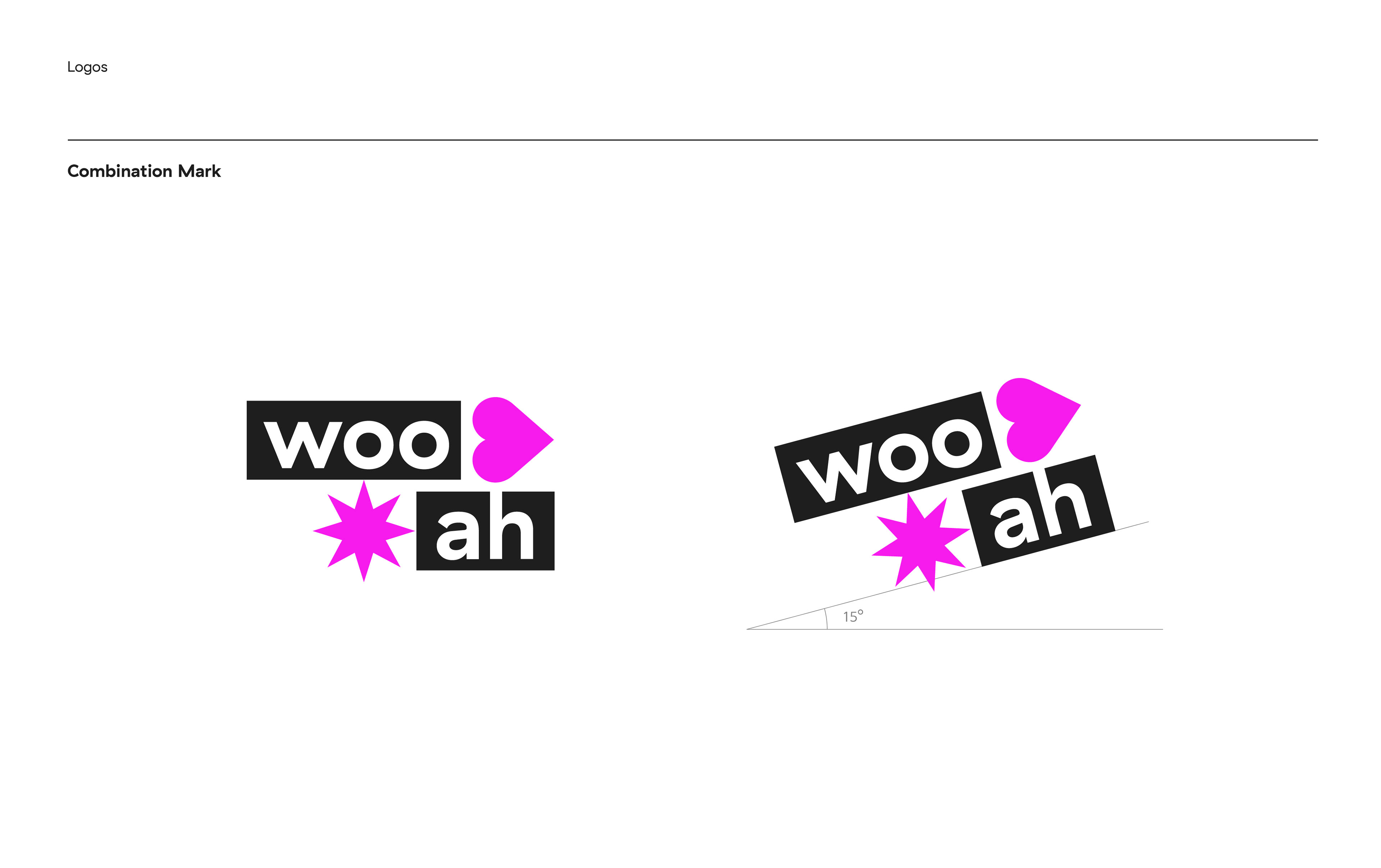
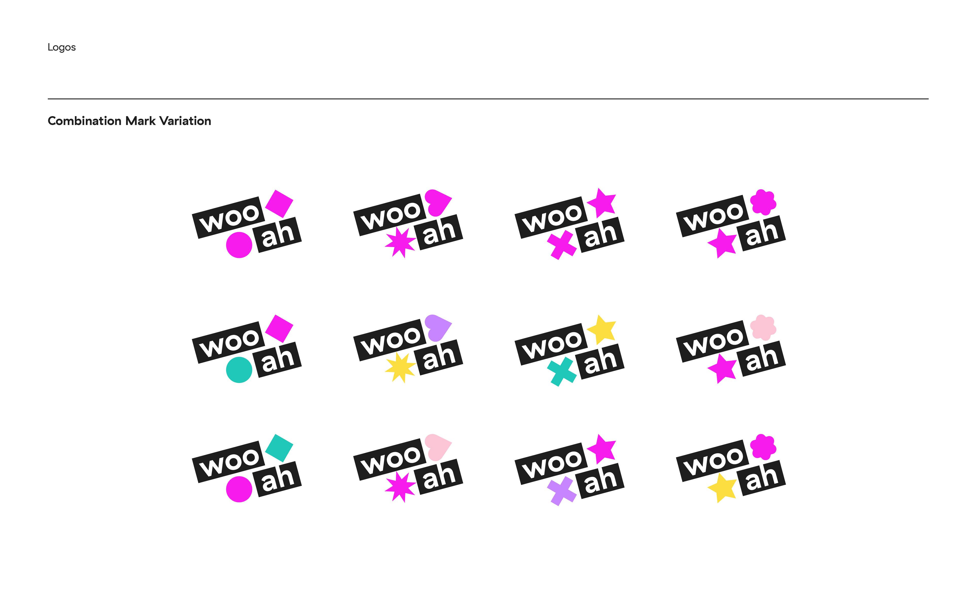
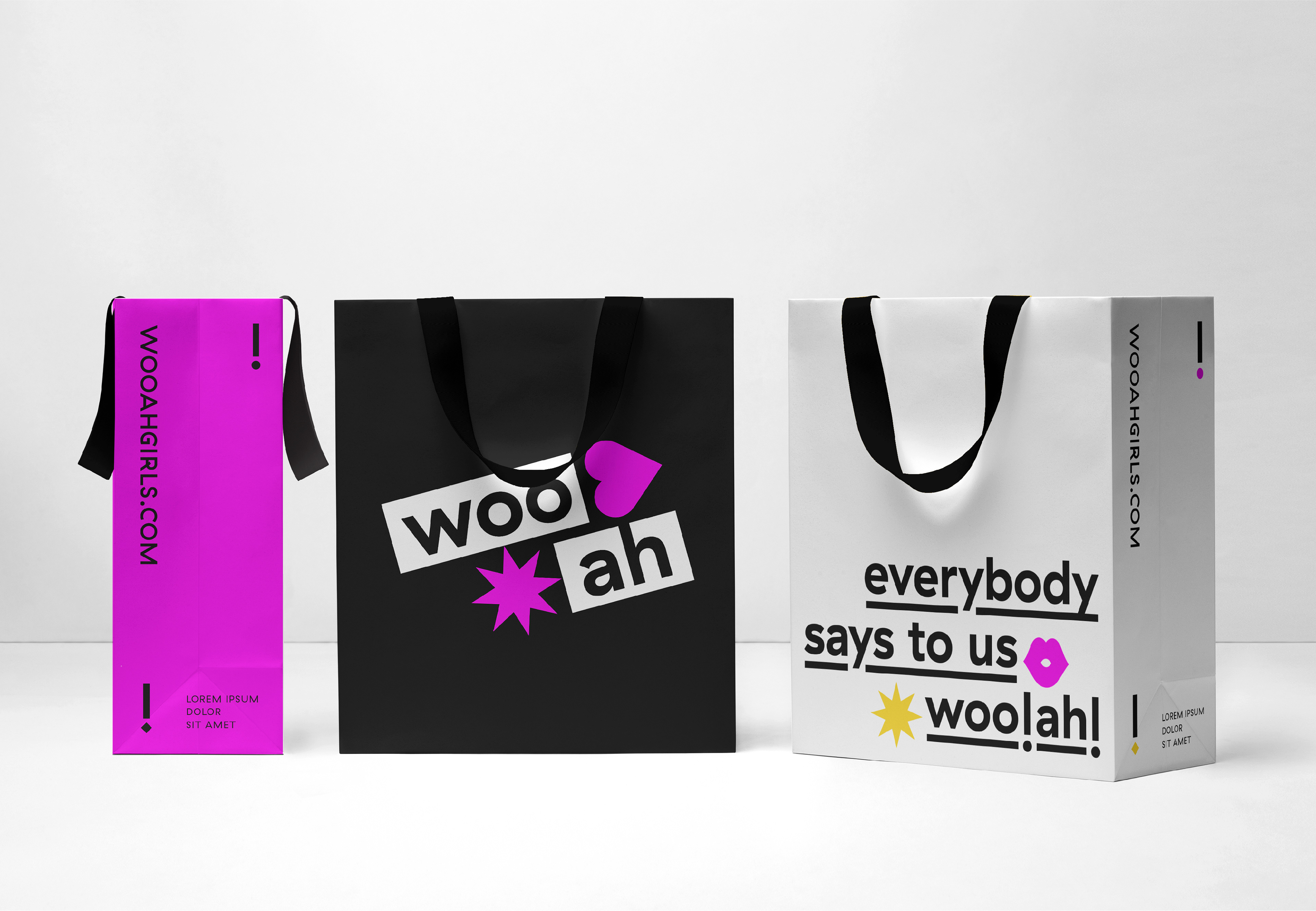
‘Colorful Exclamations’
우아는 2020년 데뷔한 한국의 걸그룹입니다. Woo!, 그리고 Ah! 두 개의 감탄사의 결합이기도 한 woo!ah!(우아!)는 다양한 음악과 스타일로 활동하며 때로는 사랑스럽게, 때로는 놀랍게 다가가겠다는 두 개의 축을 의미합니다. 우아의 컨셉은 “Everybody says to us, woo!ah!” 입니다. 10대・20대 청춘으로서 끊임없이 성장하고 새로워질 우아가 다채로운 매력으로 많은 팬들에게 ‘우아!’ 감탄을 이끌어내겠다는 의미입니다.
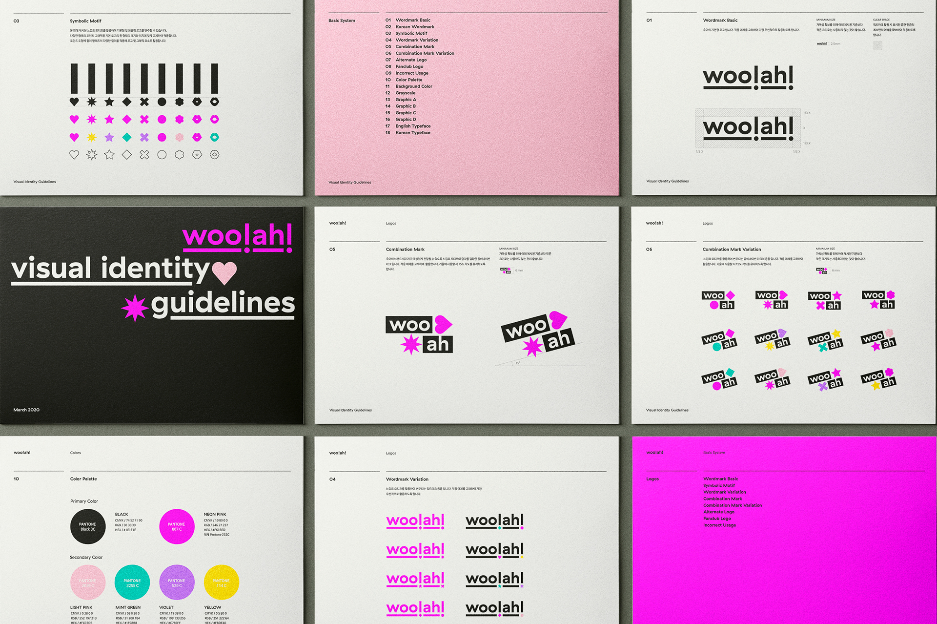
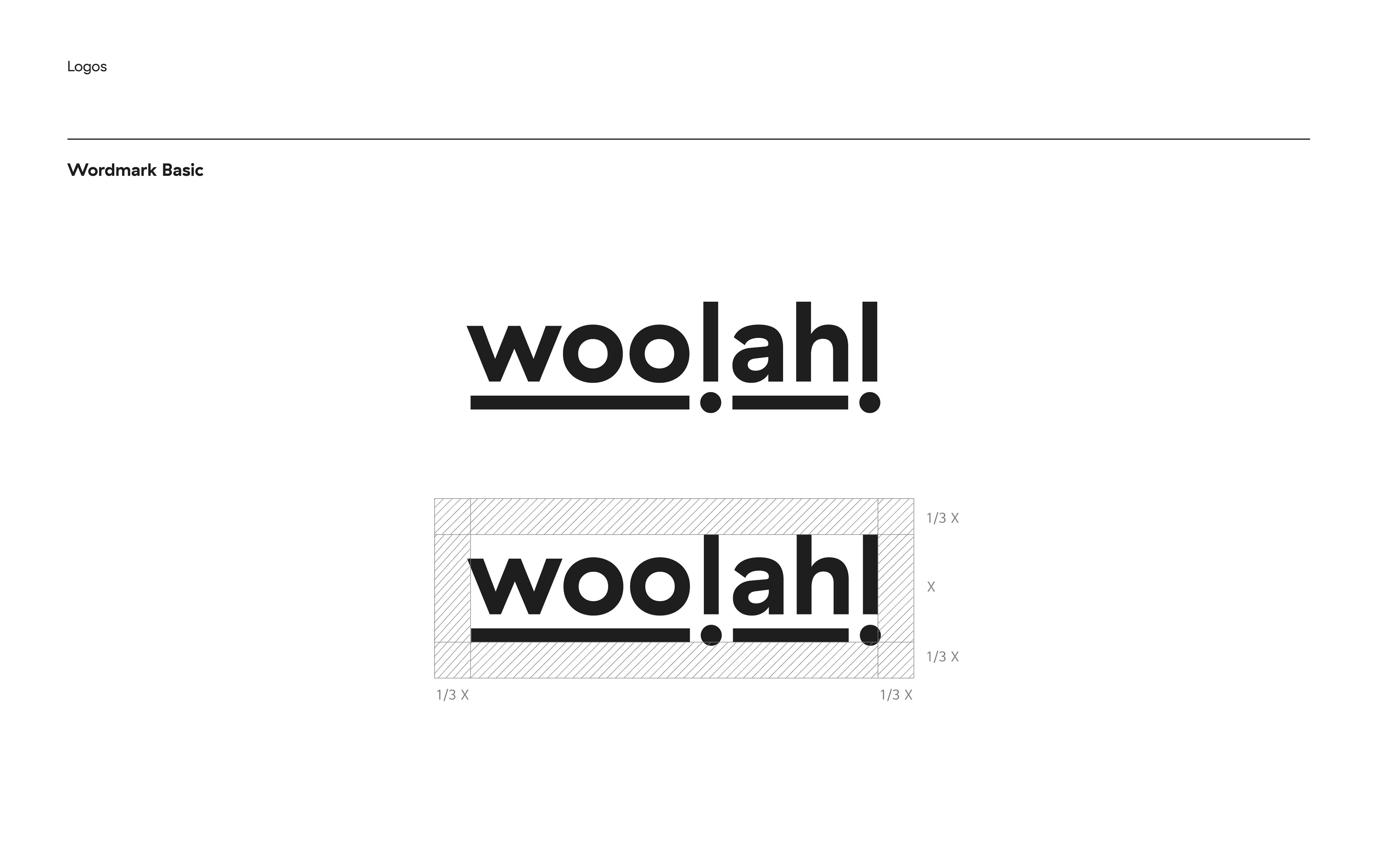
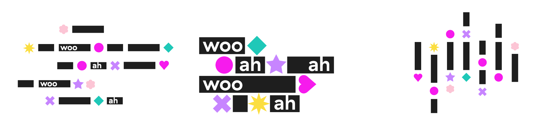
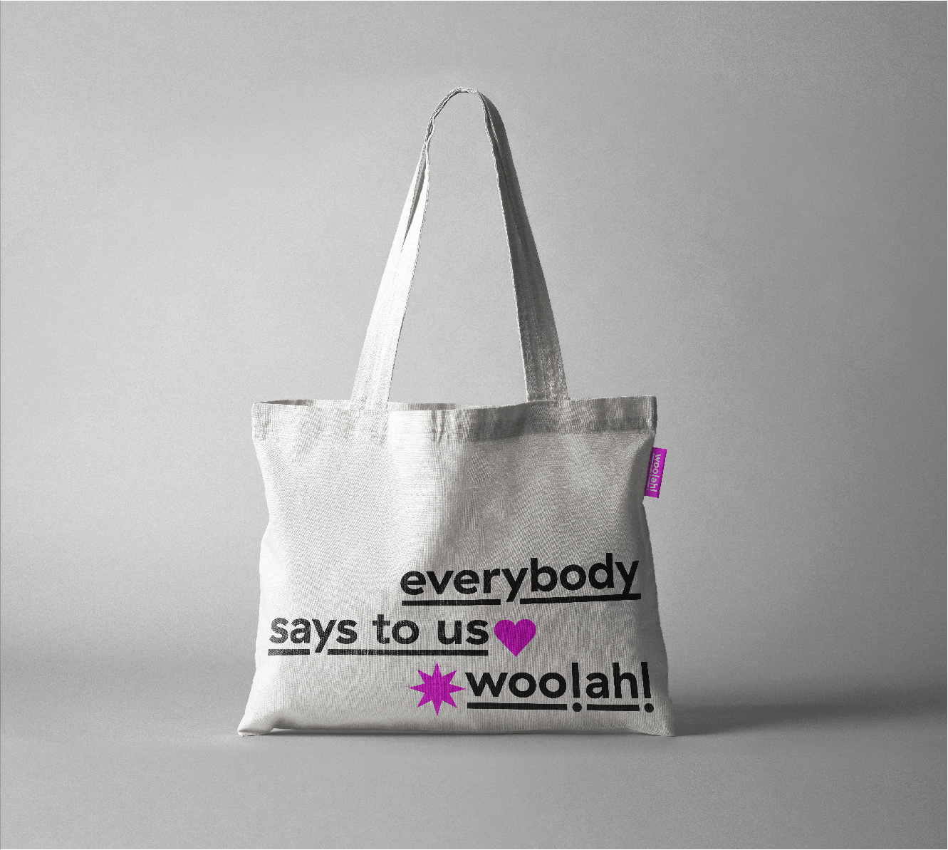
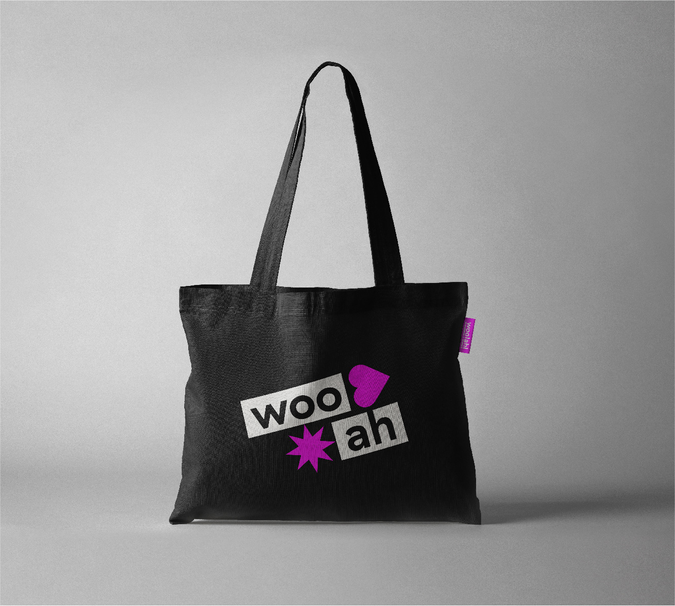
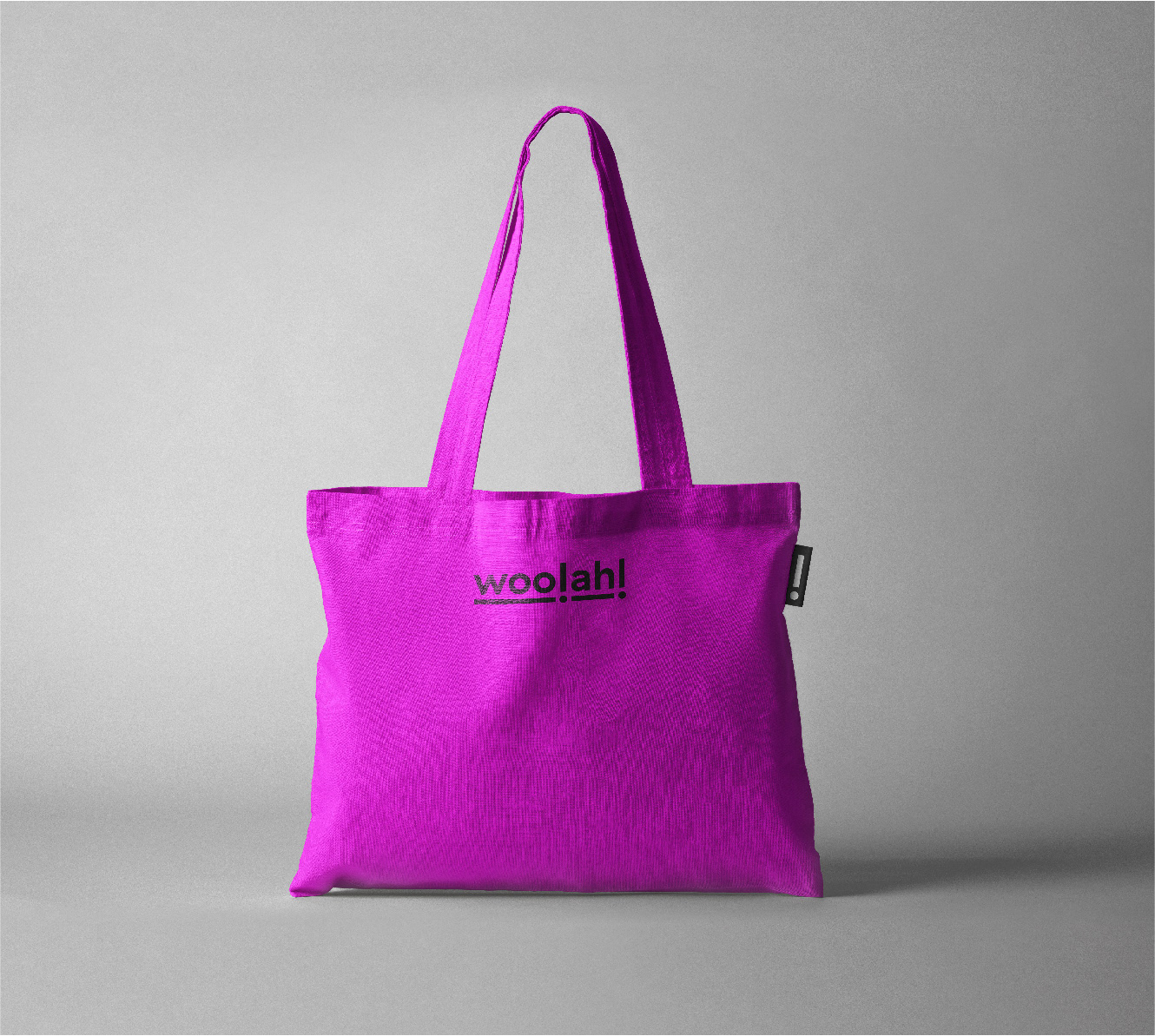
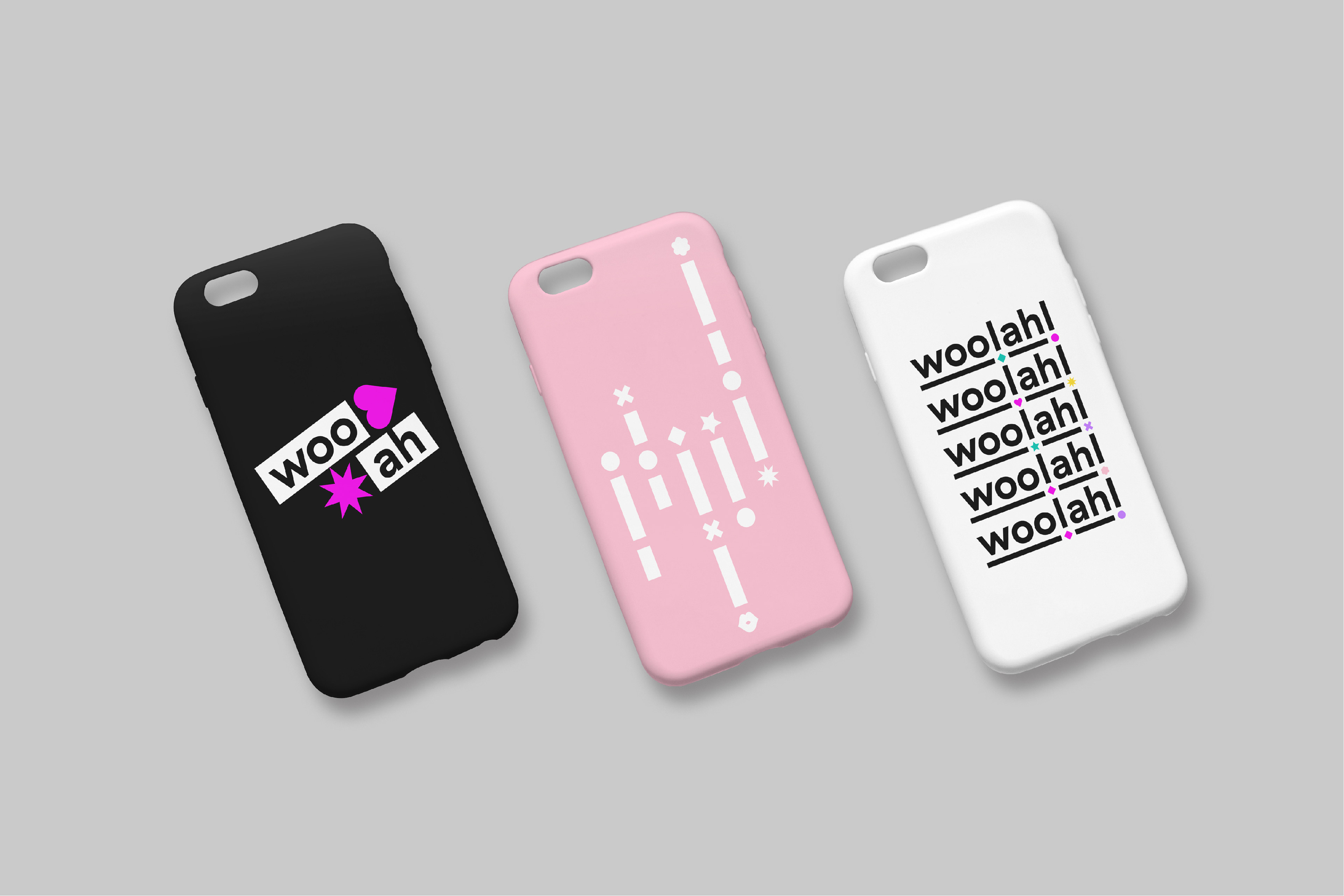
이를 시각화하기 위해서 반복되는 느낌표 두 개를 포인트로 활용하여 다양하게 변주될 수 있는 플렉서블 아이덴티티(Flexible Identity)를 만들었습니다. 기본형 워드마크 외에도 느낌표와 글자가 결합된 콤비네이션 마크를 만들어 매체에서 활용 시 눈에 띌 수 있도록 했습니다. 포인트가 다양한 도형과 컬러로 변주되면서 반복되는 느낌표는 6명의 소녀들이 이끌어내는 다채로운 감탄과 탄성을, 음악적인 리듬감과 경쾌하고 다채로운 이미지를 보여주게 됩니다.
Woo!ah! is a Korean girl group that debuted in 2020. Woo!ah! is a combination of two exclamations, ‘Woo!’ and ‘Ah!’, meaning two axes of coming lovingly and sometimes surprisingly through the variety of music, different styles, and activities. The concept of Woo!ah! is “Everybody says to us, ‘woo!ah!’”. As youths in their twenties, they will continually grow, renew, and show various charms to bring admiration from many fans.
In order to visualize these, we created a flexible identity which are variable in many ways by using two exclamation marks as points. In addition to the basic logotype, we made a combination mark that combined exclamation marks and letters so that they could be used in media, catching attention. The repeated points of the exclamation marks changing into various shapes and colors will show the colorful admiration and exclamation that six girls bring, their musical rhythm and cheerful image.


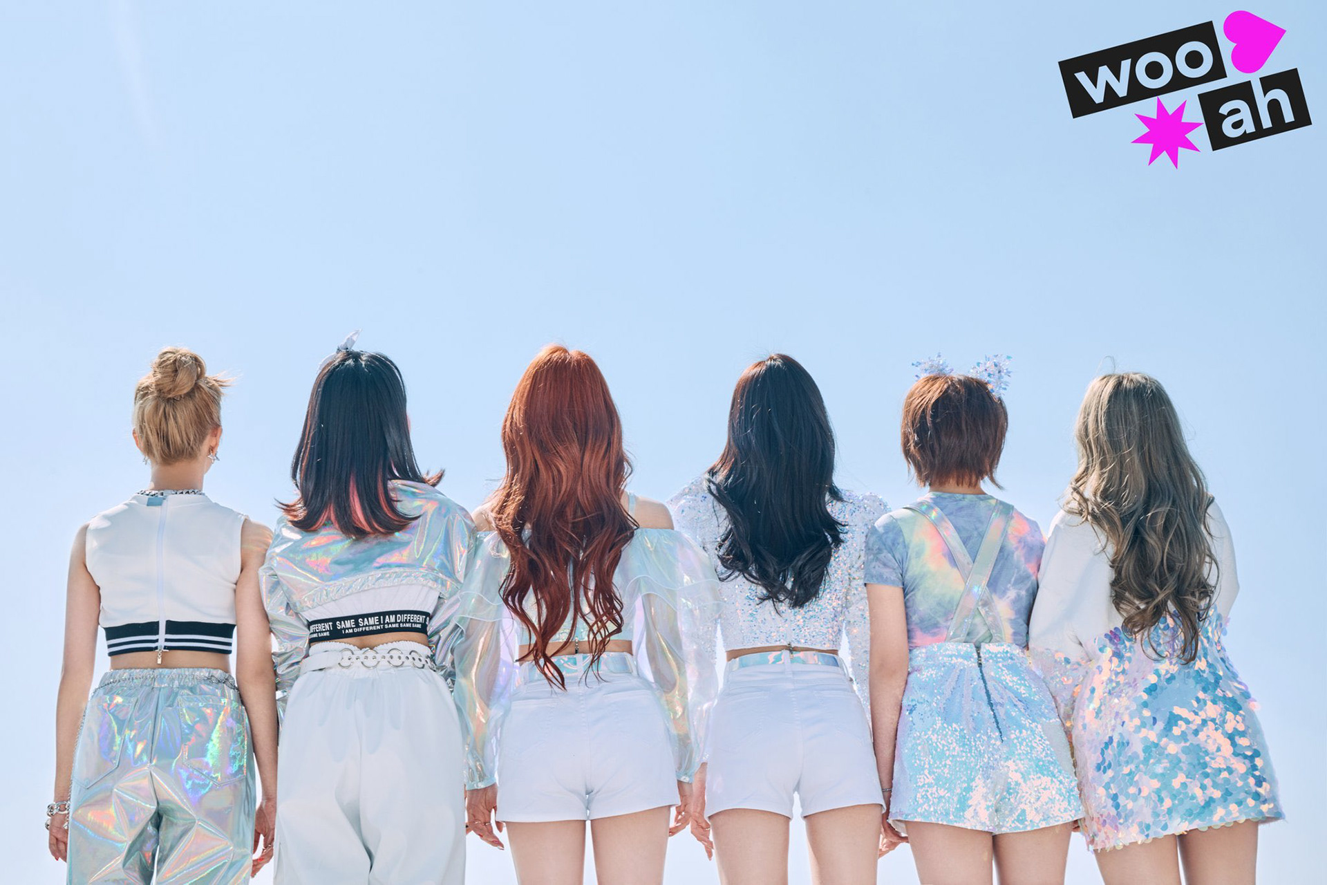
Used in photo / Image from woo!ah! official Instagram https://www.instagram.com/wooah_nv/
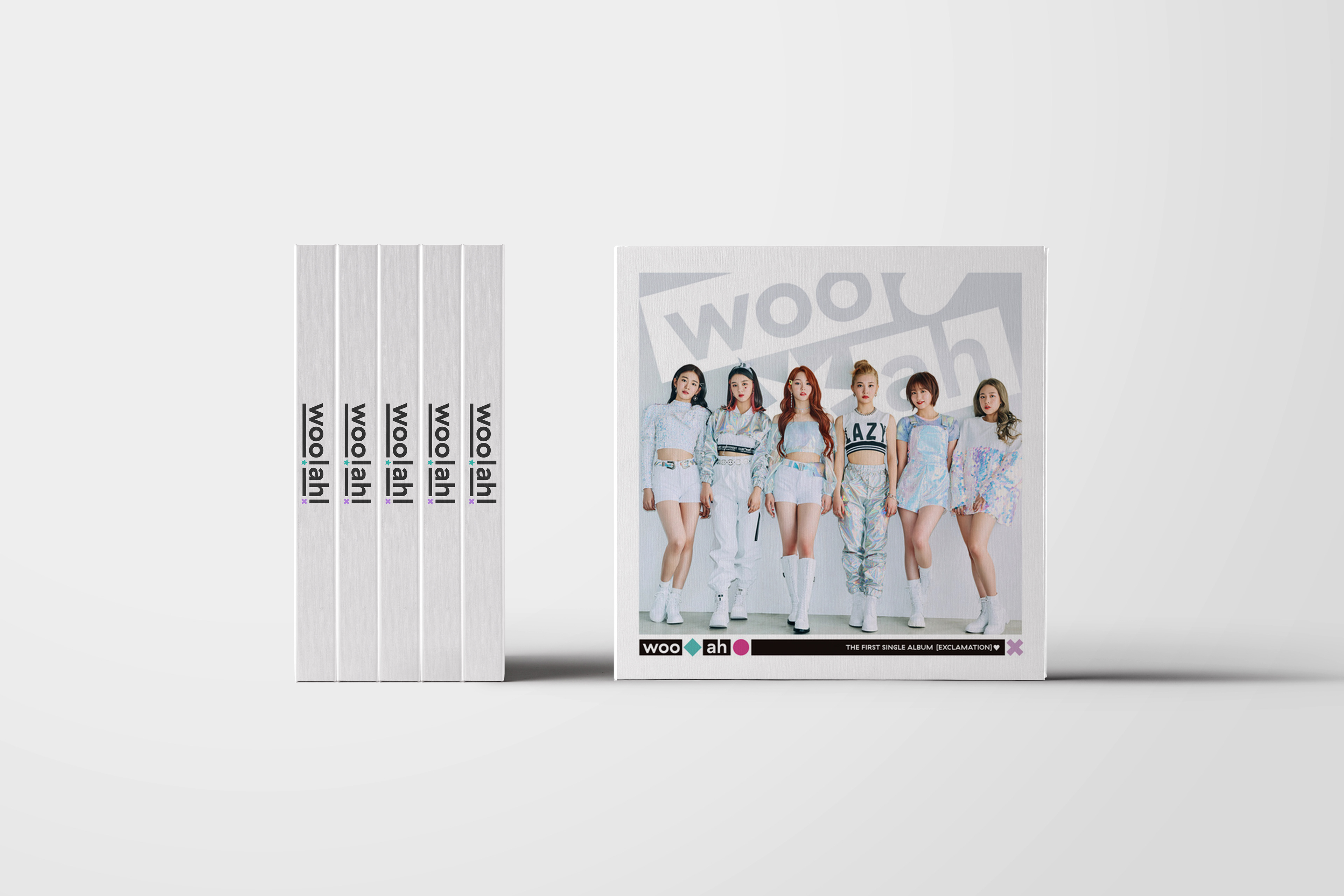
Used in album design / from NV entertainment
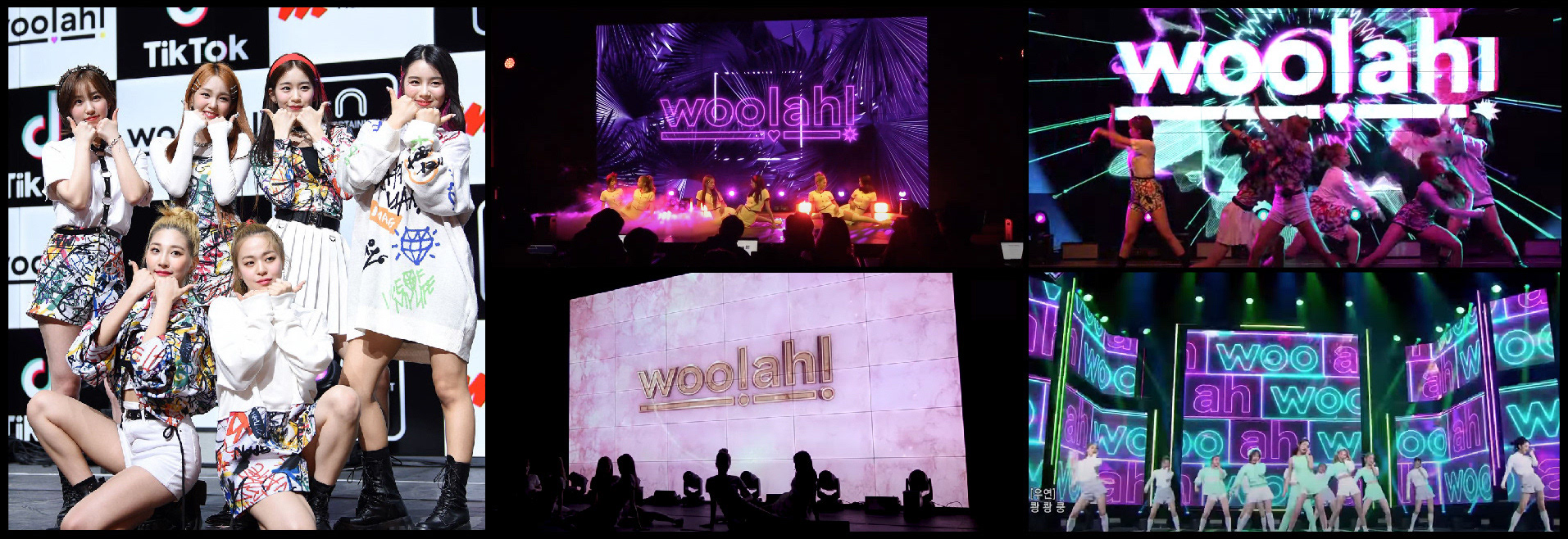
Used in stage design / Images from woo!ah! official youtube https://www.youtube.com/channel/UCNeLbWtlJzTsavMC70zY0dQ/featured
Studio roam
2020
2020