
Shinhan Super SOL BI Renewal
신한 슈퍼 SOL BI 리뉴얼
Client: Shinhan Bank
Co-work: J&Brand
Scope: Brand Visual Identity Renewal
Crew: Seyeong Jang, Chaehyun Moon, Soop Kim, Saerom Park
Studio roam|2026
Co-work: J&Brand
Scope: Brand Visual Identity Renewal
Crew: Seyeong Jang, Chaehyun Moon, Soop Kim, Saerom Park
Studio roam|2026
슈퍼SOL은 은행, 카드, 증권, 보험 등 다양한 금융 서비스를 하나로 연결하여, 복잡한 금융 경험을 쉽고 직관적으로 제안하는 신한금융의 슈퍼앱입니다.
이번 리뉴얼을 통해 계열사 간 서비스 연계를 강화하고, AI 기반 초개인화 기능을 고도화하여 고객 중심의 금융 경험으로 확장하였습니다. 이에 스튜디오 로움은 리뉴얼 컨셉의 다양한 구현을 탐색하고, BI 조형의 정교화를 진행하여 강화된 서비스 가치와 앱 전반의 일관된 사용자 경험을 효과적으로 전달할 수 있도록 하였습니다.
이번 리뉴얼을 통해 계열사 간 서비스 연계를 강화하고, AI 기반 초개인화 기능을 고도화하여 고객 중심의 금융 경험으로 확장하였습니다. 이에 스튜디오 로움은 리뉴얼 컨셉의 다양한 구현을 탐색하고, BI 조형의 정교화를 진행하여 강화된 서비스 가치와 앱 전반의 일관된 사용자 경험을 효과적으로 전달할 수 있도록 하였습니다.
Super SOL is Shinhan Bank’s super app that connects banking, credit cards, securities, insurance, and more on a single platform, making complex financial services simpler and more intuitive for users.
Through this renewal, service integration across affiliated companies was strengthened, while AI-powered hyper-personalized features were enhanced to deliver a more customer-centric financial experience. Studio Roam explored a wide range of renewal concepts and refined the BI form to effectively communicate the enhanced service value while ensuring a consistent user experience throughout the app.
Through this renewal, service integration across affiliated companies was strengthened, while AI-powered hyper-personalized features were enhanced to deliver a more customer-centric financial experience. Studio Roam explored a wide range of renewal concepts and refined the BI form to effectively communicate the enhanced service value while ensuring a consistent user experience throughout the app.
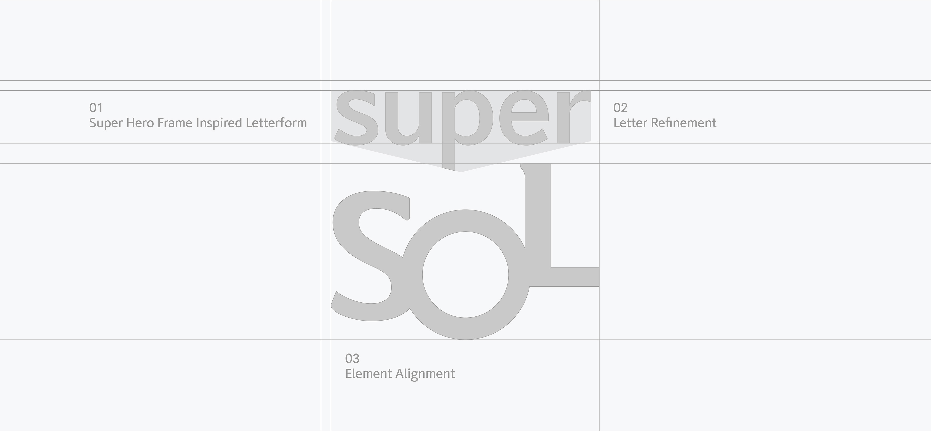
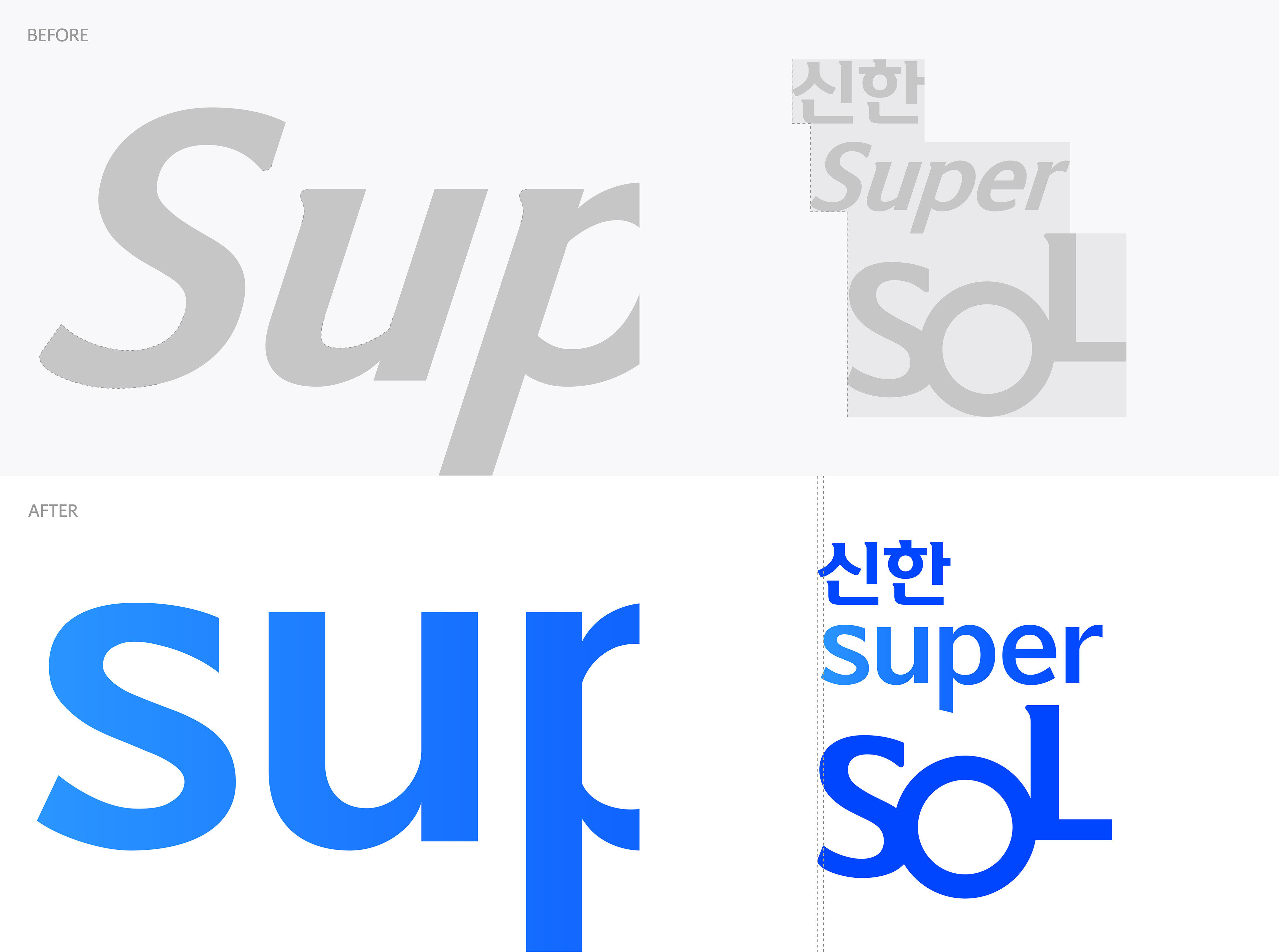
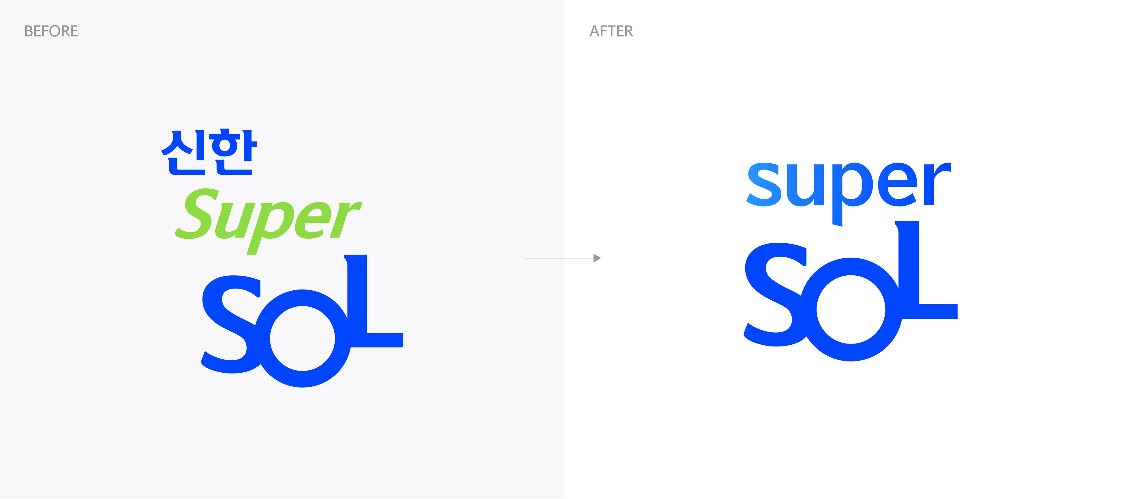
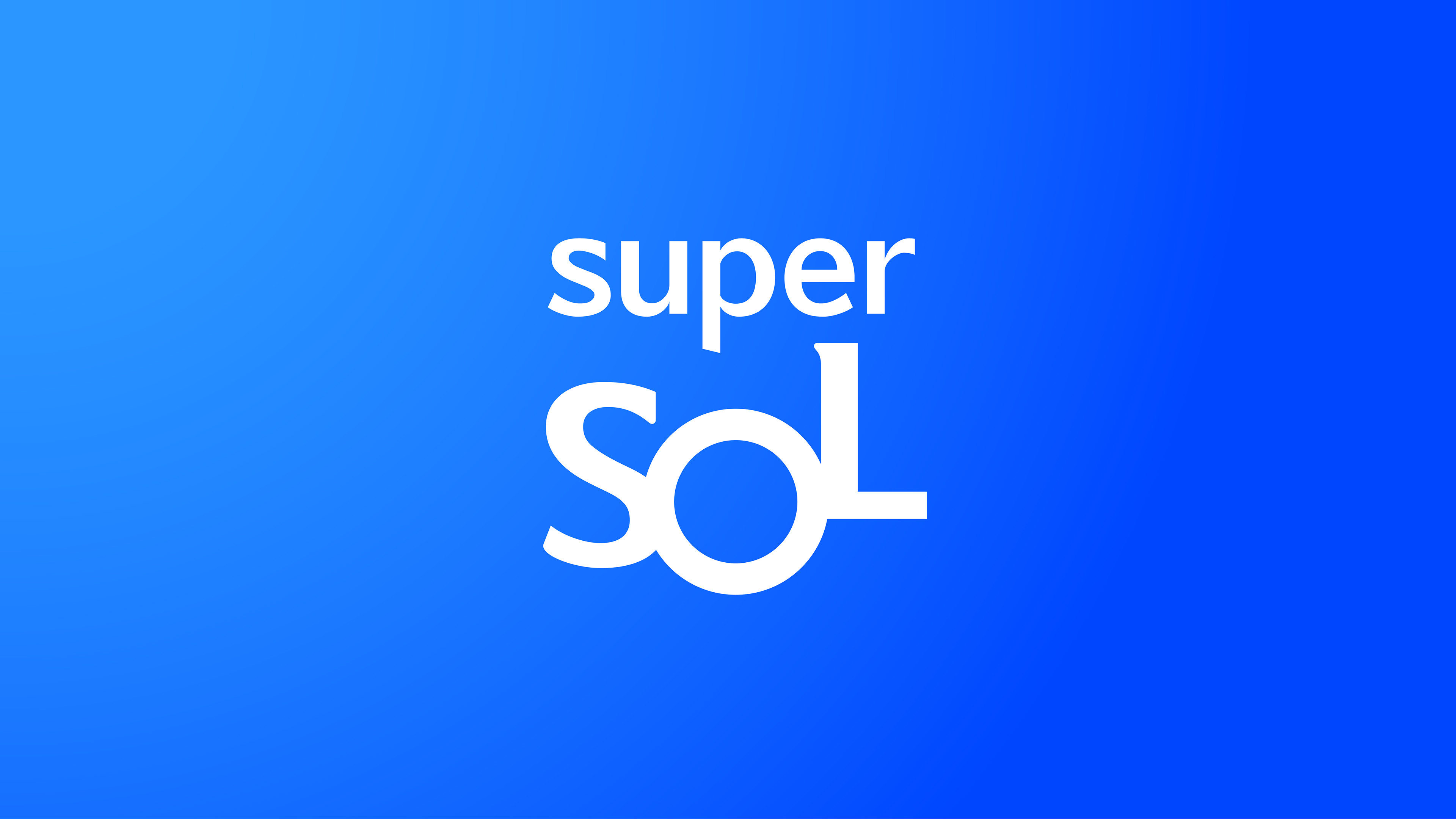
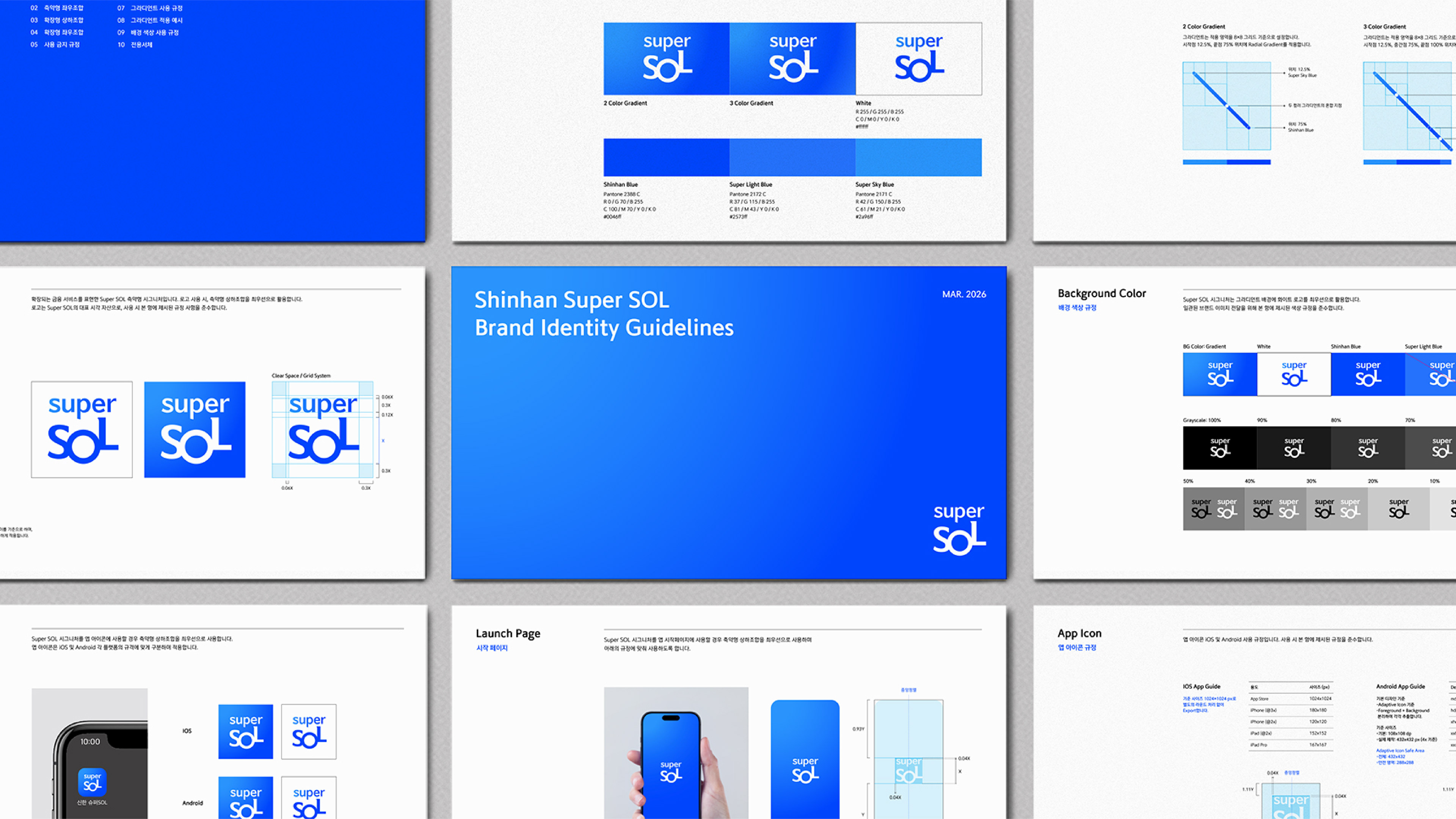
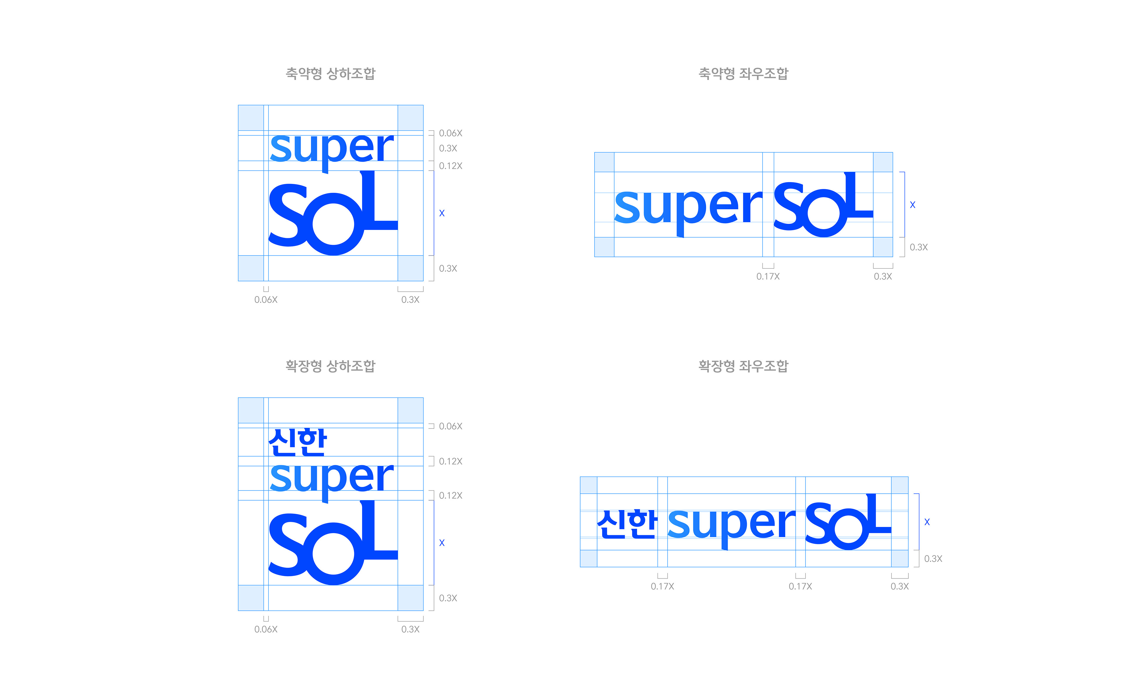
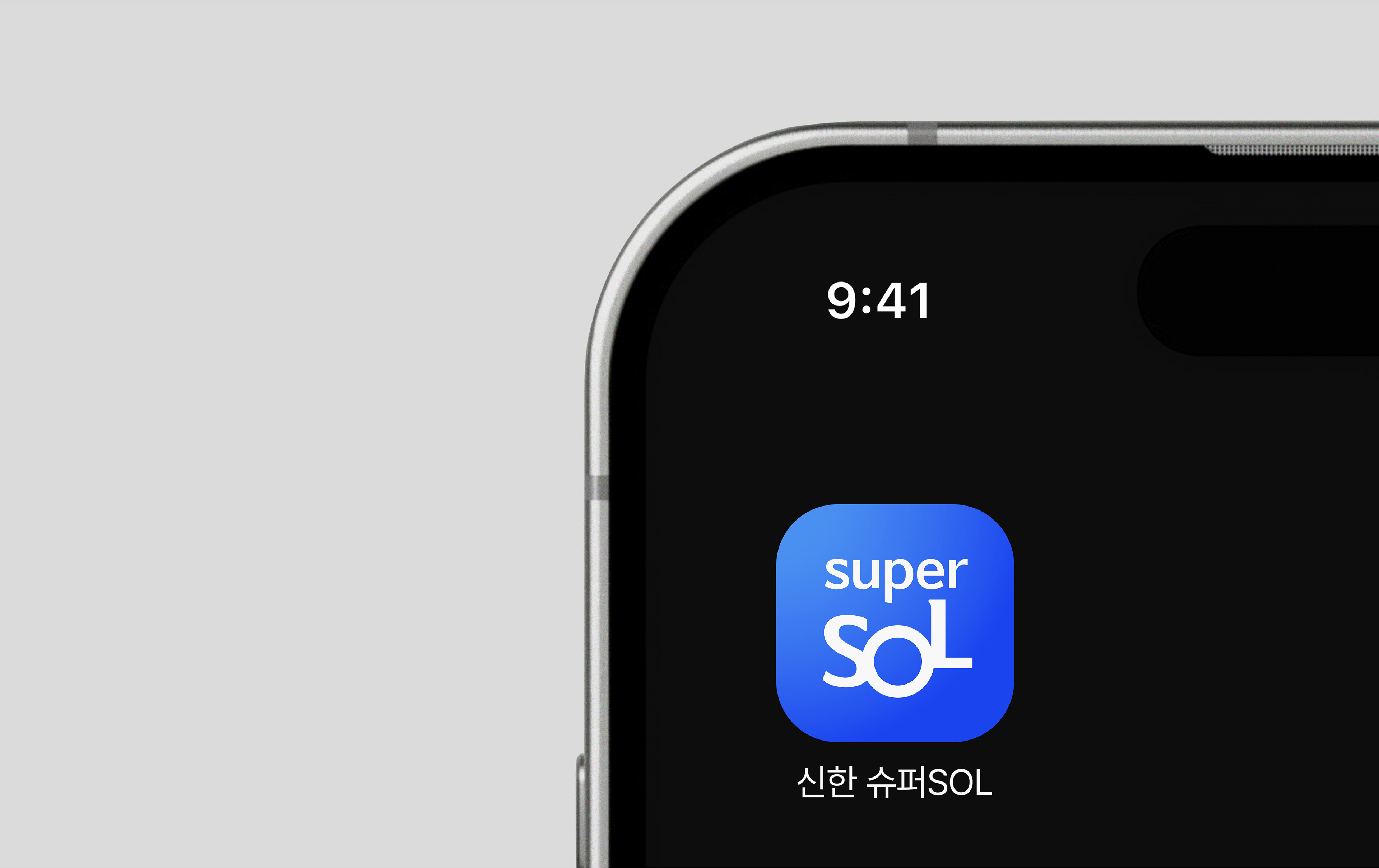
Super의 형태를 안정감있고 현대적인 조형으로 변경하고, ‘신한’과 ‘SOL’의 두께감에 맞춰 조정하여 로고 전반의 통일성을 강화하였습니다. 각 요소의 크기 비례와 간격, 정렬 체계를 정교하게 다듬고, 앱 아이콘 상의 표현요소를 단순화하여 통합 앱으로서의 대표성을 강조하고자 하였으며 이를 통해 모바일 환경에서도 더욱 선명하고 강력한 브랜드 인지가 가능하도록 개선하였습니다.
The ‘Super’ wordmark was refined into a more stable and contemporary form, with its visual weight adjusted to harmonize with ‘Shinhan’ and ‘SOL’, creating a more cohesive logo system. The proportions, spacing, and alignment were carefully optimized, while the app icon was simplified to emphasize the identity of a unified platform. These improvements ensure clearer and stronger brand recognition even in mobile environments.
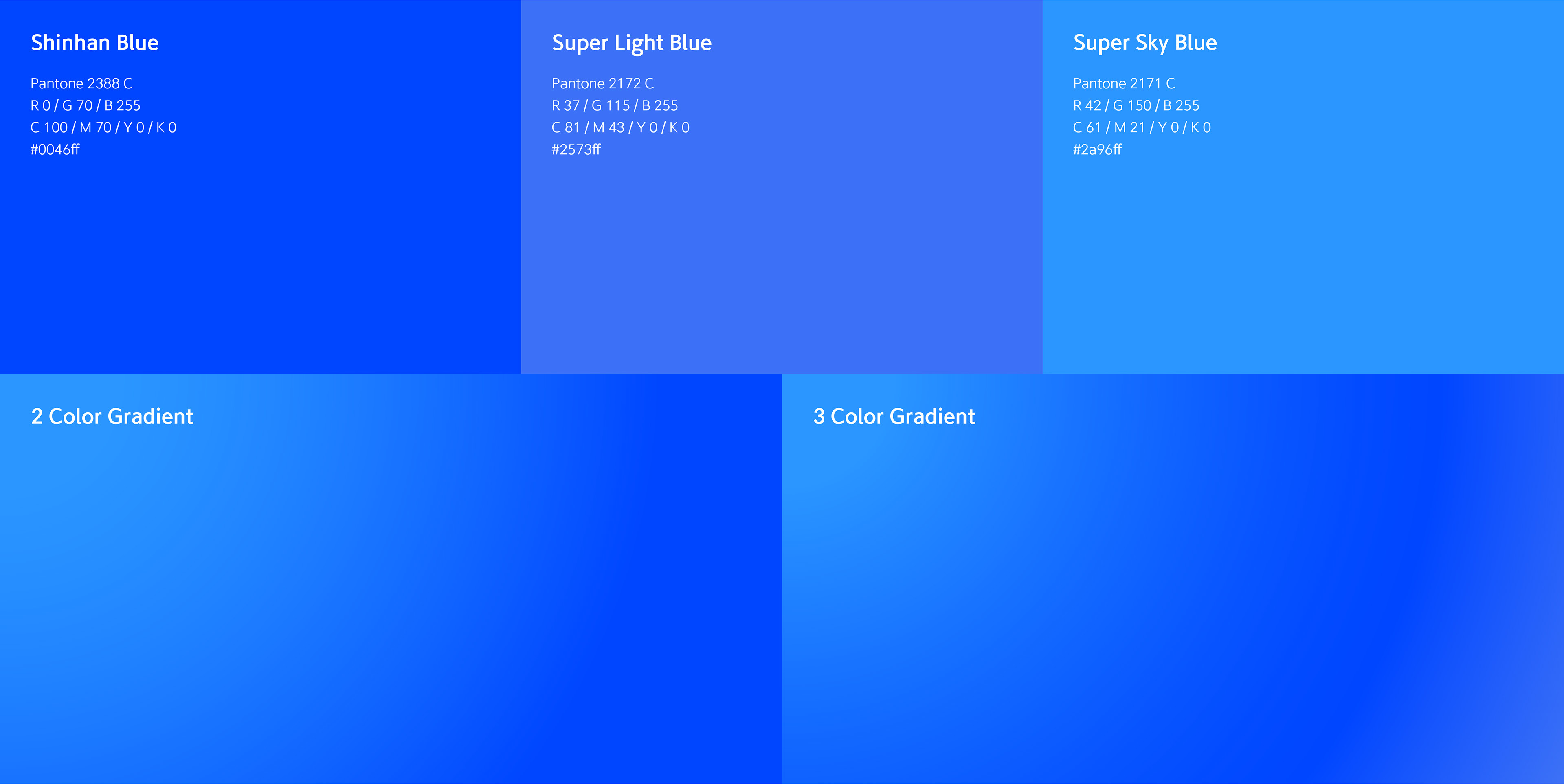
신한 블루를 중심으로 라이트 블루와 스카이 블루를 더해 컬러 스펙트럼을 확장하고, 디지털 환경에서도 선명하게 구현되는 그라디언트를 활용하여 연결되고 확장되는 금융 경험을 표현하였습니다.
The color spectrum was expanded by introducing Light Blue and Sky Blue alongside Shinhan Blue, while digitally optimized gradients were applied to express a seamless and ever-evolving financial experience.
2026
Studio roam
Studio roam