
Rêve de vent Brand Visual Identity Design
레브드방 브랜드 아이덴티티
Our own brand
Scope: Brand Visual Identity, Package & SNS design
Crew: Seyeong Jang, Chaehyun Moon, Saerom Park
Studio roam|2025
Scope: Brand Visual Identity, Package & SNS design
Crew: Seyeong Jang, Chaehyun Moon, Saerom Park
Studio roam|2025
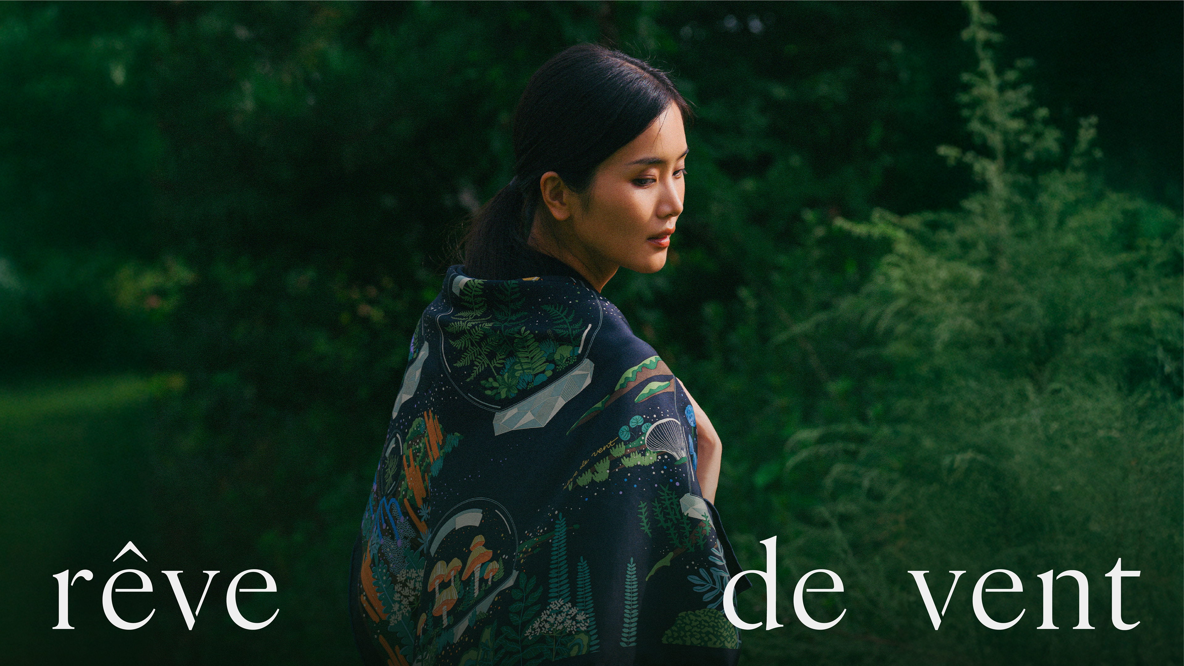
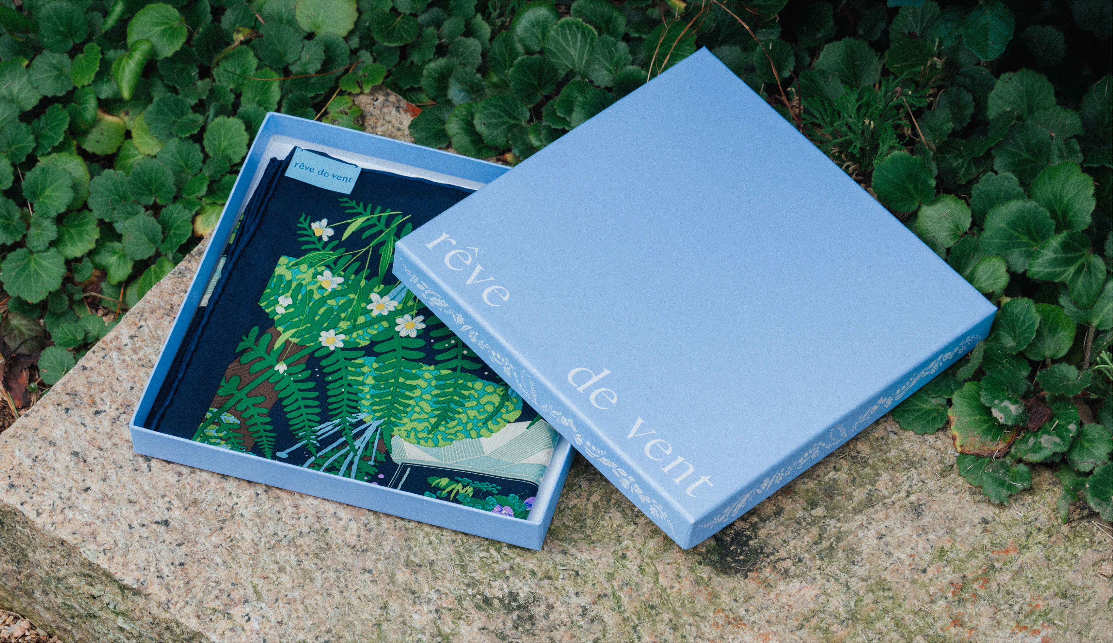
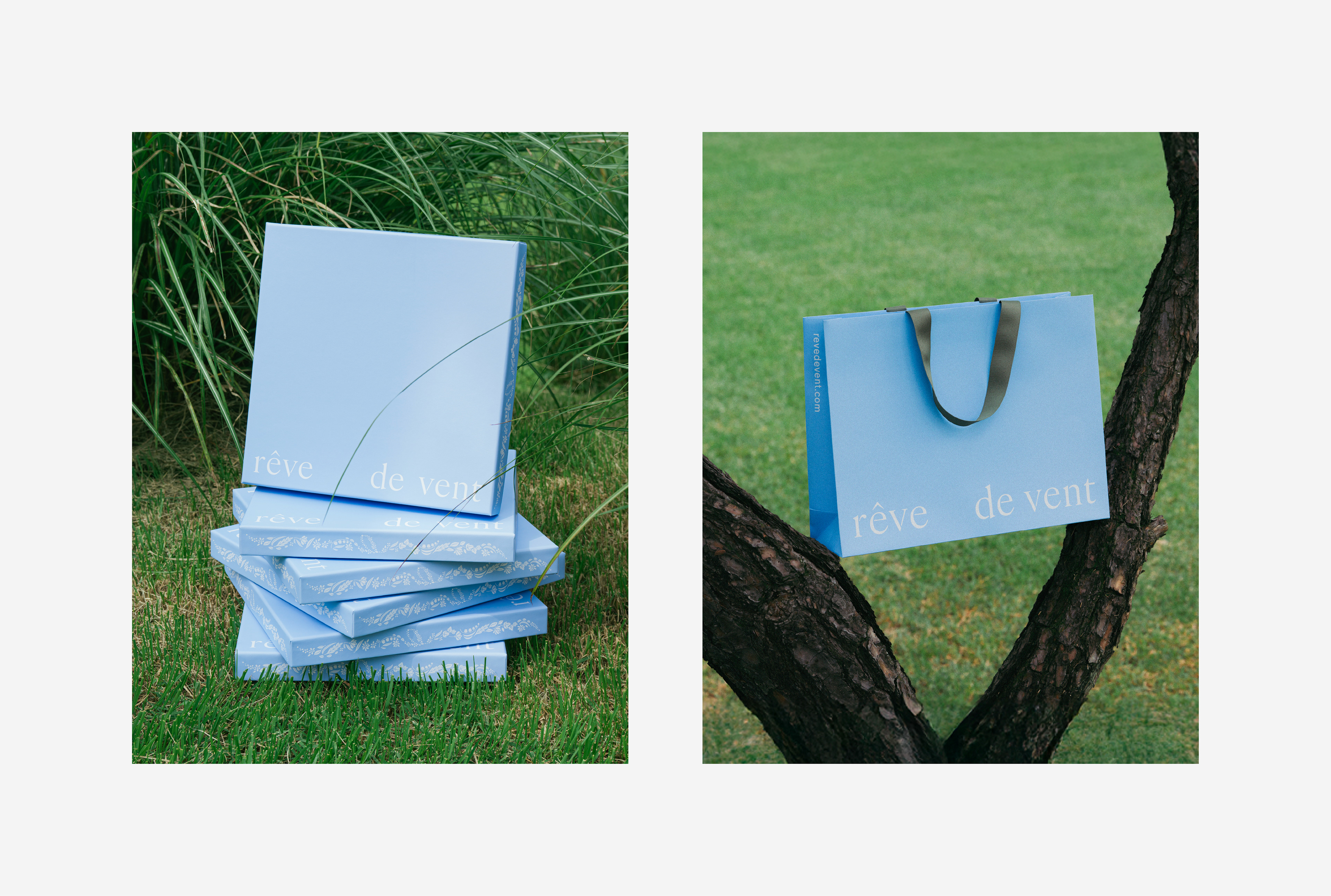
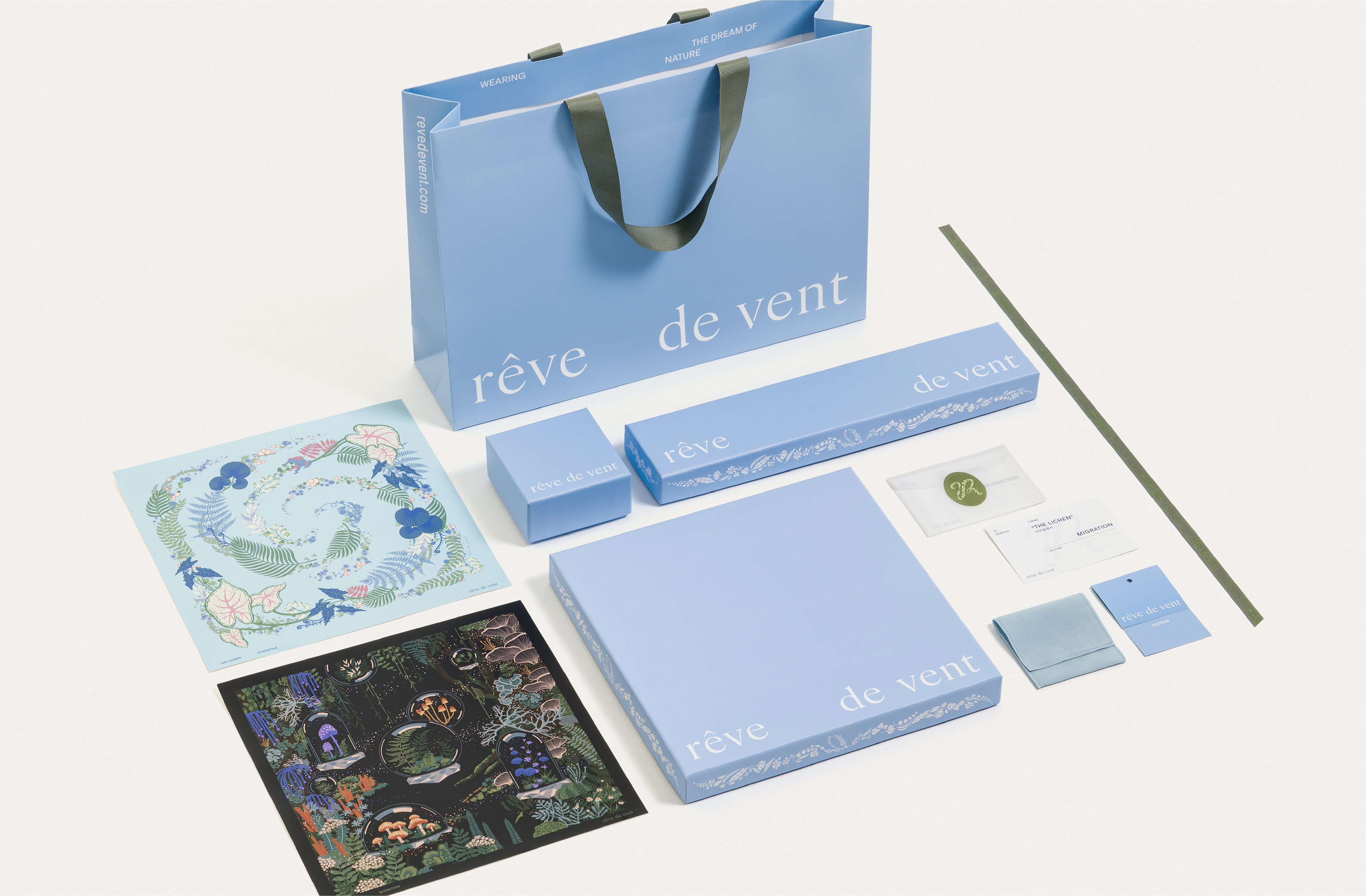
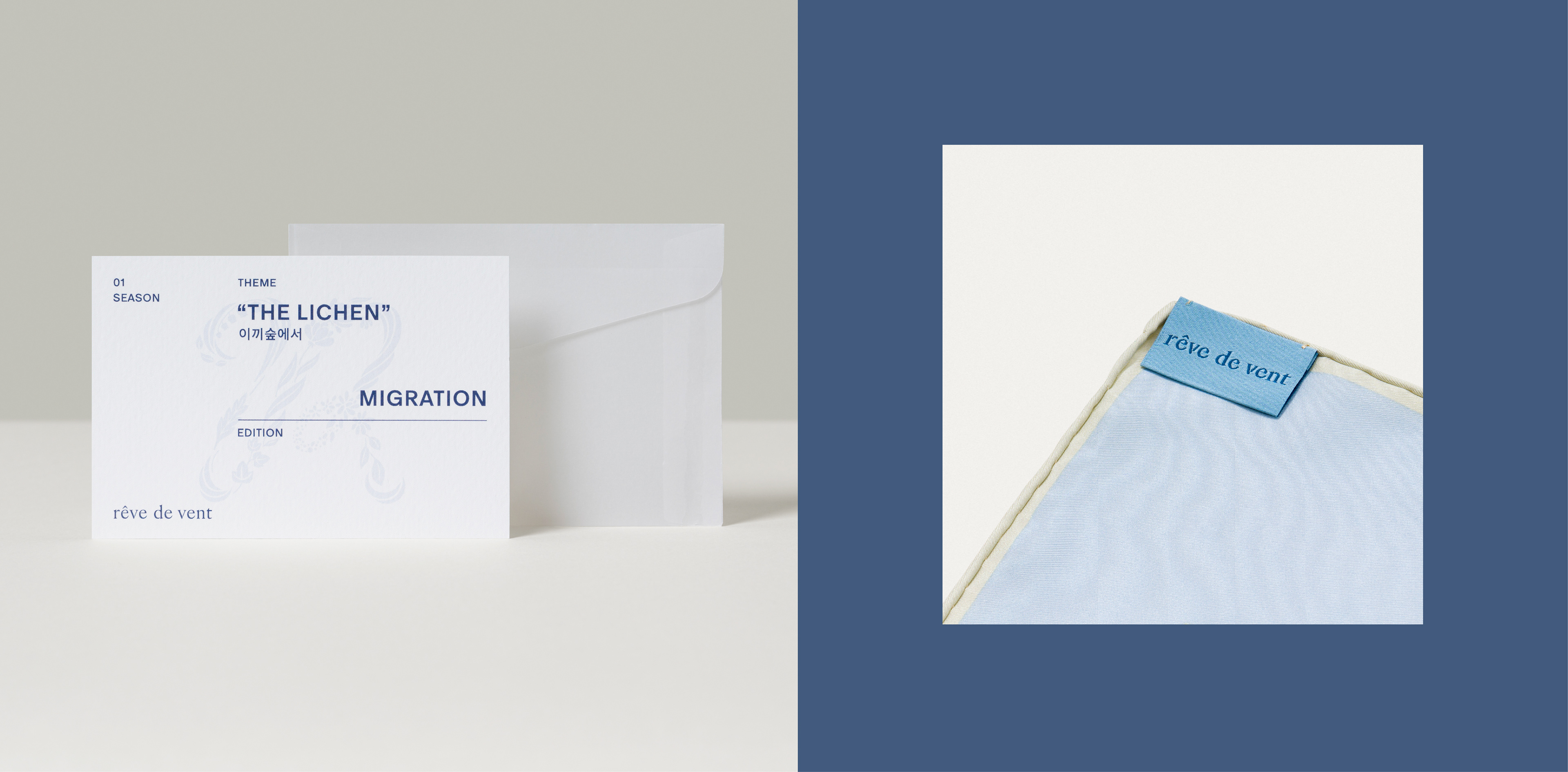
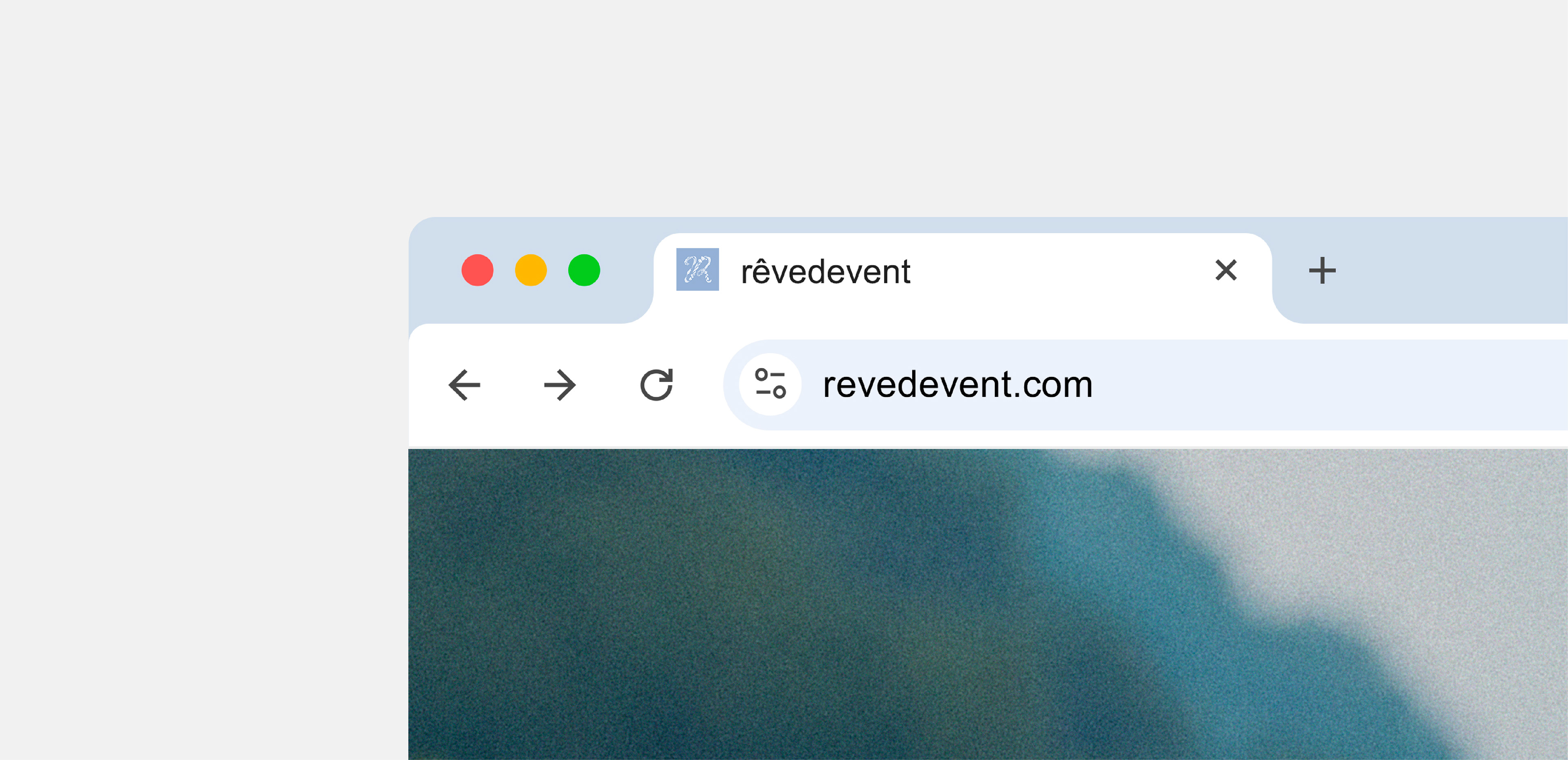
도시의 일상에 자연의 숨결을 불어넣는 스카프 브랜드 레브드방(rêve de vent)의 아이덴티티 & 패키지 디자인을 진행했습니다. 레브드방은 ‘바람의 꿈’이라는 뜻으로, 실크 위에 자연에 대한 환상과 꿈, 그리고 그 찰나의 감각을 한정판 아트피스 스카프로 선보이는 브랜드입니다.
Studio Roam designed the brand identity and packaging for rêve de vent, a scarf brand that brings the breath of nature into urban life. Meaning 'dream of the wind', rêve de vent presents limited-edition art piece scarves that capture the fantasies, dreams, and fleeting sensations of nature on silk.
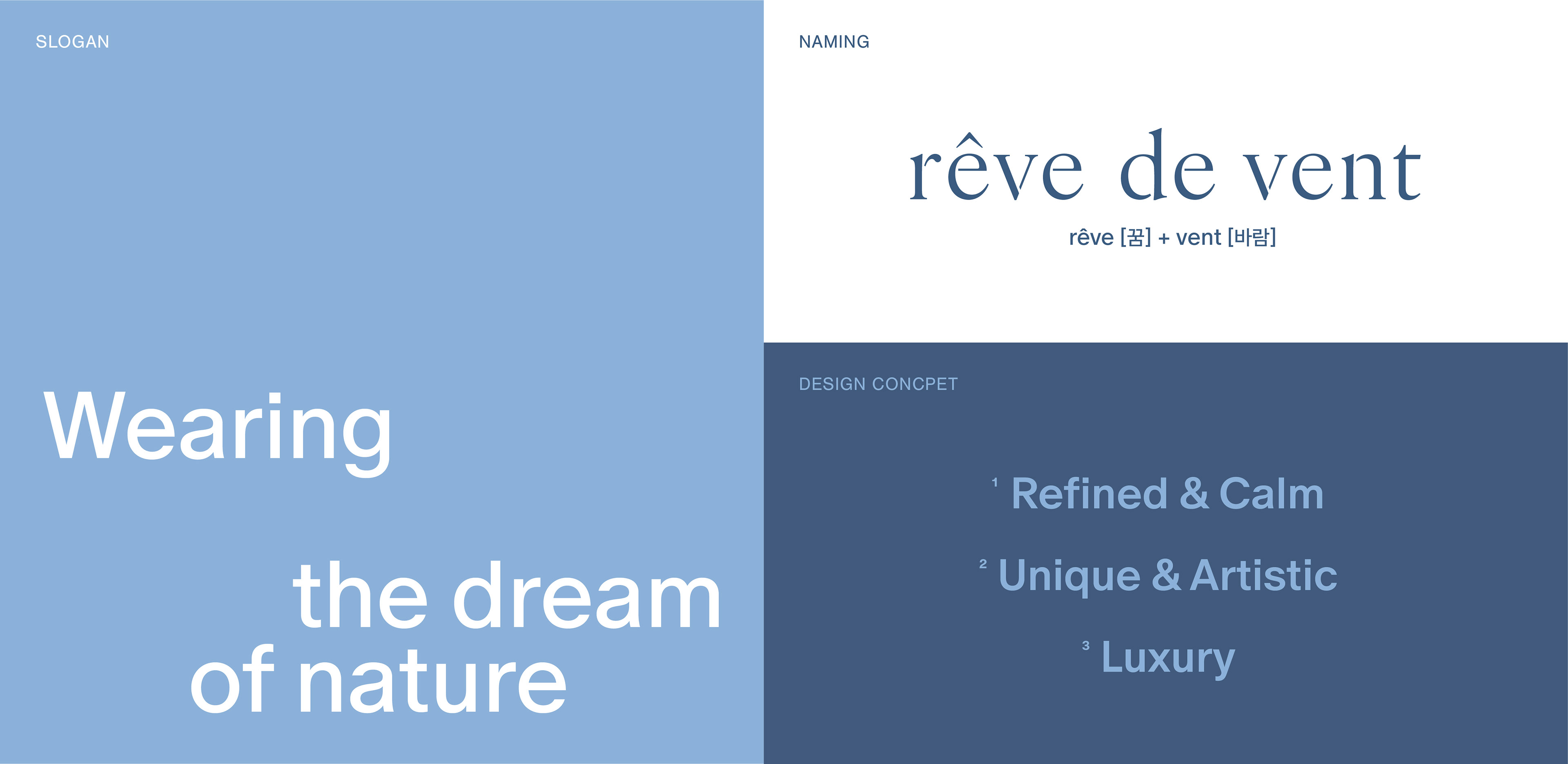

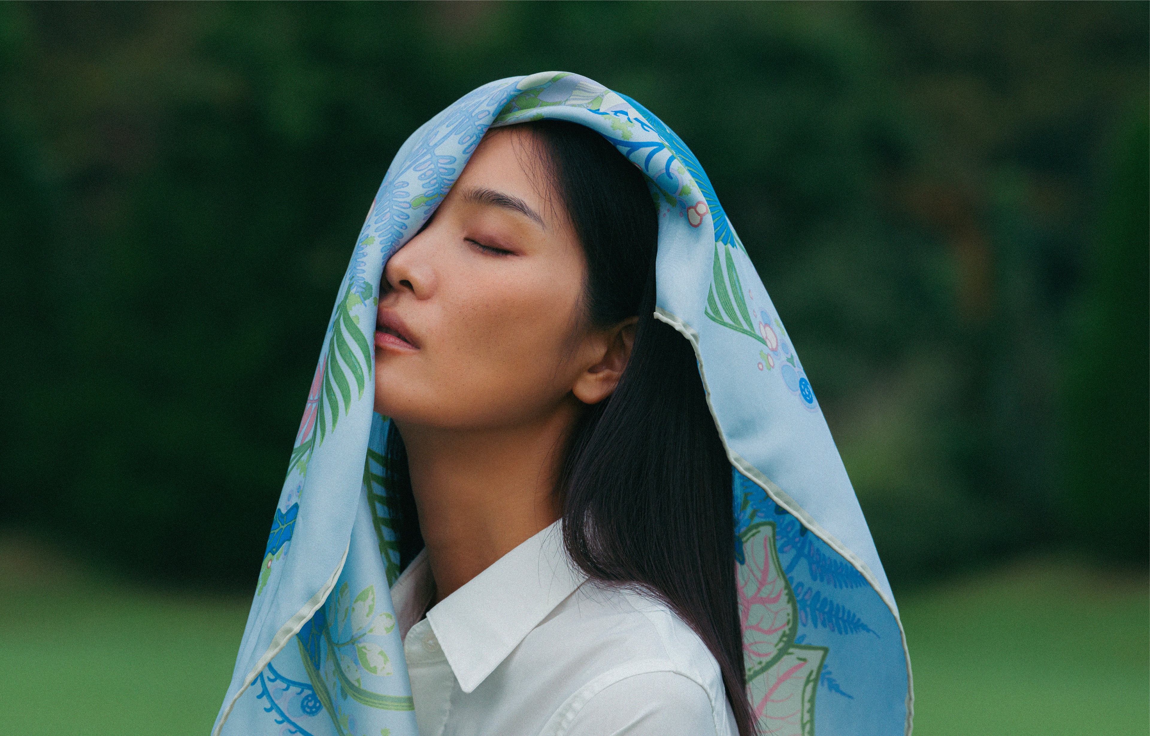
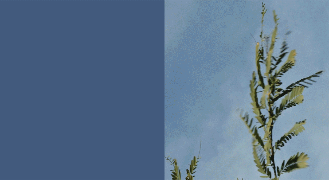
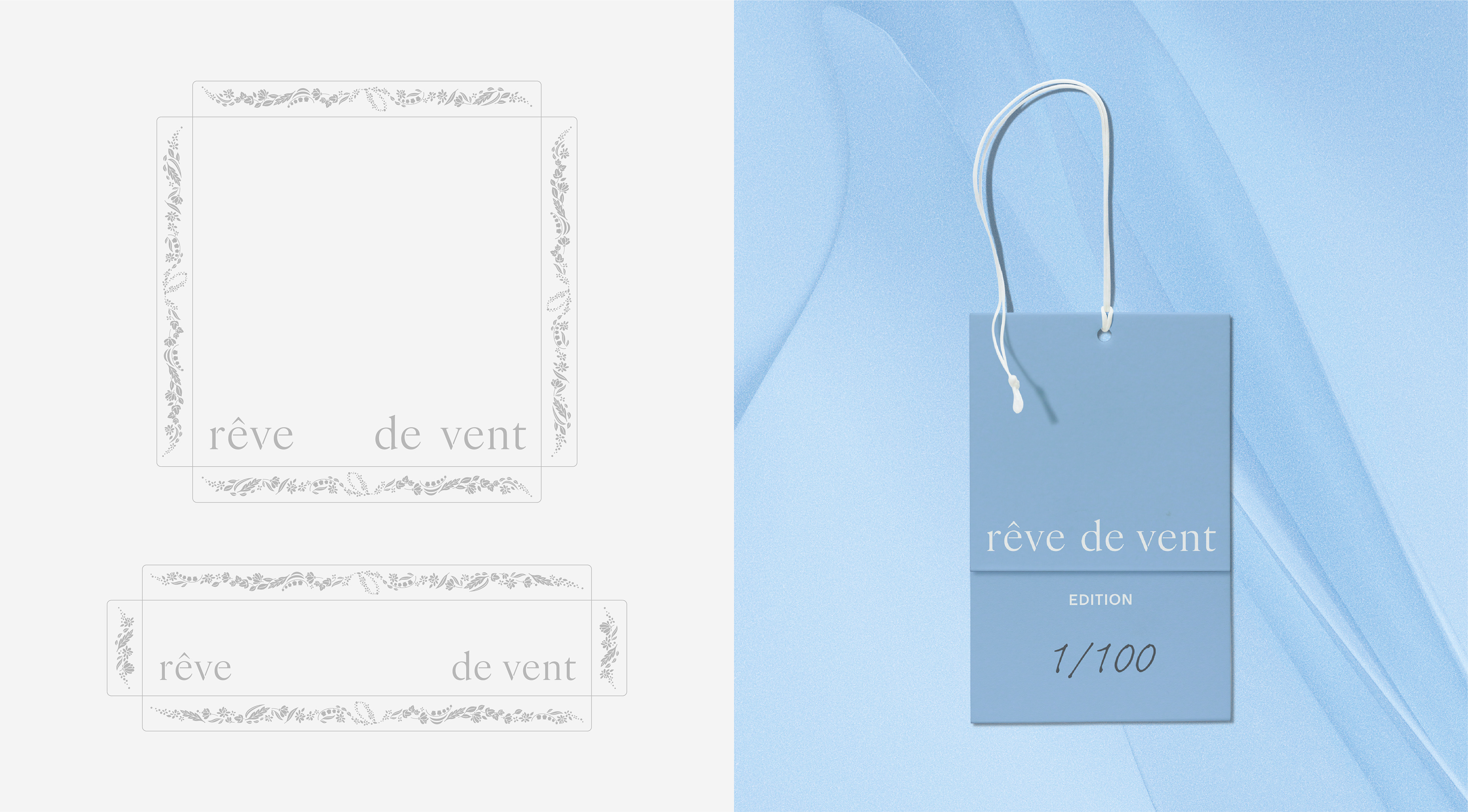
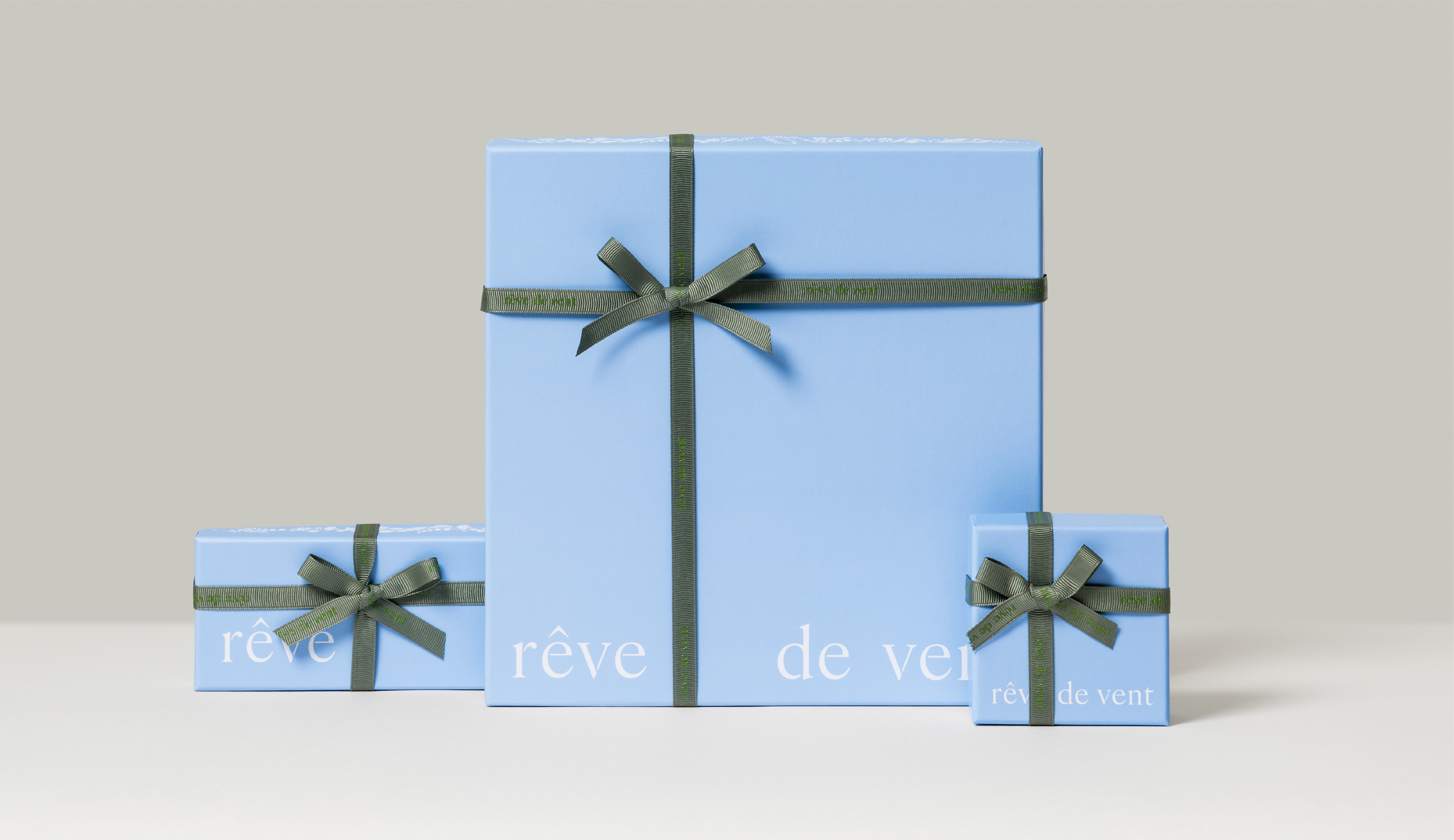
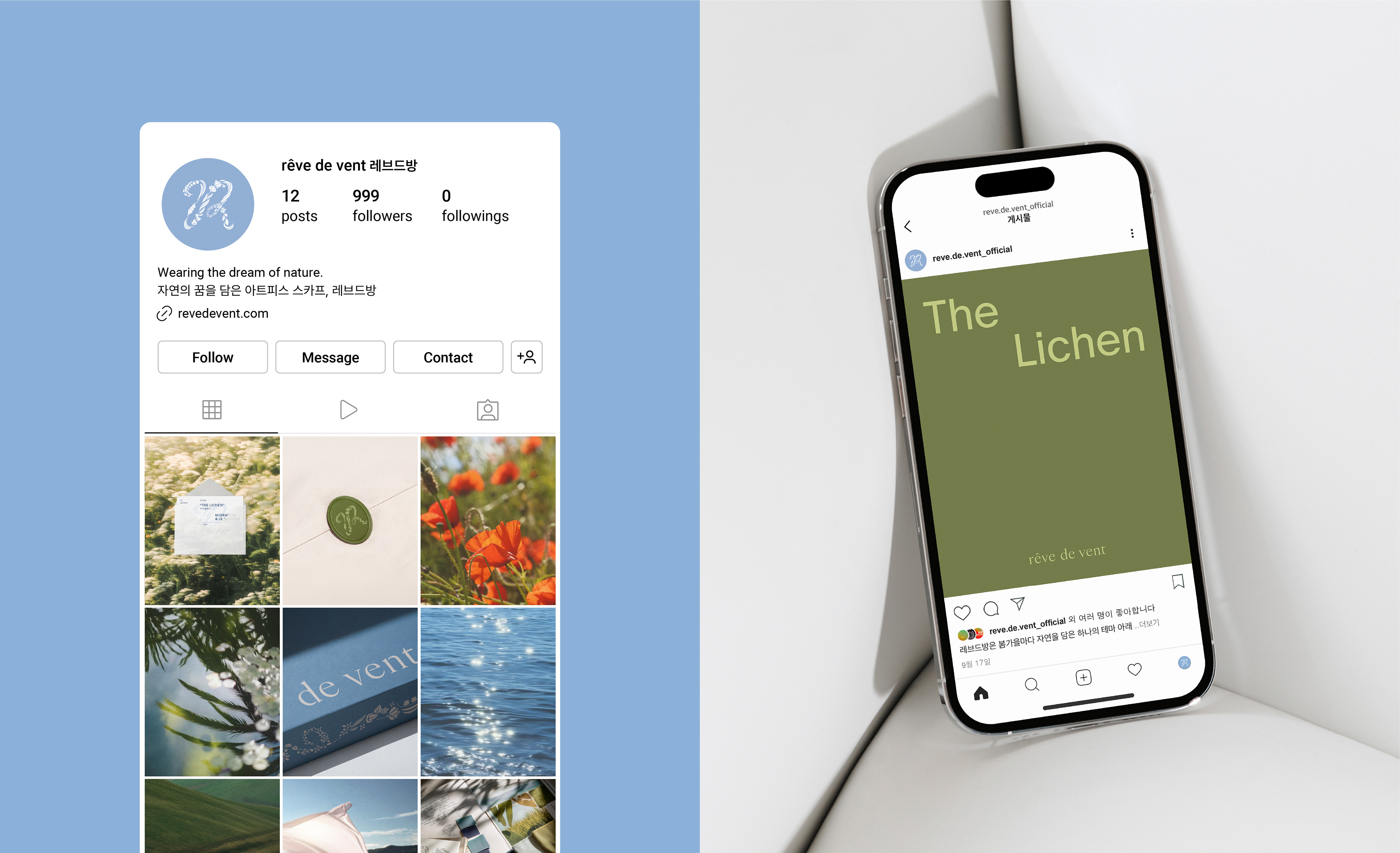
'자연에 대한 꿈을 입다’를 컨셉으로 하여 브랜드의 섬세하고 우아한 감성을 클래식한 워드마크에 정교한 트임 디테일로 표현했습니다. 또한, 바람에 흩날리는 자연의 모습을 포착한 레브드방 고유의 심볼을 개발하여 브랜드 정체성을 시각적으로 완성했습니다. 워드마크는 그리드 시스템을 기반으로 여백이 확장되는 구조를 적용하여, 단어 사이로 바람이 흐르는 여유로움을 보여주며 다양한 매체에서도 일관된 무드와 균형감을 유지합니다.
With the concept of ‘wearing a dream of nature’, we expressed the brand’s delicate and elegant sensibility through a classic wordmark featuring intricate slit details. We also developed rêve de vent’s signature symbol, inspired by the movement of nature swaying in the wind, to visually reinforce the brand identity. The wordmark is based on a grid system that allows whitespace to expand, evoking a gentle breeze between words while maintaining a consistent mood and balance across various media.
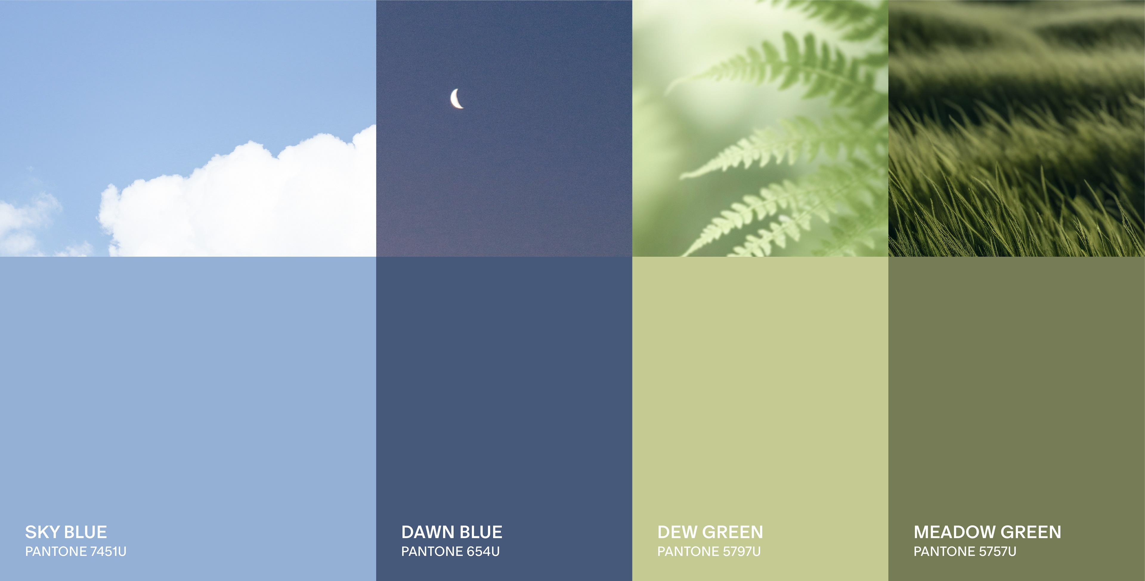
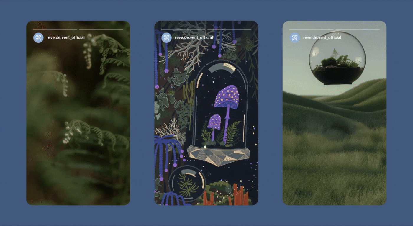
탄탄한 가독성을 지닌 타이포그래피와 바람, 하늘, 풀밭 등 자연에서 영감을 받은 컬러 팔레트를 통해, 레브드방만의 자연스럽고 감각적인 브랜드 아이덴티티 시스템을 구축했습니다.
Rêve de vent’s brand identity system was built upon highly legible typography and a nature-inspired color palette reflecting the wind, sky, and grass, creating a natural and sophisticated visual language.
2025
Studio roam
Studio roam