
LUVZE High-end Residence
하이엔드 레지던스 루브제 BI 디자인
Client: 키스톤 개발
Co-work: J&Brand
Crew: Saerom Park, Jeesu Hwang
Studio roam | 2021
Co-work: J&Brand
Crew: Saerom Park, Jeesu Hwang
Studio roam | 2021
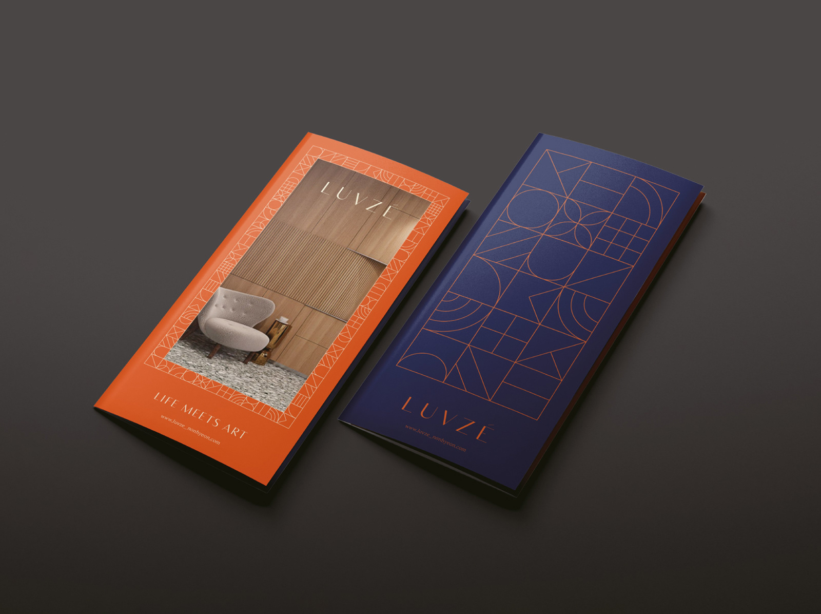
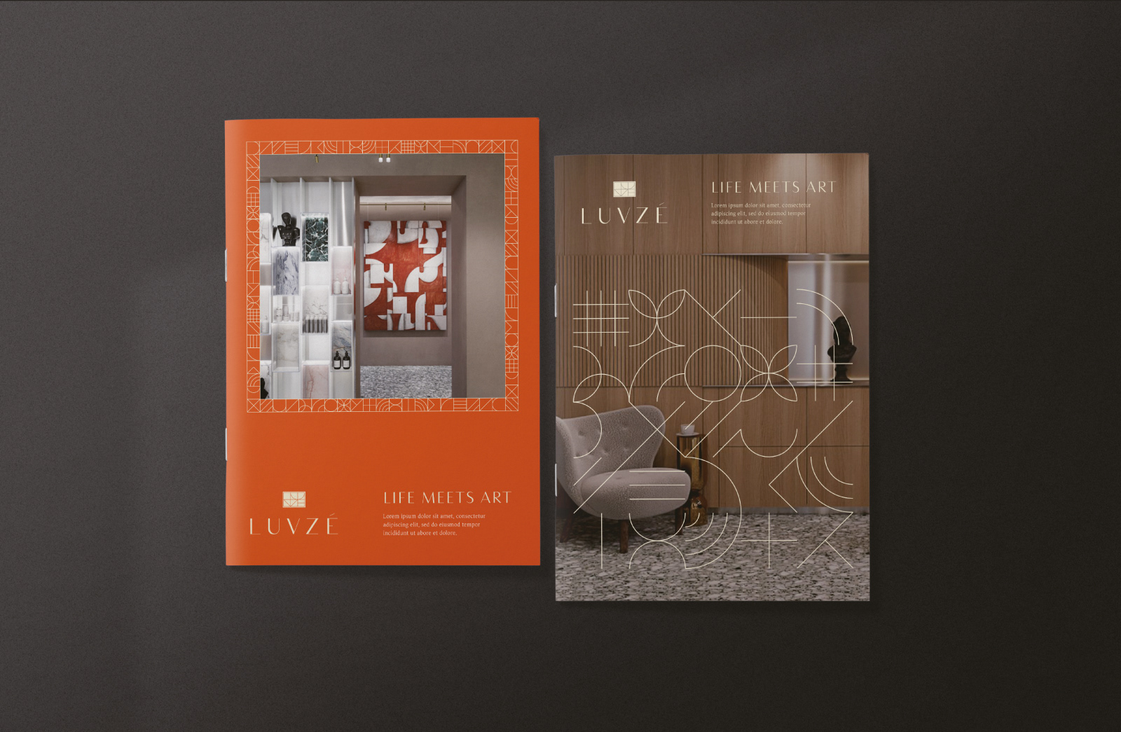
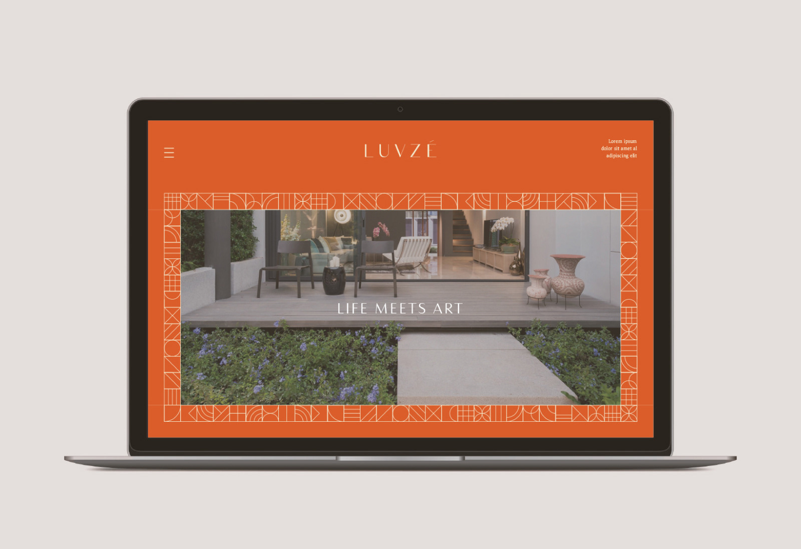
‘Life meets Art’
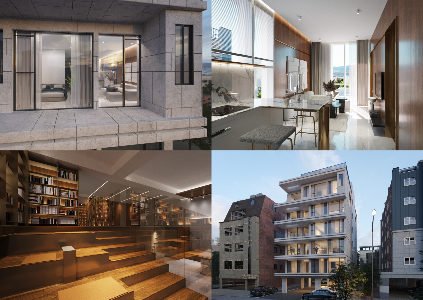
루브제는 소형 하이엔드 주거 브랜드입니다. 루브제의 어원은 ‘Luminous Objet’로, 프랑스의 전설적 건축가 르코르뷔지에가 제안한 ‘빛나는 도시’에서 영감을 받았습니다. 자신의 취향에 맞는 아름다운 주거 공간을 당연하게 여기는 프랑스적 공간 개인주의가 만든 편리하고 현대적인 고급 주거 공간입니다. 개인에게 맞춰 큐레이팅 되는 정교하고 위트 있는 공간과 맞춤형 컨시어지 서비스, 프라이빗 커뮤니티, 옥상정원 등이 개인의 취향을 담은 프라이빗 아트 컬렉션과 같은 럭셔리 주거브랜드를 만듭니다.
LUVZE is a small high-end residential brand. The etymology of LUVZE is ‘Luminous Objet’. Inspired by the ‘La ville radieuse’ proposed by the legendary French architect Le Corbusier. It is a convenient and modern luxury living space created by French space individualism that takes for granted a beautiful living space that suits one's taste. Sophisticated and witty spaces curated for individuals, customized concierge services, private communities, and rooftop gardens create a luxury residential brand such as a private art collection that reflects individual tastes.
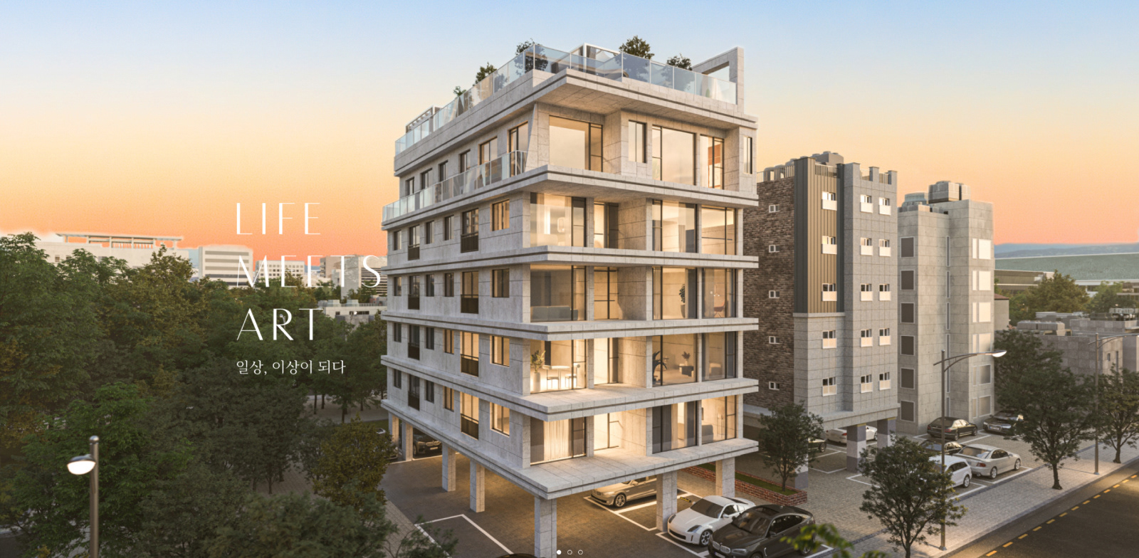
image from luvze.co.kr
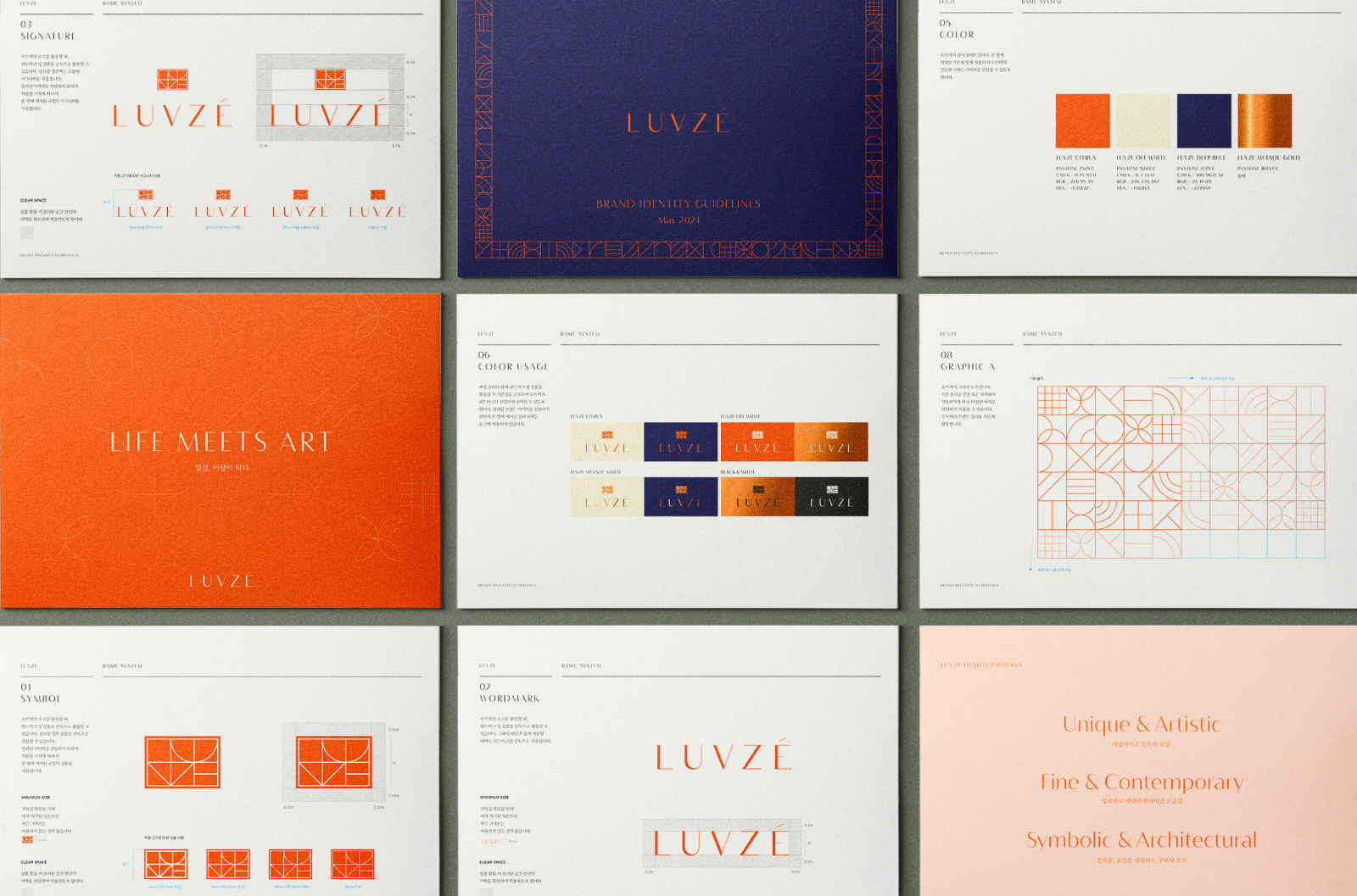
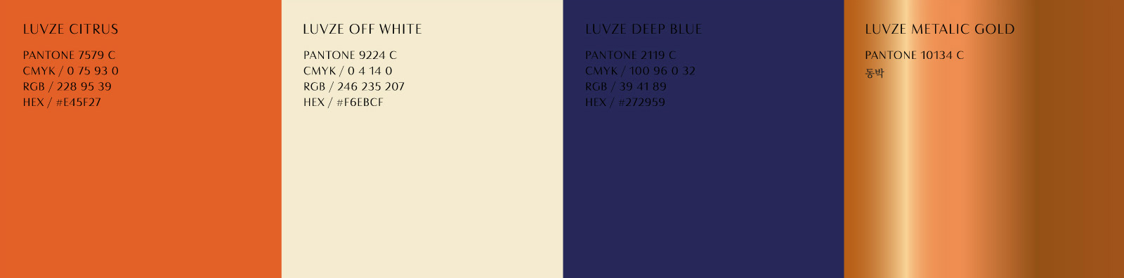
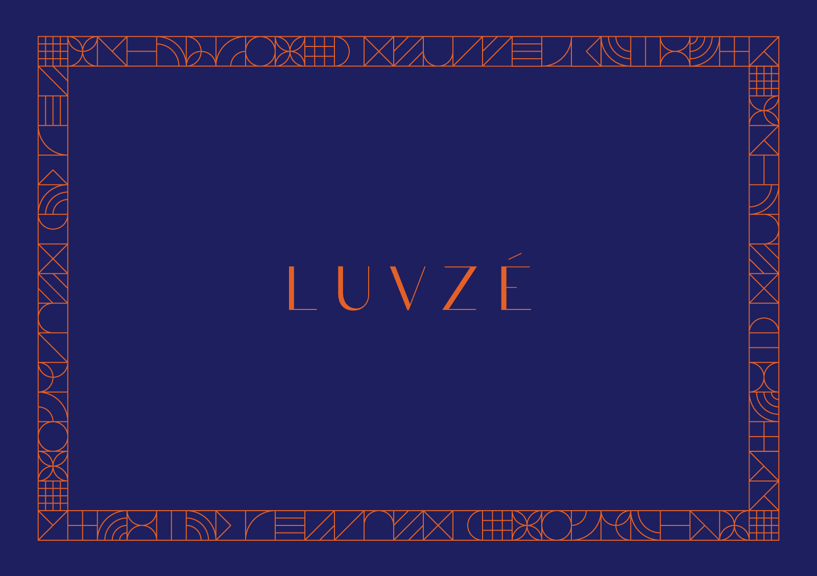
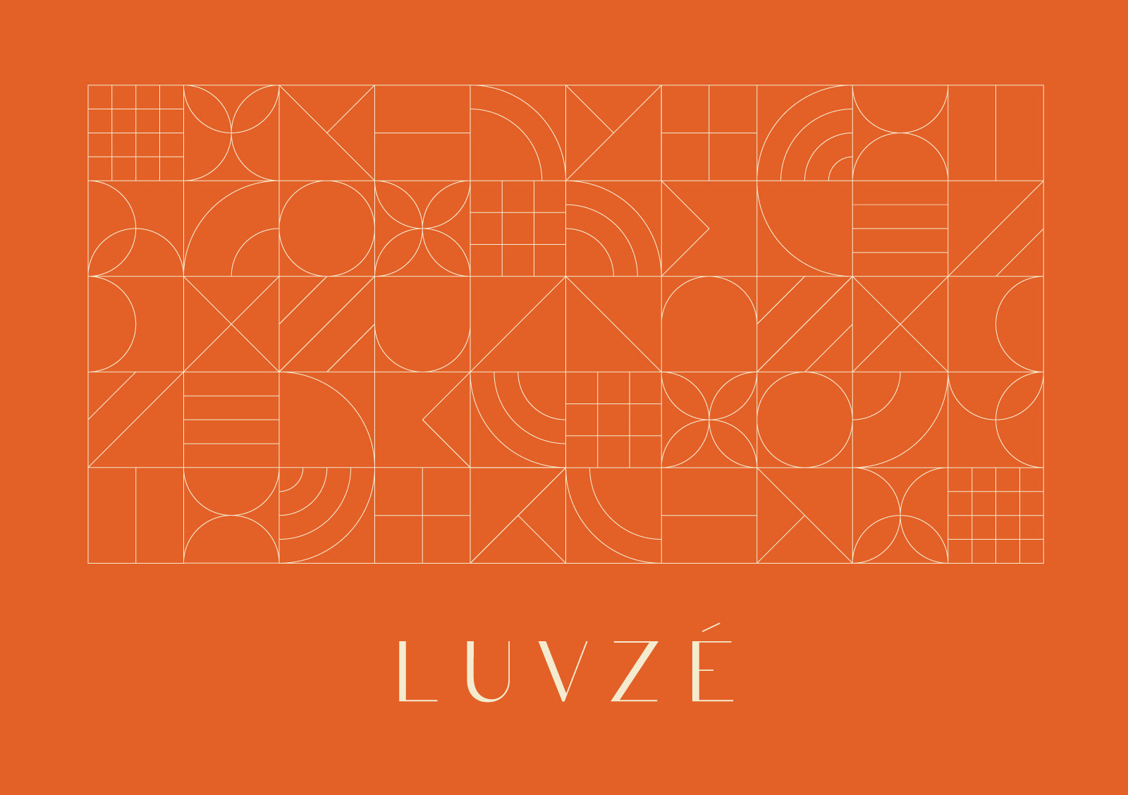
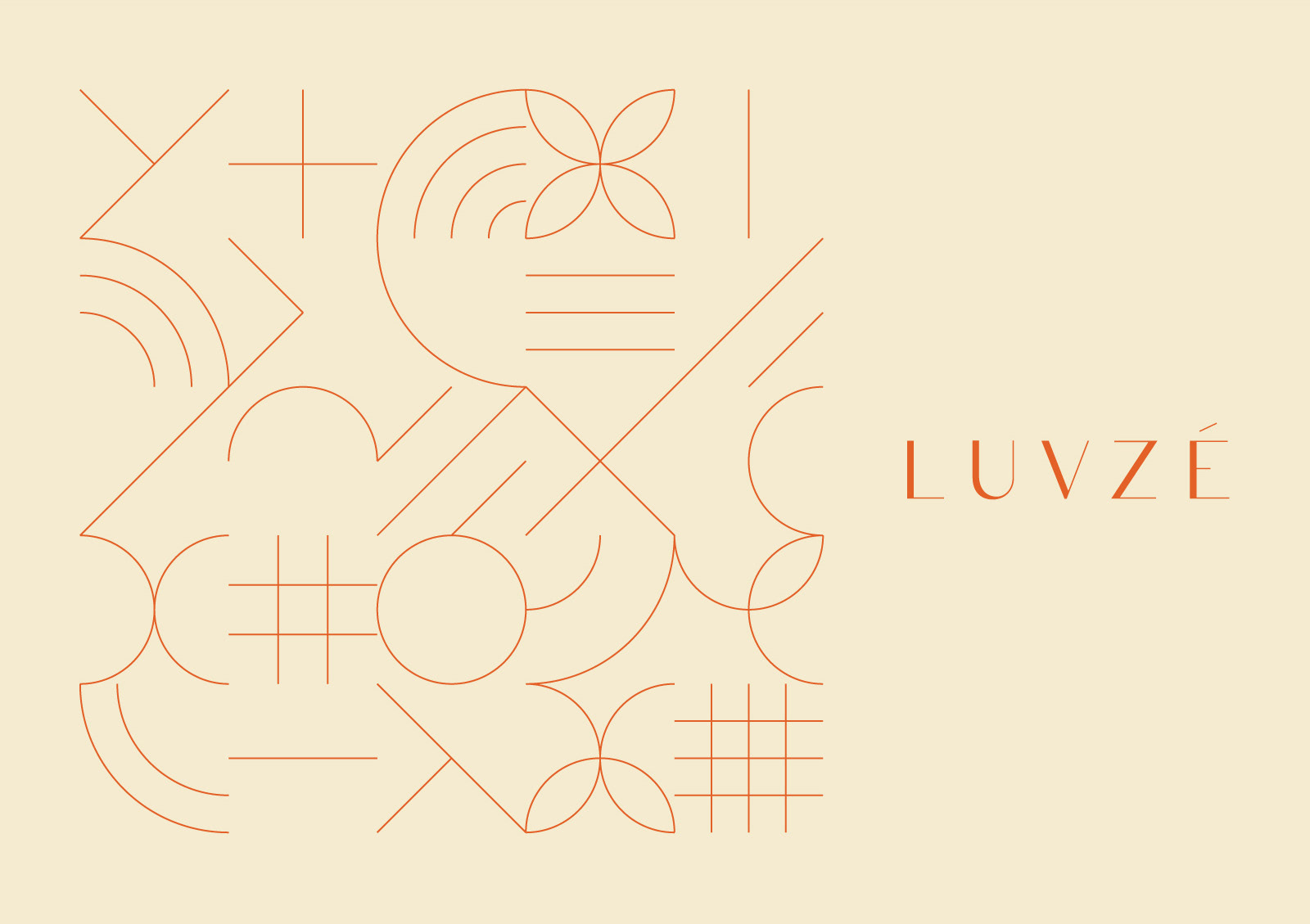
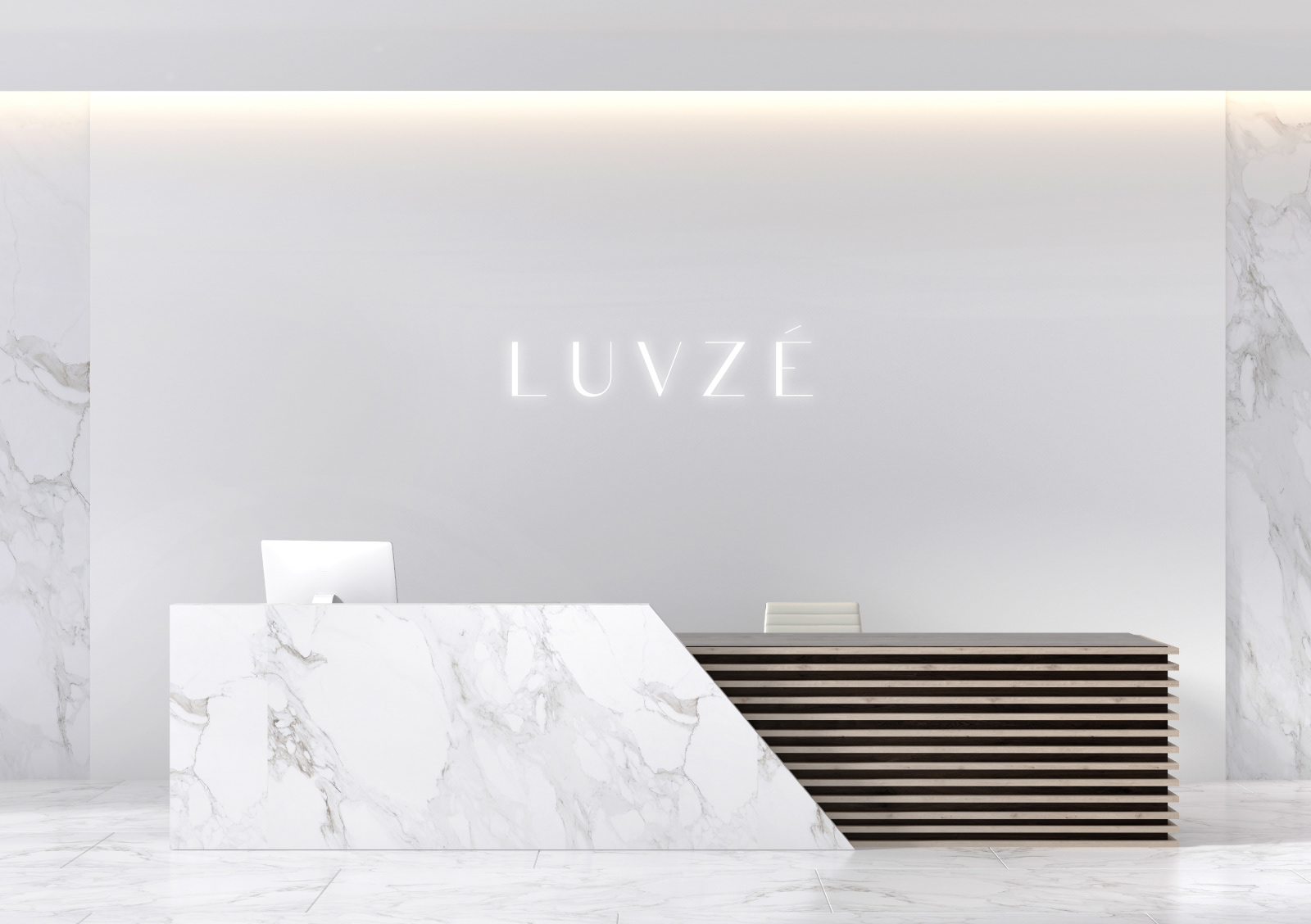
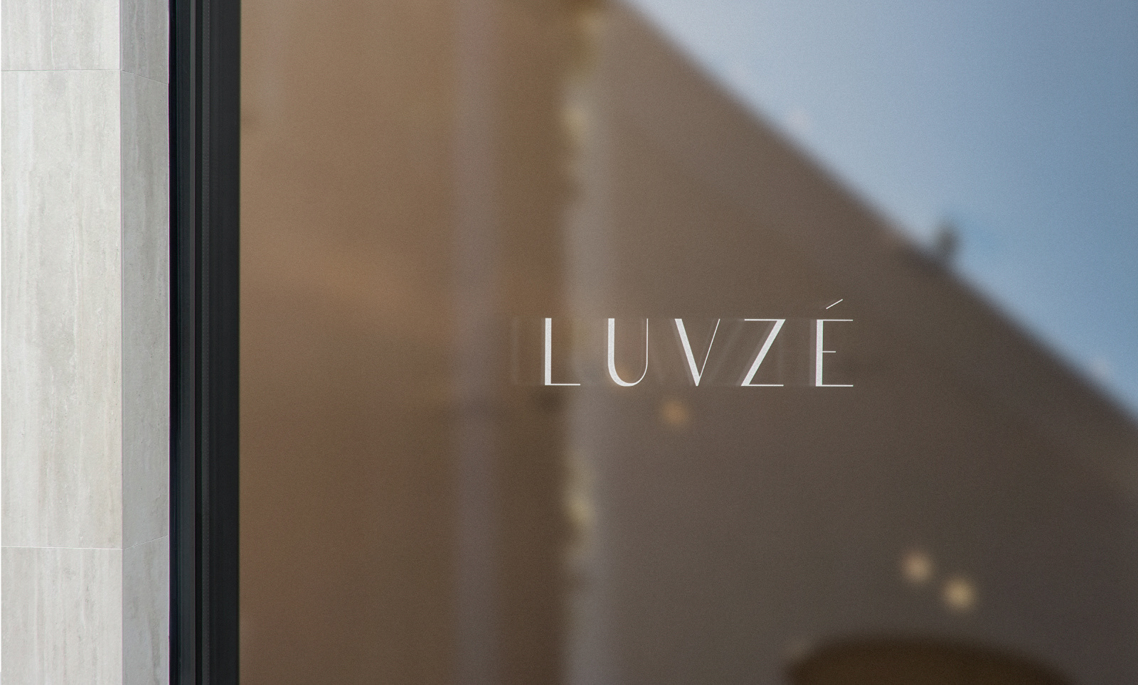
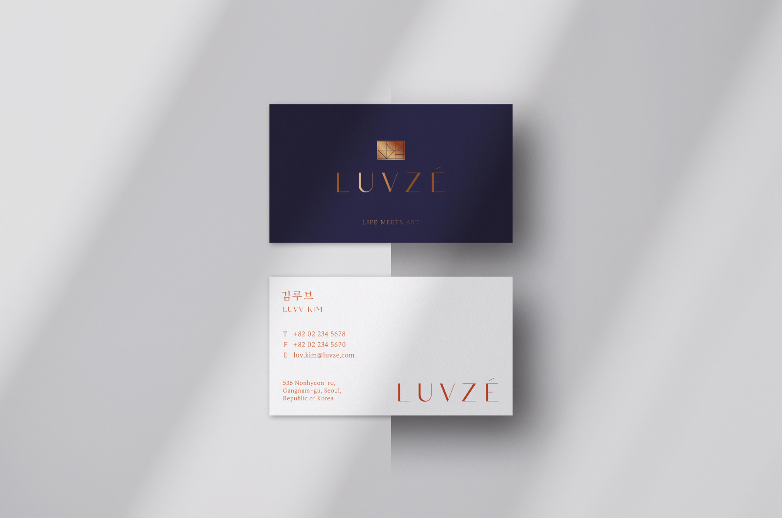
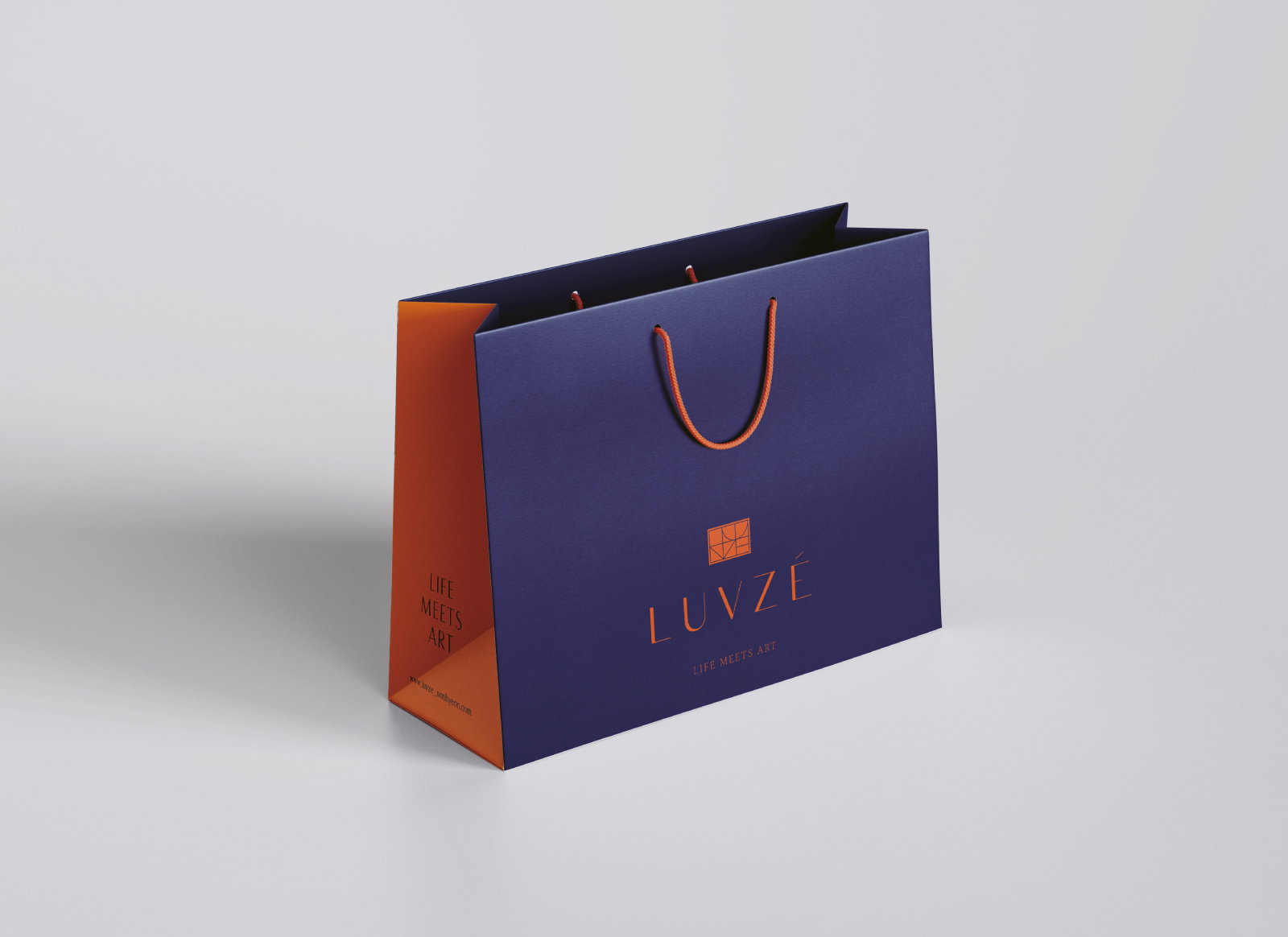
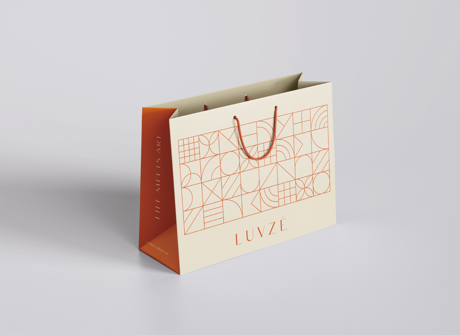
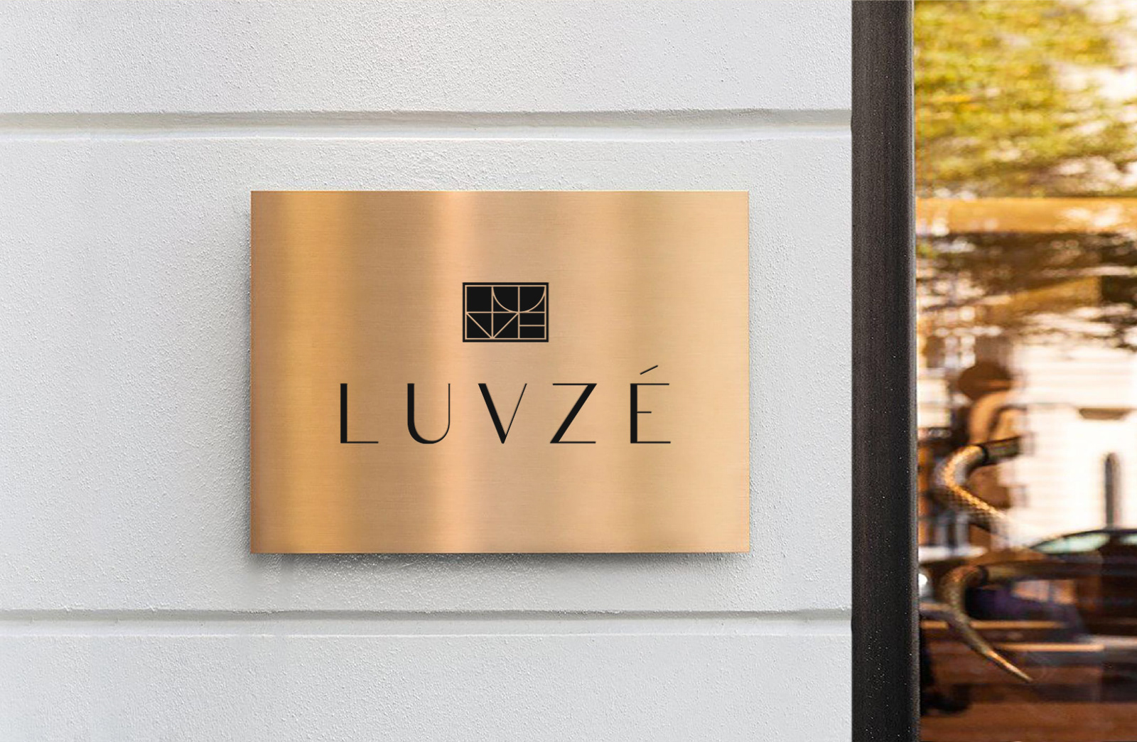
사적인 예술작품과 같은 하이엔드 주거브랜드를 표현하기 위해 정교하고 우아한 산세리프 워드마크와 건축적인 형태에 루브제의 알파벳 형태를 담은 심볼을 만들었습니다. 이 프라이빗하고 아름다운 공간에서 펼쳐지는 모든 빛나는 순간들을 상징하는 그래픽 모티프도 구조적인 형태로 변주 및 전개되며 오렌지 컬러와 황동 박을 중심으로 한 독특한 컬러팔레트가 이국적인 시트러스 향을 연상케 하여 고급스러움과 특별함을 감각적으로 전달하도록 했습니다.
To express a high-end residential brand like a private collection of art, we created a sophisticated and elegant sans-serif logotype. We also made a symbol that contains the LUVZE alphabet in its architectural form. Graphic motifs that symbolize all the shining moments in this private and beautiful space are varied and applied in a structural form, and a unique color palette centered on orange and brass foil is reminiscent of an exotic citrus scent, creating a sense of luxury and specialness. It transmits sensibly.
images from luvze.co.kr
Studio roam
2021
2021