
LUMV Brand Visual Identity & Package Design
럼브 브랜드 아이덴티티 & 패키지 디자인
Client: (주)지우글로벌
Scope: BI & Package Design
Crew: Seyeong Jang, Chaehyun Moon, Saerom Park
Studio roam|2026
Scope: BI & Package Design
Crew: Seyeong Jang, Chaehyun Moon, Saerom Park
Studio roam|2026
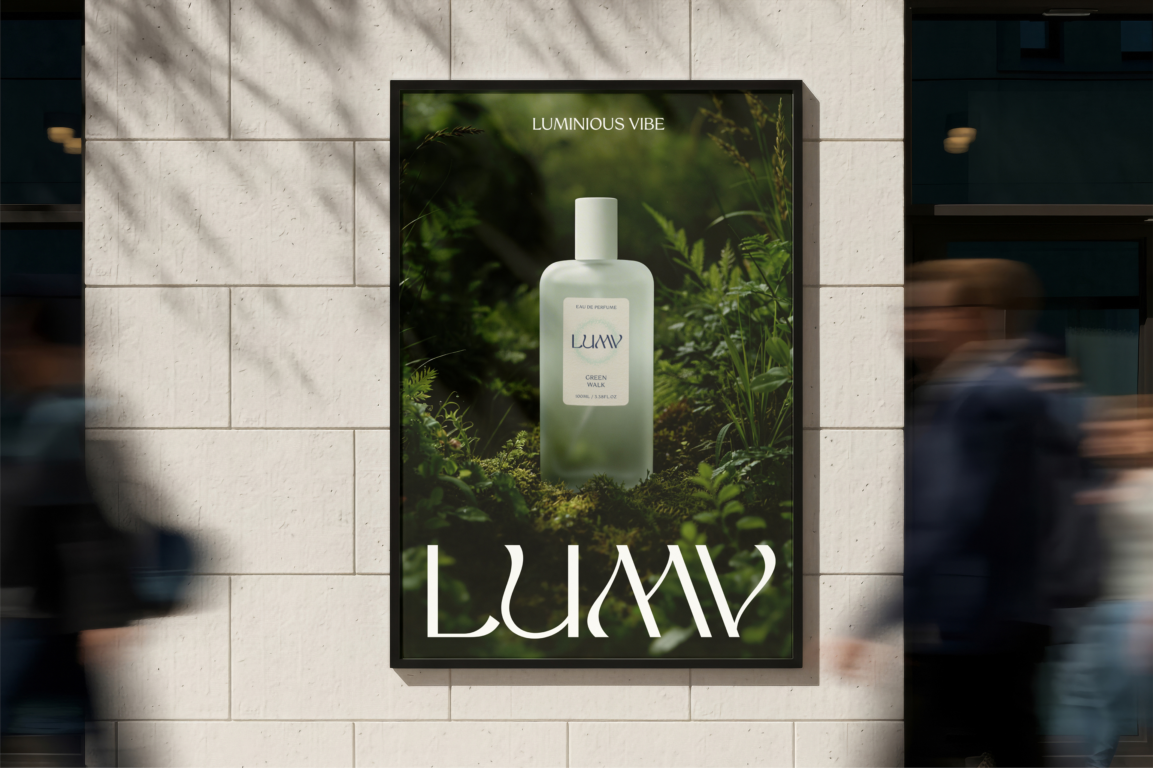
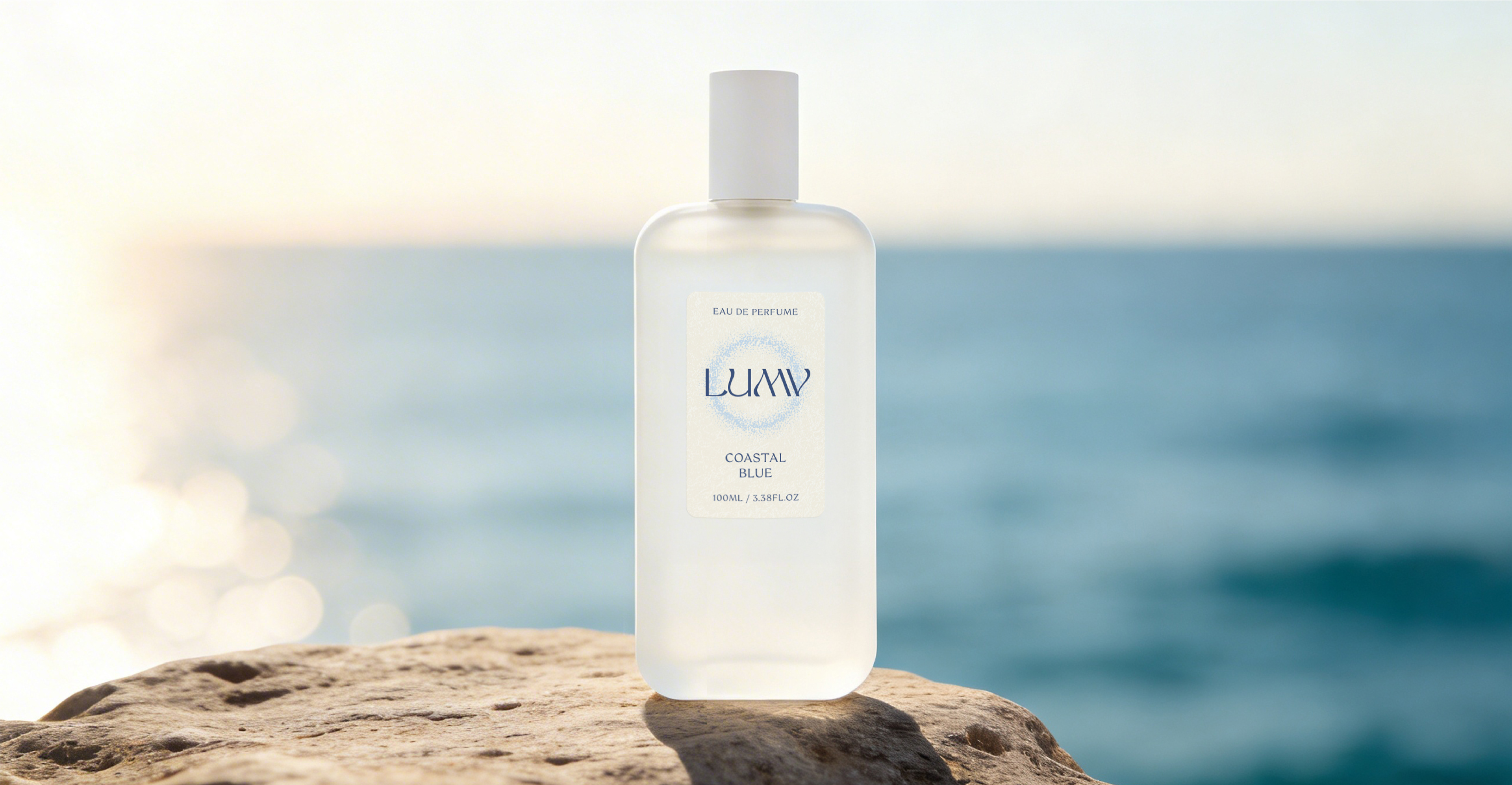
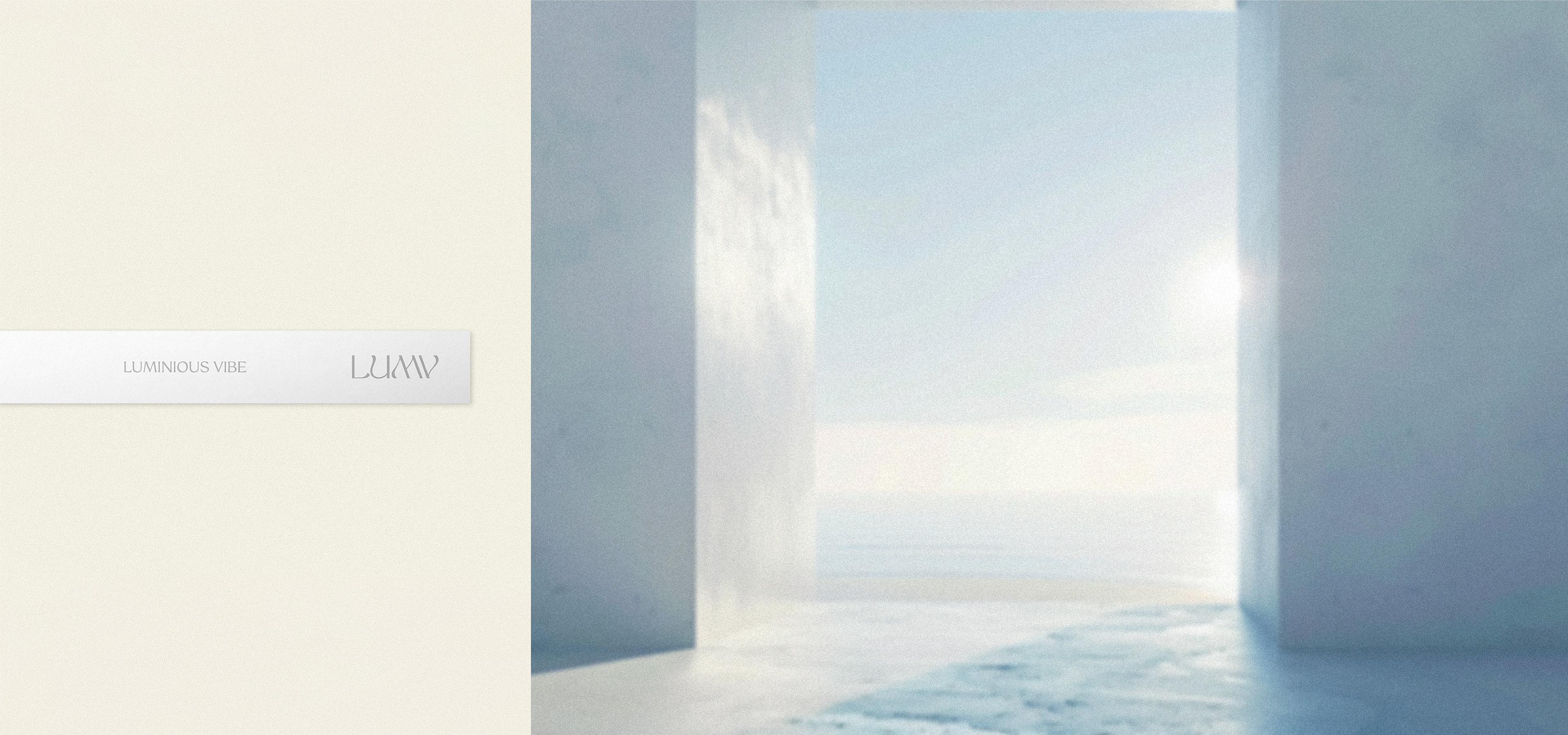
향을 중심으로 전개하는 웰니스 뷰티 브랜드 LUMV의 시각 아이덴티티 및 멀티퍼퓸 패키지 디자인을 진행하였습니다. LUMV는 ‘Luminous Vibe’라는 슬로건 아래, 일상의 다양한 감정들을 따뜻한 시선으로 바라볼 수 있도록 돕는 다양한 향 제품을 선보이는 브랜드입니다.
Studio roam designed the visual identity and multi-perfume packaging for LUMV, a fragrance-driven wellness beauty brand. Under the slogan ‘Luminous Vibe,’ LUMV offers a range of fragrance products that encourage people to view the various emotions of daily life with a warm perspective.
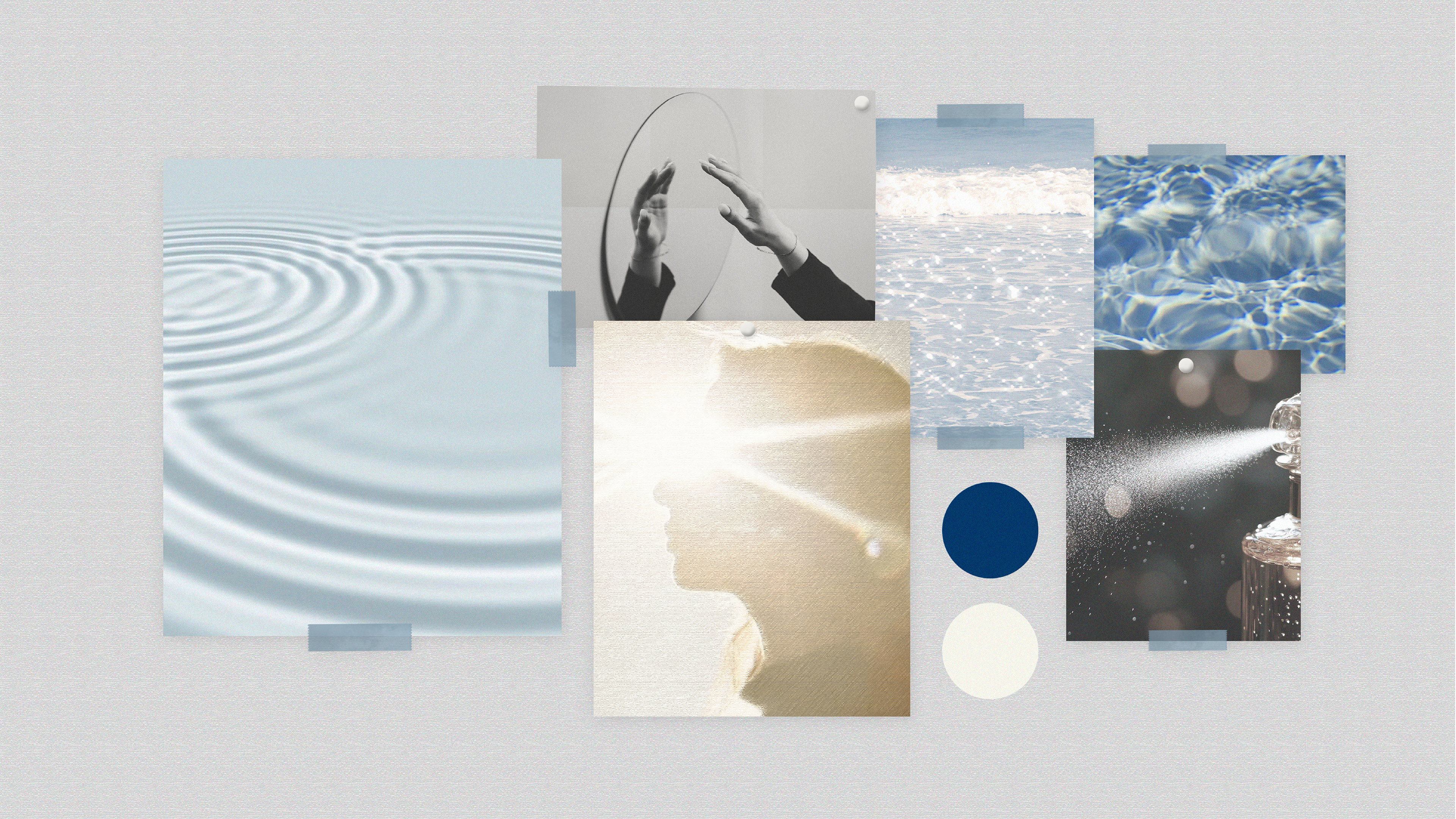
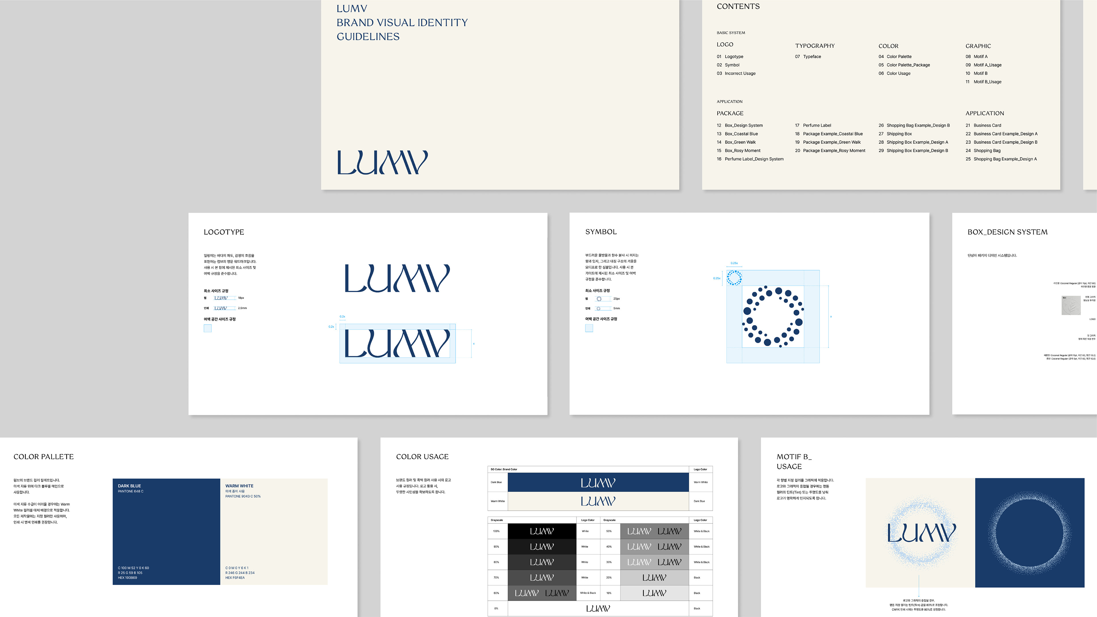

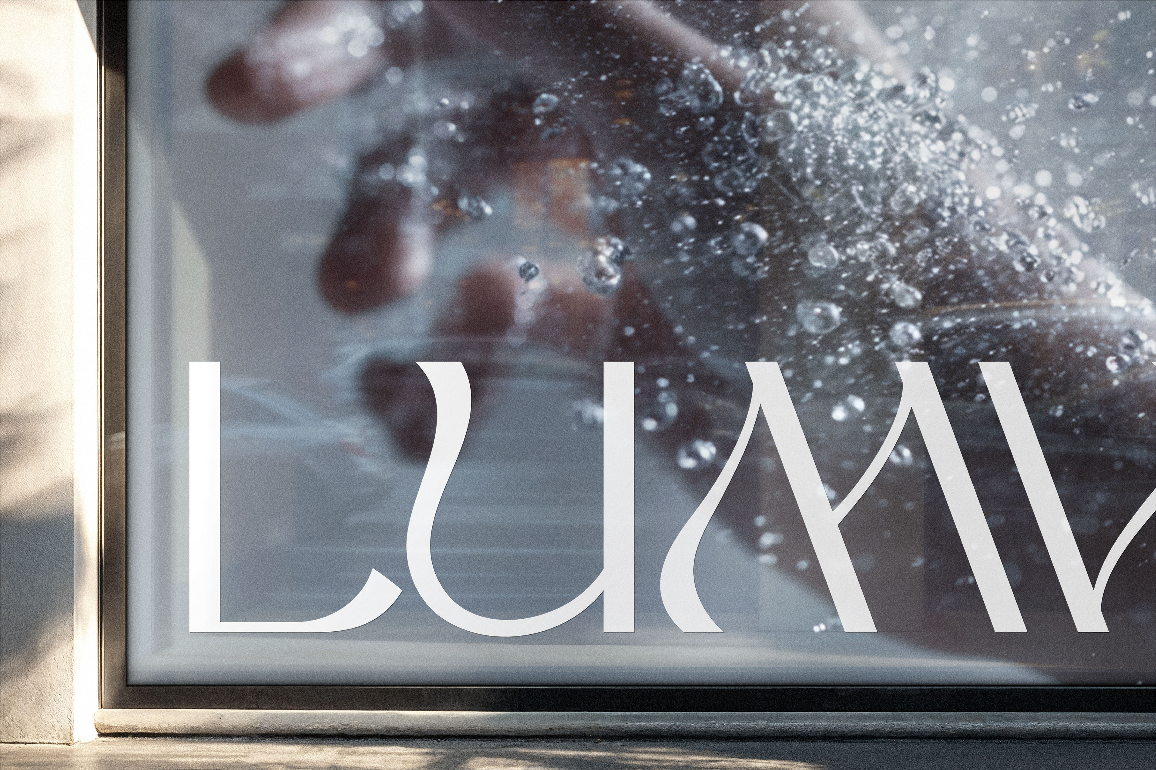
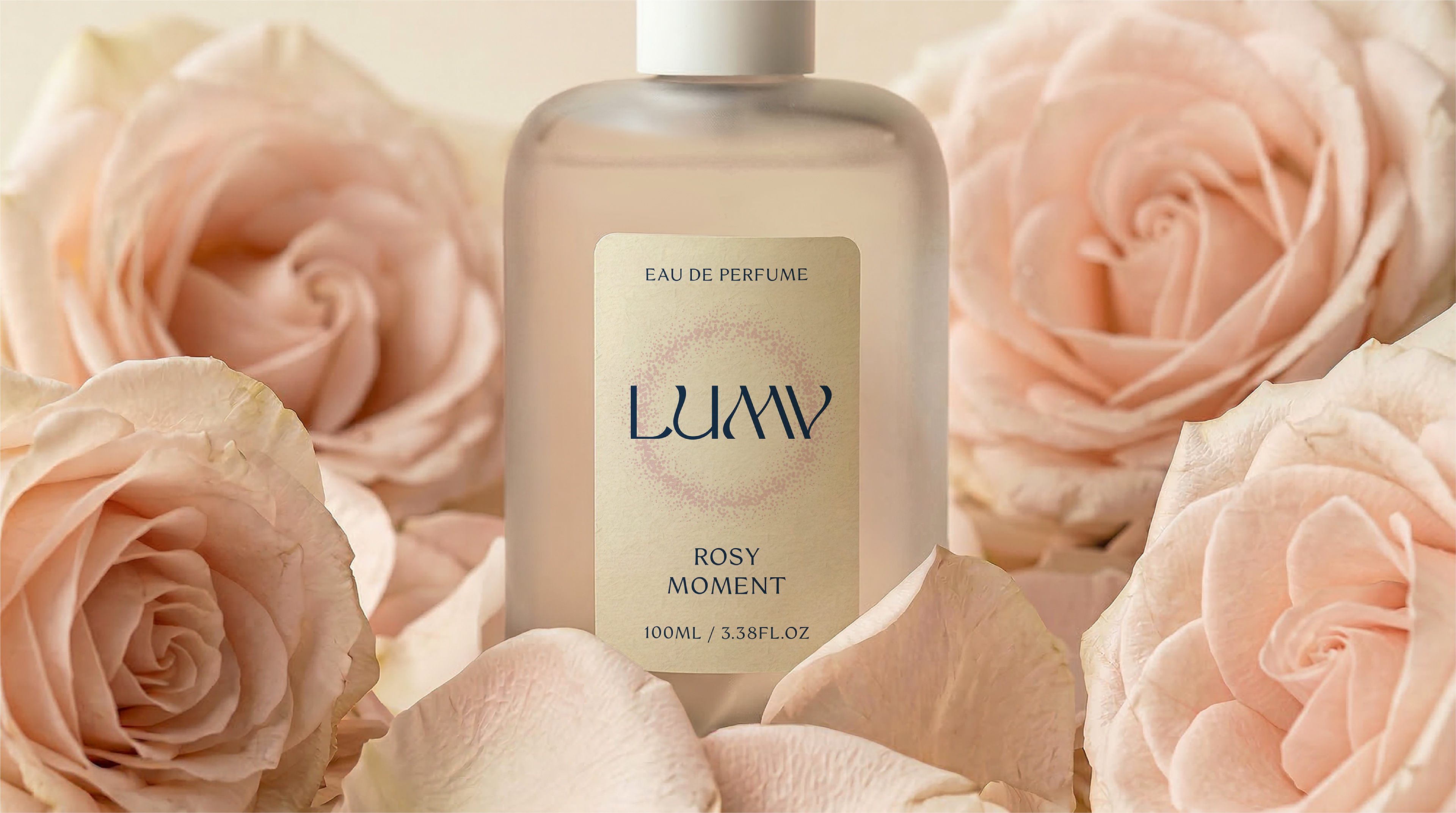
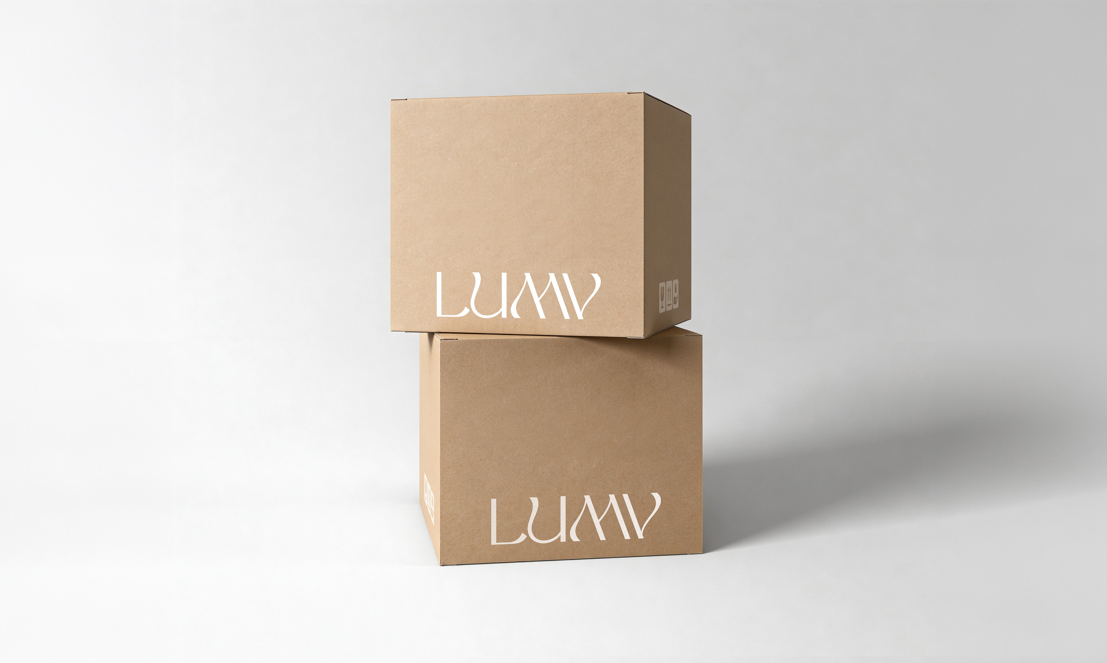
‘반짝이는 감정의 흐름’을 디자인 컨셉으로, 일렁이는 파도와 감정의 흐름을 담아낸 섬세한 획 대비의 워드마크로 표현했습니다. 향수의 입자와 부드러운 물방울을 연상시키는 원형의 심볼을 더해, 럼브만의 따뜻하고 감각적인 브랜드 정체성을 완성했습니다.
With the concept of ‘shimmering emotional flow,’ the wordmark features delicate stroke contrasts that capture the gentle movement of waves and the fluidity of emotions. A circular symbol, reminiscent of perfume particles and soft droplets, completes LUMV’s warm and sensorial brand identity.
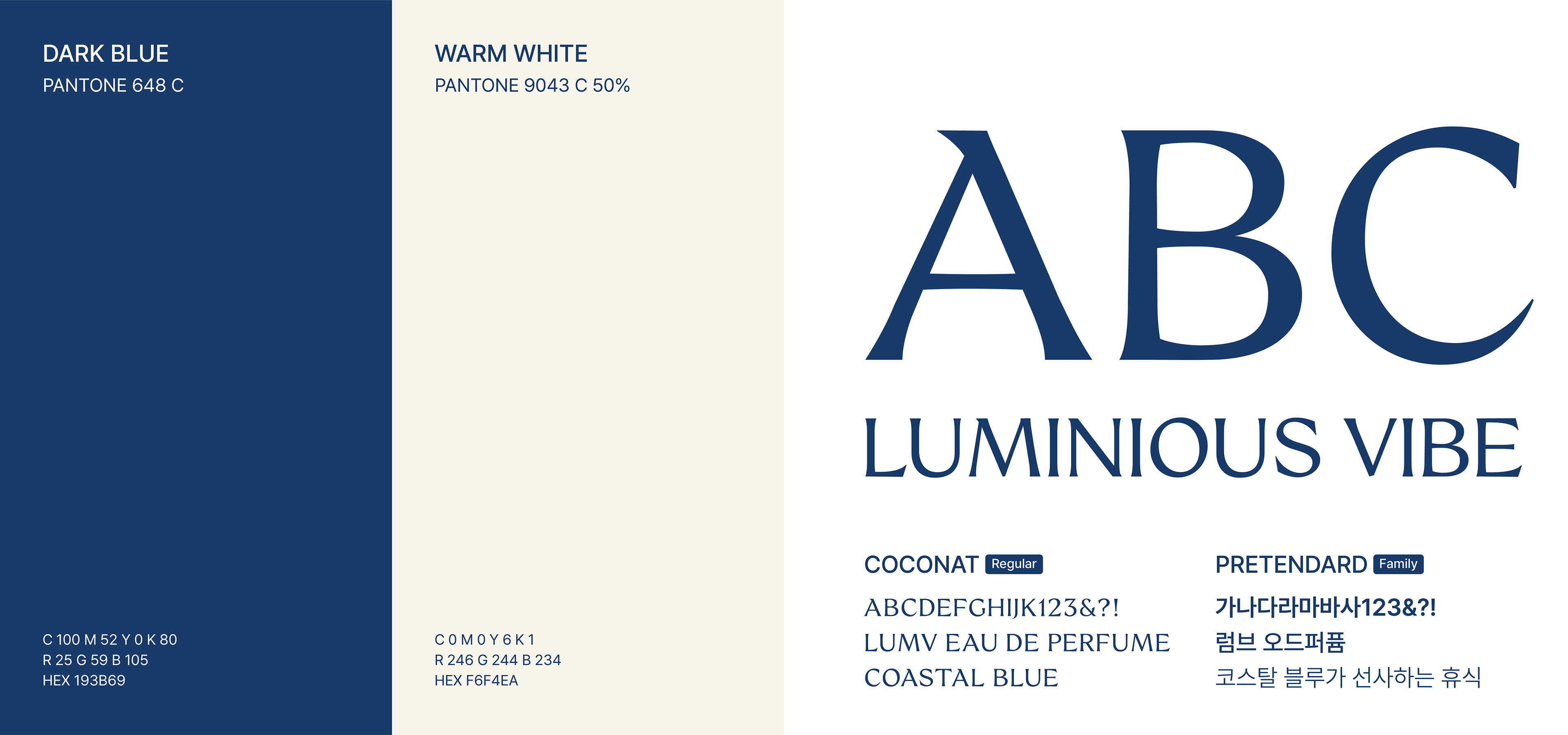
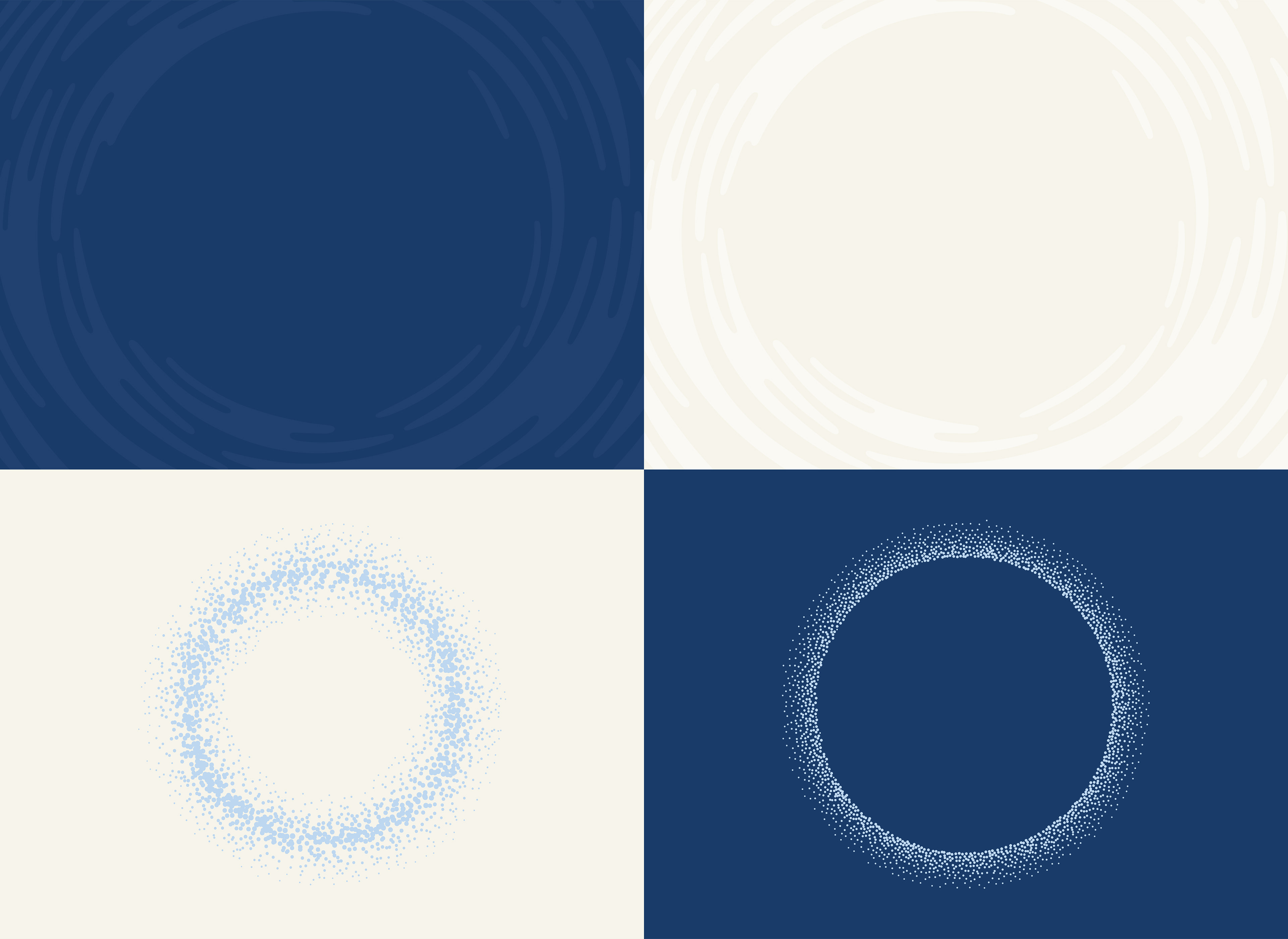
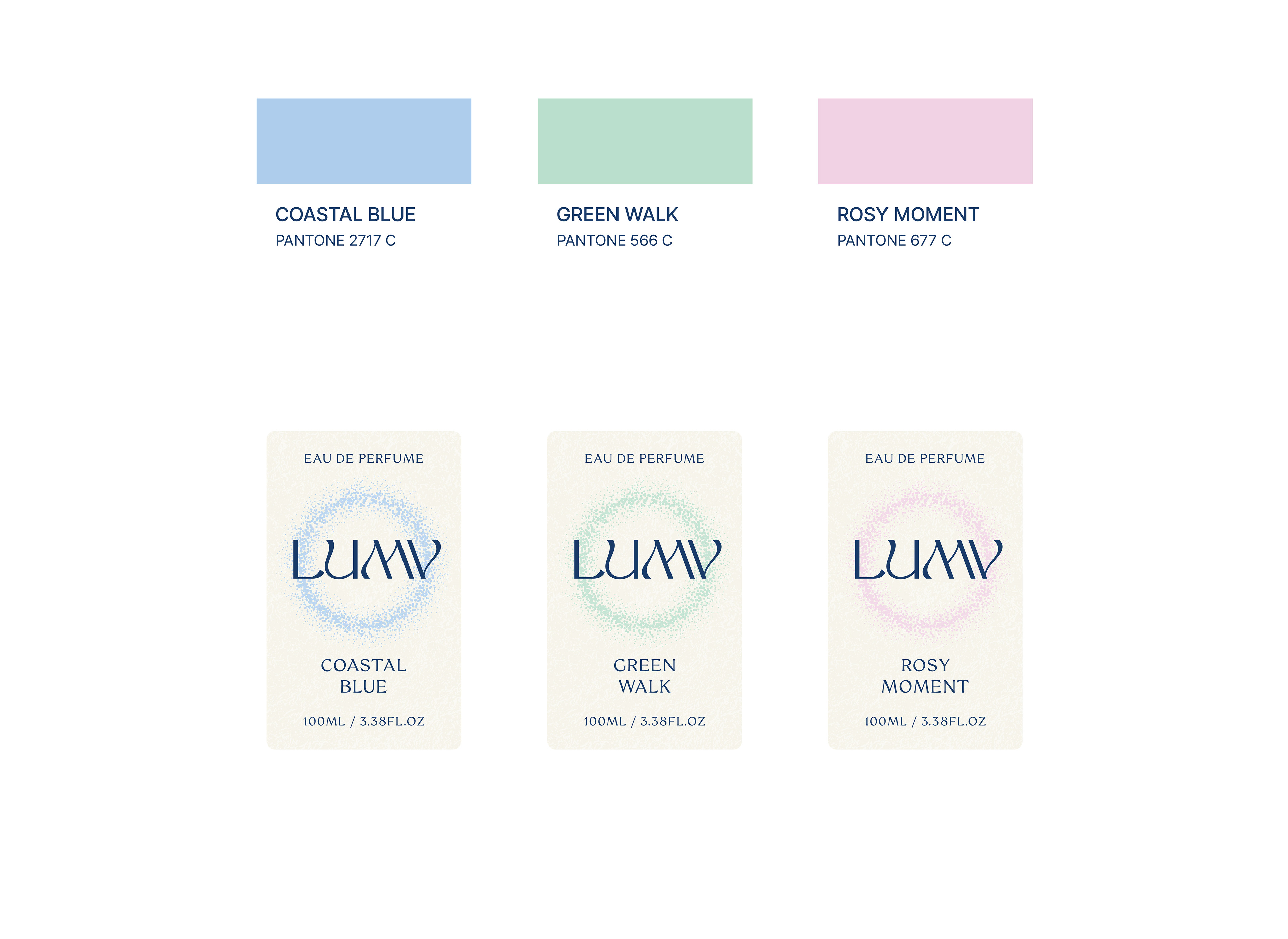
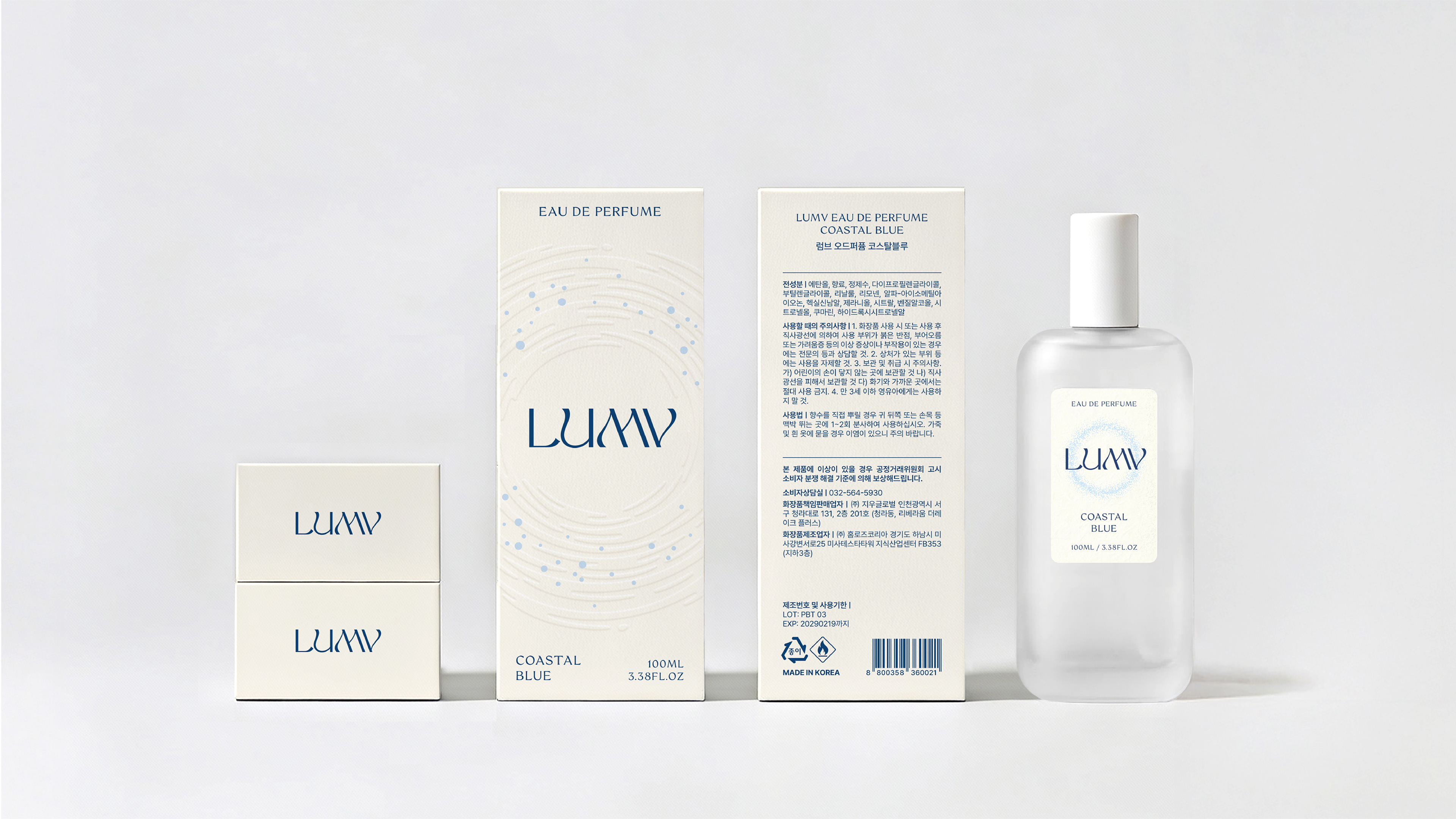
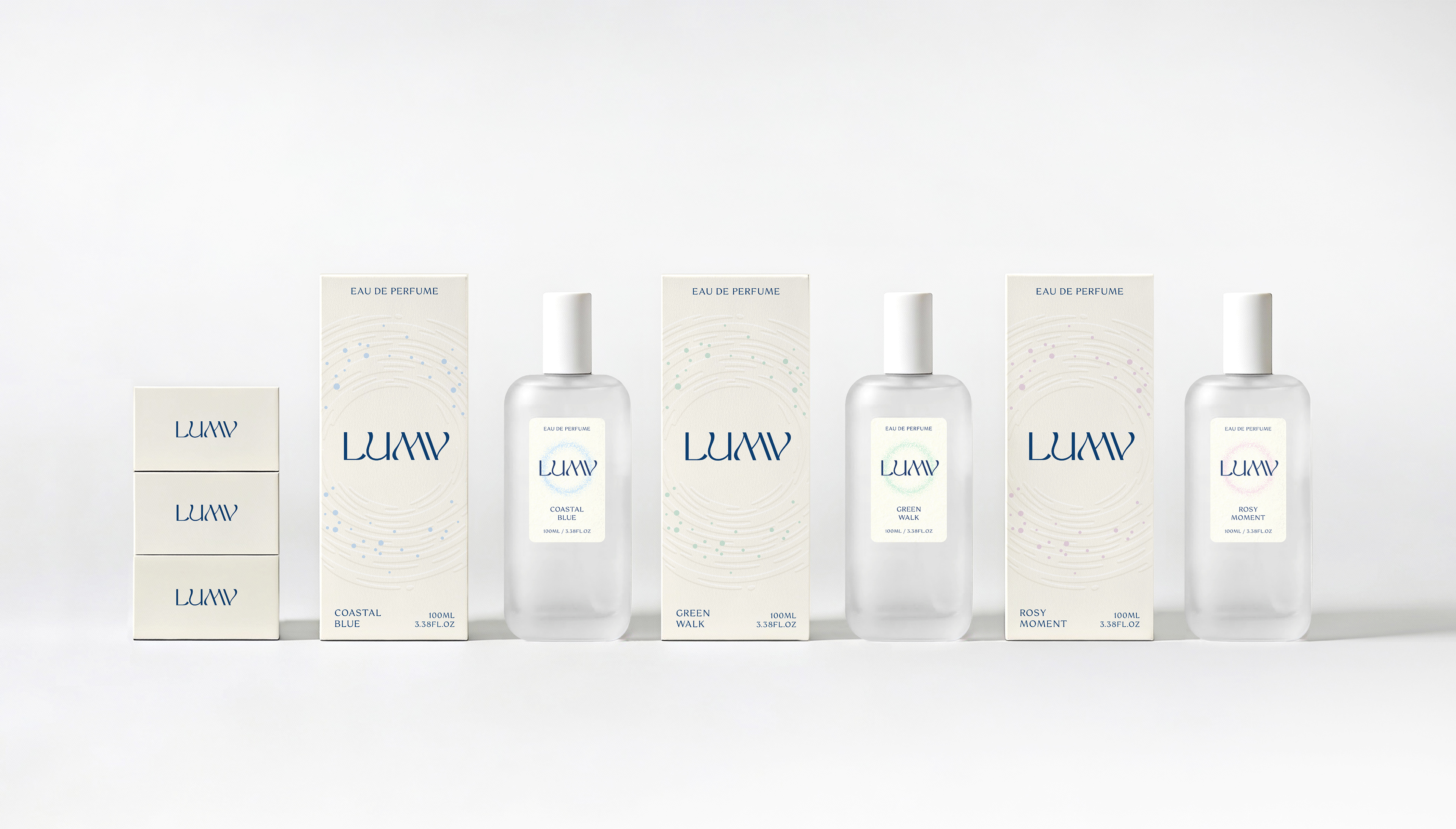
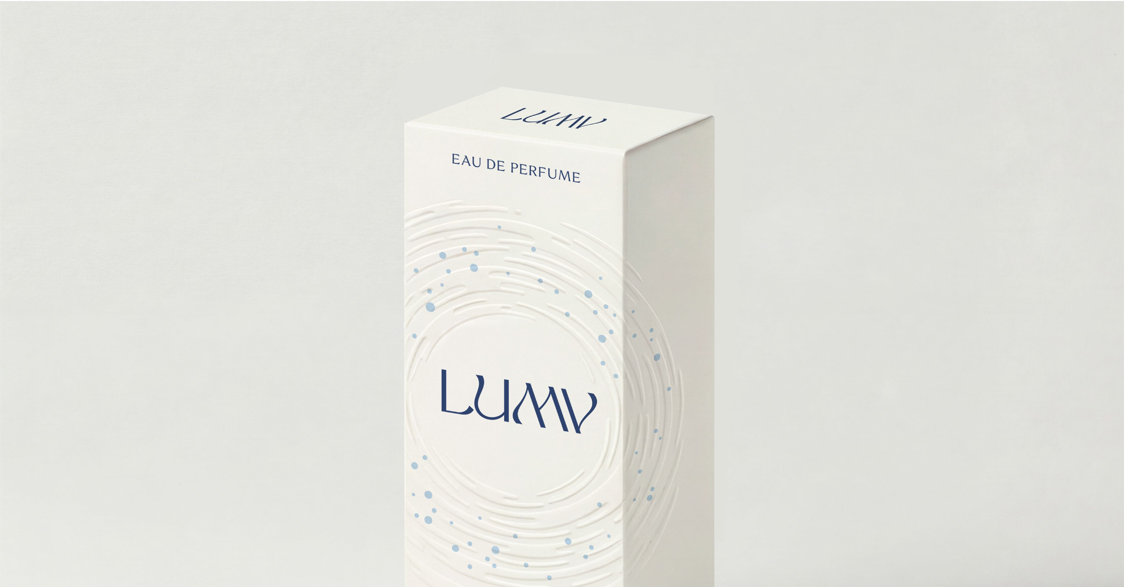
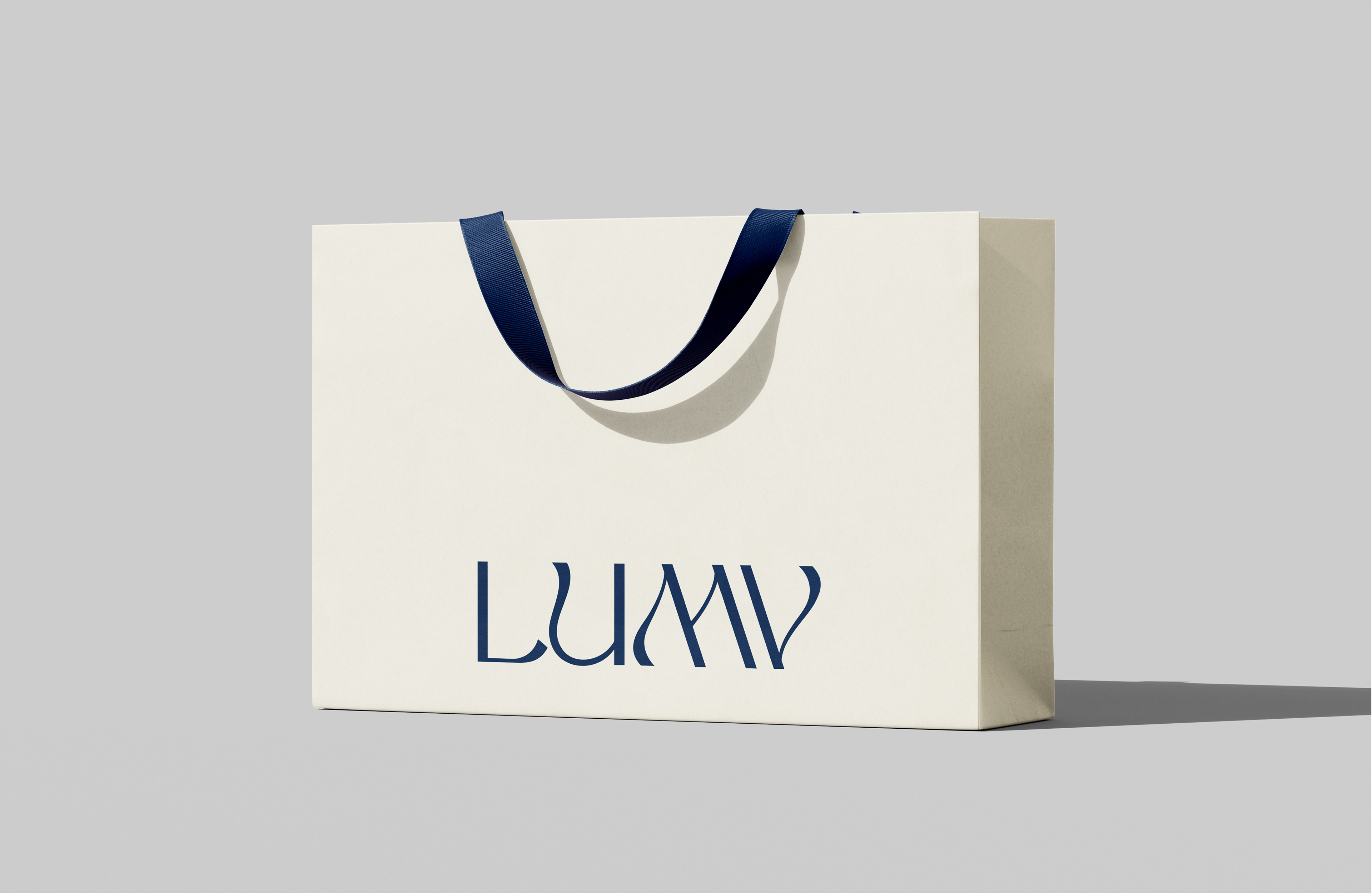
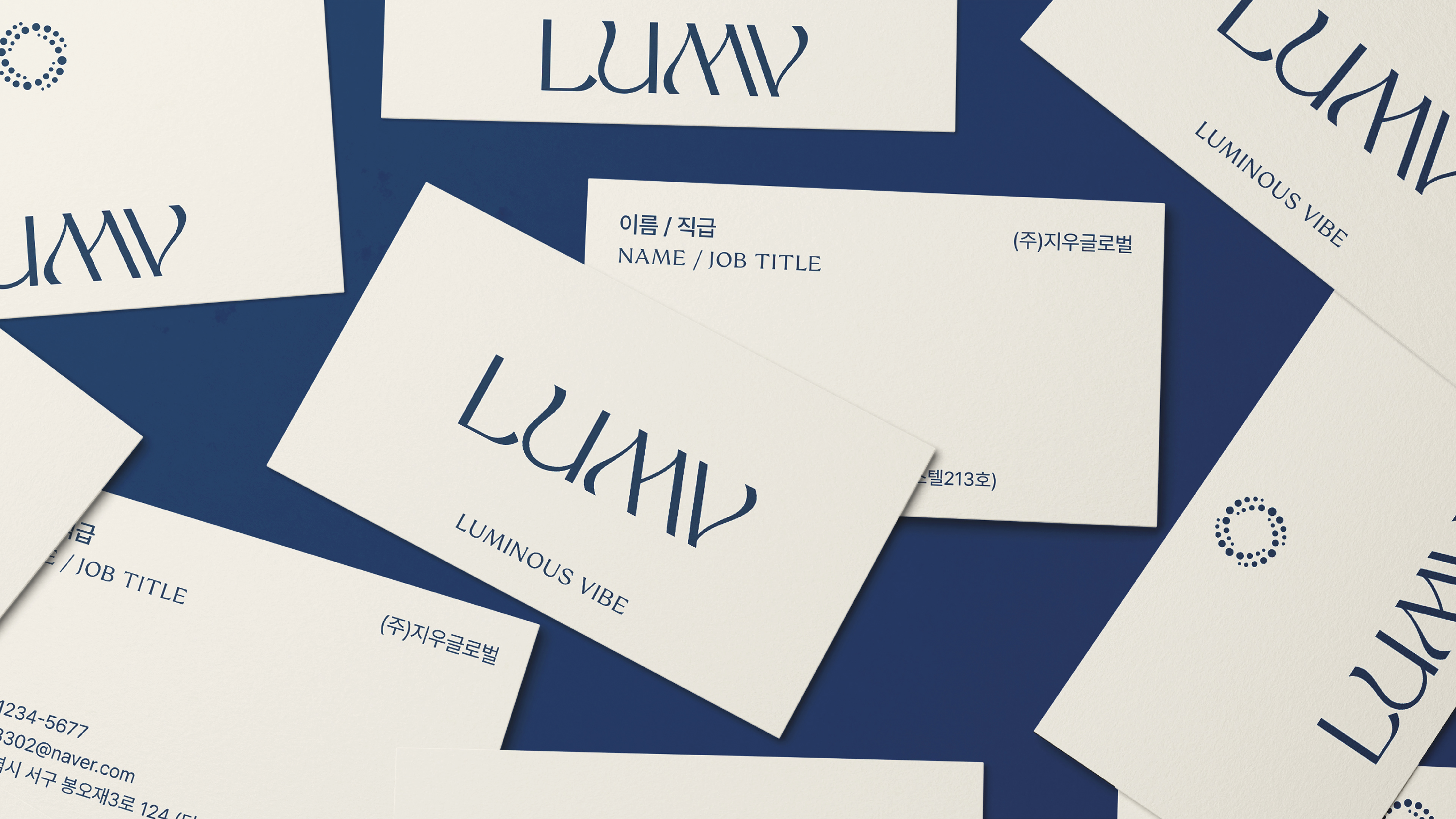
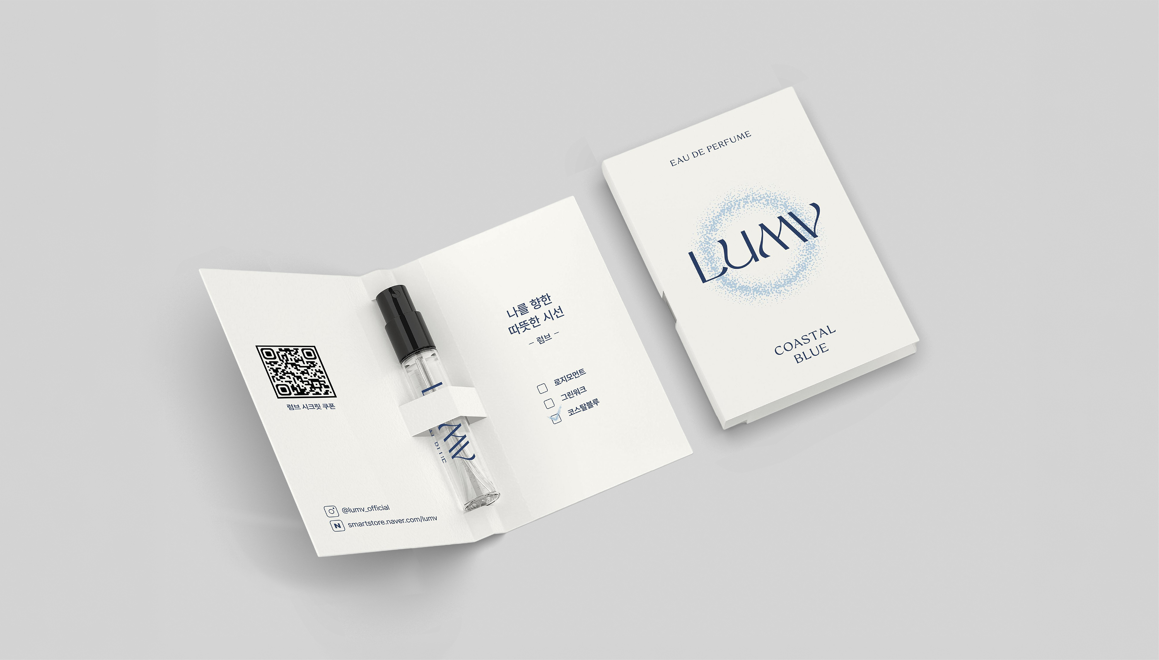
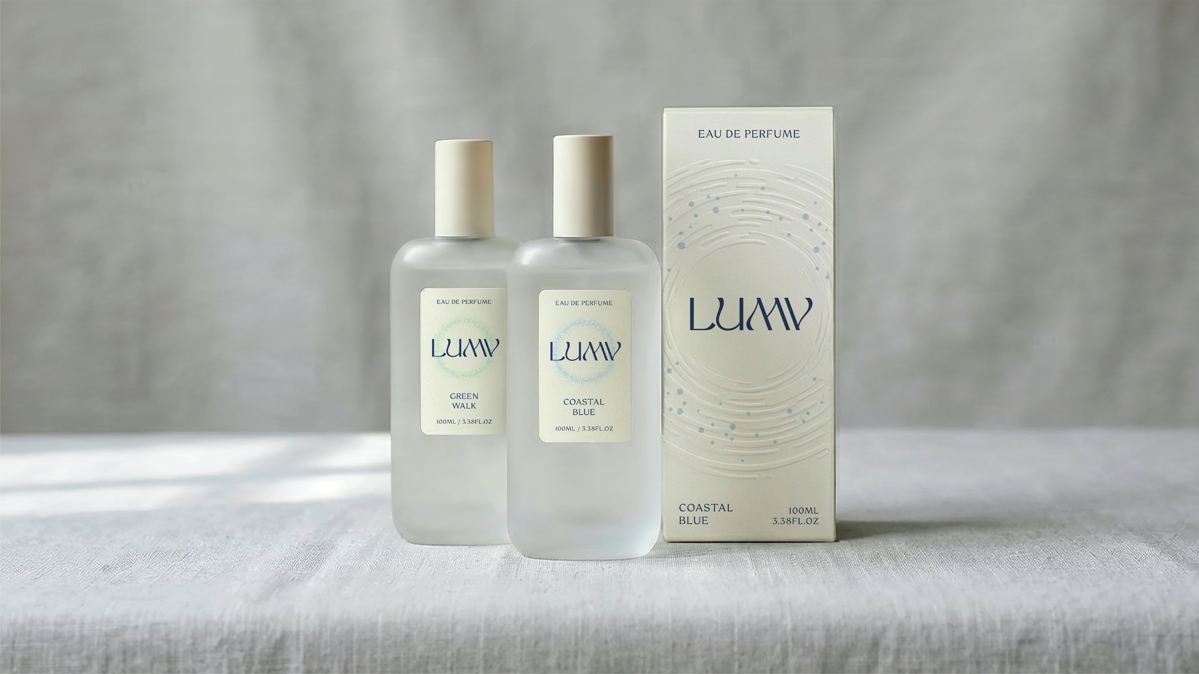
미색과 네이비 메인 컬러가 따뜻하고 차분한 이미지를 전달하고, 각 향을 상징하는 파스텔 톤의 제품 컬러를 선정했습니다. 퍼져나가는 물결형태의 형압과 윤슬을 연상시키는 닷 그래픽을 통해 향이 은은하게 퍼져나가고 내면의 반짝이는 감정을 바라보게 되는 순간을 섬세하게 표현했습니다. 향을 중심으로 감정을 케어하는 따뜻하고 밝은 웰니스 브랜드 이미지를 만들고자 했습니다.
A warm white and navy color palette creates a calm and inviting impression, complemented by soft pastel tones used as a sub-palette to represent each fragrance. Embossed wave-inspired textures and dot graphics, reminiscent of shimmering light on water, delicately capture the moment when a scent gently diffuses, inviting reflection on one’s inner, luminous emotions. Through this, we aimed to create a warm and uplifting wellness brand centered on emotional care through fragrance.
2026
Studio roam
Studio roam