
DNC DCLASSY Brand Identity & Package Design
디엔컴퍼니 디클래시 브랜드 아이덴티티 & 패키지 디자인
Client: DNC AESTHETICS
Co-work: STONE Brand Communications
Crew: Seyeong Jang, Chaehyun Moon, Saerom Park
Product Images from https://dclassy.co.kr/
2025 Studio roam
Co-work: STONE Brand Communications
Crew: Seyeong Jang, Chaehyun Moon, Saerom Park
Product Images from https://dclassy.co.kr/
2025 Studio roam
2025년 초, DNC 에스테틱스에서 출시한 필러 ’디클래시(DCLASSY)’의 브랜드 아이덴티티와 패키지 디자인을 진행했습니다.디클래시는 사명의 이니셜(D)와 ’본질(Classic)’, ’고급스러움(Classy)’을 결합한 이름으로, 뛰어난 기능성과 품격을 함께 담아낸 프리미엄 에스테틱 브랜드입니다.
In early 2025, we developed the brand identity and package design for DCLASSY, a dermal filler launched by DNC Aesthetics.The name DCLASSY combines the company’s initial “D” with Classic, representing essence, and Classy, symbolizing sophistication. It is a premium aesthetic brand that brings together outstanding performance and refined elegance.
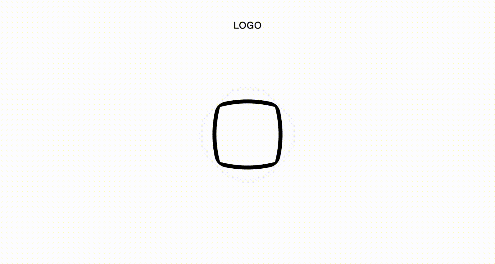
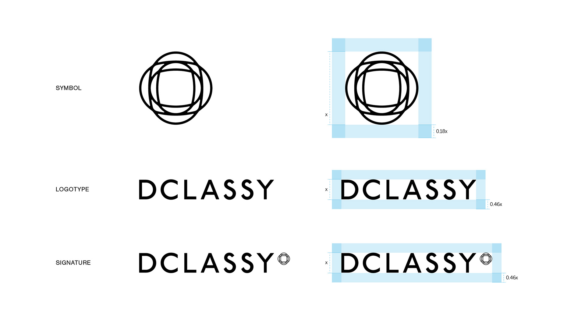
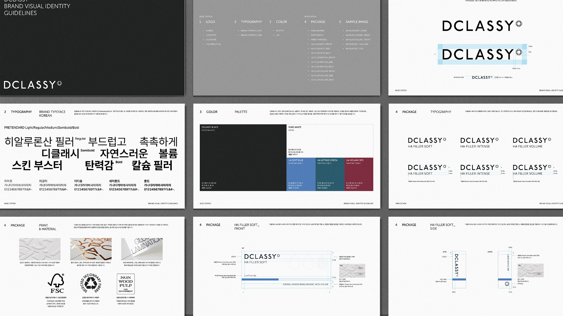
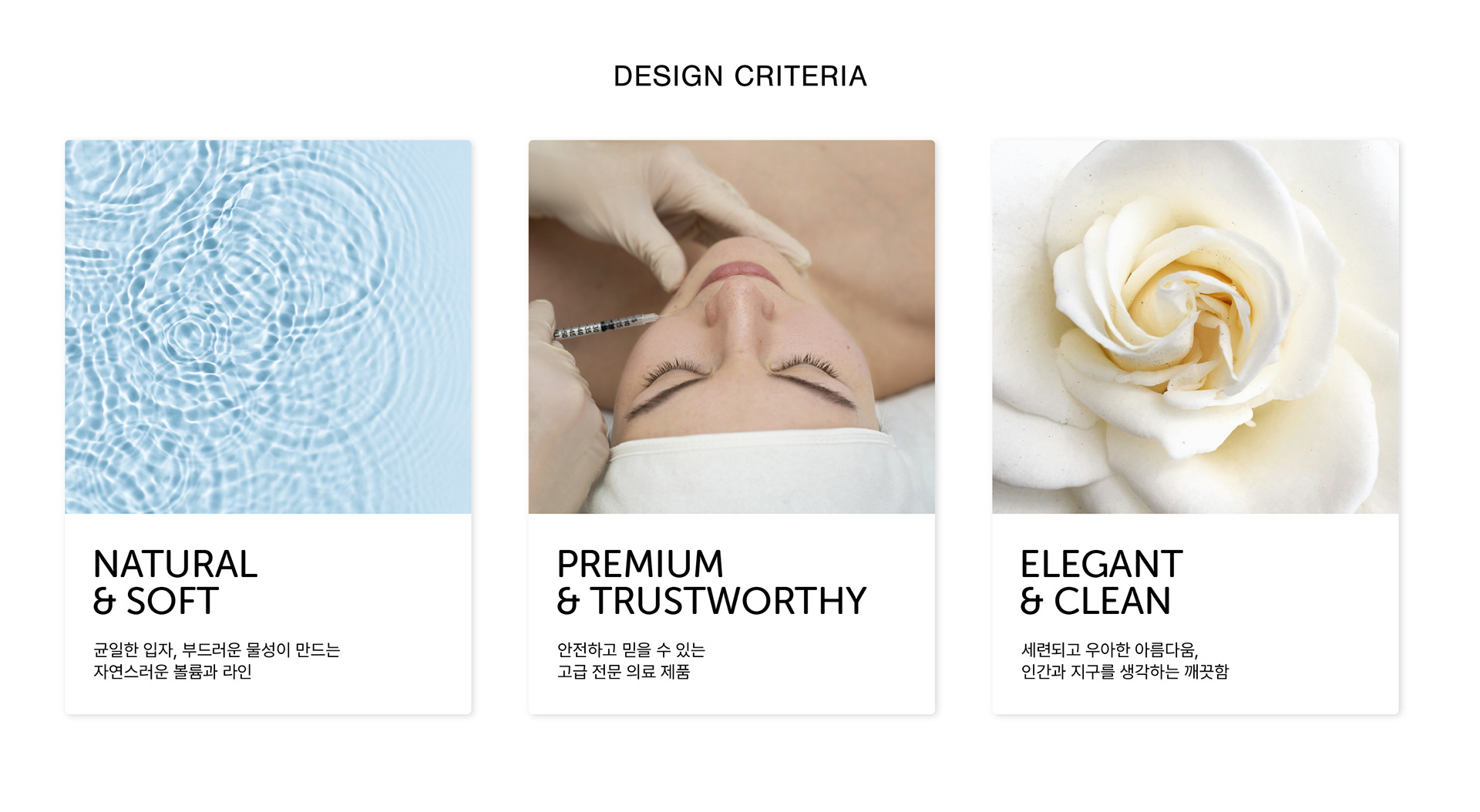
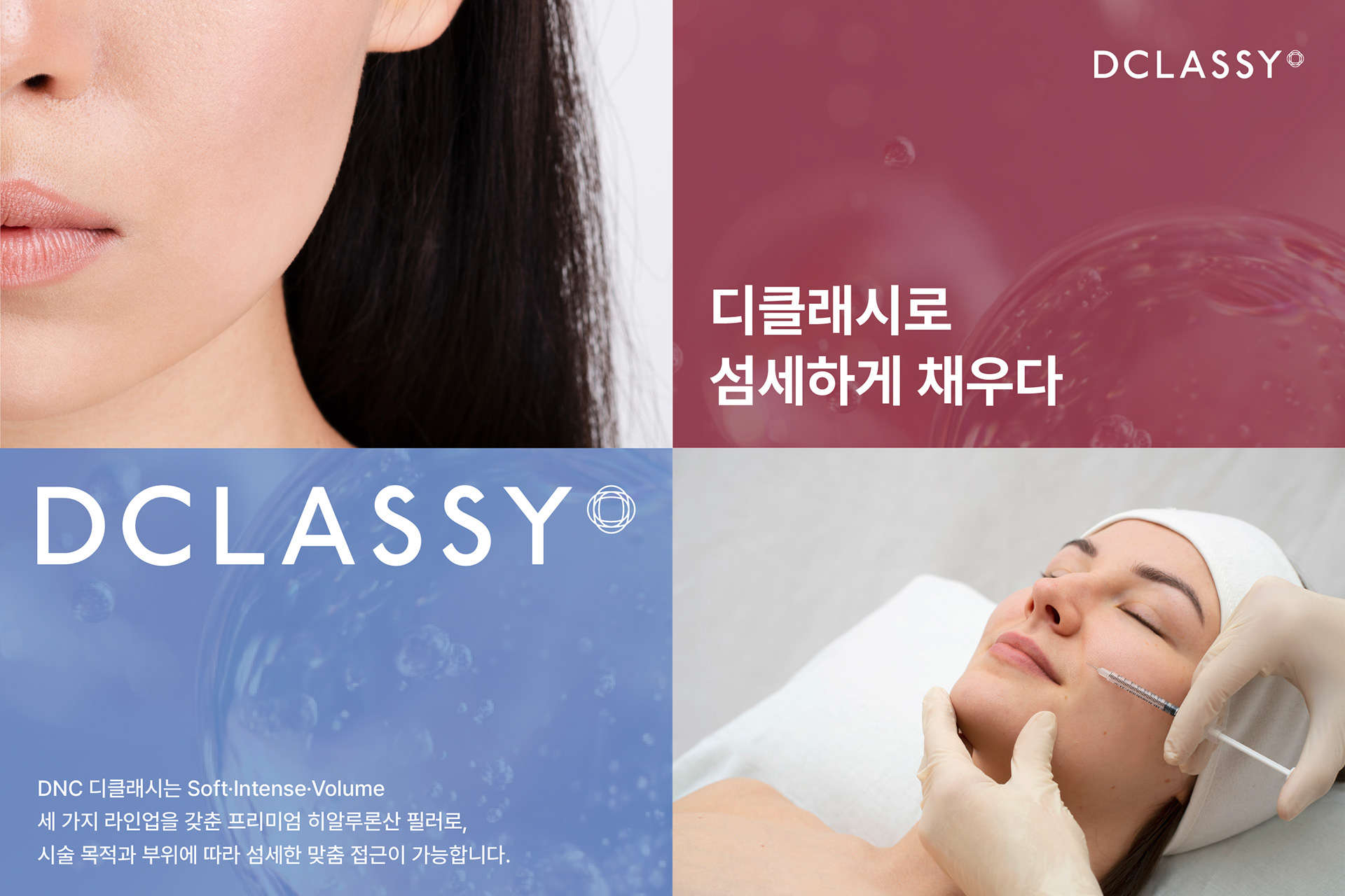
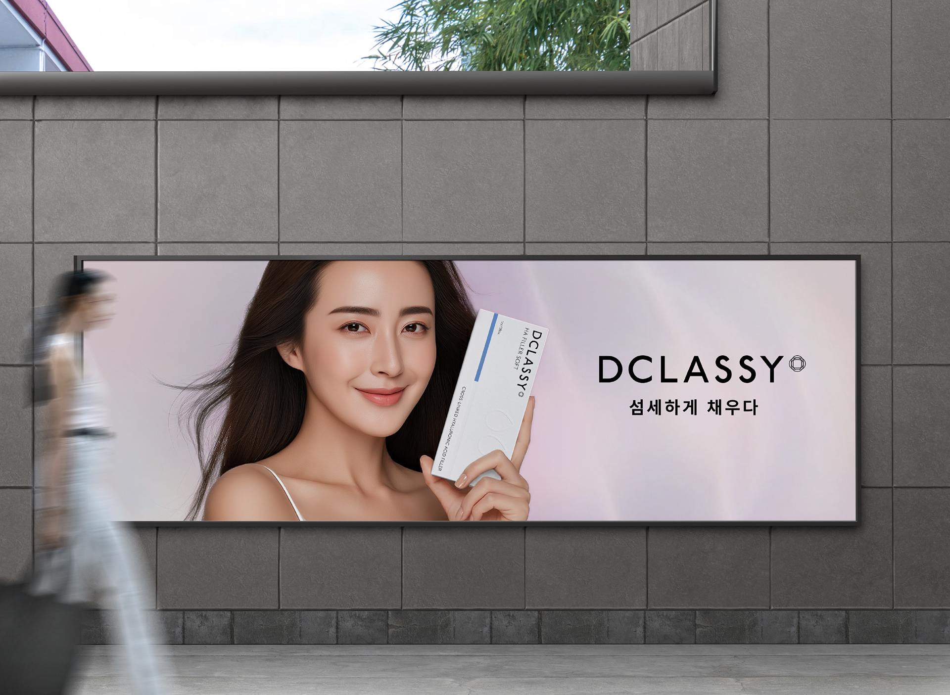
우리는 디클래시 제품이 지닌 가치인 ’부드러운 물성으로 만드는 섬세하고 자연스러운 볼륨’, ’품격 있는 아름다움’을 비주얼 아이덴티티에 담아내고자 했습니다. 자연스러운 볼륨이 더해져 피어나는 아름다움을 상징하는 심볼, 정제된 산세리프를 기반으로 S에 포인트를 준 로고타입으로 우아하고 현대적인 이미지를 표현하고자 했습니다.
We aimed to translate the core values of DCLASSY—delicate, natural volume created through a soft texture and refined beauty—into its visual identity.
A symbol representing beauty blooming through naturally enhanced volume, along with a refined sans-serif logotype featuring a subtle accent on the letter “S,” was developed to express an elegant and contemporary brand image.

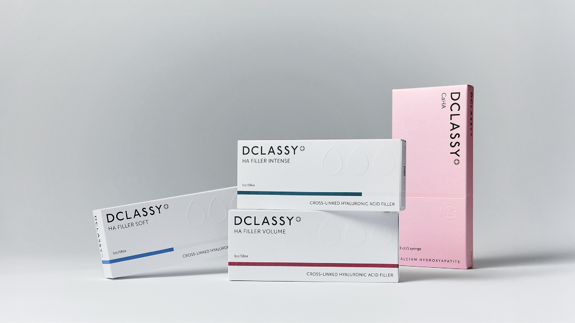
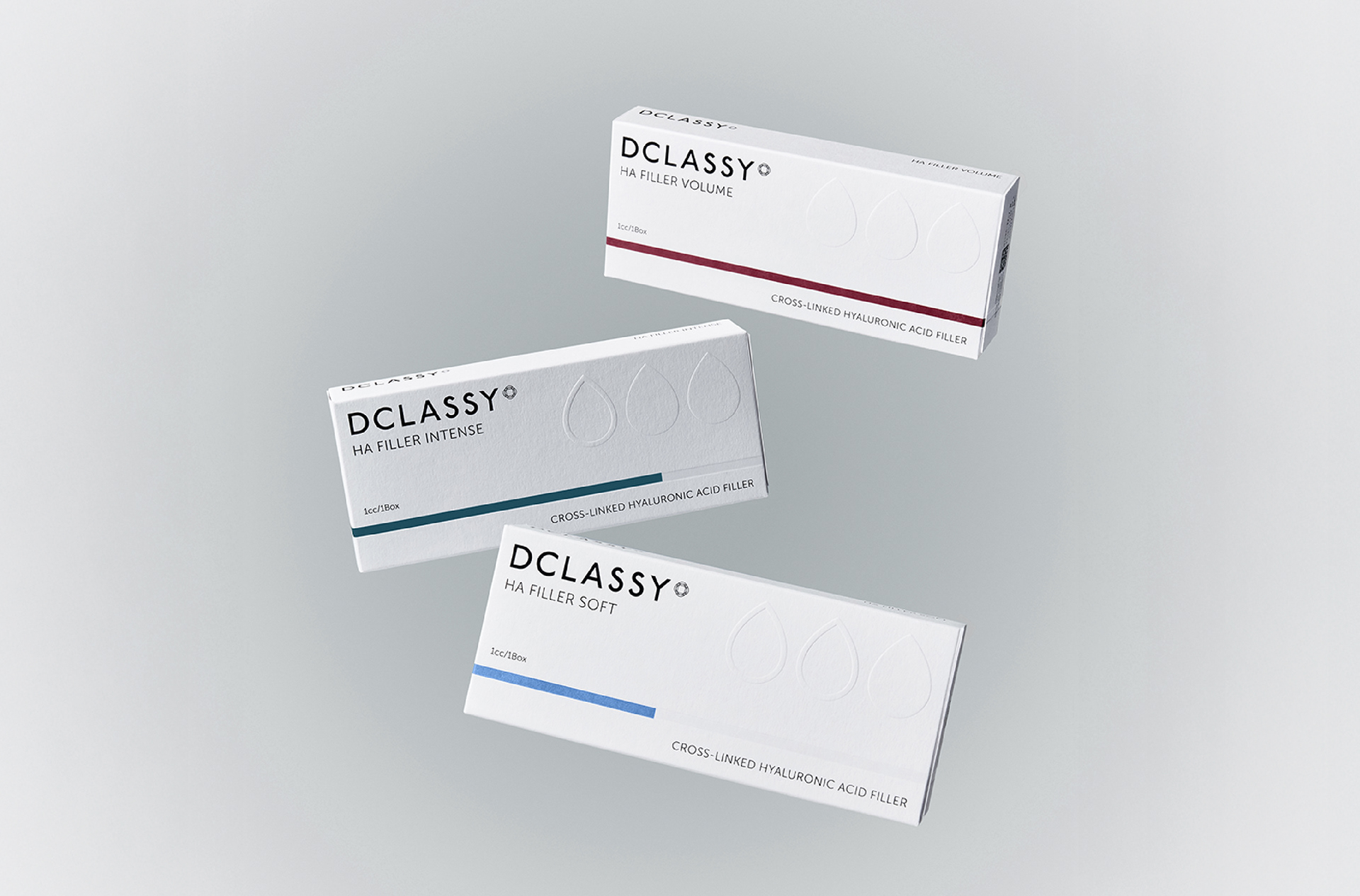
첫 출시 제품은 디클래시 HA 필러로, 소프트·인텐스·볼륨 3가지의 라인업을 갖추고 있는 프리미엄 필러입니다.
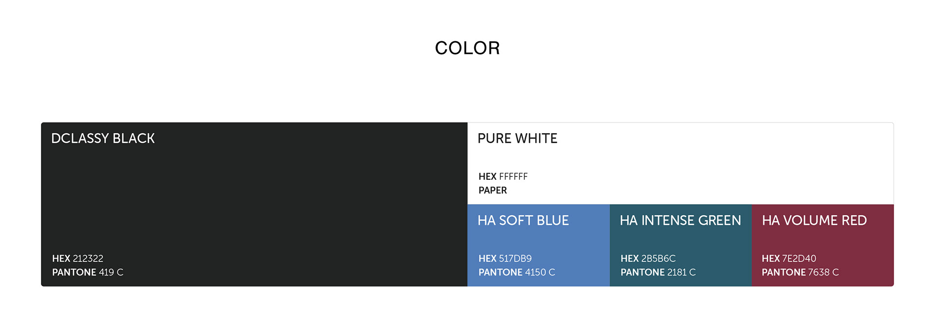
패키지에서는 의료 제품으로서의 전문성과 신뢰감을 표현하기 위해 깨끗한 흰색에 선명한 라인 그래픽으로 제품을 구분하는 전략을 택했습니다. 흰 여백과 깊이 있는 중명도 컬러 팔레트를 활용하여 제품을 선명하게 구분하고 고급스러운 무드를 전달하며,
라인의 길이에 따라서 제품의 강도를 직관적으로 알 수 있도록 했습니다.
라인의 길이에 따라서 제품의 강도를 직관적으로 알 수 있도록 했습니다.
단상자에는 친환경 비코팅지를 사용했으며, 박이나 특수 잉크 사용을 최소화하고 형압으로 고급감을 전달하여 고객 접점에서 세상과 사람을 생각하는 지속 가능성에 대한 의지를 표현하였습니다.
The first product launch was DCLASSY HA Filler, a premium filler available in three formulations—Soft, Intense, and Volume.
For the packaging, we adopted a clean white base paired with sharp linear graphics to clearly distinguish each product while conveying medical expertise and reliability. Generous white space and a deep mid-tone color palette enhance clarity and create a sophisticated mood, while variations in line length intuitively communicate product intensity.
The folding cartons were produced using eco-friendly uncoated paper. By minimizing the use of foil stamping and specialty inks and instead applying embossing to convey a premium feel, the packaging reflects the brand’s commitment to sustainability and its consideration for both people and the environment at every customer touchpoint.
2025
Studio roam
Studio roam