
Daesang Sweevero Brand Identity
대상 스위베로 브랜드 아이덴티티
Client: 대상(DAESANG)
Scope: Brand Visual Identity
Crew: Taerim Lee, Seyeong Jang, Chaehyun Moon, Saerom Park
Studio roam|2023
Scope: Brand Visual Identity
Crew: Taerim Lee, Seyeong Jang, Chaehyun Moon, Saerom Park
Studio roam|2023
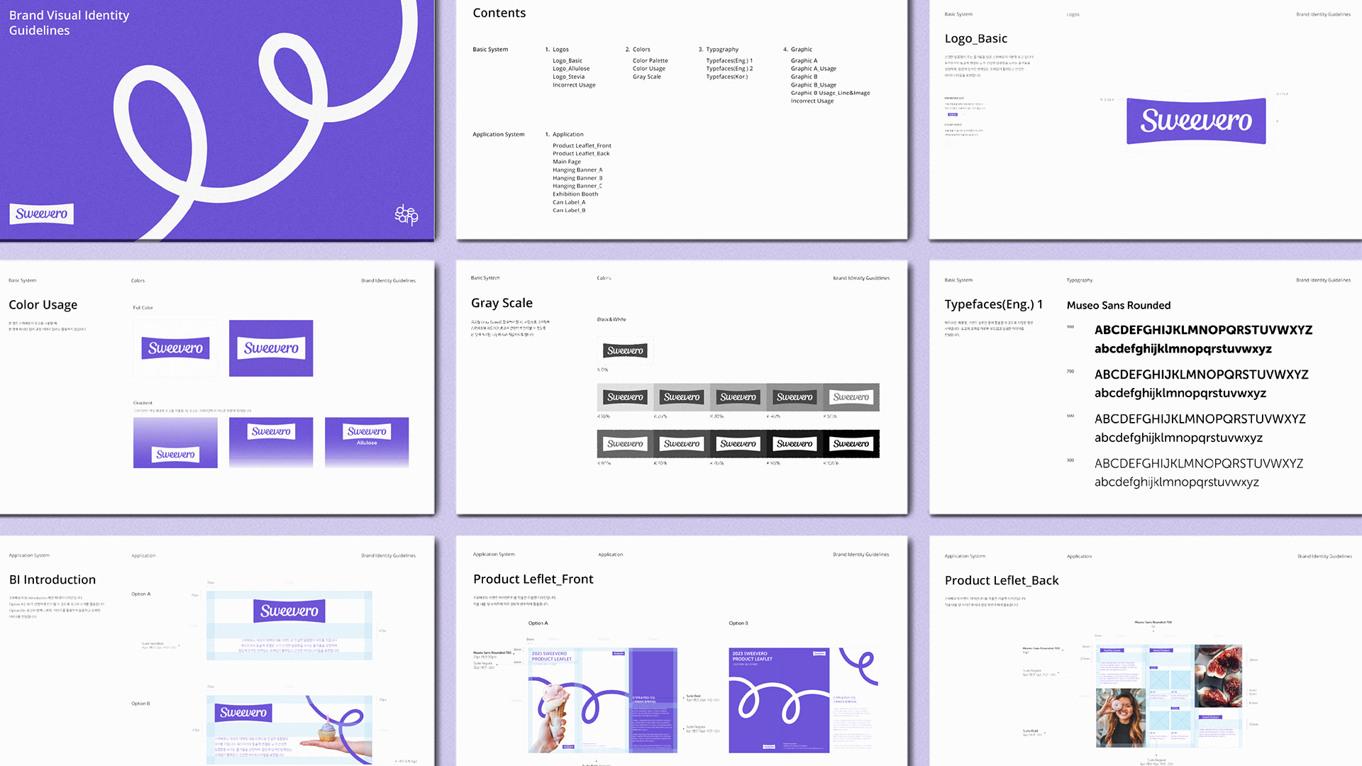
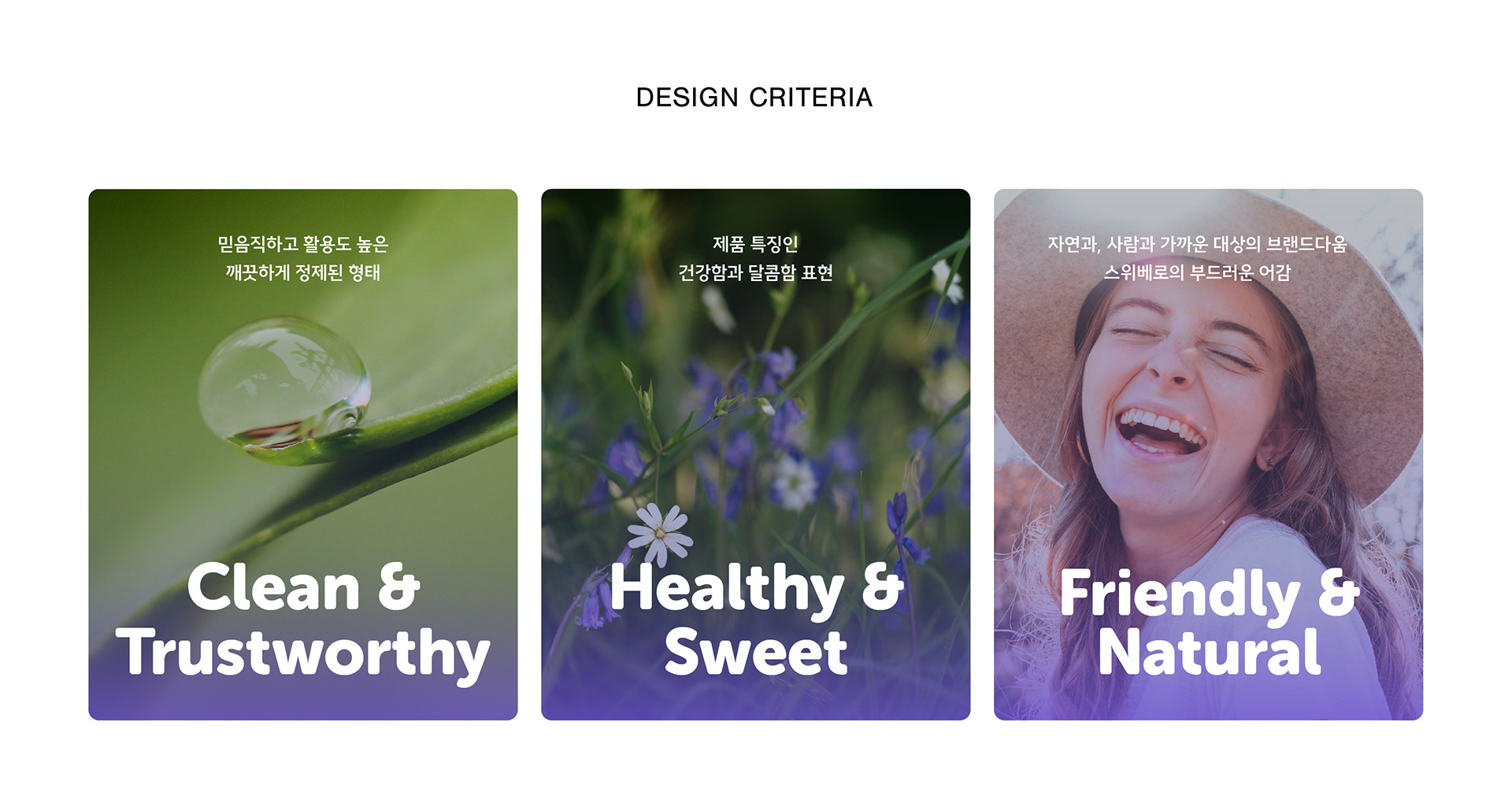
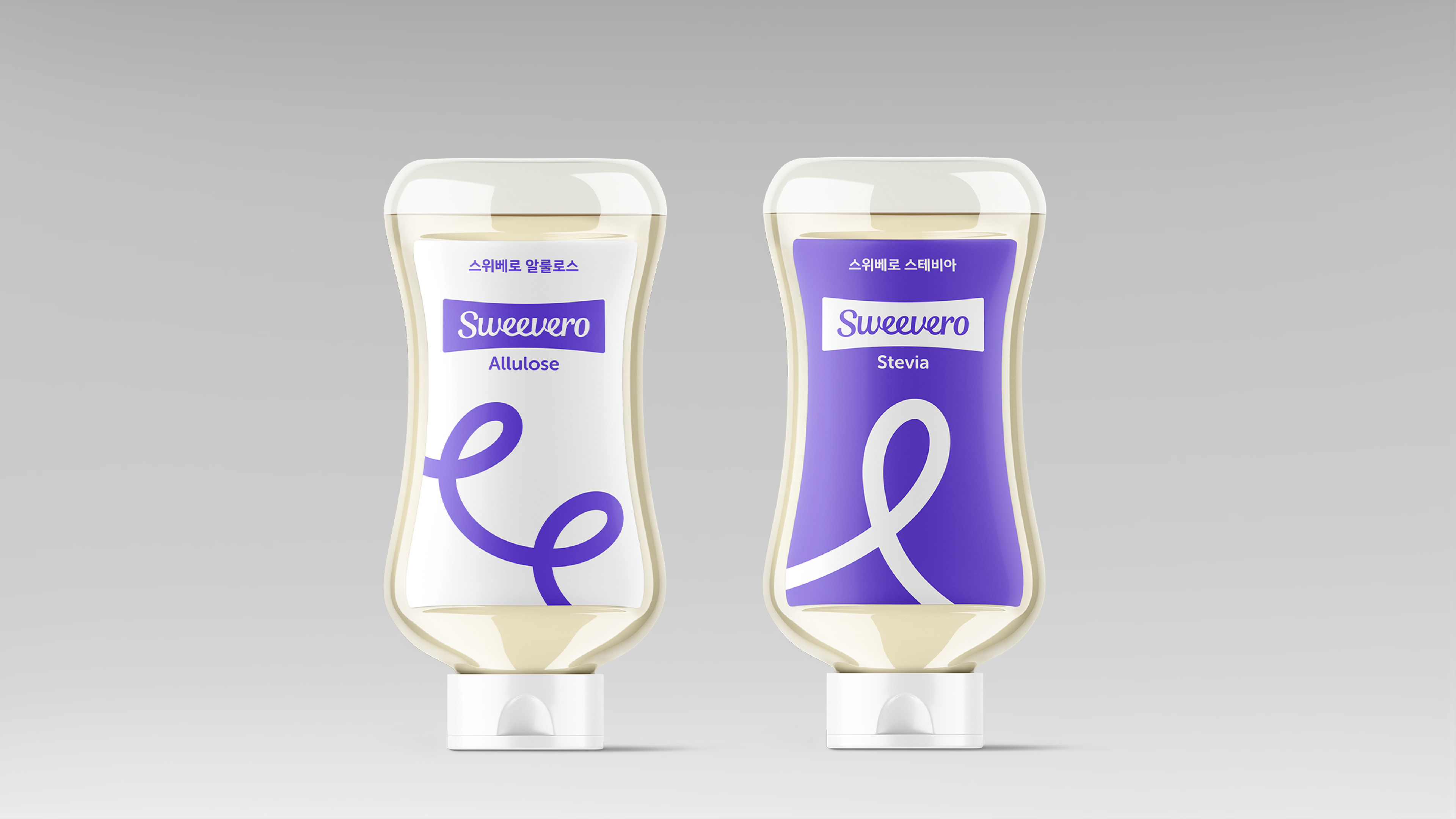
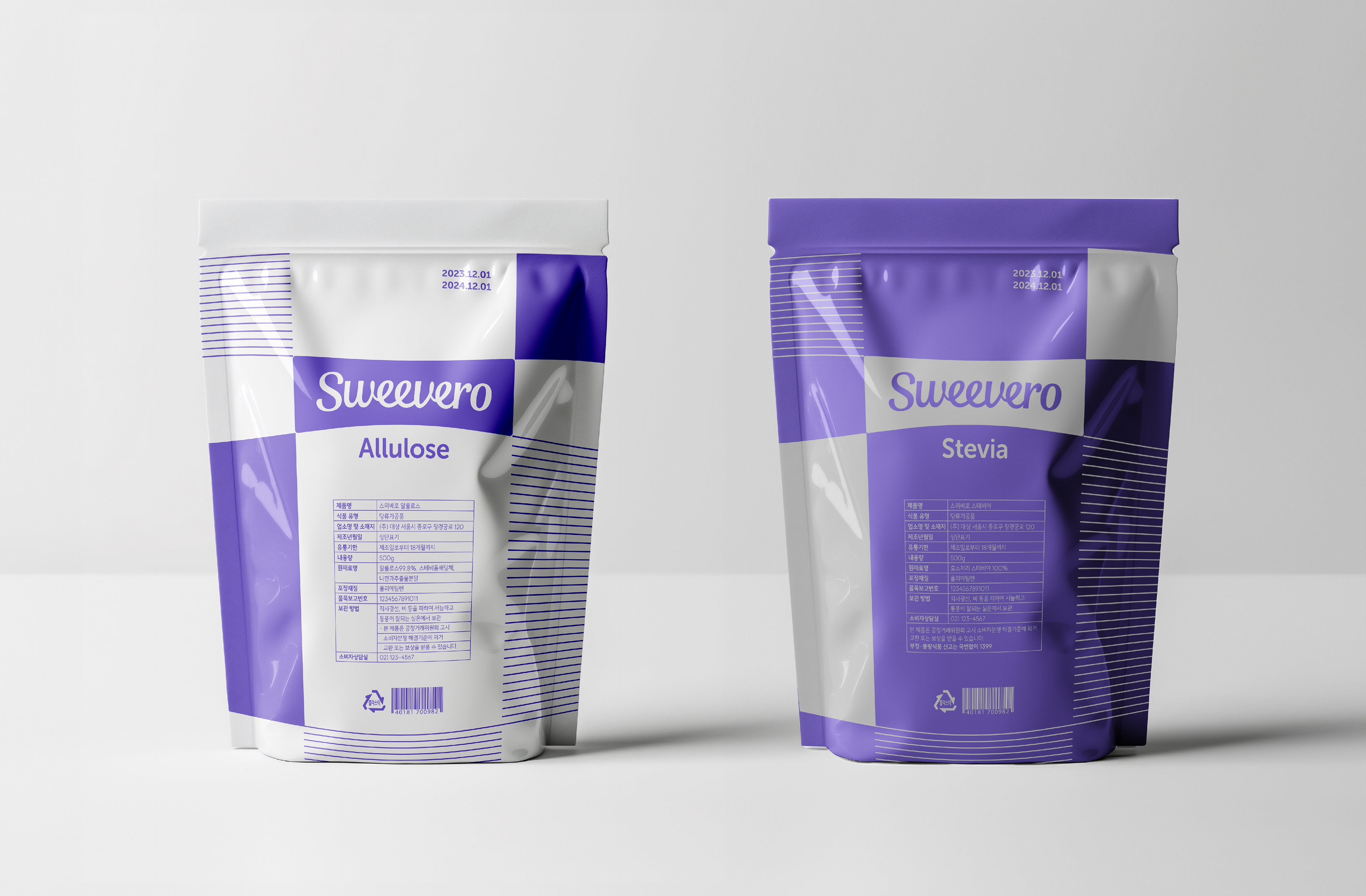
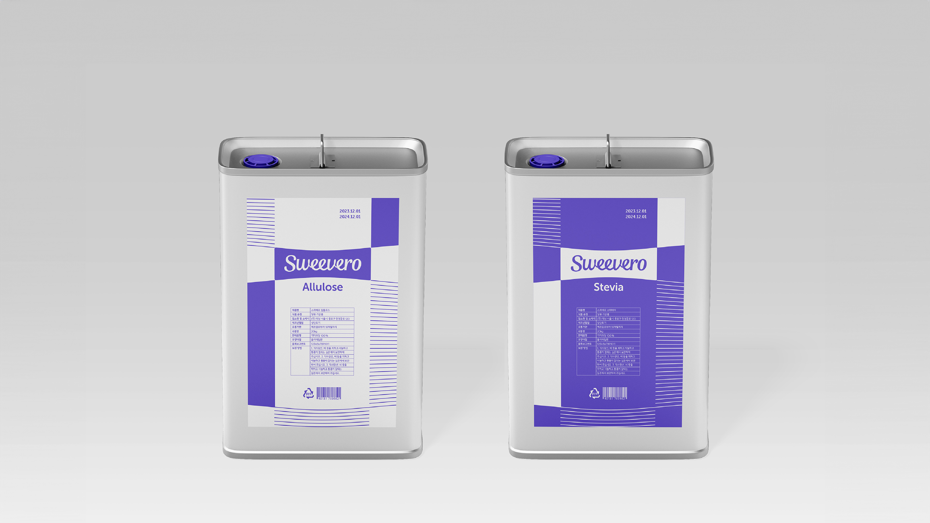
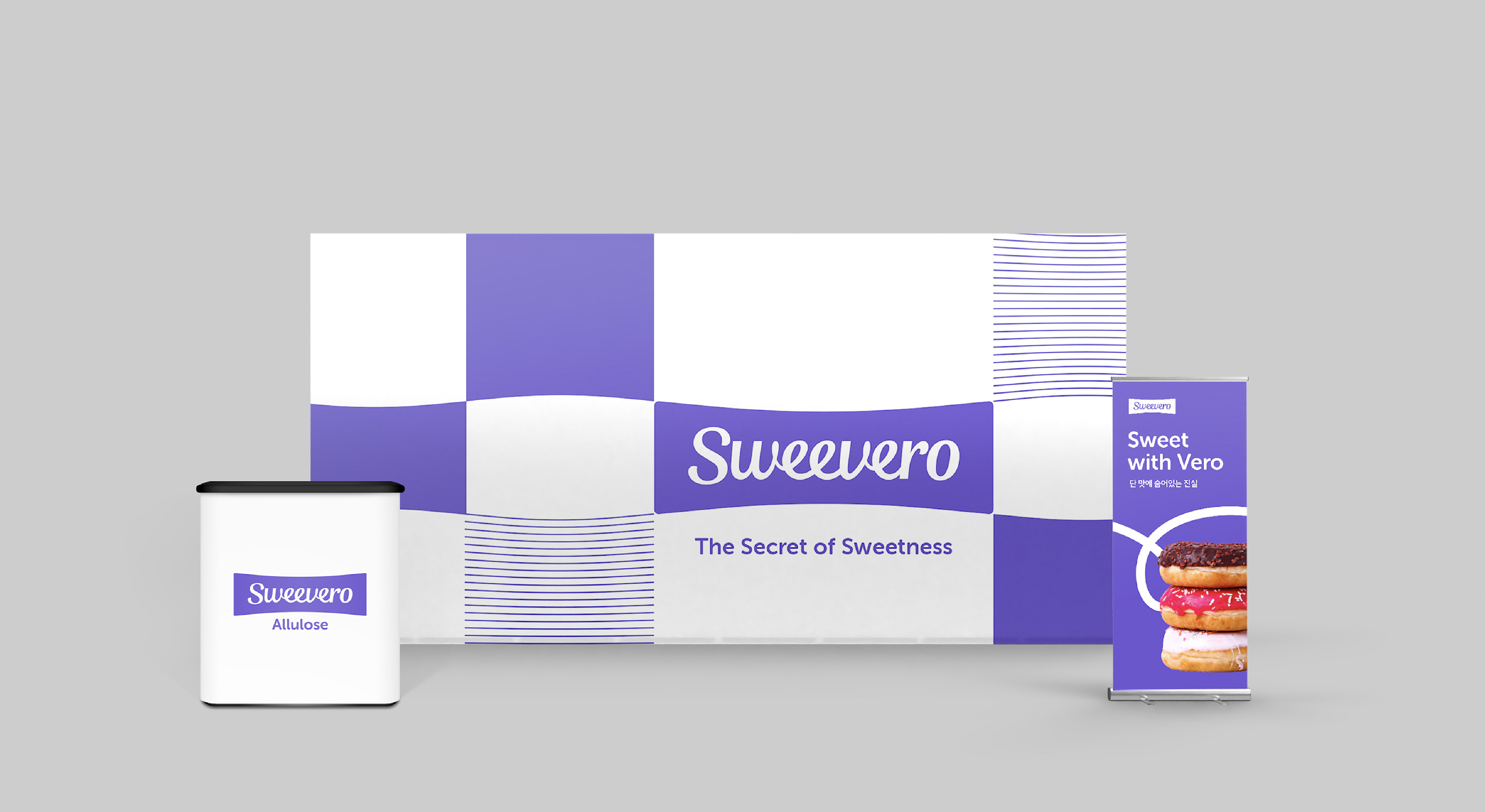
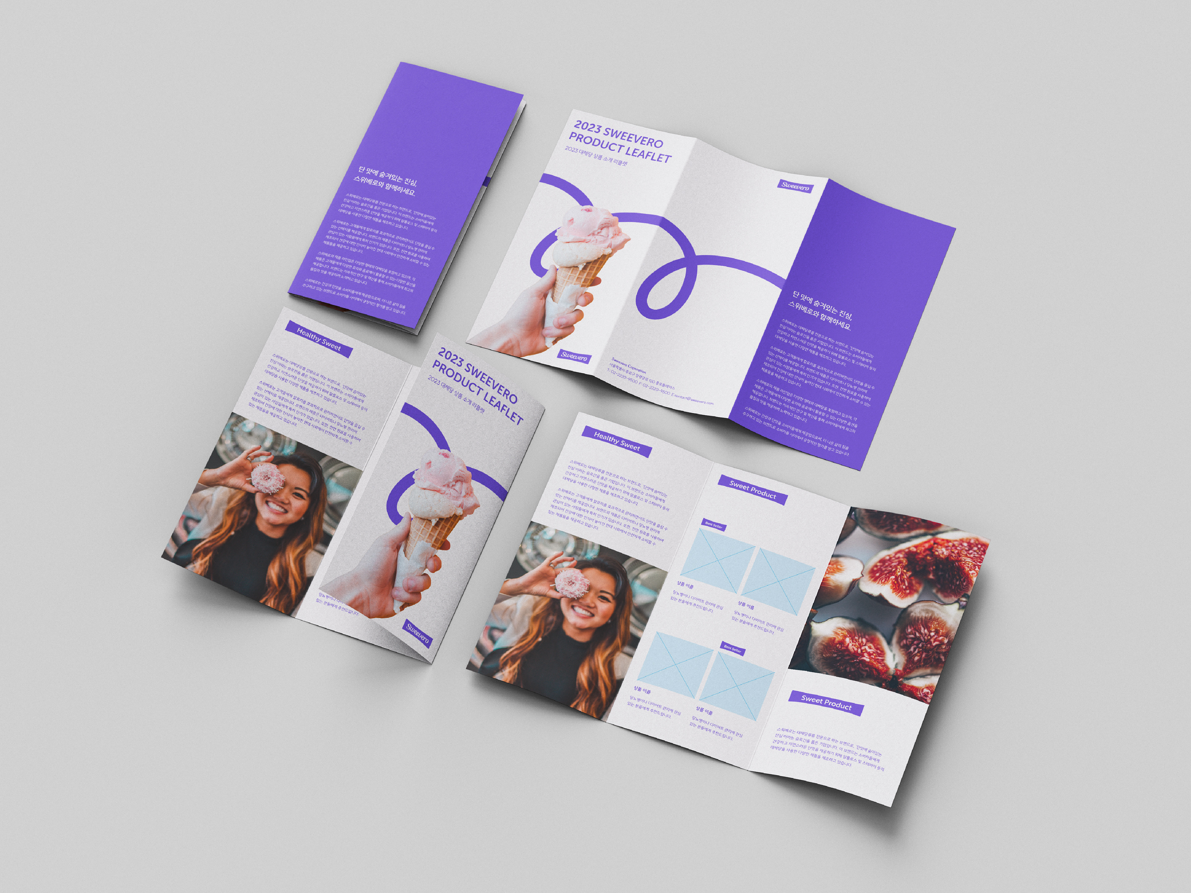
대상에서 출시한 대체당 대표 브랜드 ‘스위베로’는 기존 당이 가진 유해한 영향을 줄인 알룰로스와 스테비아 등 대체당 상품을 포괄하는 B2B 중심 브랜드입니다. 로움은 브랜드 아이덴티티 부분을 맡아 작업했습니다. 달콤함과 진실함의 의미를 담고있는 Sweevero라는 이름의 의미와 형태를 고려하여 ‘건강한 달콤함이 주는 즐거움’ 을 주제로 디자인했습니다.
Studio Roam worked on the BI design for DAESANG’s alternative sugar brand, Sweevero. It is a B2B-focused brand that encompasses alternative sugars such as allulose and stevia that reduce the harmful effects of existing sugars. Considering the meaning and form of the name, which contains the meaning of sweetness and truthfulness, we designed it with the theme of ‘the joy of healthy sweetness.’
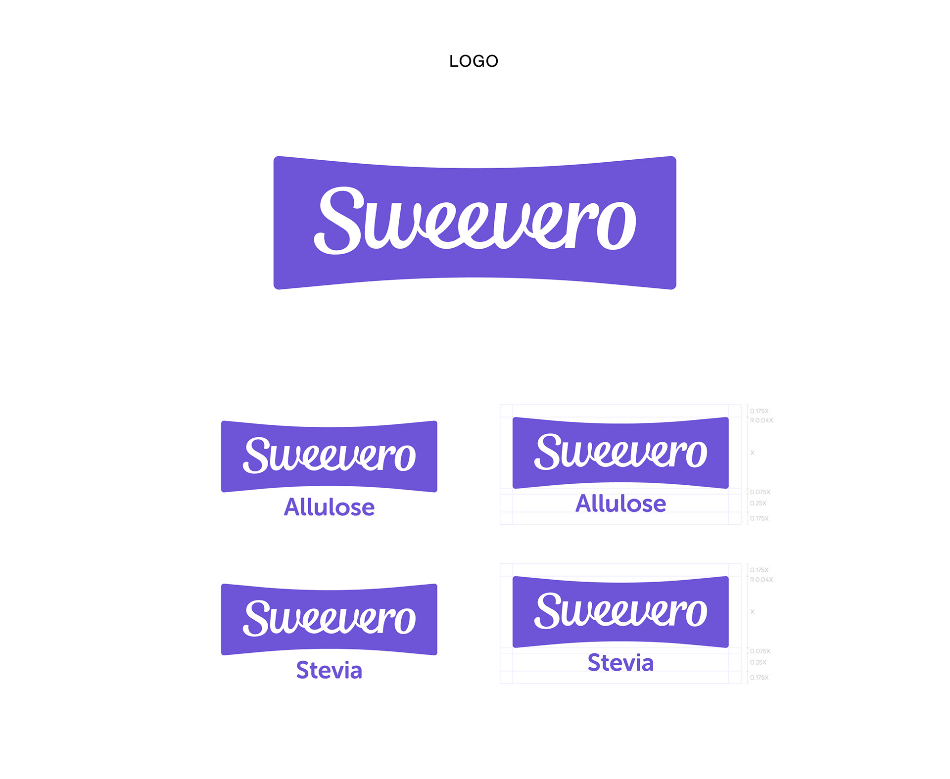
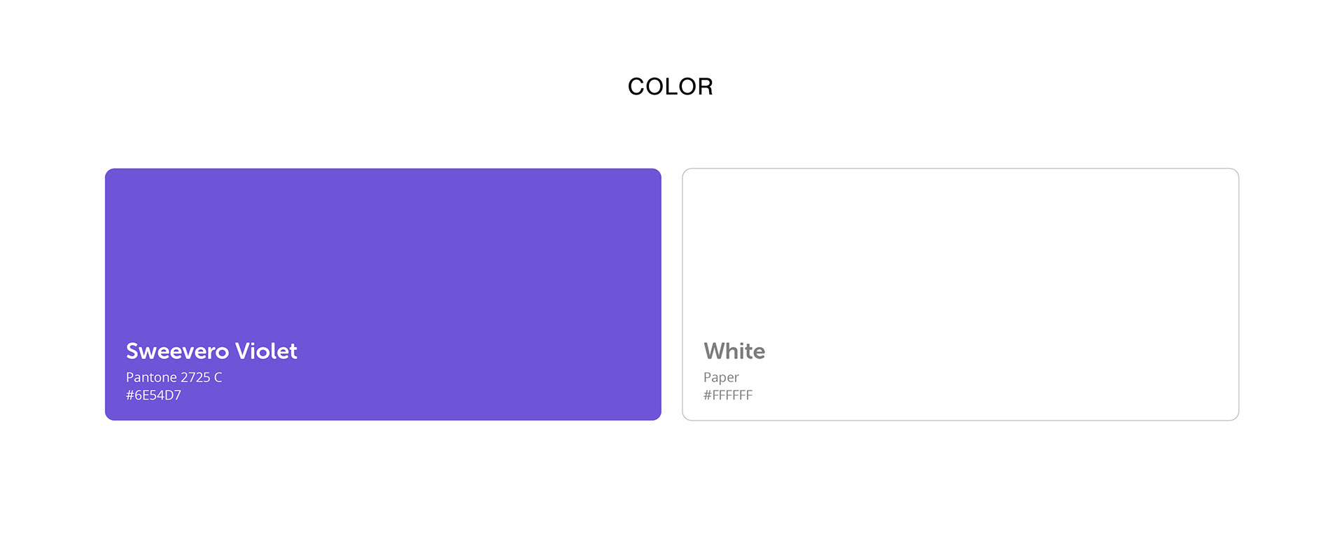
워드마크의 둥글게 연결된 ‘e’는 건강한 달콤함을 누리는 즐거움을 상징합니다. 힘 있게 당겨진 탄력있는 프레임으로 활력 넘치고 건강한 라이프스타일을 표현하고, 달콤하면서도 청량하고 가벼운 이미지를 전달하고자 브랜드 컬러로 바이올렛을 사용했습니다.
The logotype's ‘ee’ connected with the curved line symbolizes the joy of enjoying healthy sweetness, and the strongly pulled, elastic frame expresses a lively and healthy lifestyle. We used violet as the brand color to convey a sweet, yet refreshing and light image.


2023
studio roam
studio roam