
Carenology95 Package System Renewal & Brand Illustration
닥터아임 케어놀로지95 패키지 시스템 리뉴얼 & 브랜드 일러스트레이션
Client: DoctorI'm Co./Ltd.
Co-work: B:SCOPE, DoctorI'm Managing team & Designer
Crew who helped: Sunkyoung Kim
Studio roam | Jun 2020
Co-work: B:SCOPE, DoctorI'm Managing team & Designer
Crew who helped: Sunkyoung Kim
Studio roam | Jun 2020
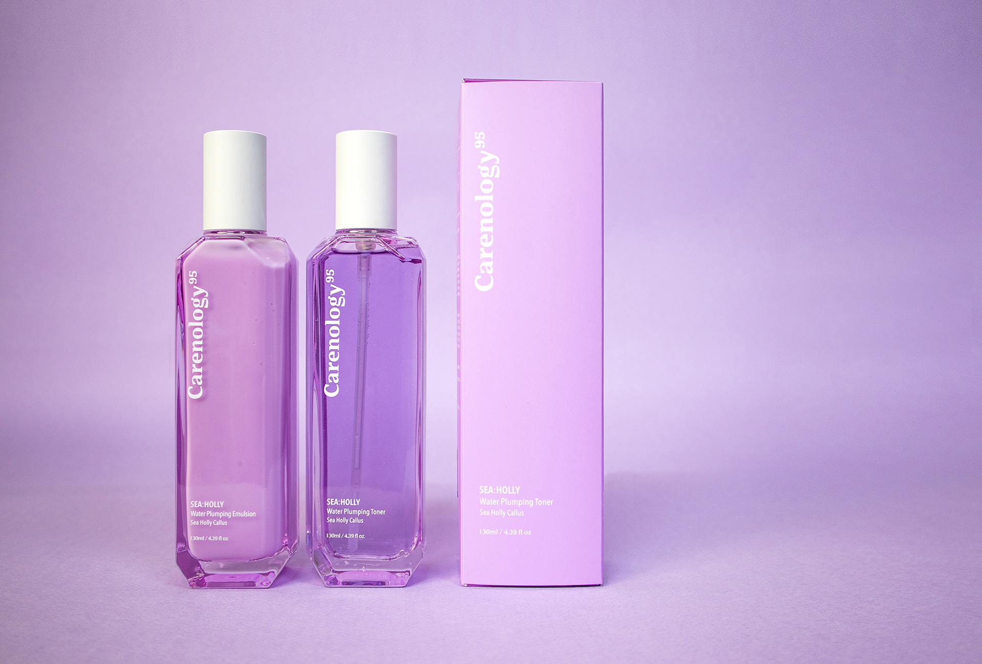
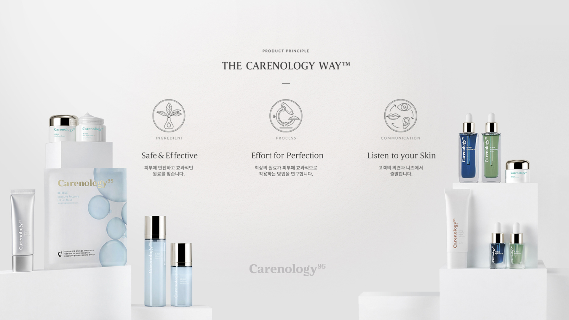
‘Journey from nature to lab’
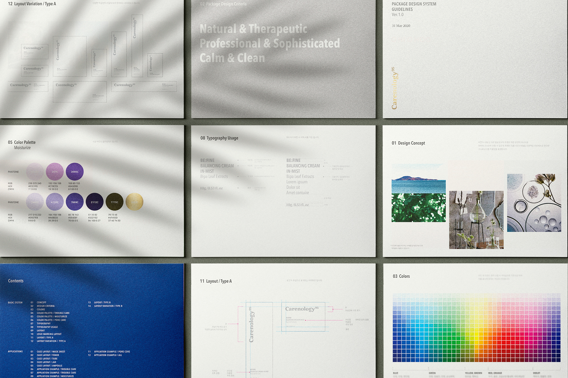
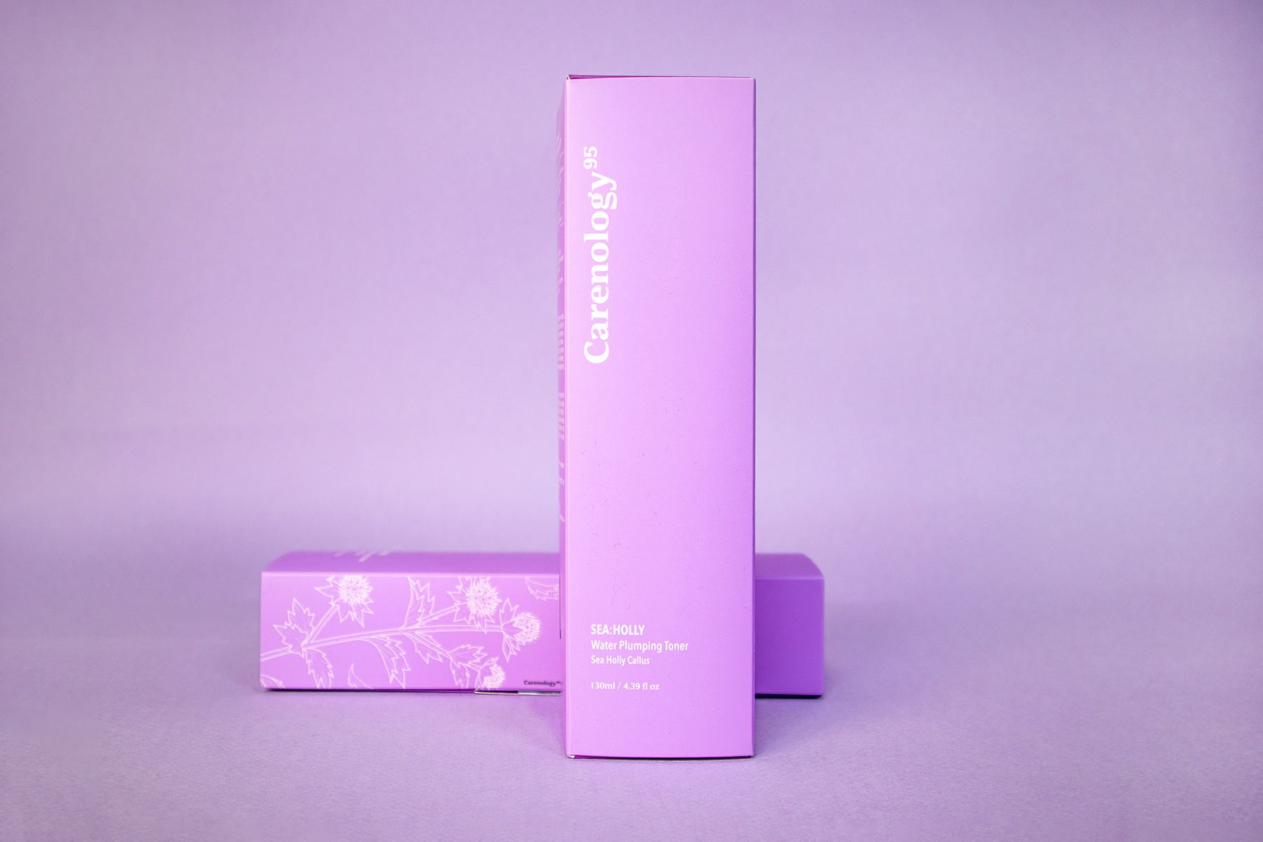
케어놀로지95는 피부과 의사가 만든 화장품 코스메슈티컬 브랜드입니다. 귀한 자연의 재료부터 피부 전문가의 연구실로 이어지는 여정을 컨셉으로 하여 컬러 선정 기준, 레이아웃 디자인 기준을 정립했습니다. Natural & Therapeutic, Professional & Sophisticated, Calm & Clean을 디자인 기준으로 하여 기존 리블루라인 디자인과의 조화, 아이덴티티의 명확성과 라인 확장 가능성을 고려하여 4가지 제품 라인의 컬러 팔레트, 레이아웃 시스템을 재정립하였습니다.
Careology95 is a cosmeceutical skincare brand researched and developed by dermatologists. With the concept of a journey of precious natural materials from nature to the skin specialist's lab, Studio roam has established standards for color scheme and layout design. Based on the design criteria of Natural & Therapy, Professional & Sophisticated, and Calm & Clean, we also re-established the color palette and layout system of four product lines.
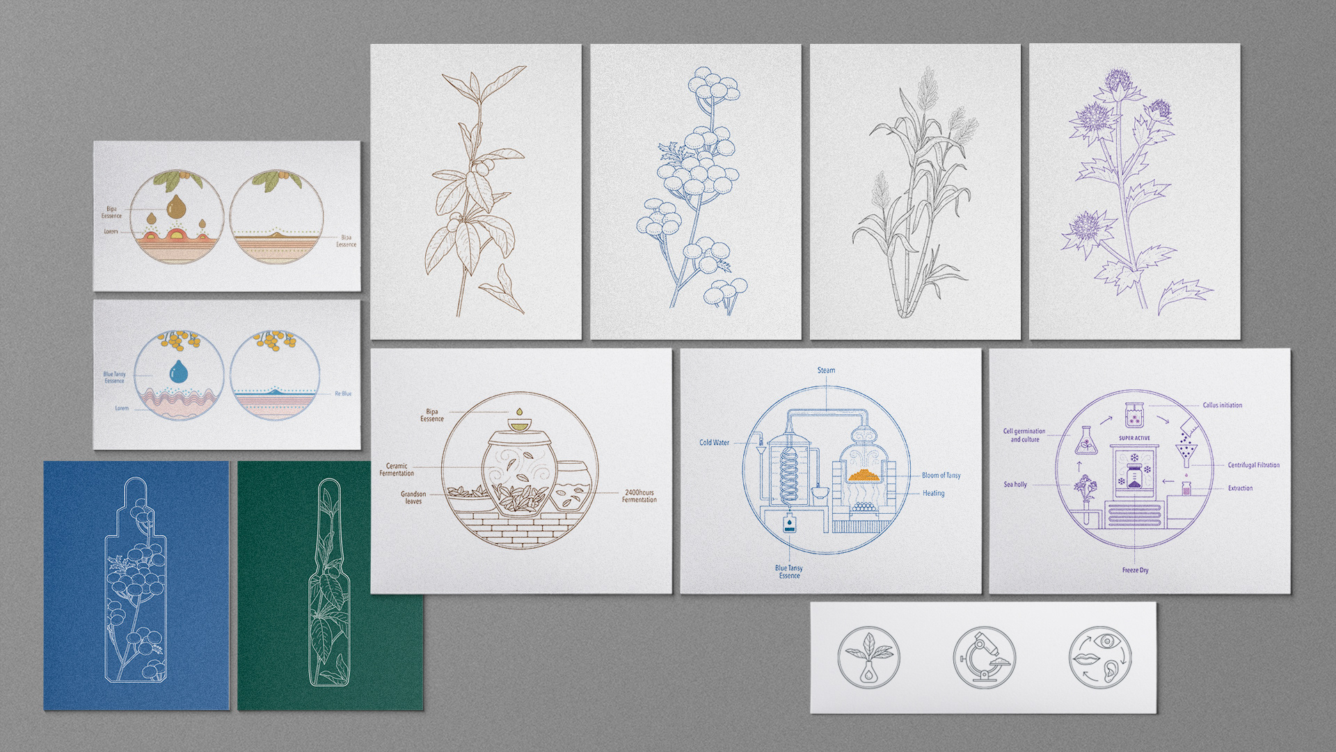
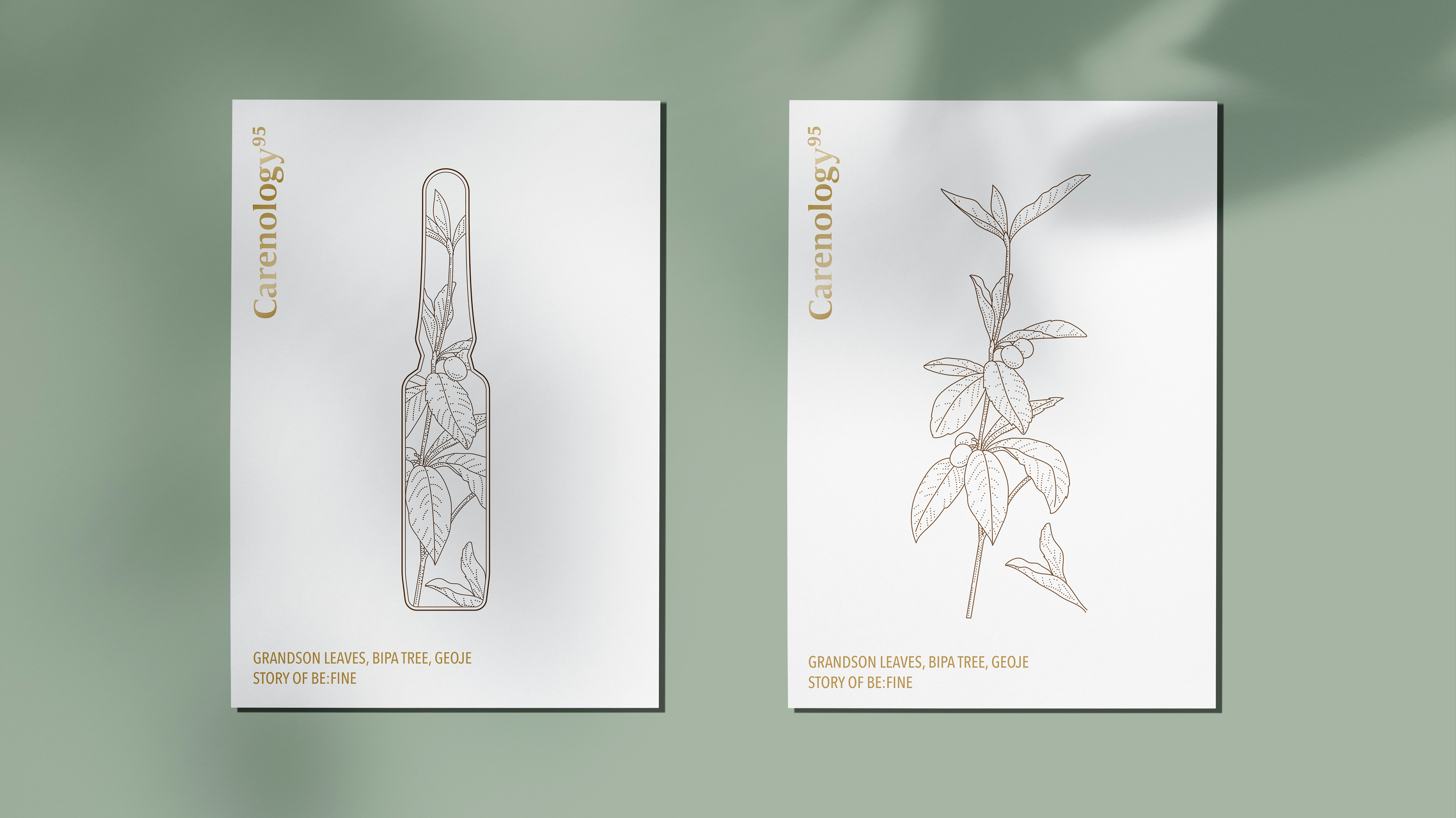
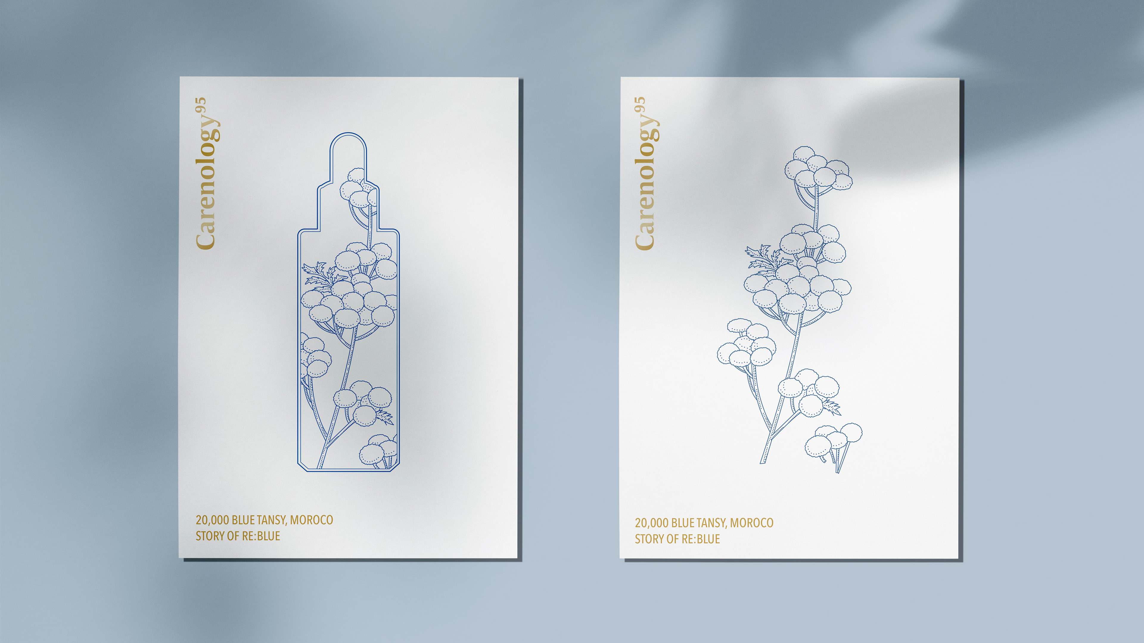
Brand illustration
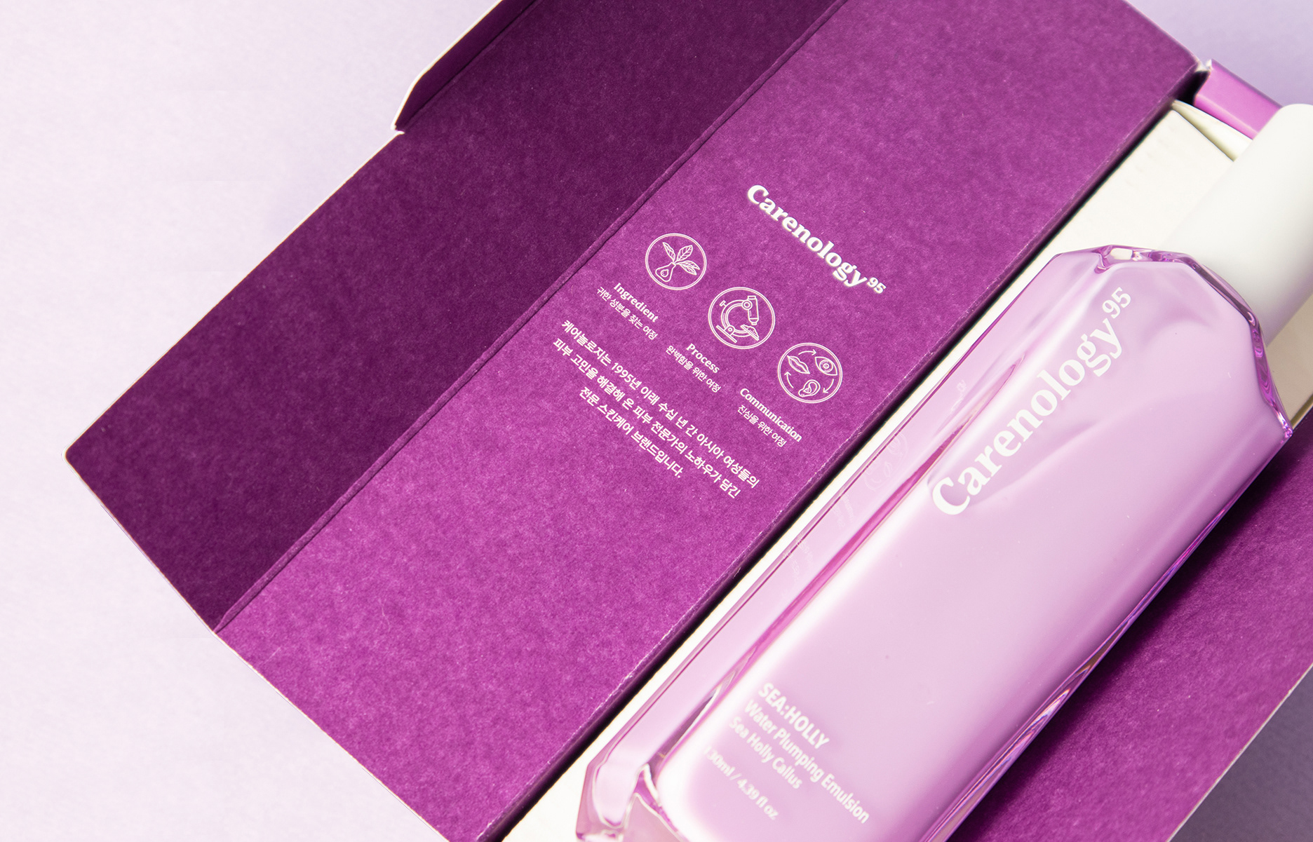
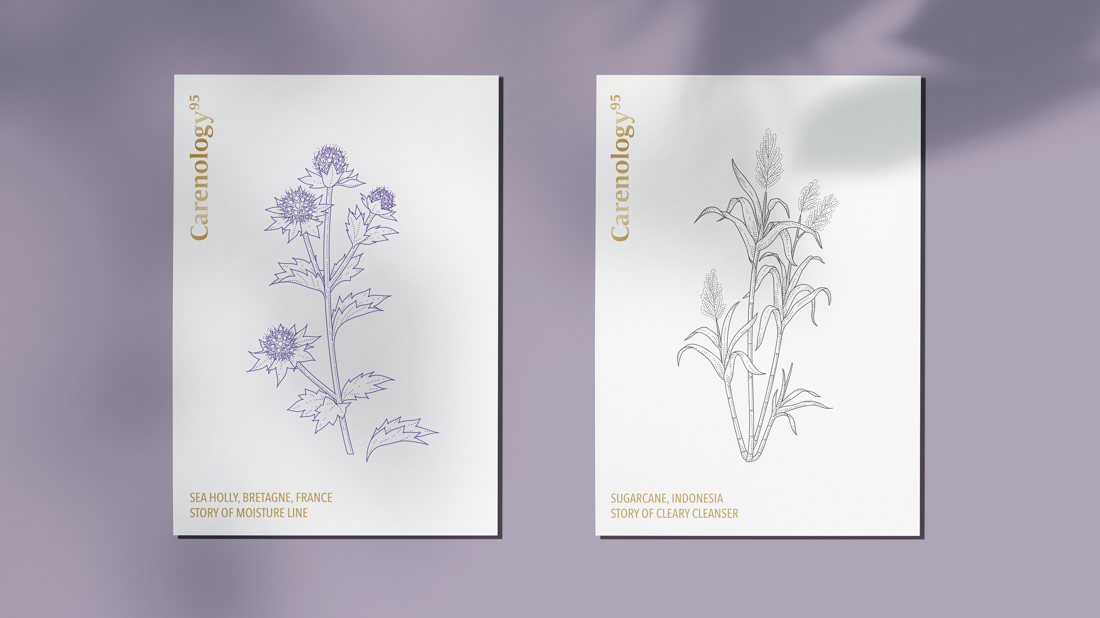
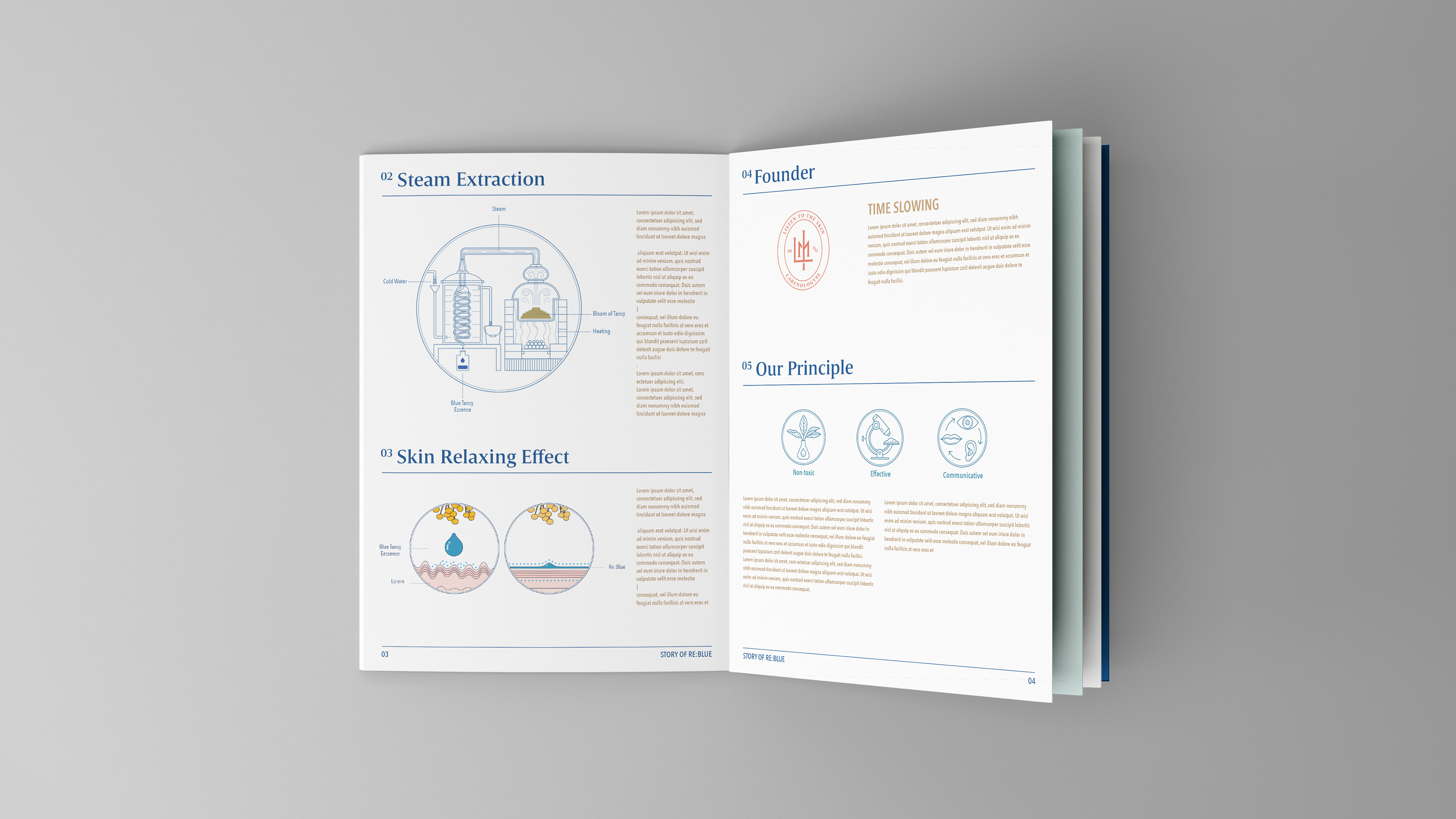
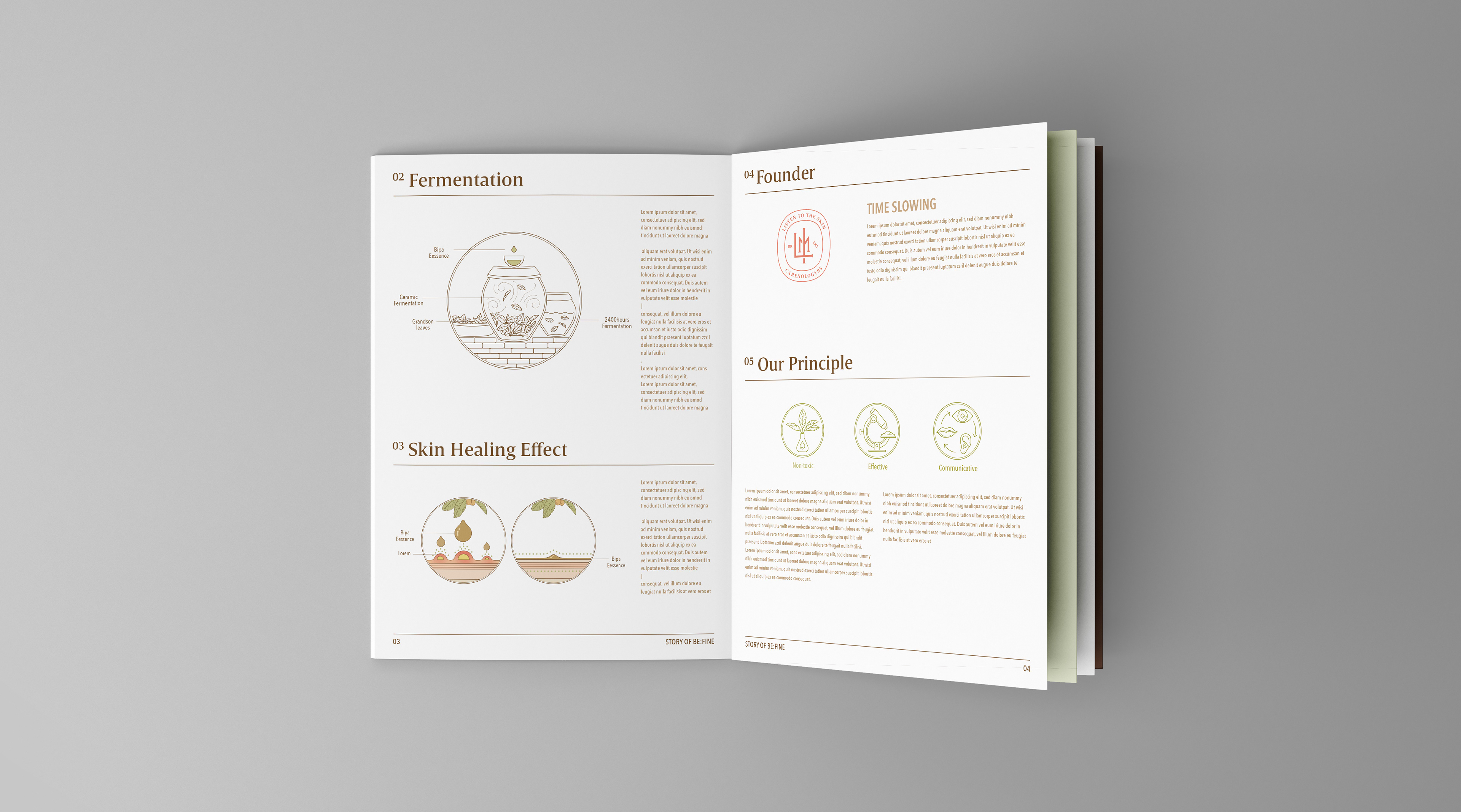
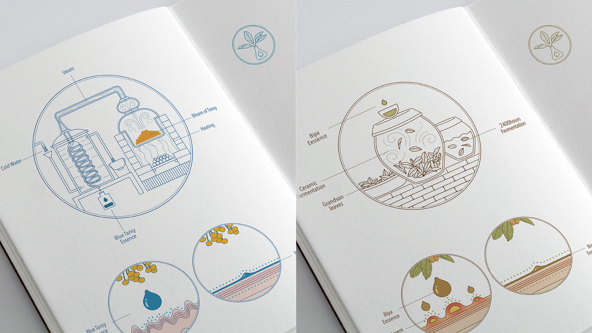
오랜 시간 공들여 만드는 원료와 정성 어린 제작공정, 작용기전, 브랜드 철학 일러스트를 과학적이고 섬세한 이미지로 표현했습니다. 원료에 들이는 시간과 정성 어린 마음, 전문가가 연구하는 의과학적인 제품의 이미지를 함께 전달하기 위해서 점으로 그린 세밀한 사이언스 드로잉 스타일을 단순화하여 기하학적인 외곽 형태 안에 담았습니다.
In order to convey the time spent on processing raw materials, the sincere effort of the developers and the image of a medical product researched by experts, the detailed science drawing style of using dots is simplified and expressed in a geometric shape.
Studio roam
2020
2020