
Andong Gu Market Brand Identity & Applications
안동구시장 브랜드 아이덴티티 & 어플리케이션
Client: 안동시(Andong City)
Crew: Saerom Park, Millim Sung
Scope: Brand Visual Identity, Application design
Studio roam|2021
Crew: Saerom Park, Millim Sung
Scope: Brand Visual Identity, Application design
Studio roam|2021
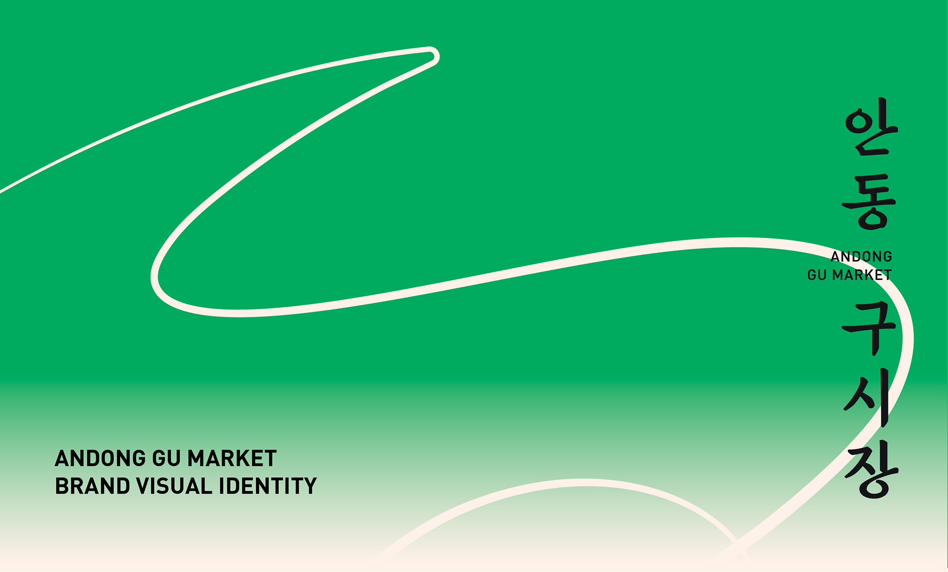
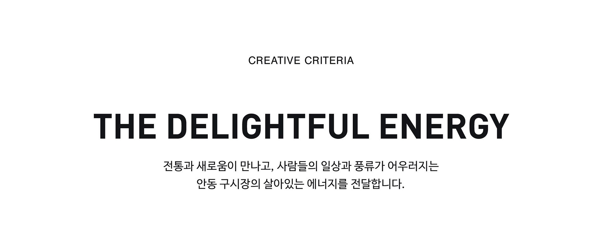
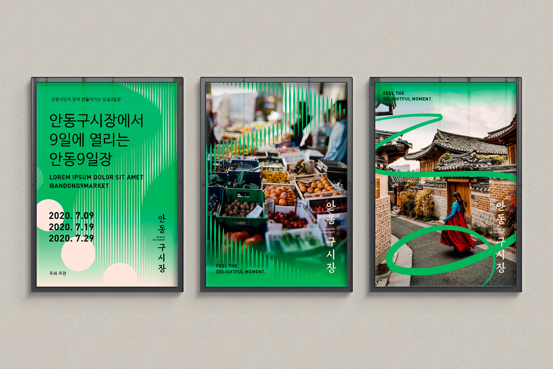
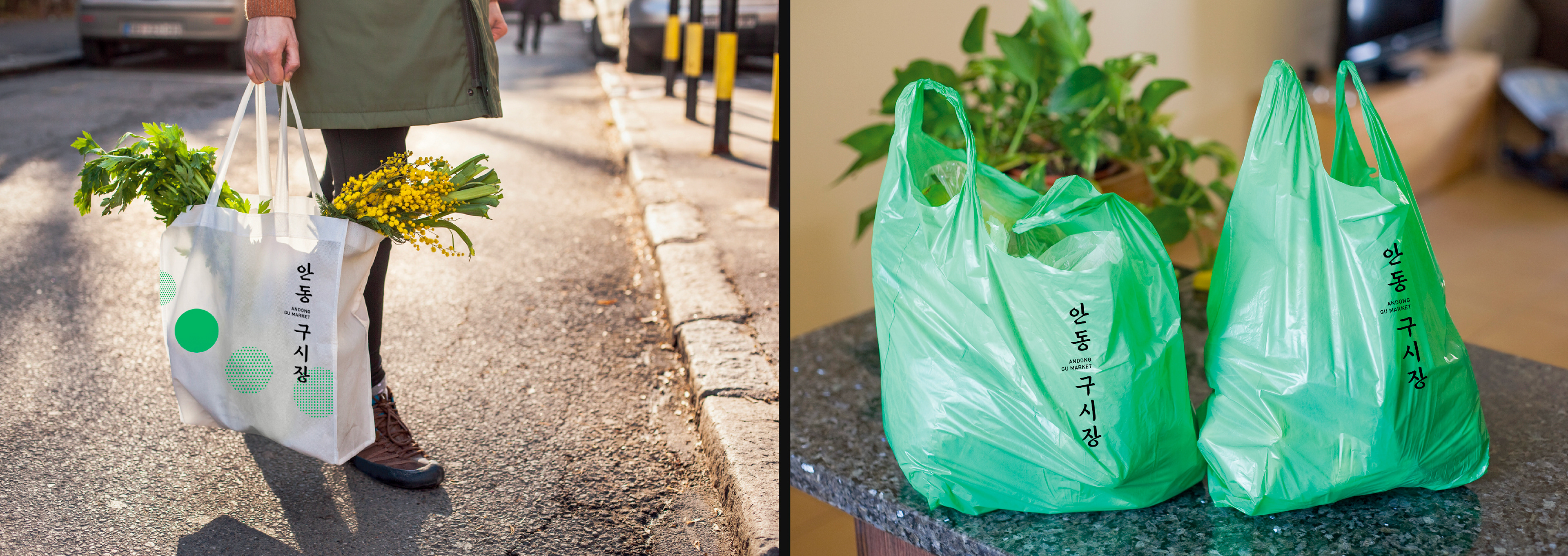
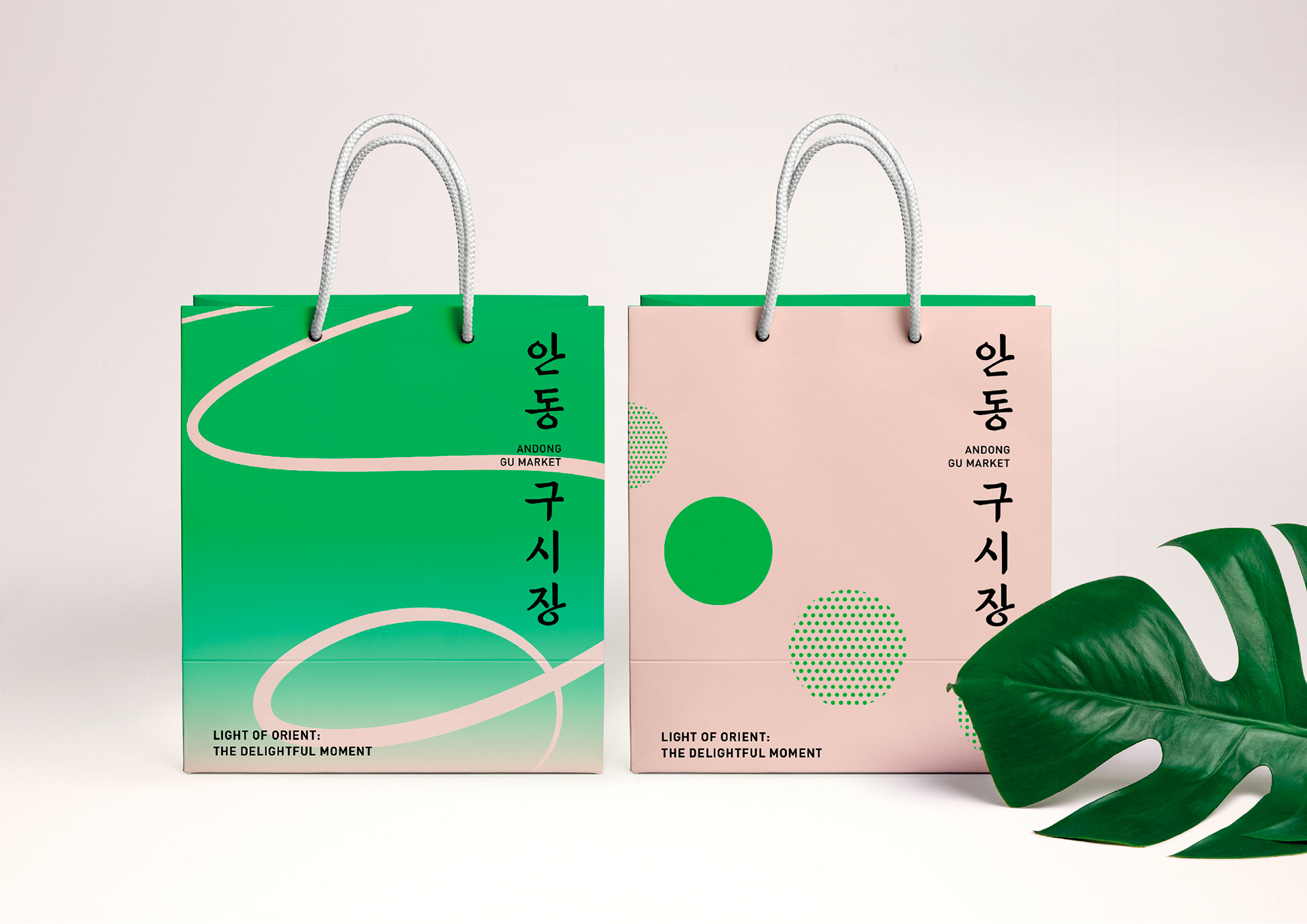
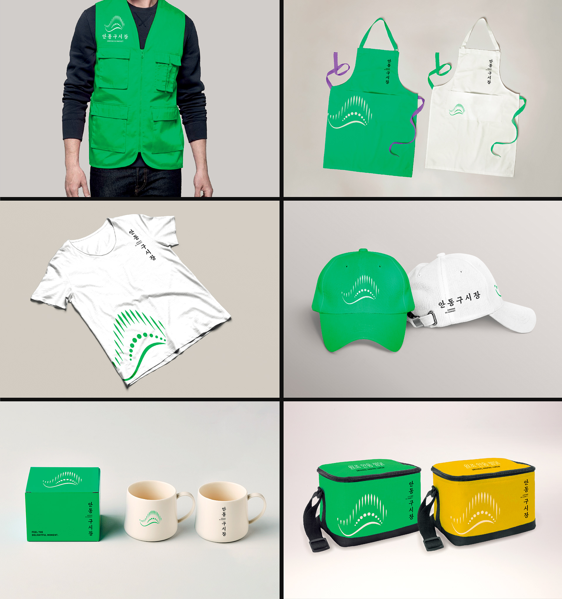
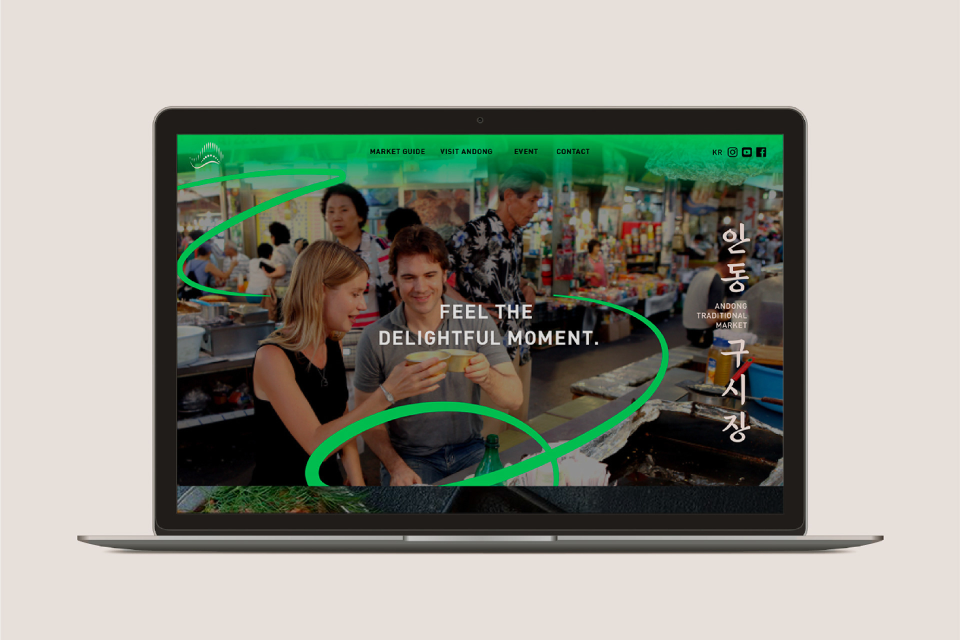
안동구시장은 안동시에 위치한 600년 역사의 전통시장입니다. 새로운 세대의 글로벌 관광 명소로 발돋움하기 위해서 경관조명과 시장환경을 개선하고 브랜드를 재정립하는 프로젝트에서 BI 디자인 작업을 진행했습니다. 전통과 새로움이 만나고, 사람들의 일상과 풍류가 어우러지는 안동구시장의 살아있는 에너지를 새로운 시대의 감성으로 전달하고자 했습니다.
Andong Gu Market is a traditional market spanning 600 years, situated in Andong, Gyeongsangbuk-do. To rejuvenate this historical landmark as a global tourism destination for the contemporary generation, the project was undertaken to enhance the landscape illumination, improve the market environment, and reestablish its brand identity. We aimed to convey the vibrant energy of the market, where tradition and novelty converge, and where everyday life and culture coalesce, in the aesthetics of the modern age.
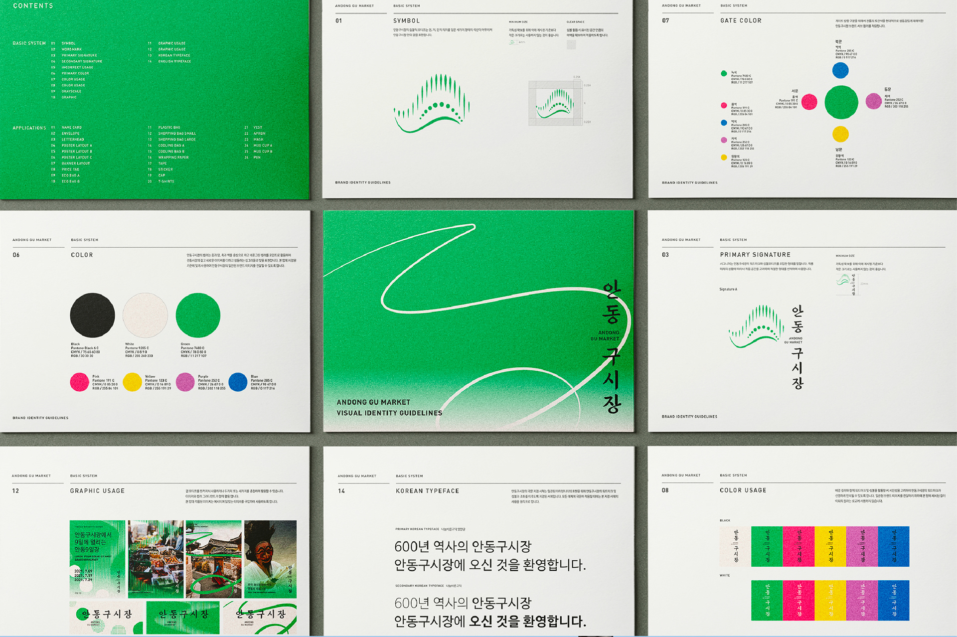

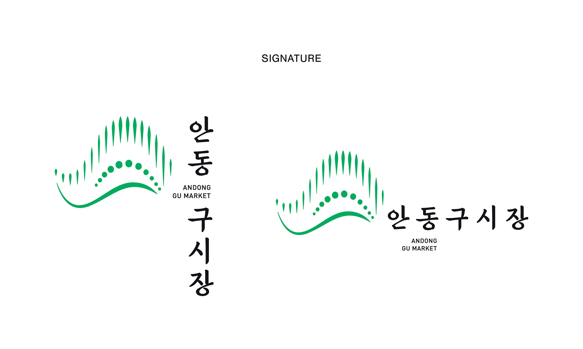
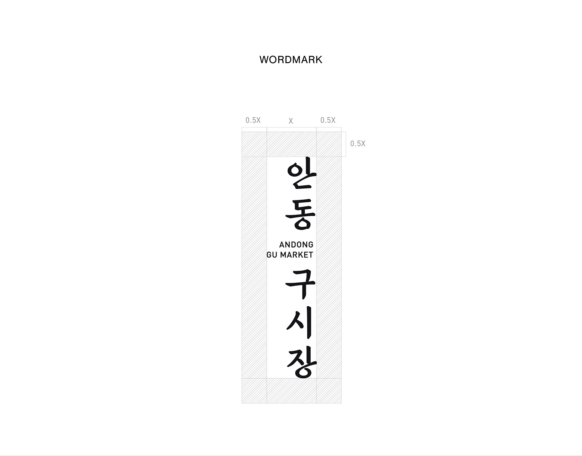
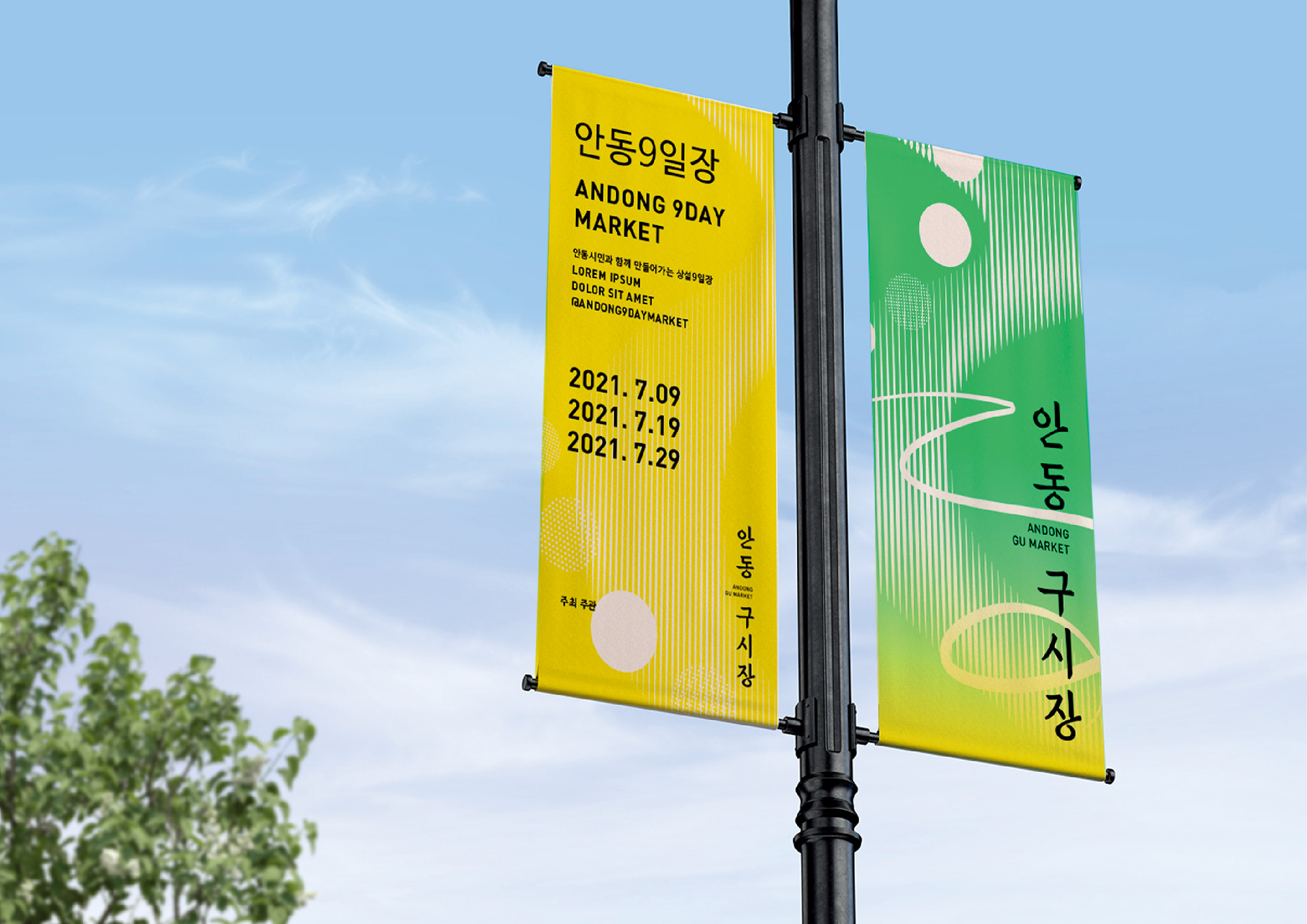
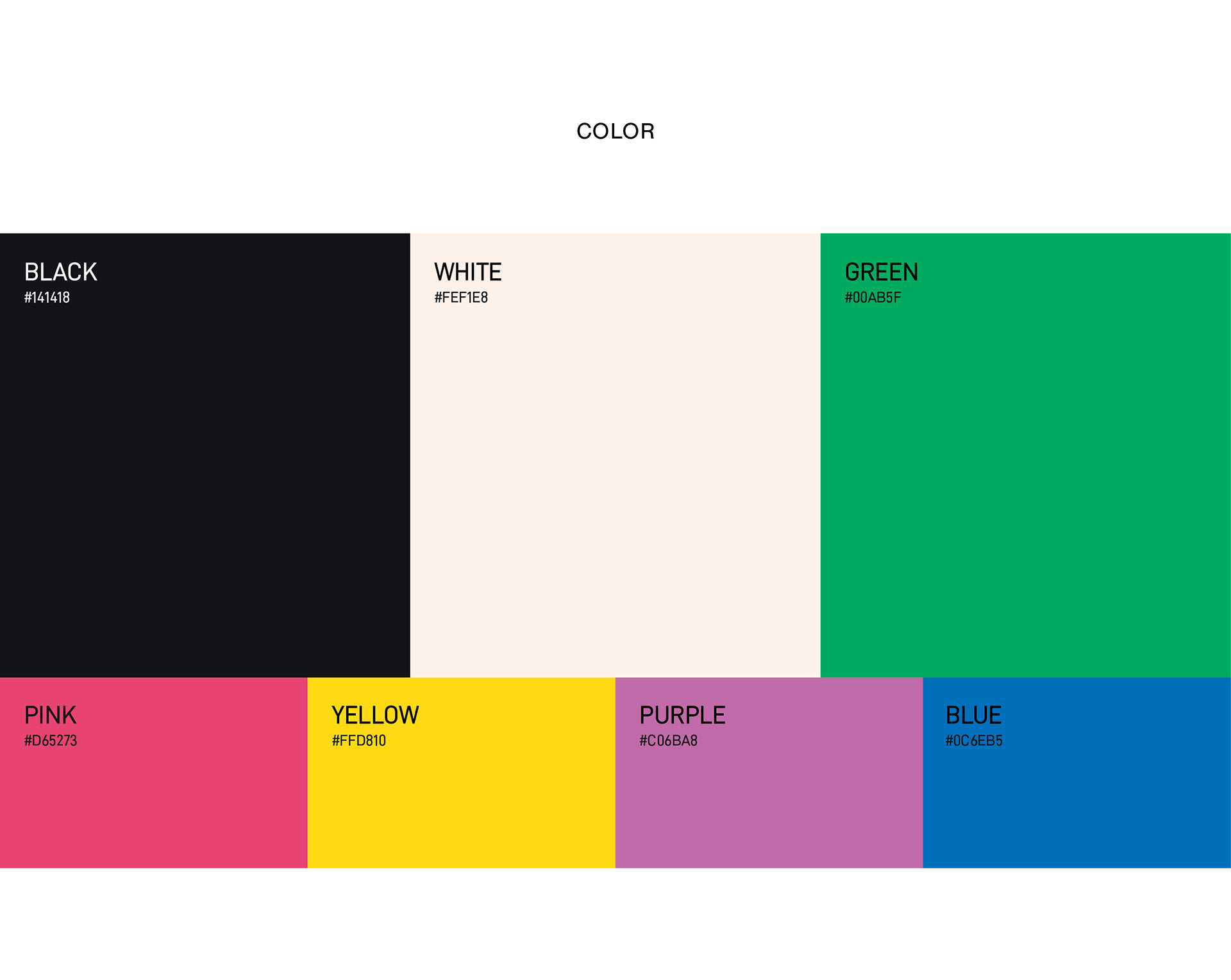
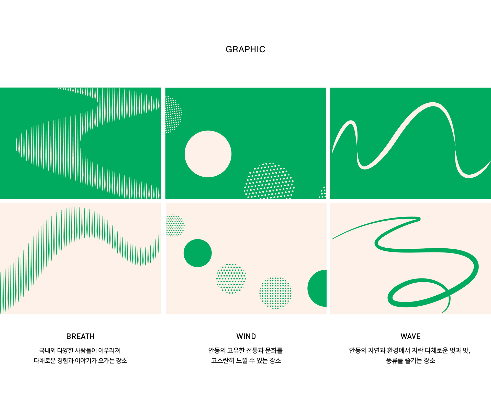
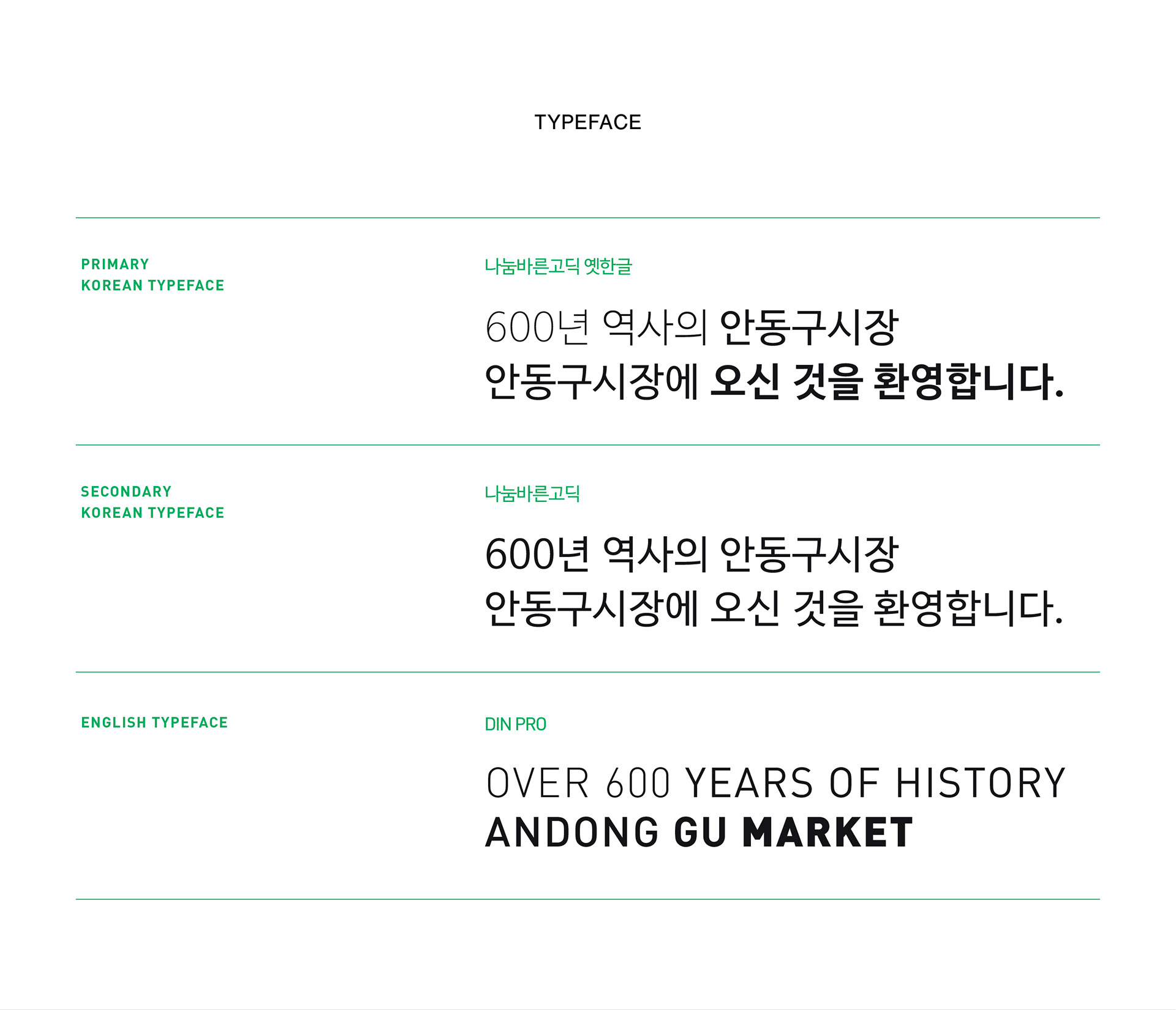
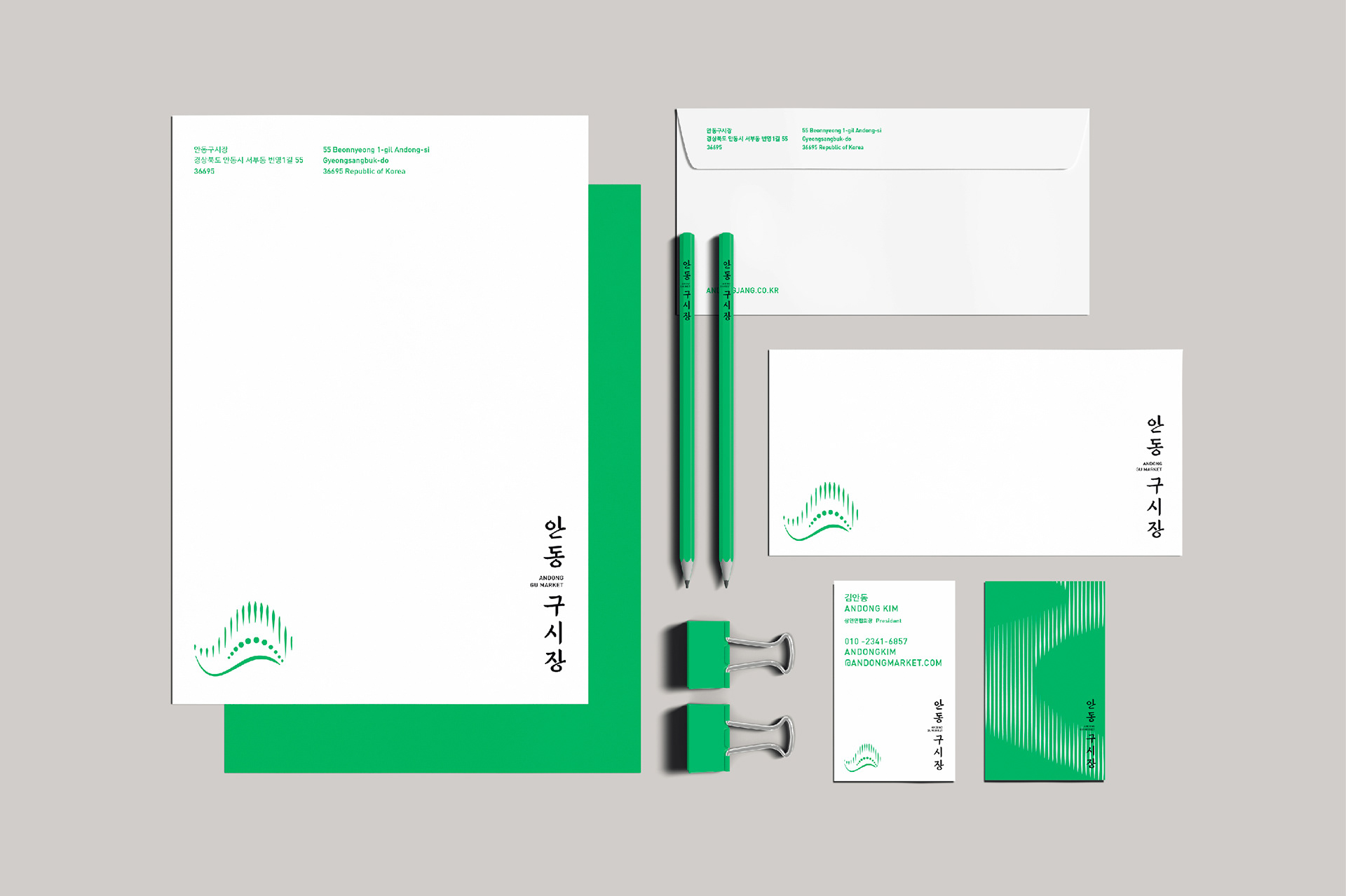
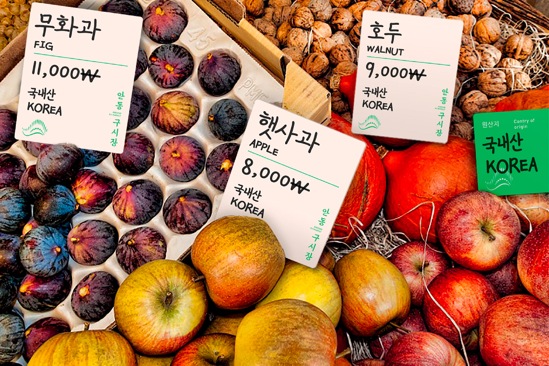
조선시대 서적의 글자체를 딴 현대의 서체를 기반으로 로고타입을 만들었습니다. 심볼릭 모티프는 안동시의 전통적 상징인 하회탈의 미소를 역동적인 빛으로 표현하여 시장에서 경험할 수 있는 따뜻하게 빛나는 순간들을 담았습니다. 선명한 녹색의 생동감 있는 그래픽을 통해 한국 전통시장의 이미지를 새롭게 보여주고자 했습니다.
We designed the logotype based on a modern typeface, which is modeled on the calligraphies of an ancient Chosun-era book. The symbolic motif, represents hahoetal, the famous traditional mask of Andong. We portrayed it with dynamic radiance, encapsulating the warm, shining moments one can experience within the market. The dynamic graphics in vivid green aimed to present a fresh perspective on the image of Korean traditional markets.
2021
studio roam
studio roam