
Amid Hotel Seoul BI & Application
아미드 호텔 서울 브랜드 아이덴티티 & 어플리케이션
Client: Amid Hotel Seoul
Crew: Taerim Lee, Seyeong Jang, Saerom Park
Scope: Brand Visual Identity, Application Design
Photo: Hyojin Lim
Studio roam|2023
Crew: Taerim Lee, Seyeong Jang, Saerom Park
Scope: Brand Visual Identity, Application Design
Photo: Hyojin Lim
Studio roam|2023

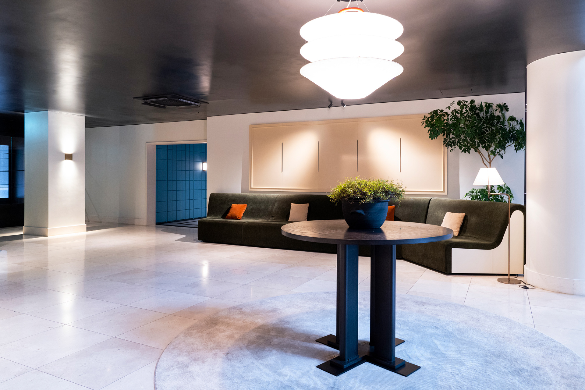
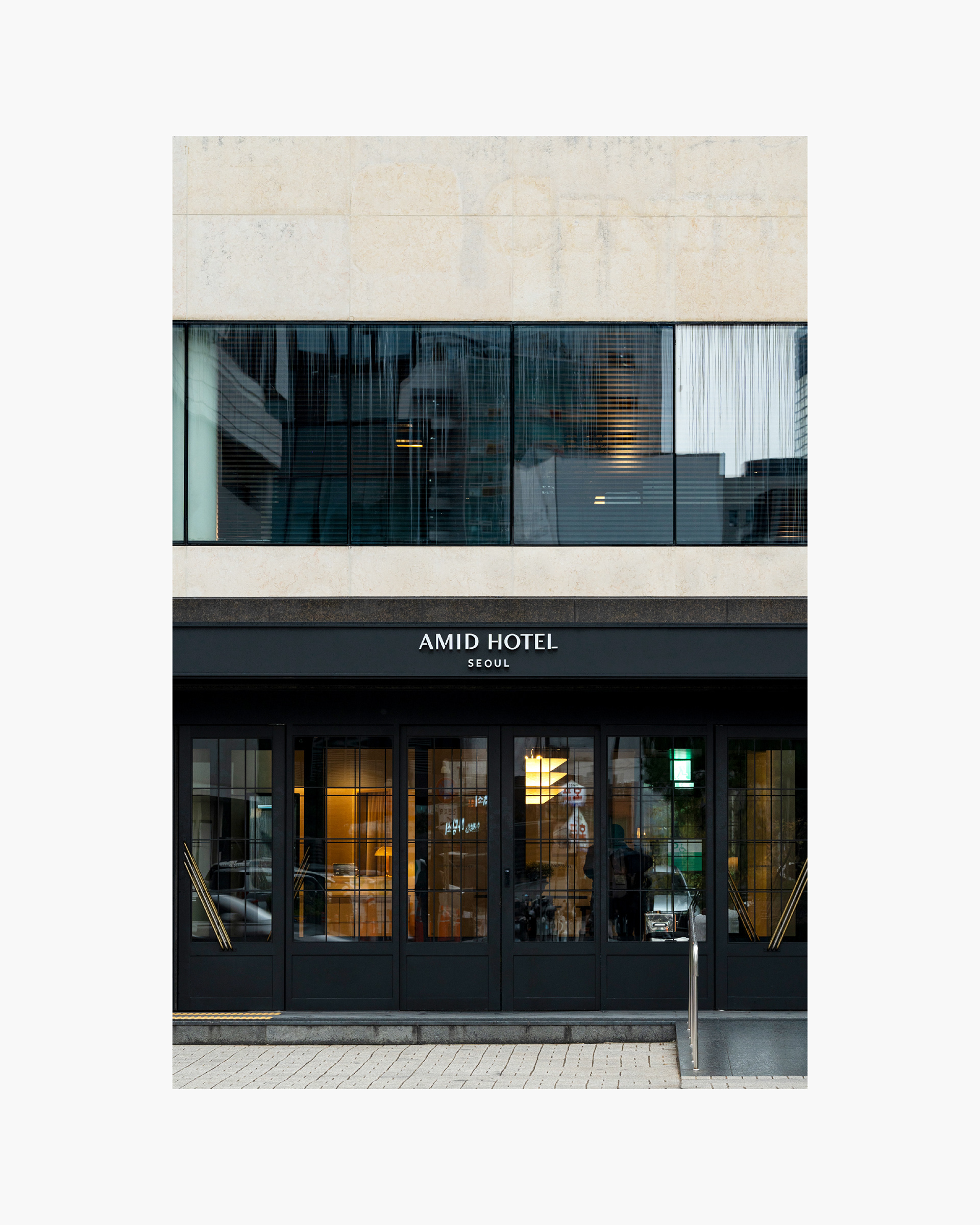
서울 인사동에 위치한 (구)센터마크 호텔이 아미드 호텔로 리뉴얼하여 새롭게 오픈했습니다. 서울의 중심지에 위치한 강점을 살려, 모든 흥미로운 경험들의 중심지를 의미하는 ‘Amid’ 라는 이름이 탄생했습니다. 서울의 로컬을 제대로 경험하는 여행의 일부이자 매력적인 숙박이 될 수 있도록 공간, 브랜드, 서비스를 모두 재정비하였습니다.
The former Centermark Hotel in Insadong, Seoul, has been rebranded as Amid Hotel. Taking advantage of its central location in Seoul, the name ‘Amid’ was born, meaning the center of all interesting experiences. With a whole reorganization of space, brand, and services, our goal was to present an alluring accommodation that would allow guests to immerse themselves in the local essence of Seoul.
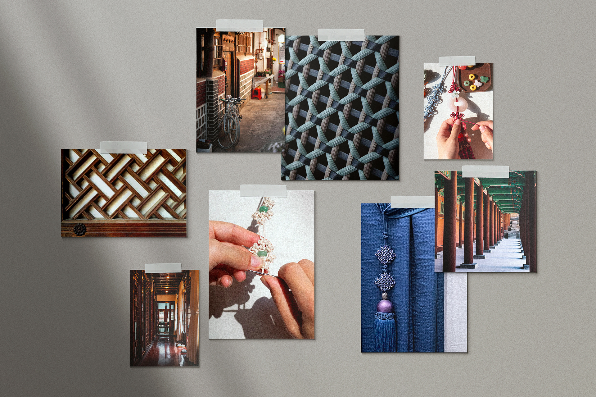
로움은 비주얼 아이덴티티 부분을 담당하여 오랫동안 문화와 역사, 비즈니스와 관광의 중심지였던 인사동의 장소성을 담아 한국적이면서도 현대적인 호텔의 이미지를 새로이 만들고자 했습니다. 현장 답사와 리서치를 통해 조선시대부터 근현대까지 여러 시대의 모습들이 뒤섞여 있는 인사동만의 매력을 찾고, 모던한 공간 디자인과 한국의 전통이 담긴 오브제들, 현대적인 BI가 결합되어 매력적인 우리 호텔만의 아이덴티티를 형성할 수 있도록 기획했습니다.
We designed the visual identity to be both Korean and contemporary, capturing the sense of place of Insadong, which has long been a center of culture, history, business, and tourism. Through a series of field trips and research, we found Insadong's unique charm in its blend of features from different eras of Korea, from the Joseon Dynasty to the present day. Inspired by this mixture, we planned to combine modern space design with traditional objects and modern BI to establish a distinctive identity for our hotel.

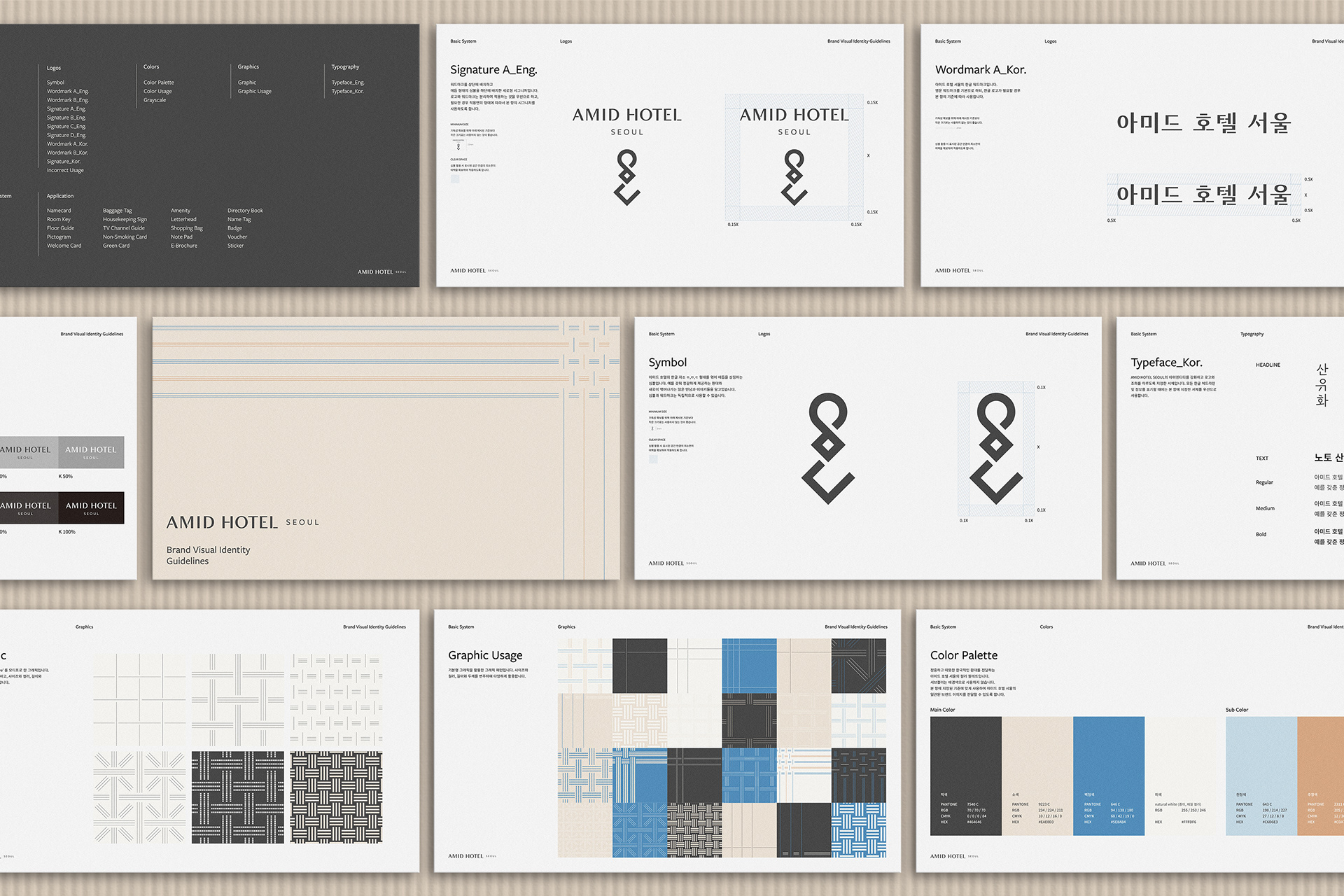
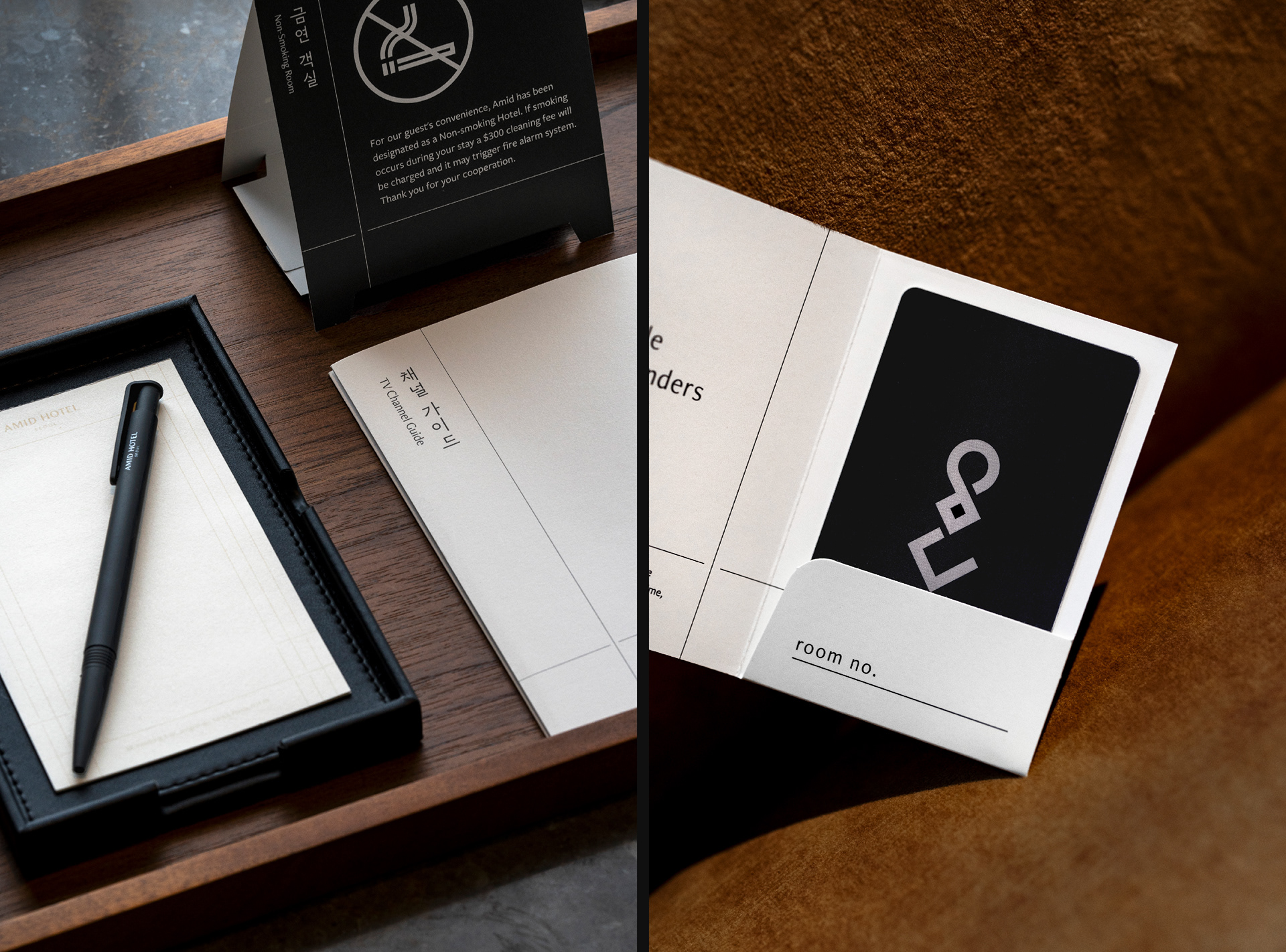
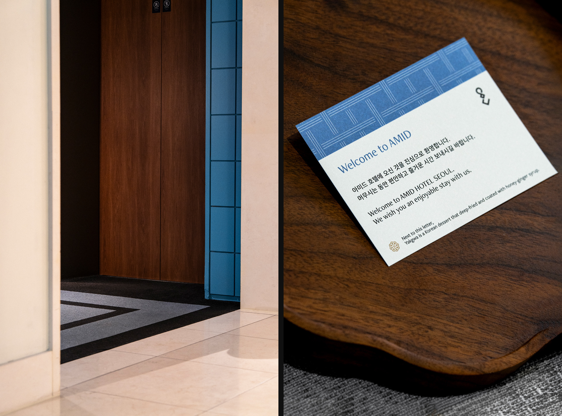
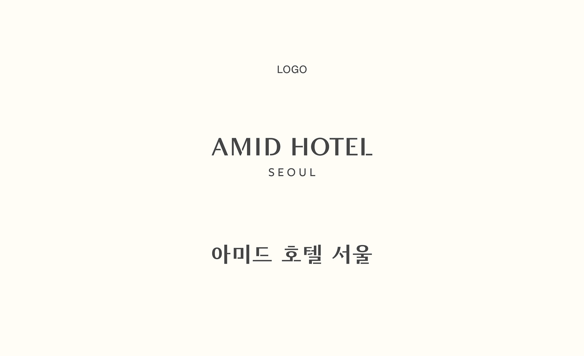
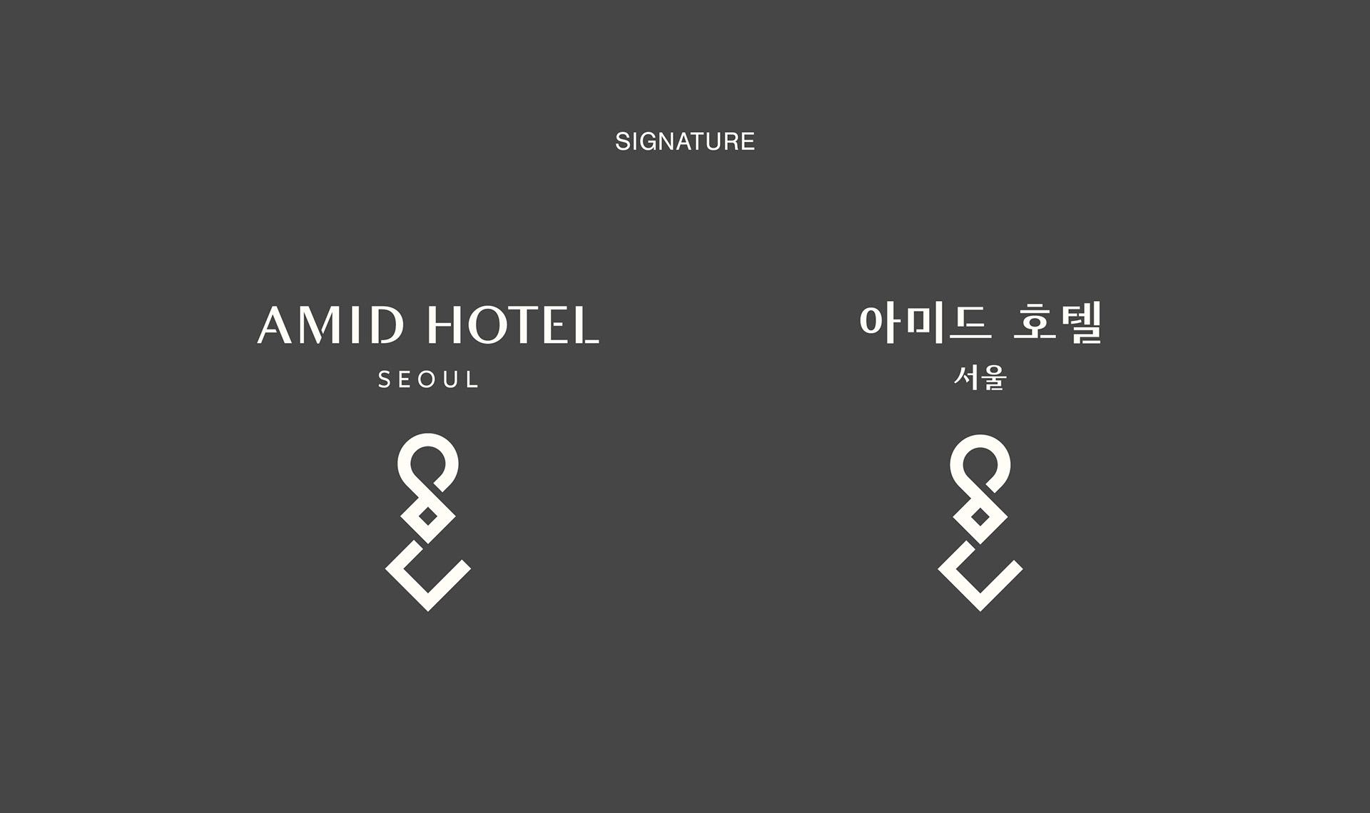
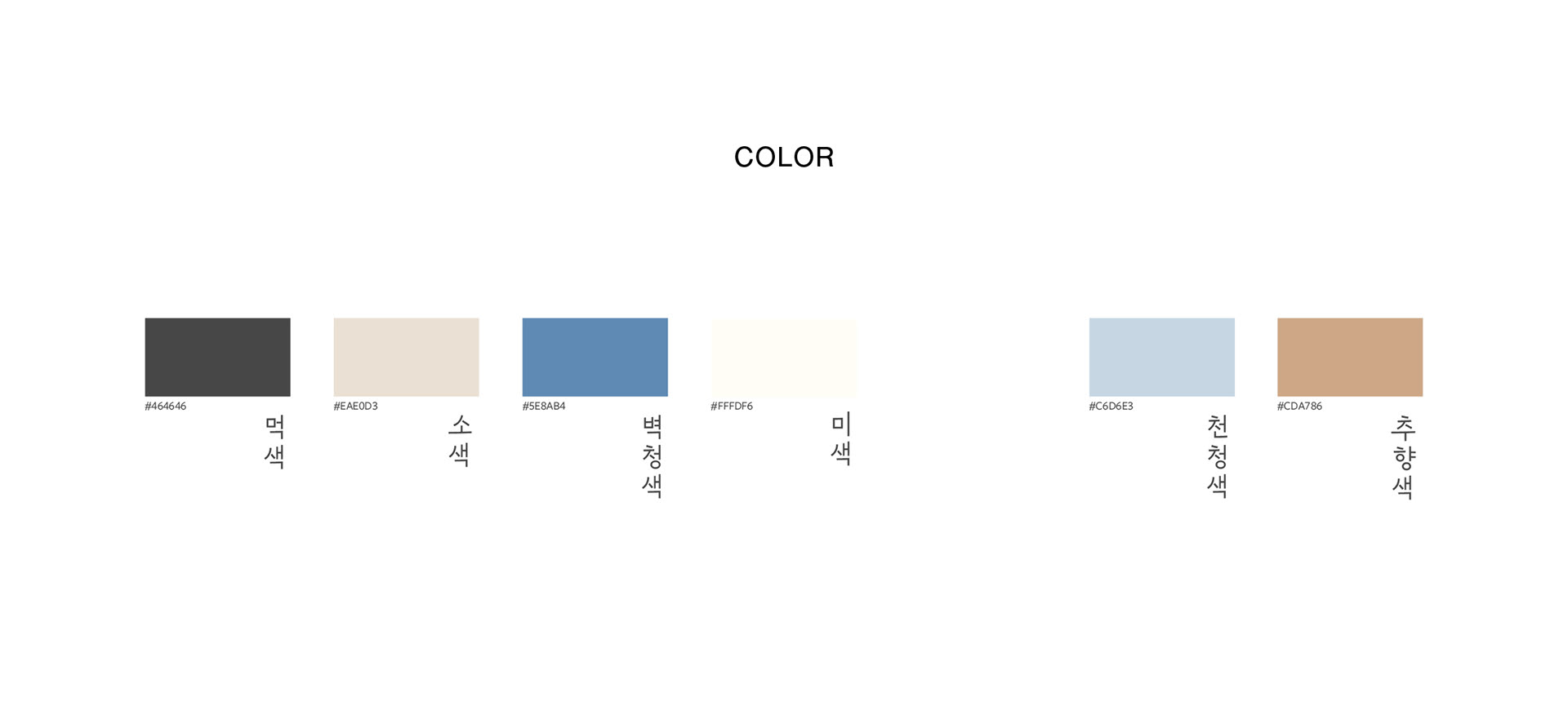
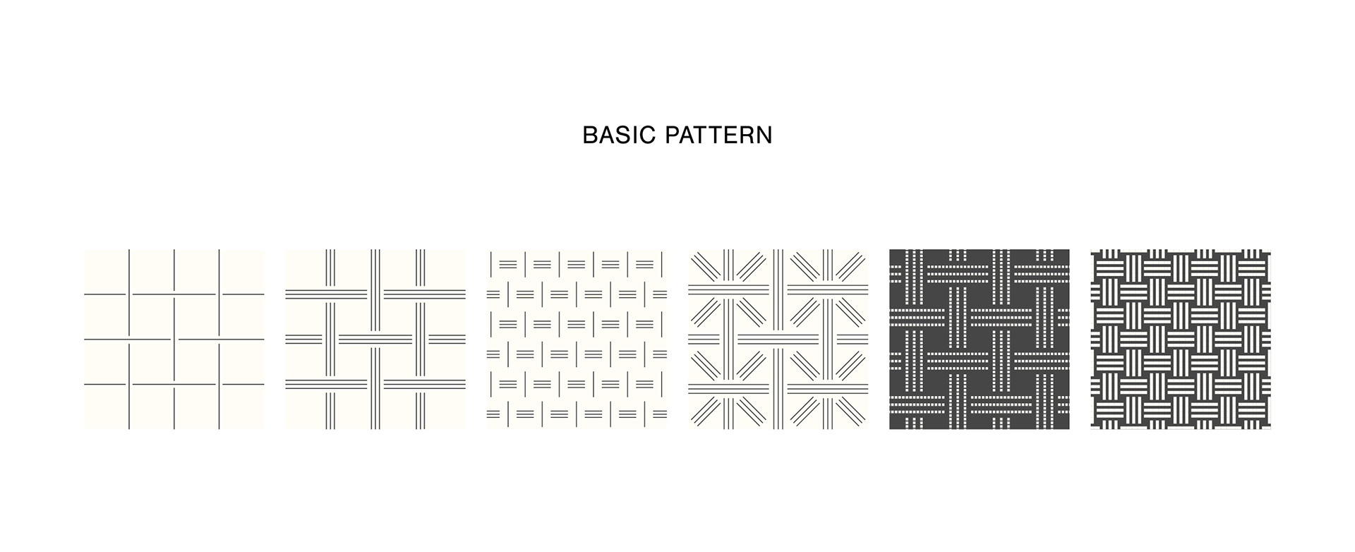
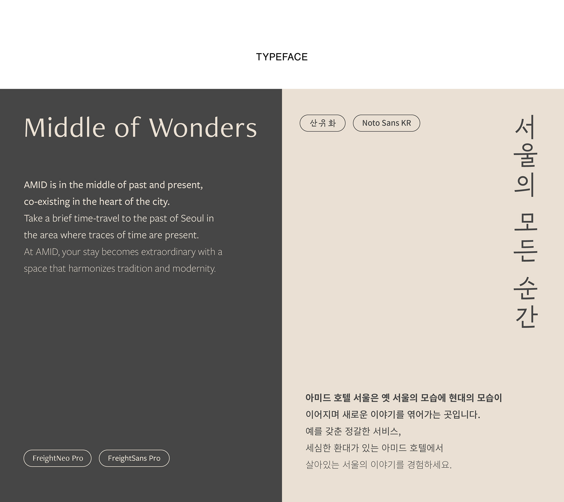
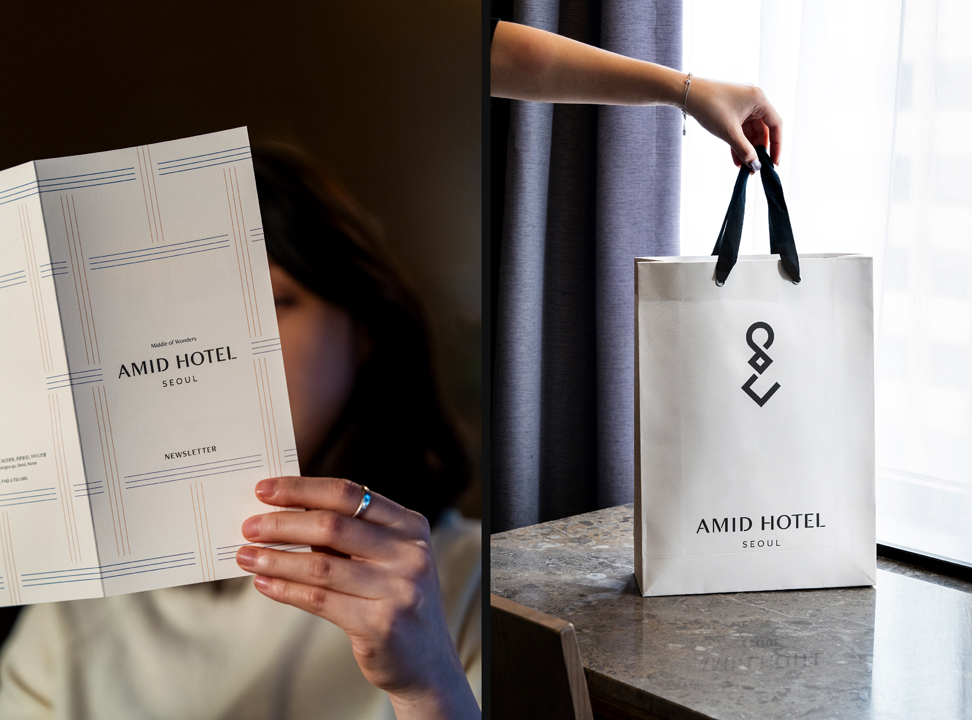
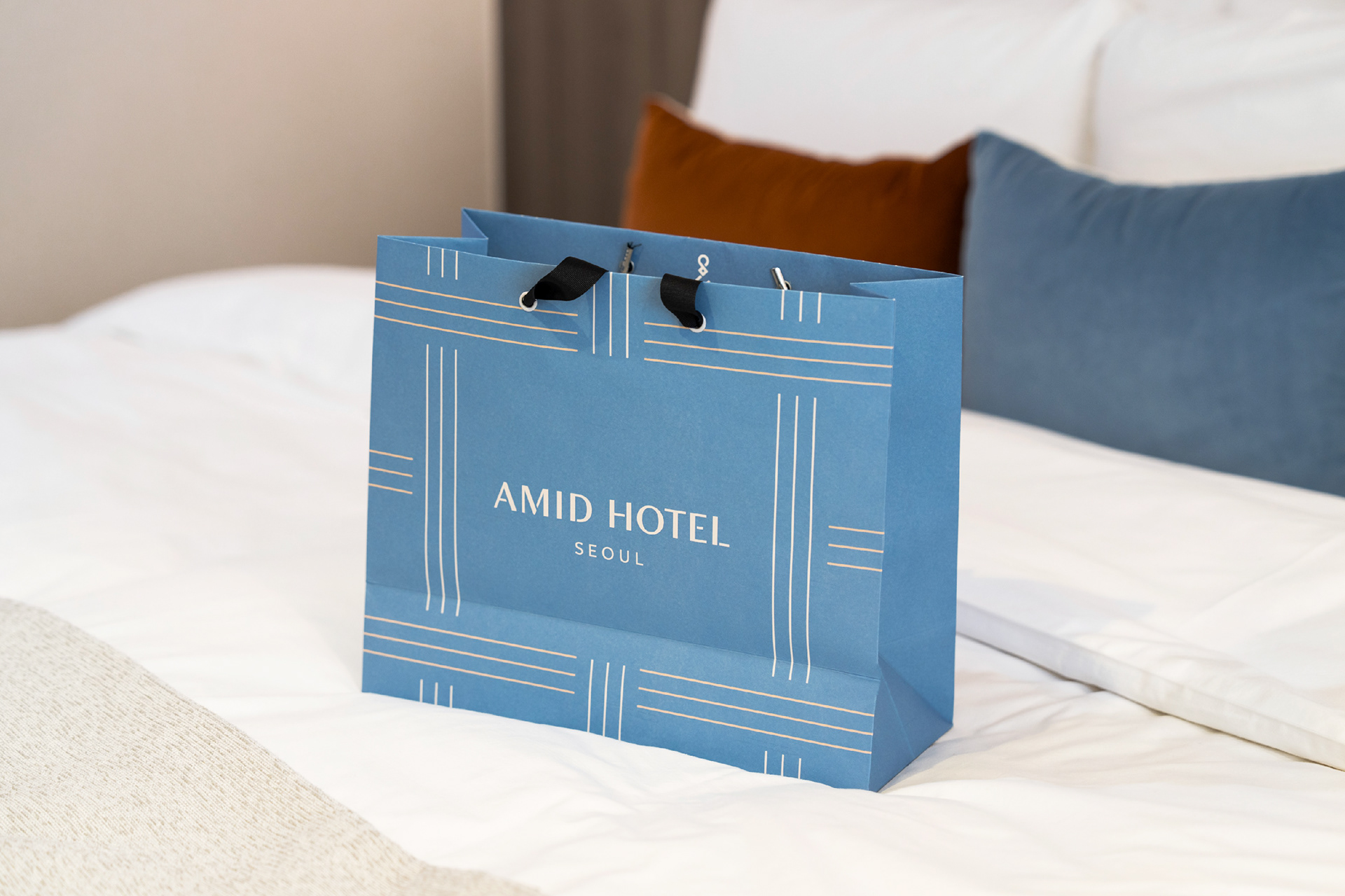
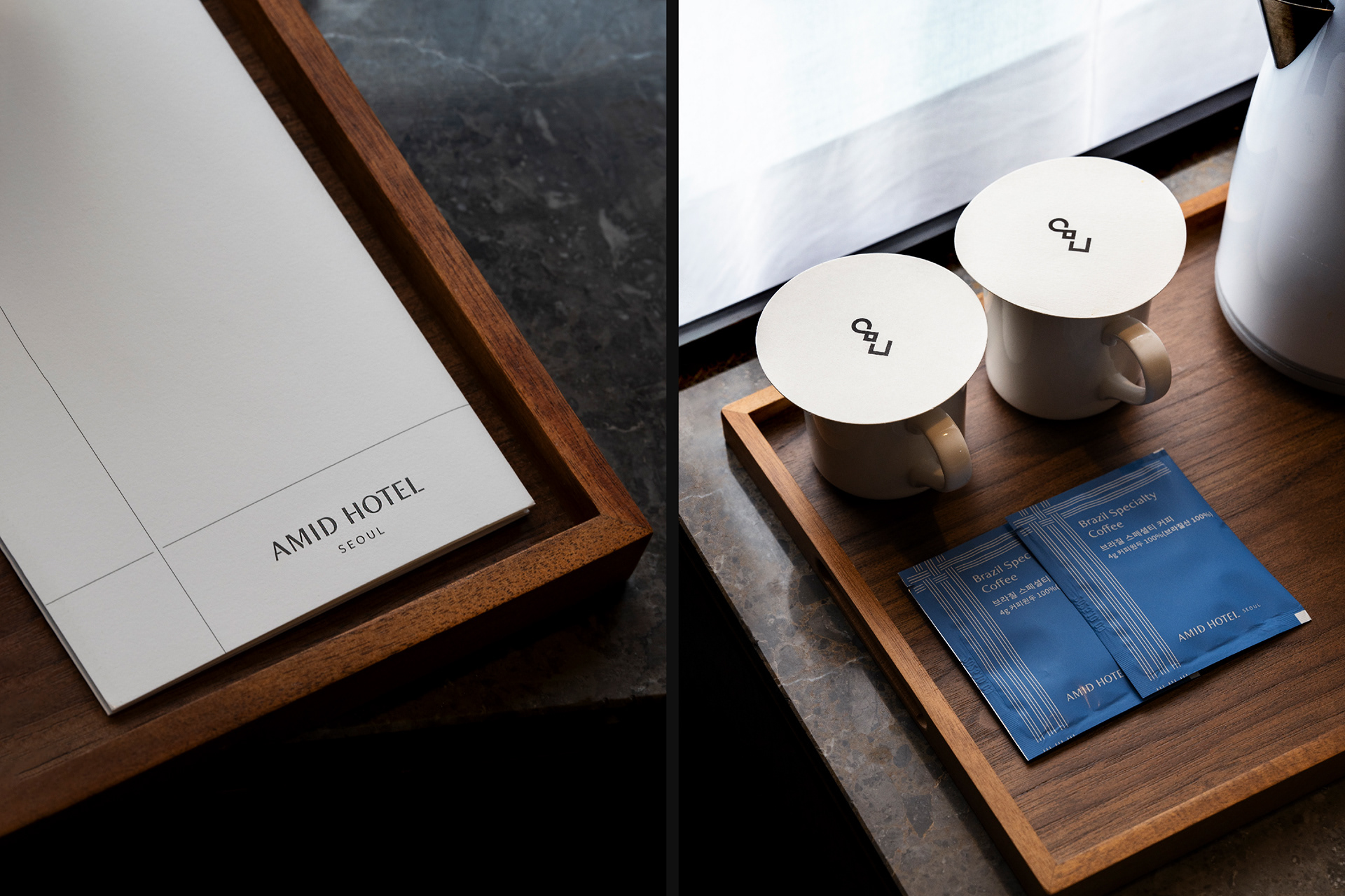
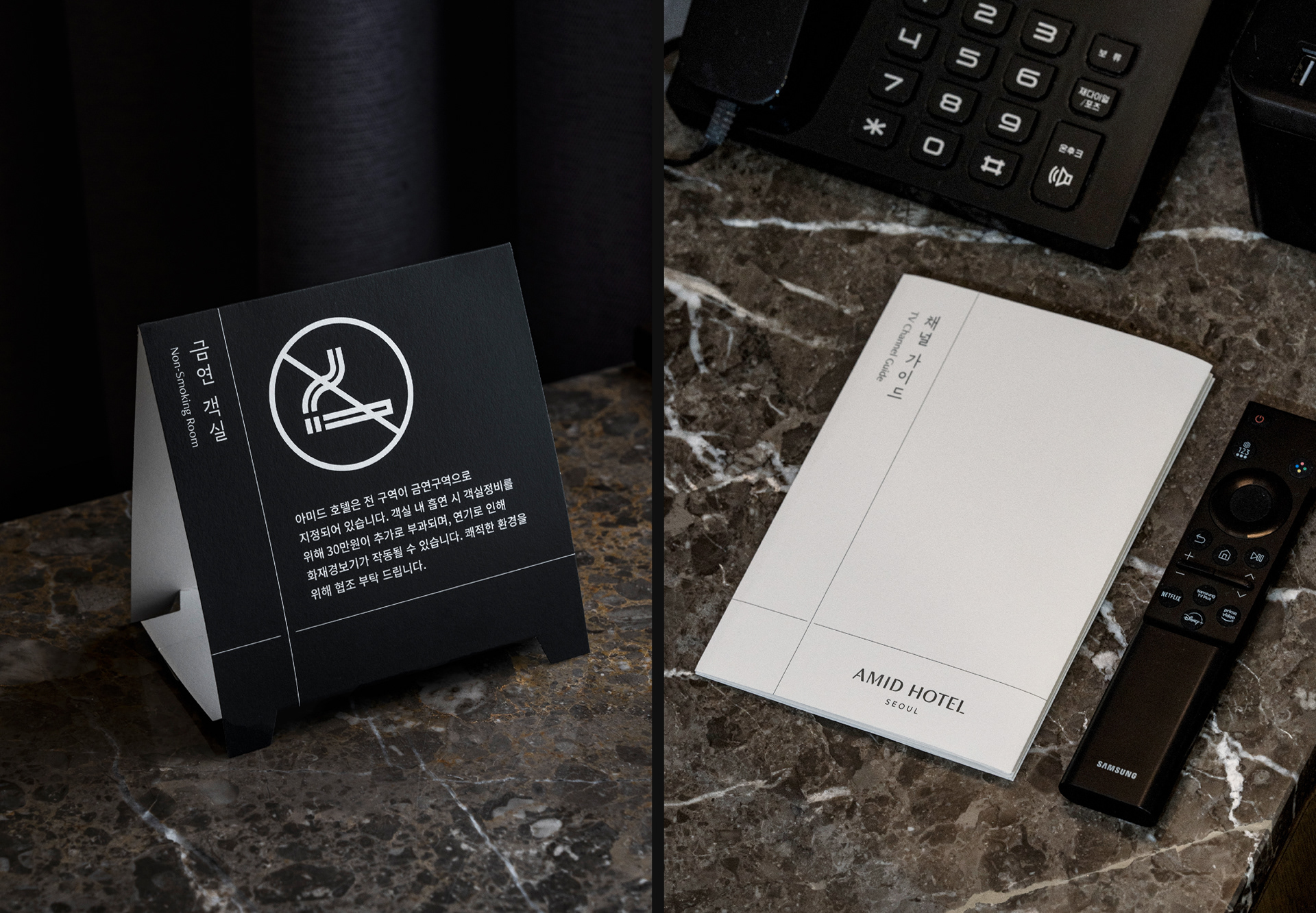
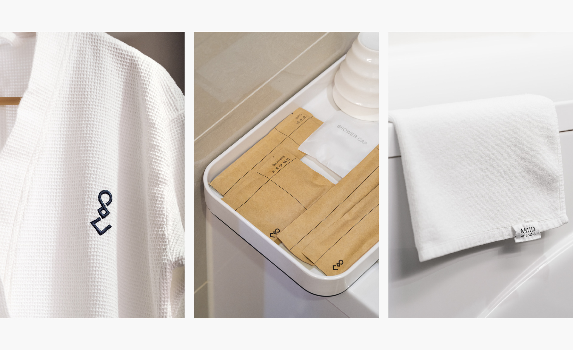
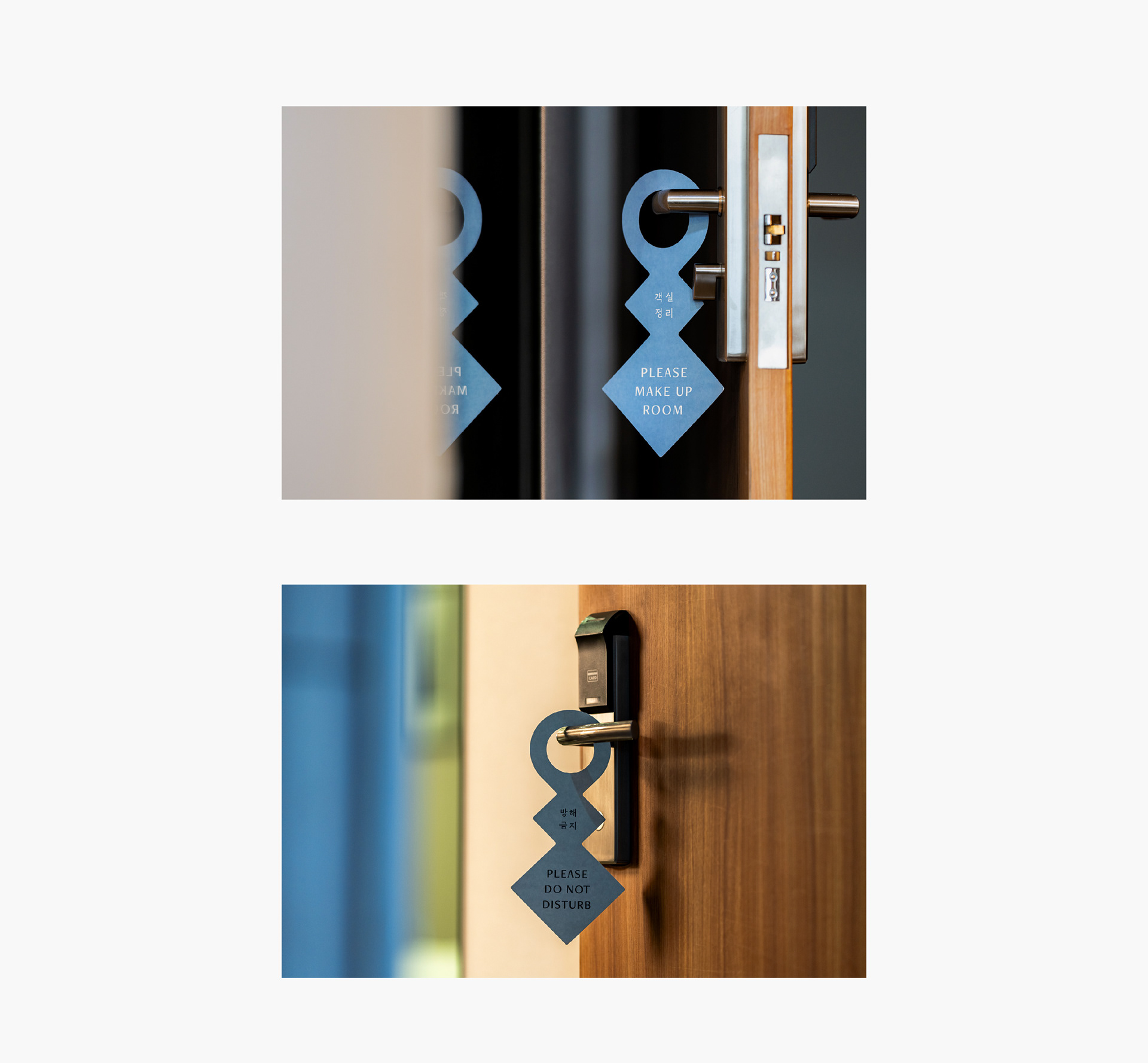
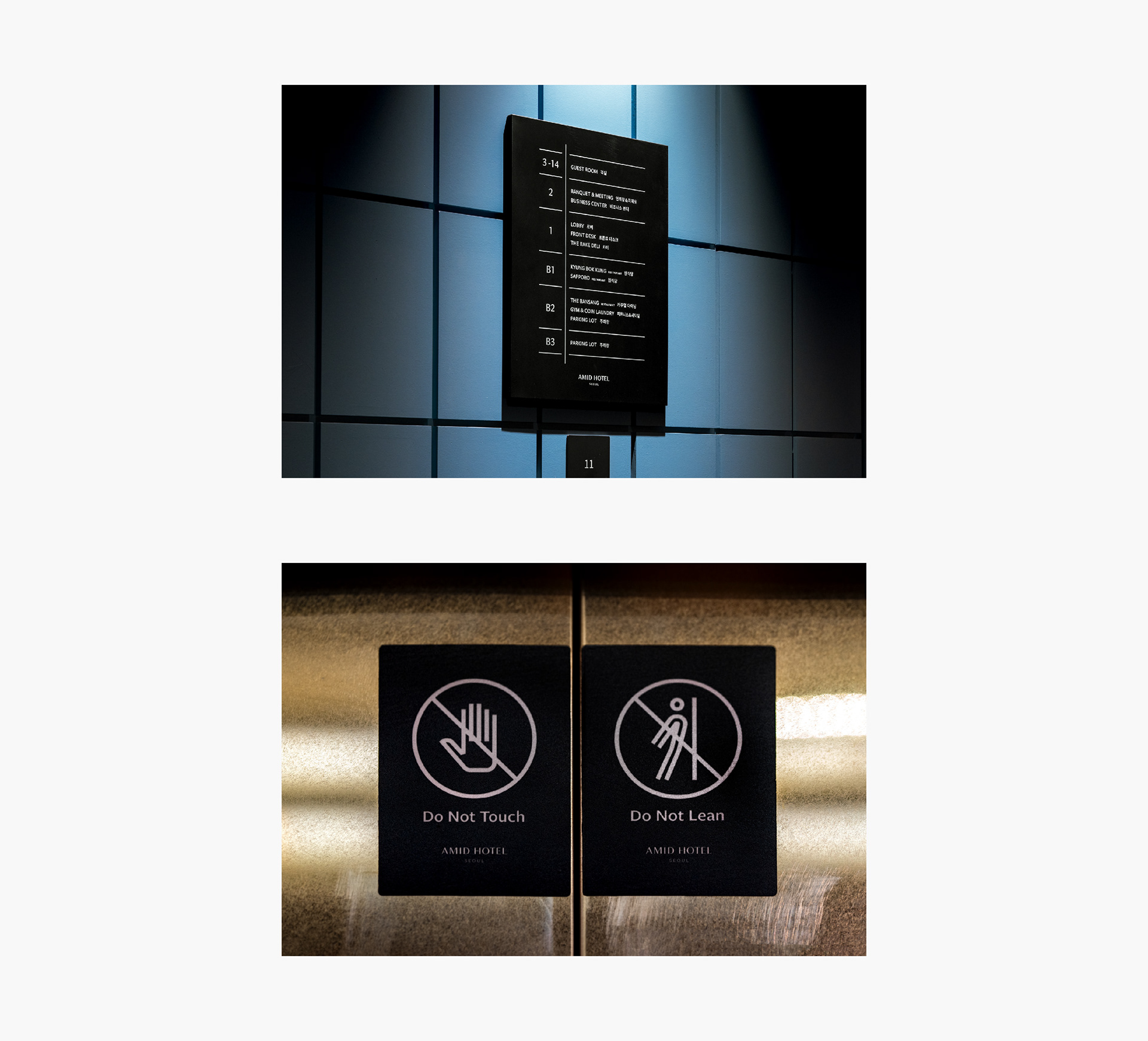
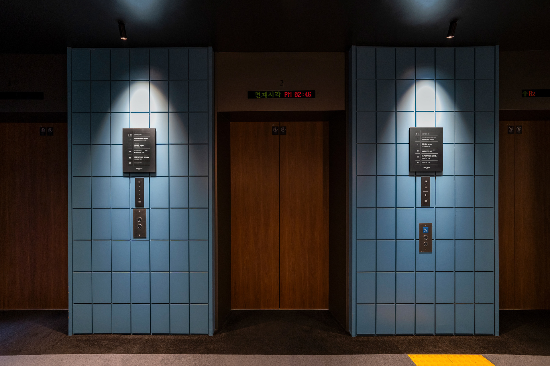
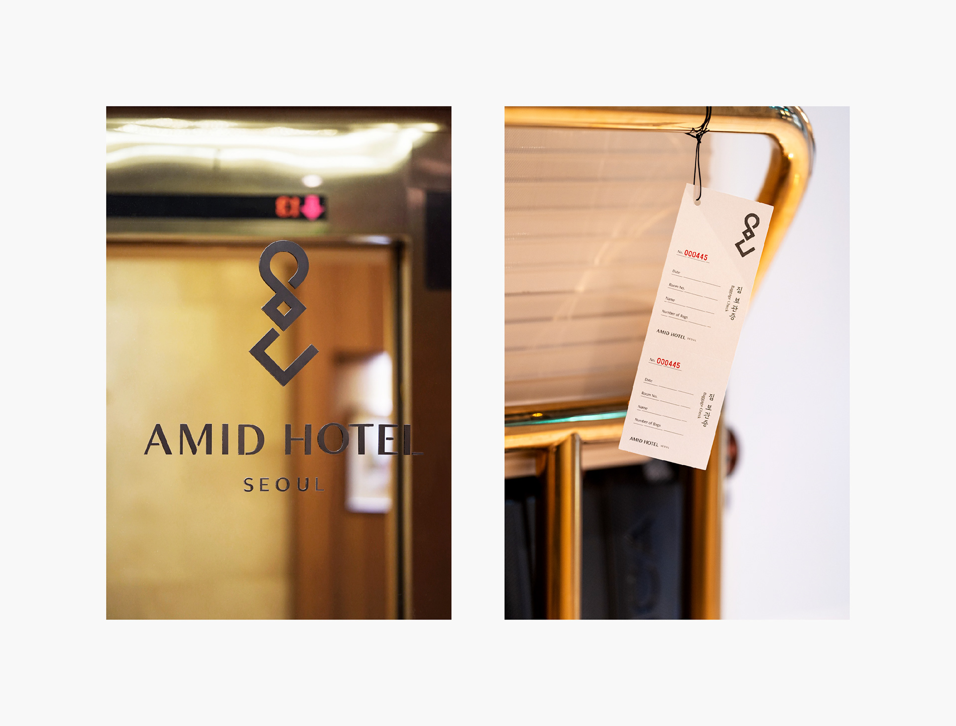
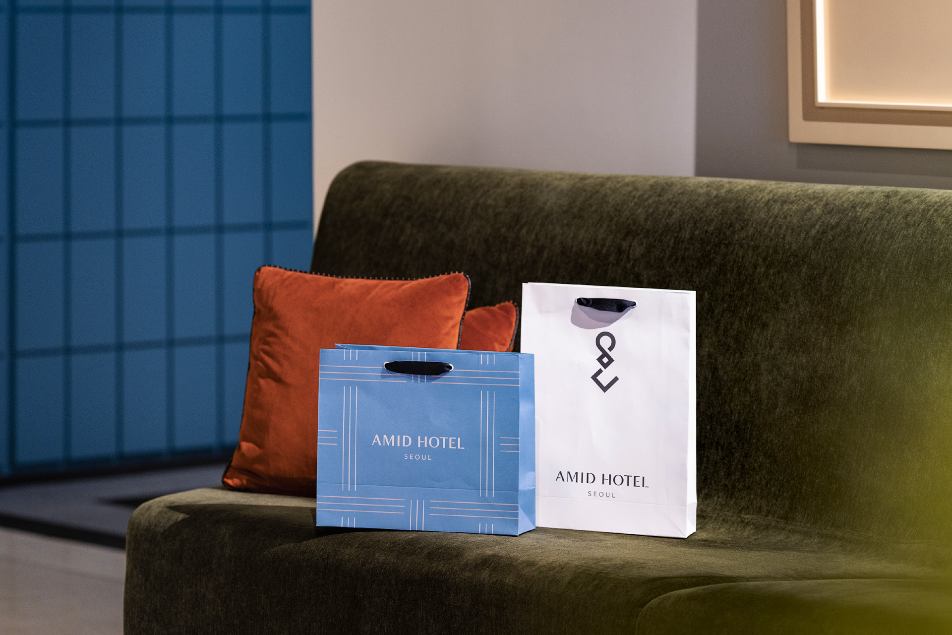
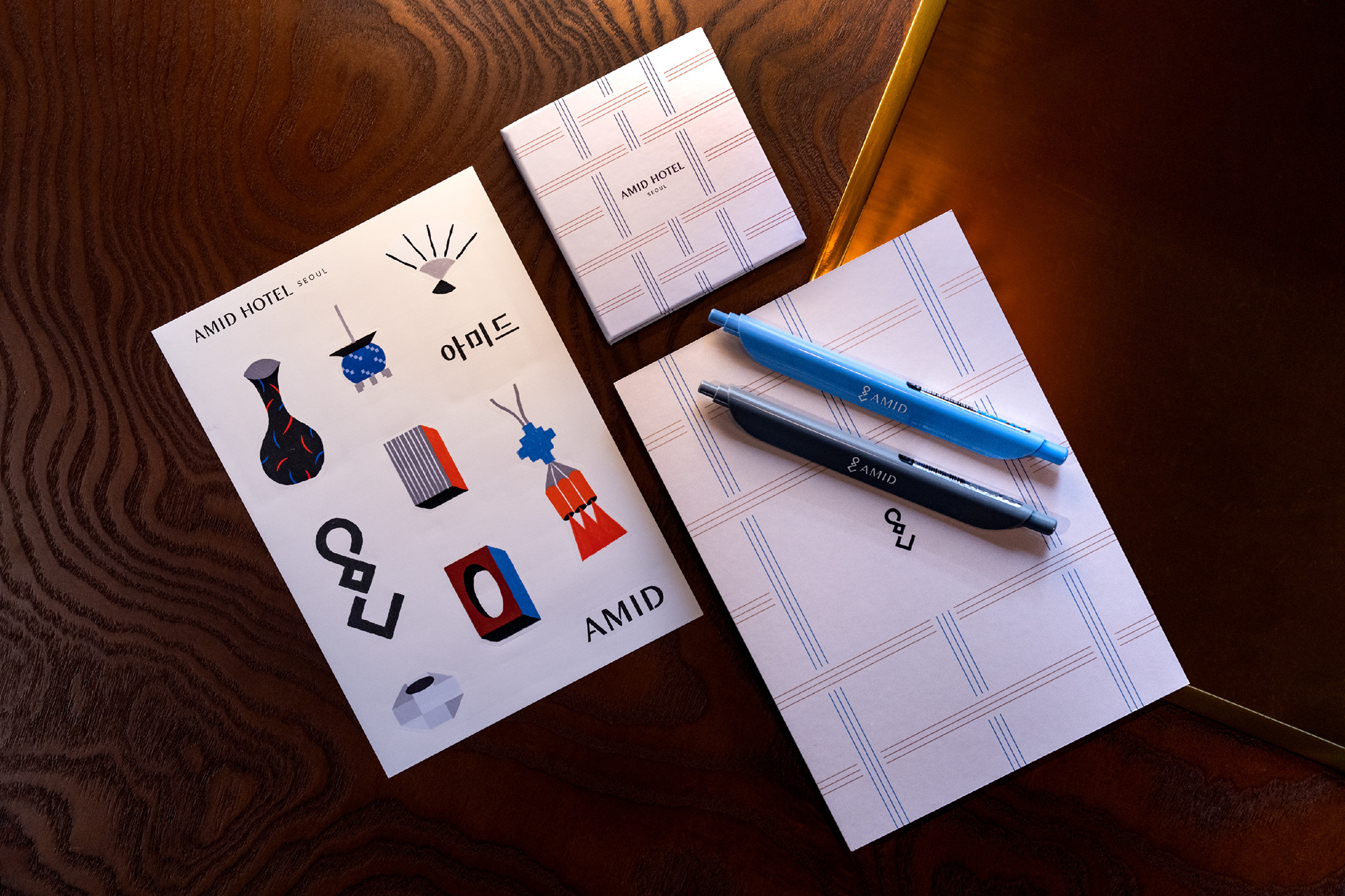
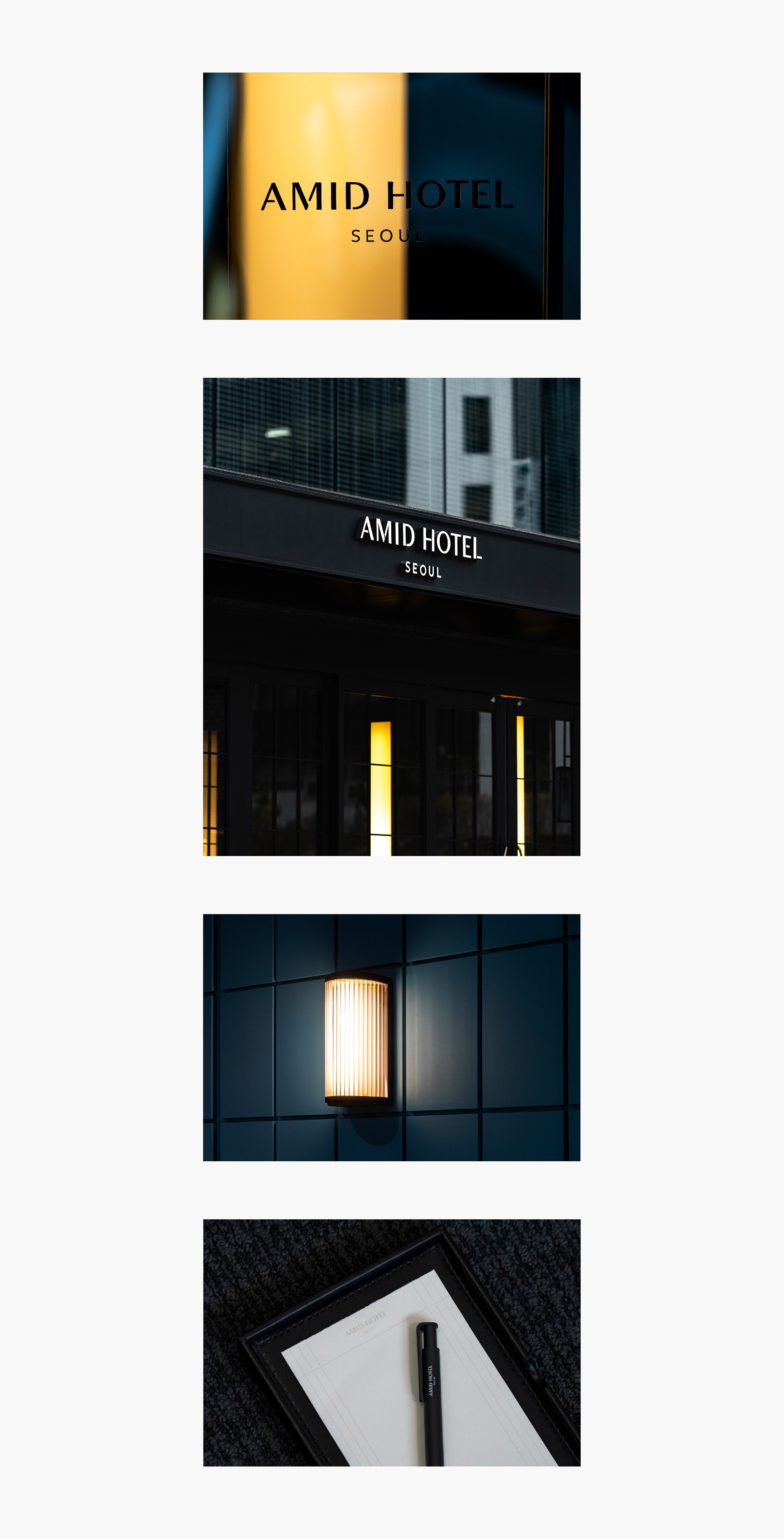
엮임과 짜임을 모티프로 하여 ‘옛 서울의 이야기들에 새로운 이야기들을 이어 엮어가는 곳’을 표현했습니다. 예를 갖춰 준비하는 정갈한 환대를 상징하는 매듭과 아미드의 한글 자소 형태를 결합한 심볼, 엮이는 형태를 포인트로 한 워드마크, 엮임과 근현대 건축양식의 특징을 결합한 그래픽 패턴을 개발했습니다. 먹색, 소색, 벽청색, 미색의 차분하고 한국적인 컬러가 공간과 어우러지며 정중하고 따뜻한 환대의 이미지를 전달합니다.
The motifs of ‘Intertwine’ and ‘Weave’ symbolize connecting the old and new stories of Seoul. The symbol mark incorporates a knot, which means an unwavering commitment to great hospitality, and Hangeul consonants of ‘Amid’. With inspirations from woven forms and modern architectural style, the wordmark and graphic patterns harmonize with the space. Also, the traditional serene colors (ink, cream, beige, azure-blue) give off an image of polite and warm hospitality.


2023
studio roam
studio roam