
ALOT Brand Identity & Applications
어랏 브랜드 아이덴티티 & 어플리케이션
Client: Enterprise Blockchain
Crew: Soop Kim, Saerom Park
Scope: Brand Visual Identity, Application design
Studio roam|2022
Crew: Soop Kim, Saerom Park
Scope: Brand Visual Identity, Application design
Studio roam|2022
https://www.alot.community/

‘어랏’은 한화의 자회사 엔터프라이즈블록체인이 긱 워커를 위한 플랫폼 ‘요긱’에 이어 두 번째로 런칭한 크리에이터와 팬을 위한 서비스입니다. 어랏은 NFT CV기술을 바탕으로 크리에이터의 재능을 자산화하고 더 많은 팬들과 크리에이터들이 서로를 발견하고 소통하며 함께 성장할 수 있는 커뮤니티입니다.
ALOT is a service for creators and fans launched by Hanwha's subsidiary Enterprise Blockchain following the success of YOGIG, a gig worker marketplace. ALOT leverages NFT CV technology to encourage creators to maximize their talents. The platform provides a vibrant community where creators and fans can connect, communicate, and grow together.
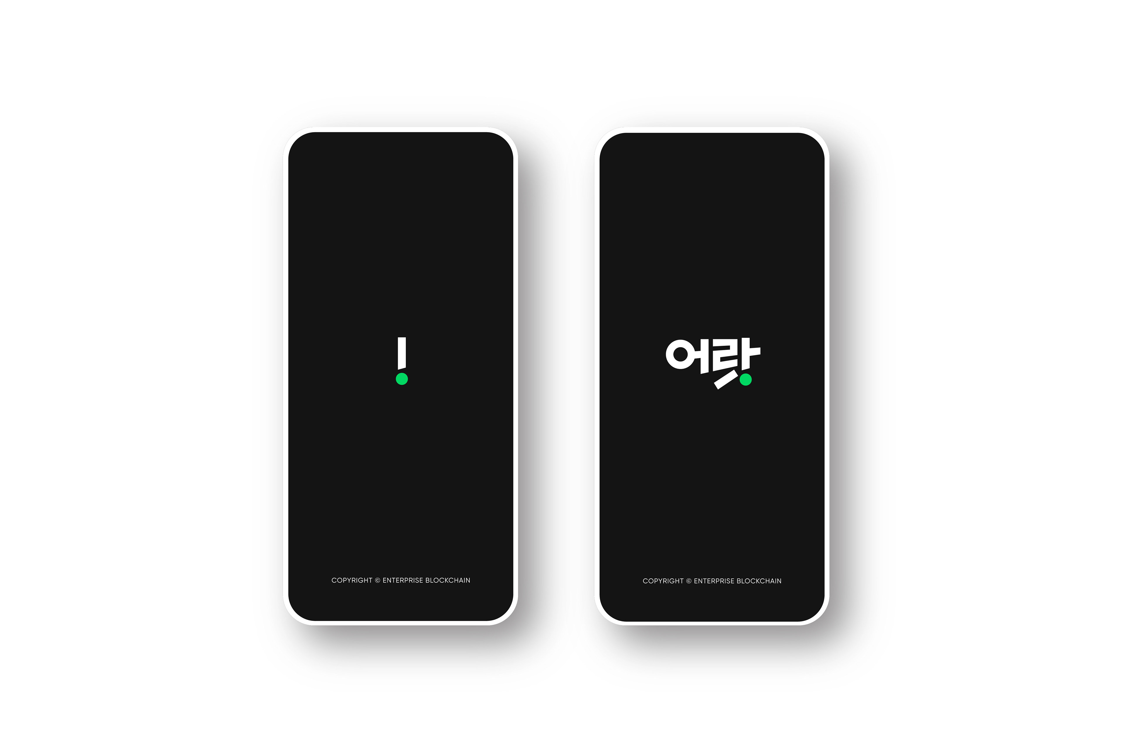


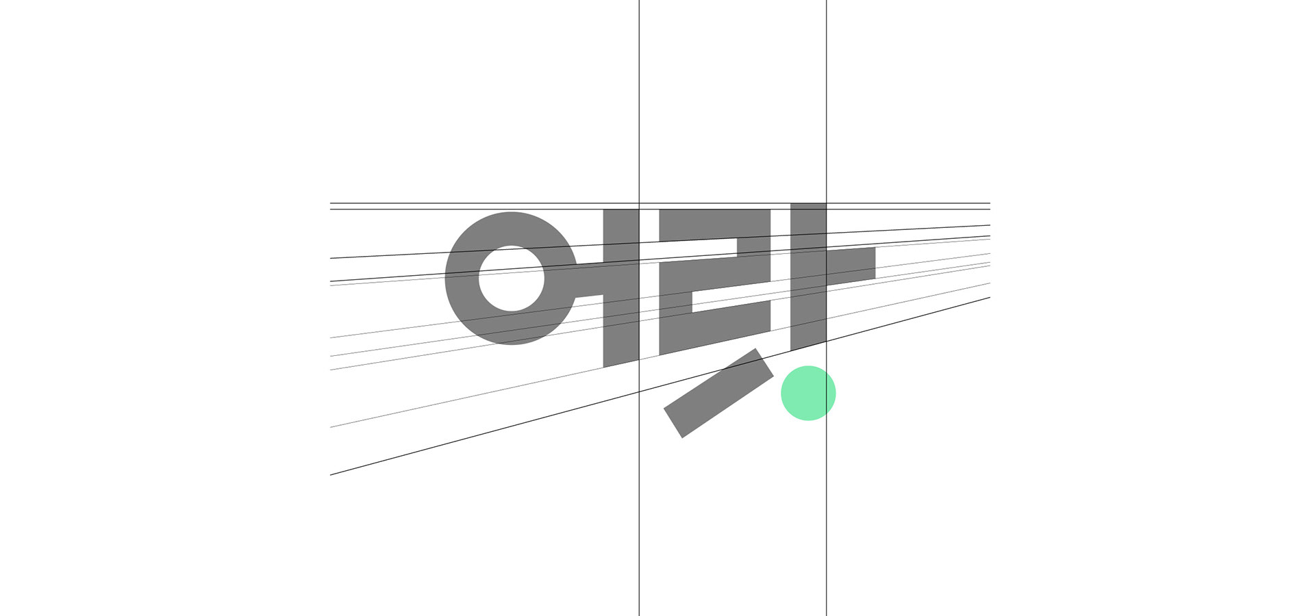
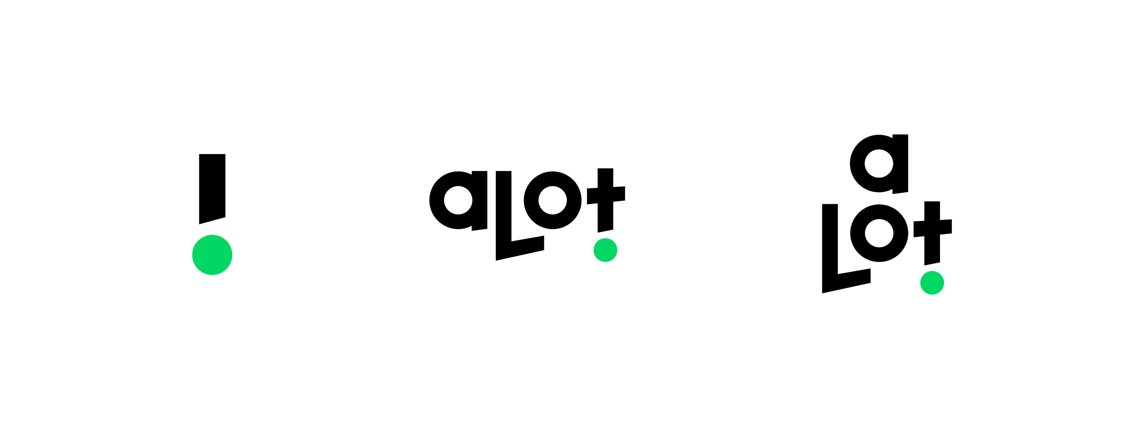

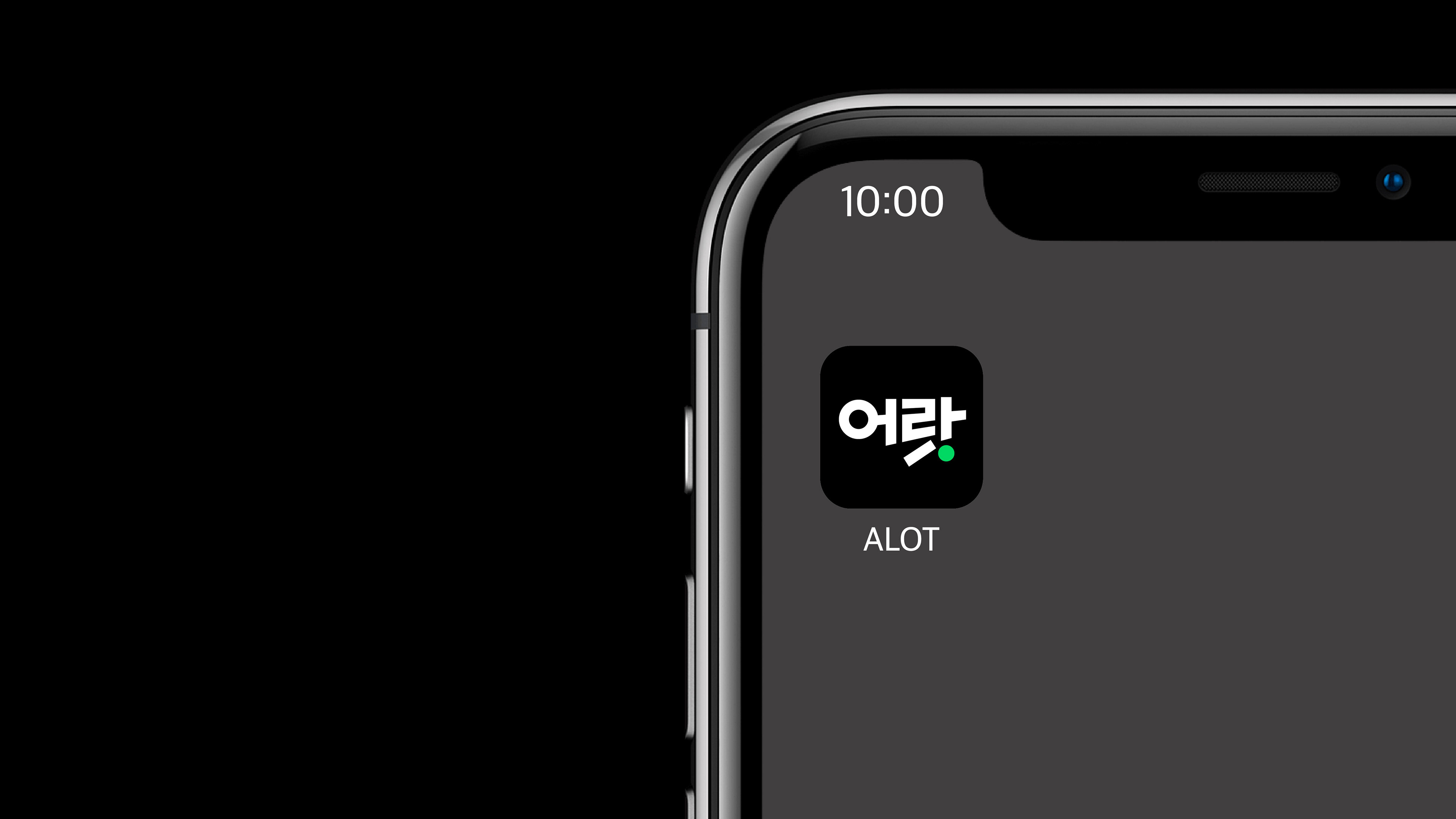
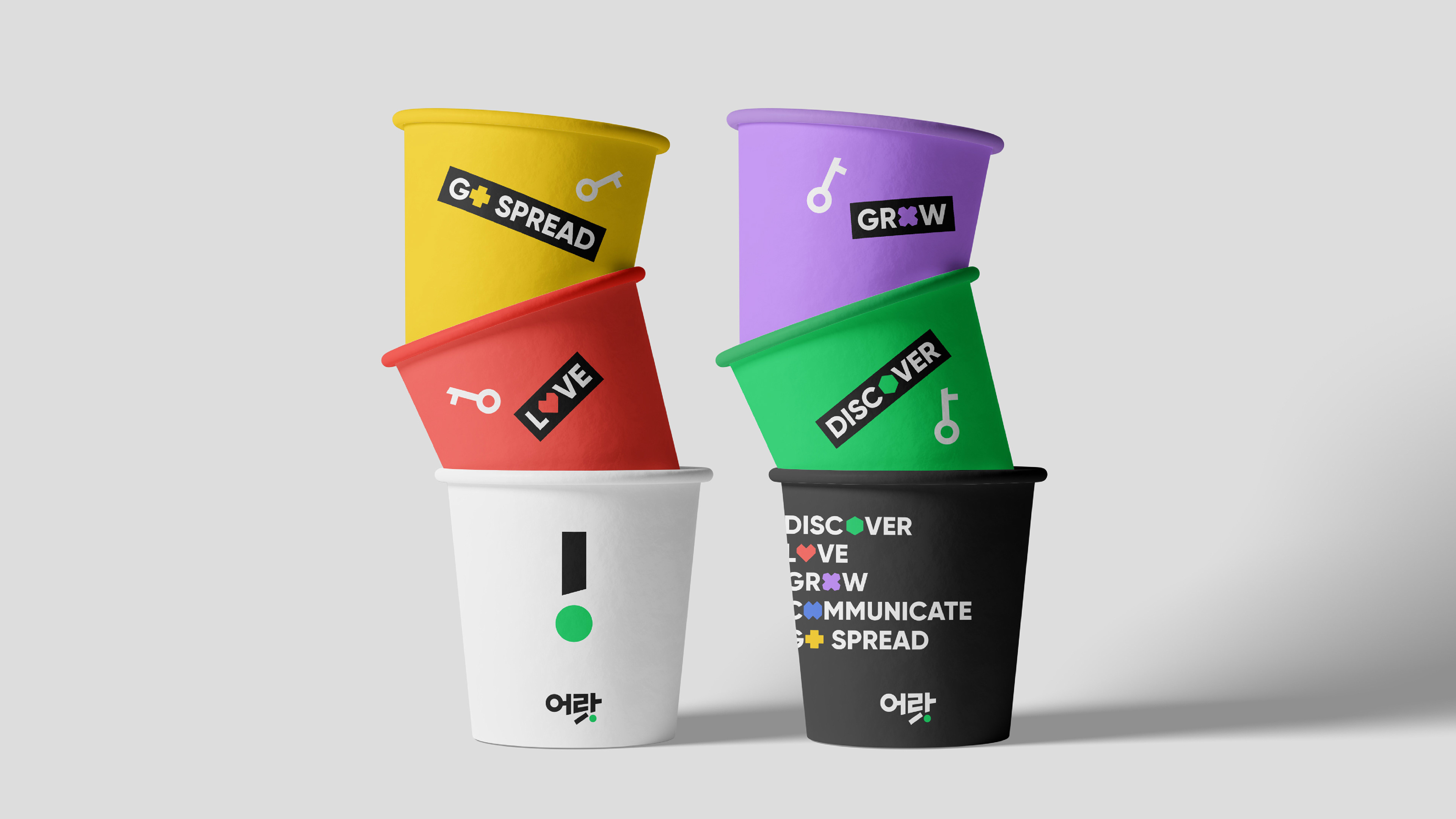
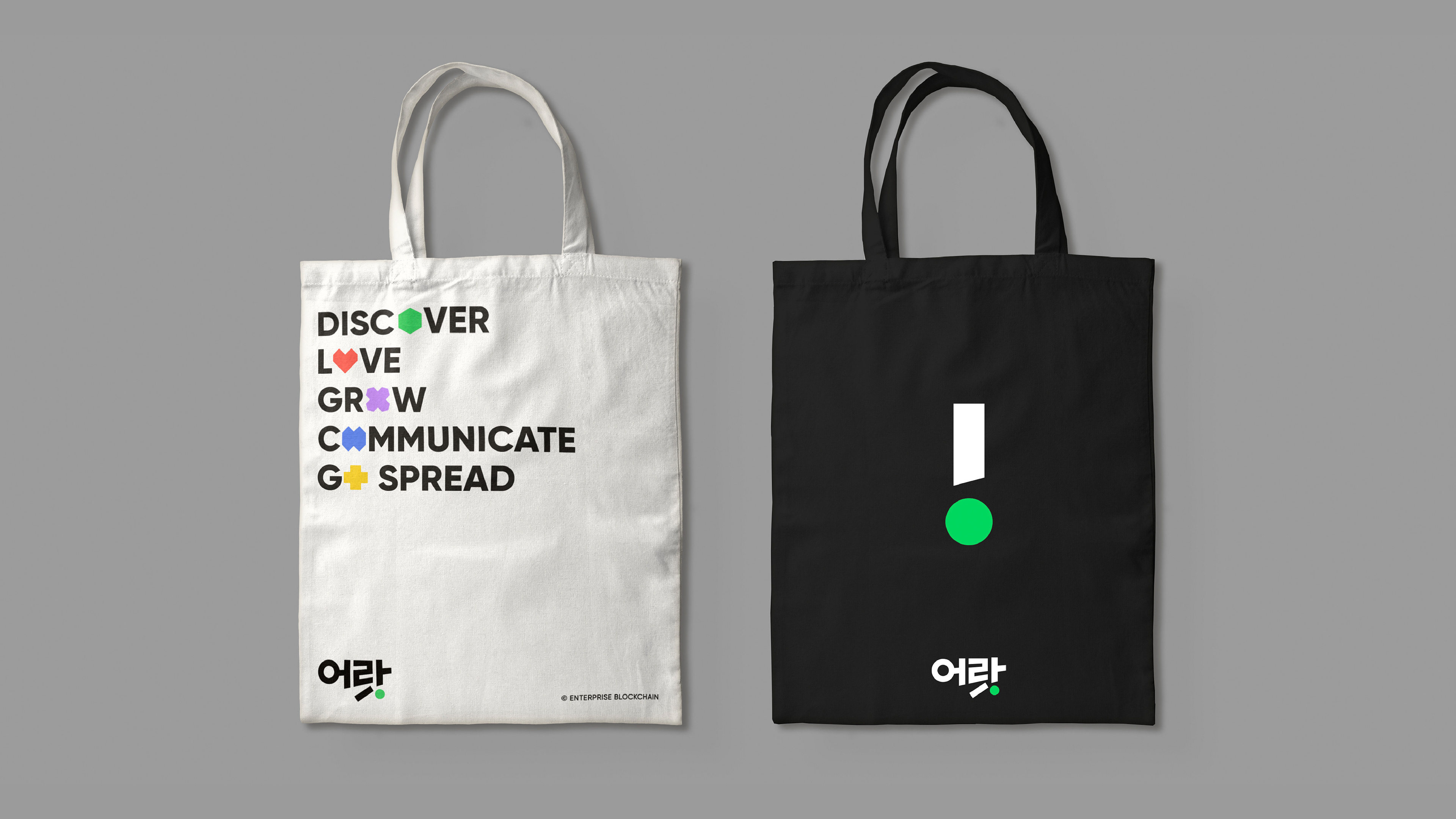
‘어랏!: 놀라는 감탄사’, ‘A lot!: 많은’ 의 중의적인 의미를 담은 서비스명은 보다 많은 크리에이터와 팬들이 서로를 발견하고, 연결하고, 성장하며 느끼는 즐거움을 담고 있습니다. 서비스 가치를 시각적으로 전달하기 위해 운동감 있는 형태의 한글과 느낌표 포인트를 결합한 워드마크를 만들었습니다. 짧고 임팩트 있는 한글 브랜드를 통해 새로운 서비스를 쉽게 각인시키며 커뮤니케이션하고 있습니다.
The name of the service has a dual meaning. It can represent the Korean exclamation of surprise and the phrase “A lot: Many,” indicating the abundance of engaging experiences that the service offers creators and fans alike. We designed the logotype to visually convey service value, combining sportive Hangeul and an exclamation point.
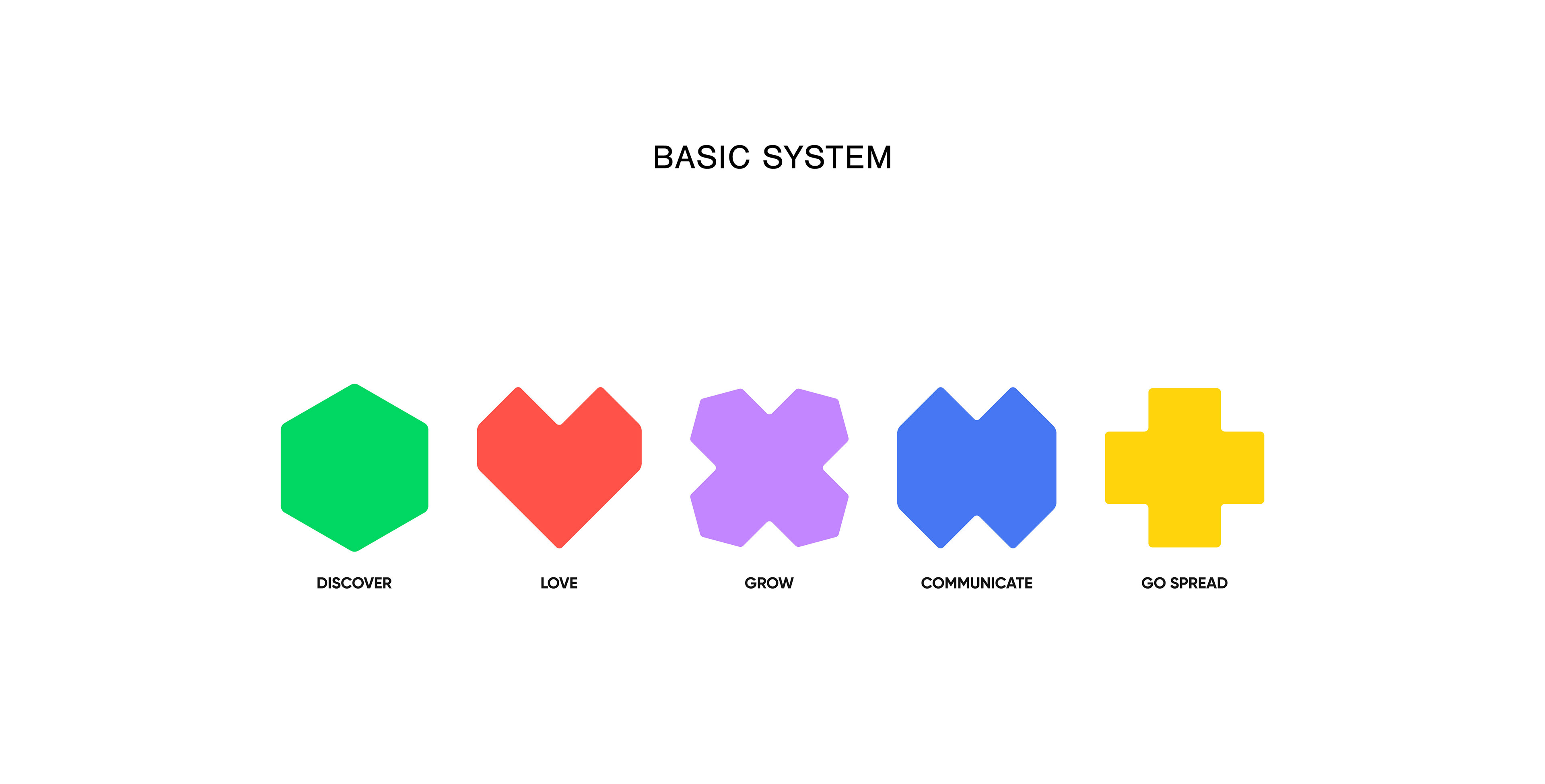
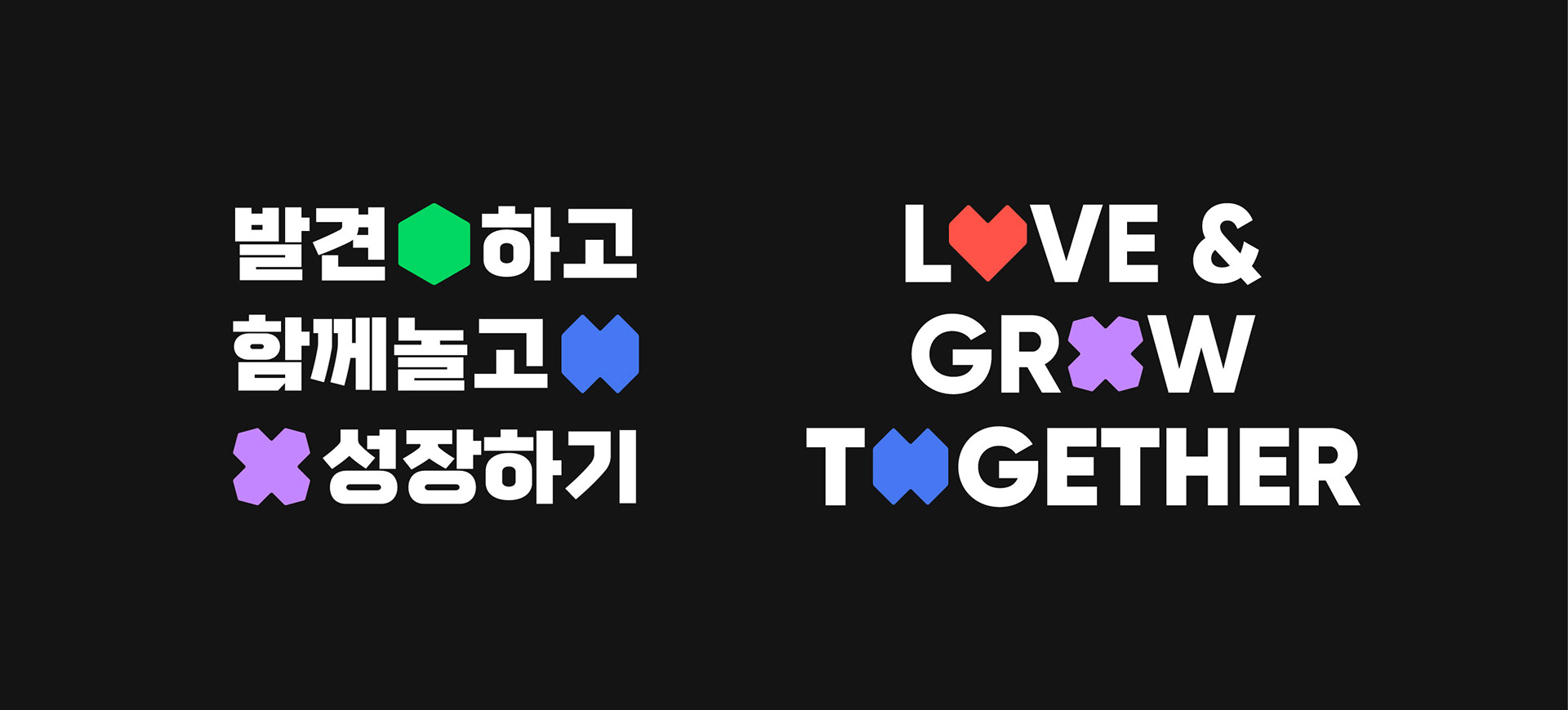


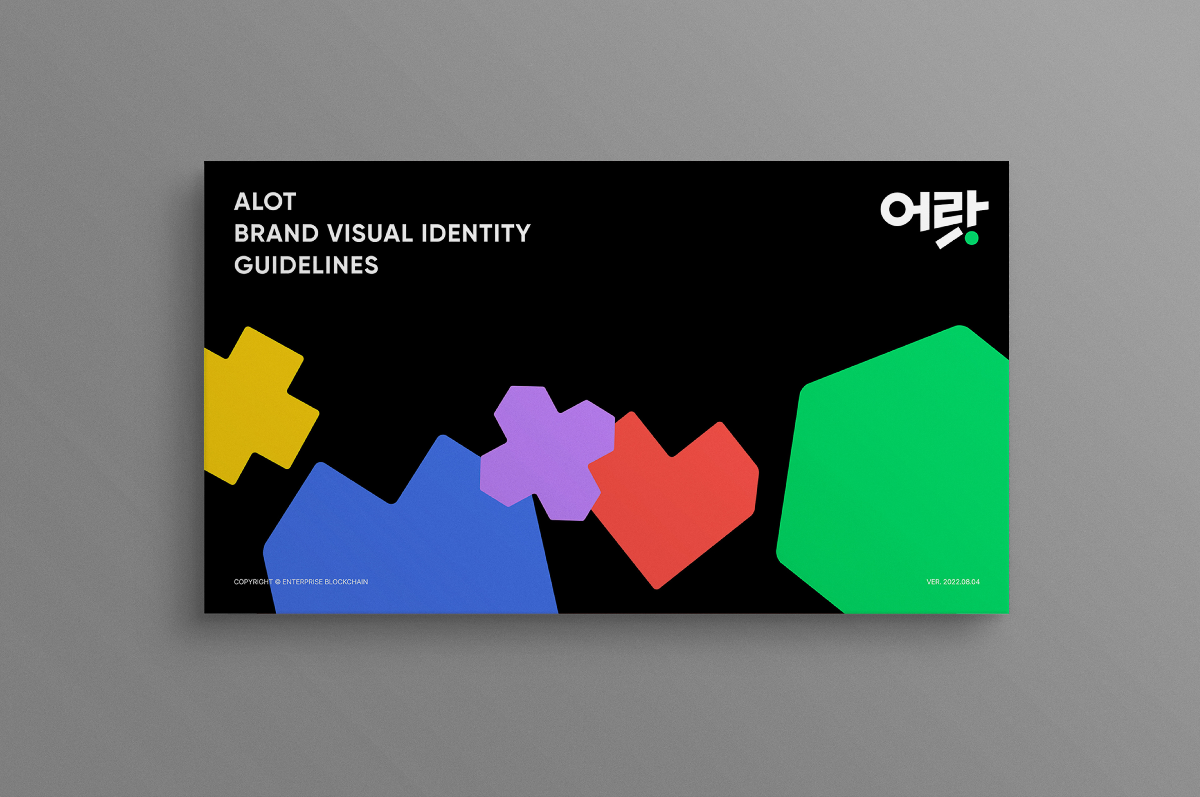
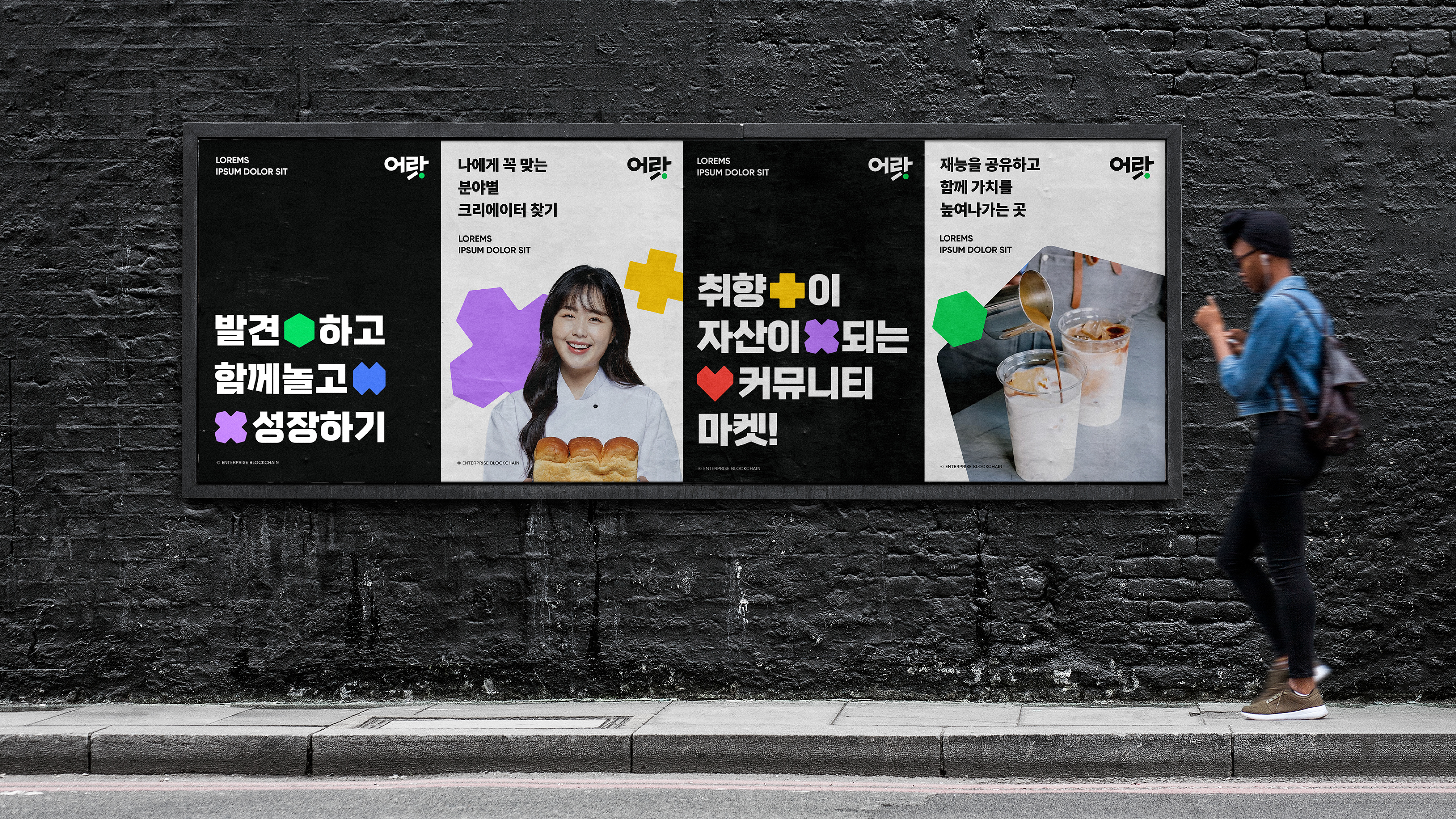
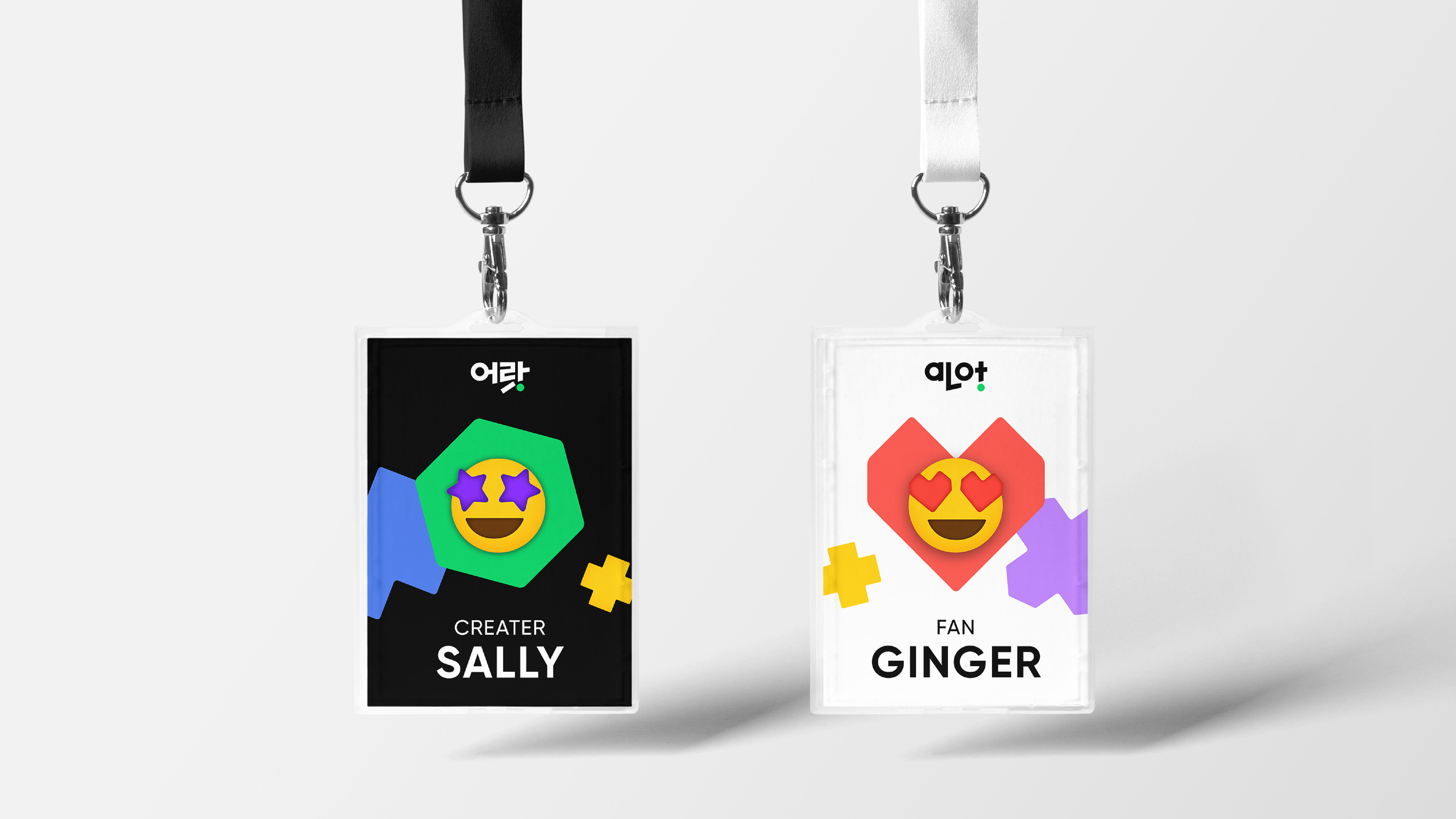
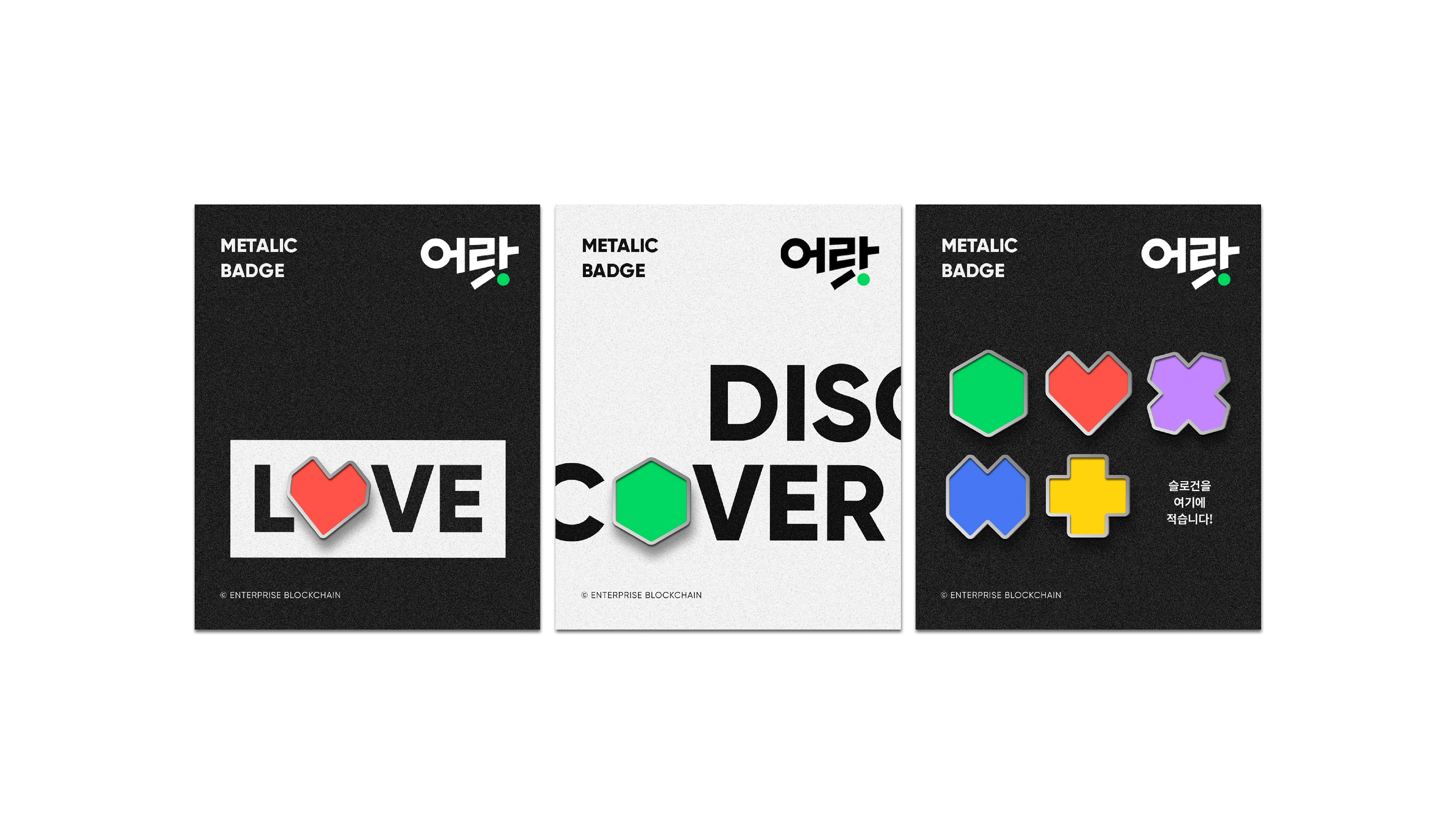
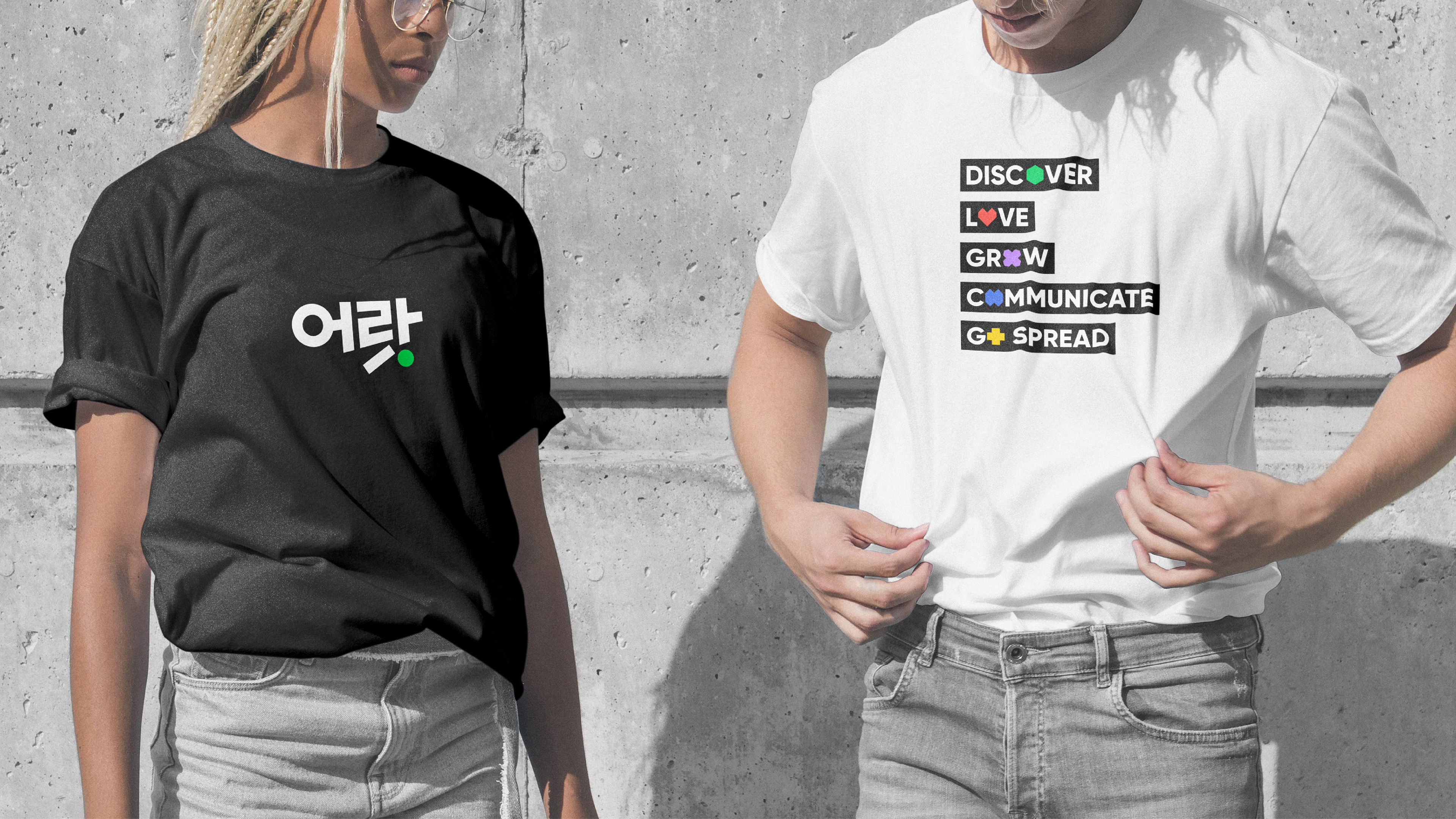
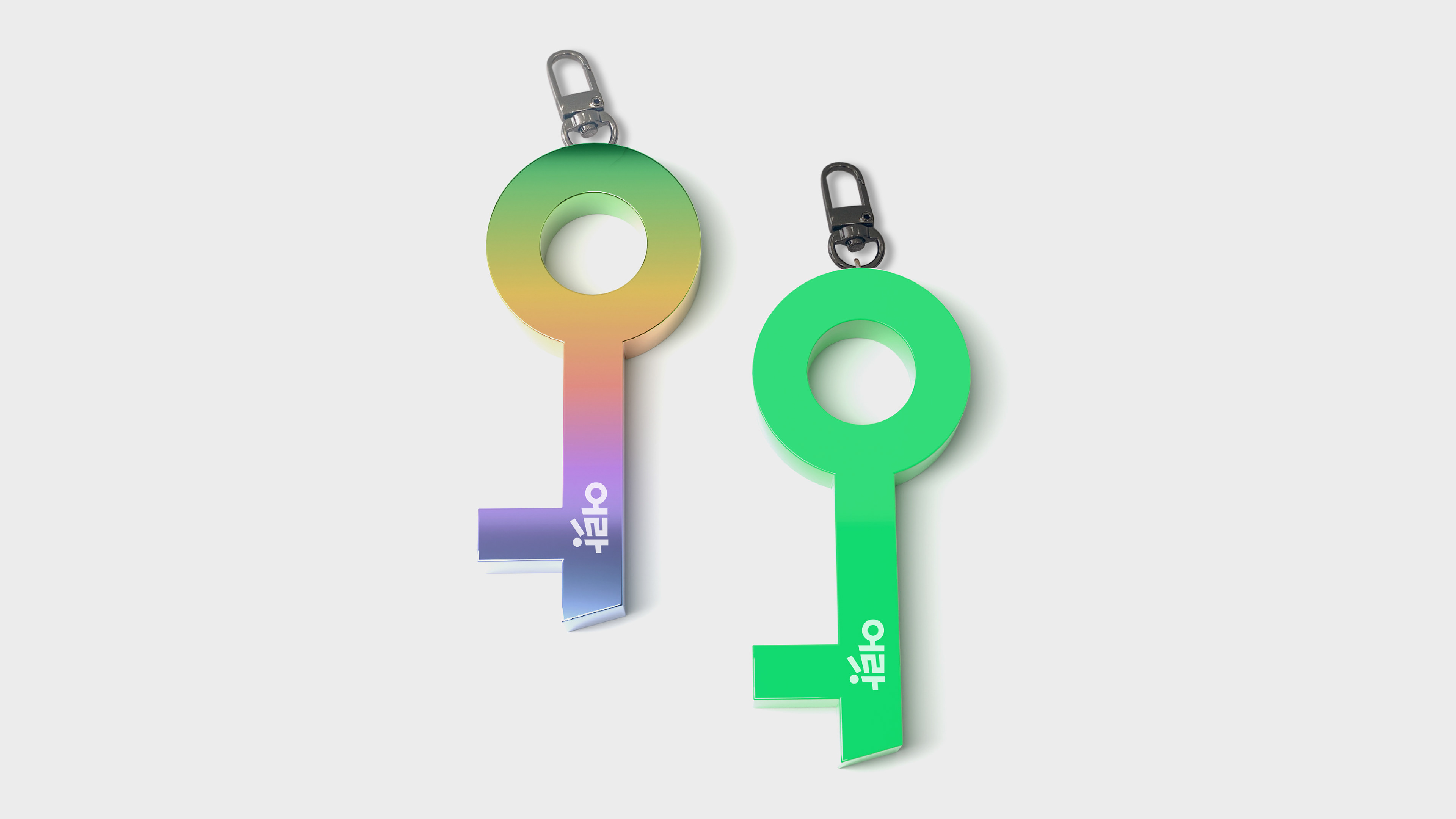
발견하고, 좋아하고, 성장하고, 소통하고, 확산시키는 어랏의 서비스 경험을 은유하는 컬러풀한 도형들을 기본 그래픽 요소로 개발했습니다. 사선 포인트와 기하학적 형태를 가진 볼드한 서체는 서비스의 언어를 임팩트 있고 명랑하게 전달합니다. 브랜드의 시각 자산은 다양한 온・오프라인 어플리케이션에 자유롭게 변주되어 적용되며 다채롭고 즐거운 서비스 이미지를 전달합니다.
We've designed a collection of vibrant and essential elements that symbolize the service experience for the user. These elements capture the essence of discovery, appreciation, growth, communication, and sharing. And bold typefaces with diagonal points and geometric shapes effectively deliver the service mood. The Brand assets are varied to applications to ensure a seamless and consistent brand experience across a range of mediums.


2022
studio roam
studio roam