
Allisilla Brand Identity
신라에스지 올리실라 브랜드 아이덴티티
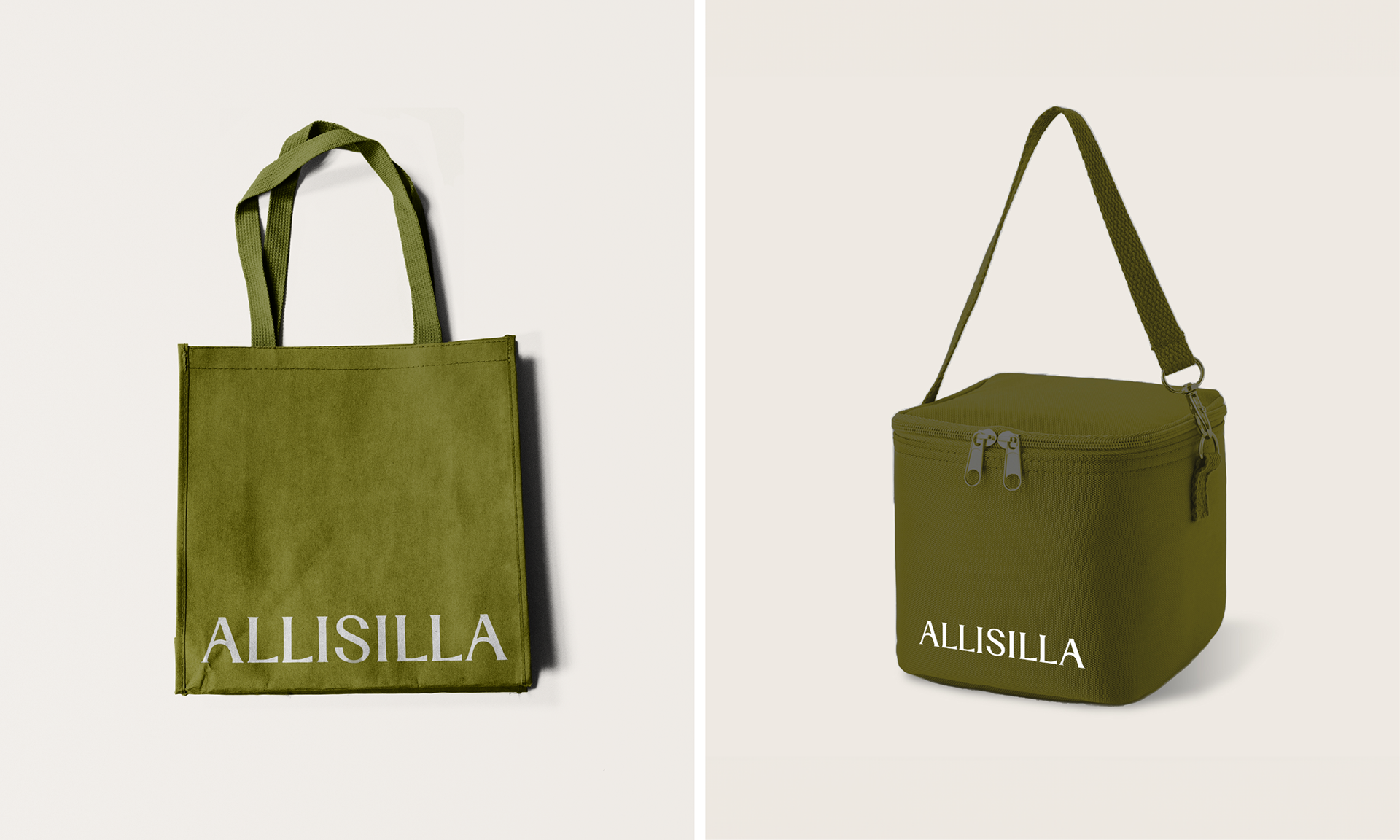
Client: 신라에스지(SILLA SG)
Scope: Brand Visual Identity
Co-Work: Not A But B, MINYULJIN Company
Crew: Seyeong Jang, Chaehyun Moon, Saerom Park
Studio roam|2024
Scope: Brand Visual Identity
Co-Work: Not A But B, MINYULJIN Company
Crew: Seyeong Jang, Chaehyun Moon, Saerom Park
Studio roam|2024
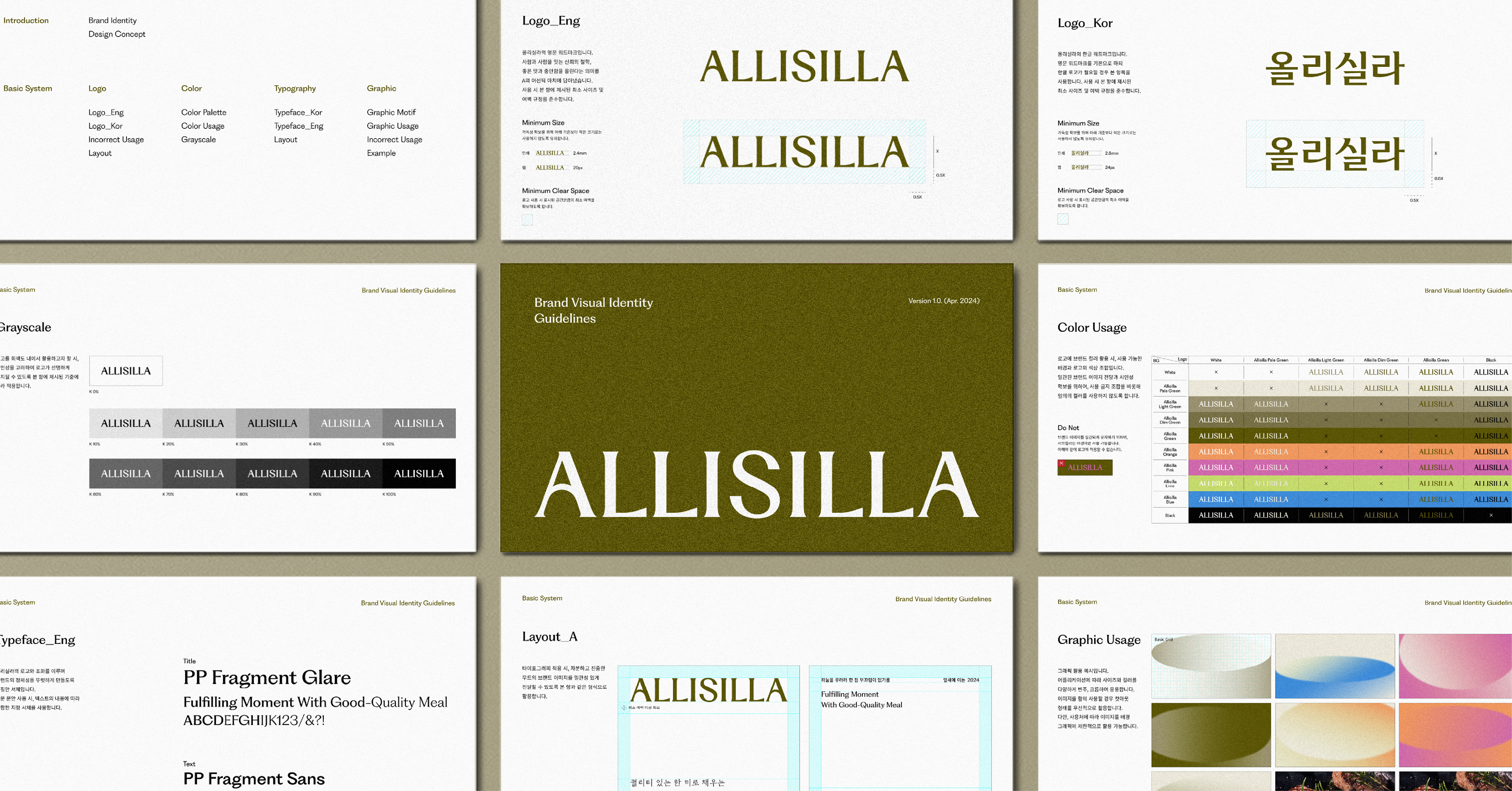
올리실라는 건강한 수산물 가공식품을 생산해 온 신라SG의 첫 B2C 식품 브랜드로, 합리적인 가격에 간편하게 즐기는 건강한 미식 브랜드로의 성장 비전을 갖고 있습니다. 로움은 BI 디자인을 맡아 진행했습니다.
Studio roam worked on the BI design for ALLISILLA, a B2C food brand by Silla SG. It aims to become a healthy gourmet brand that provides a convenient and affordable dining experience.

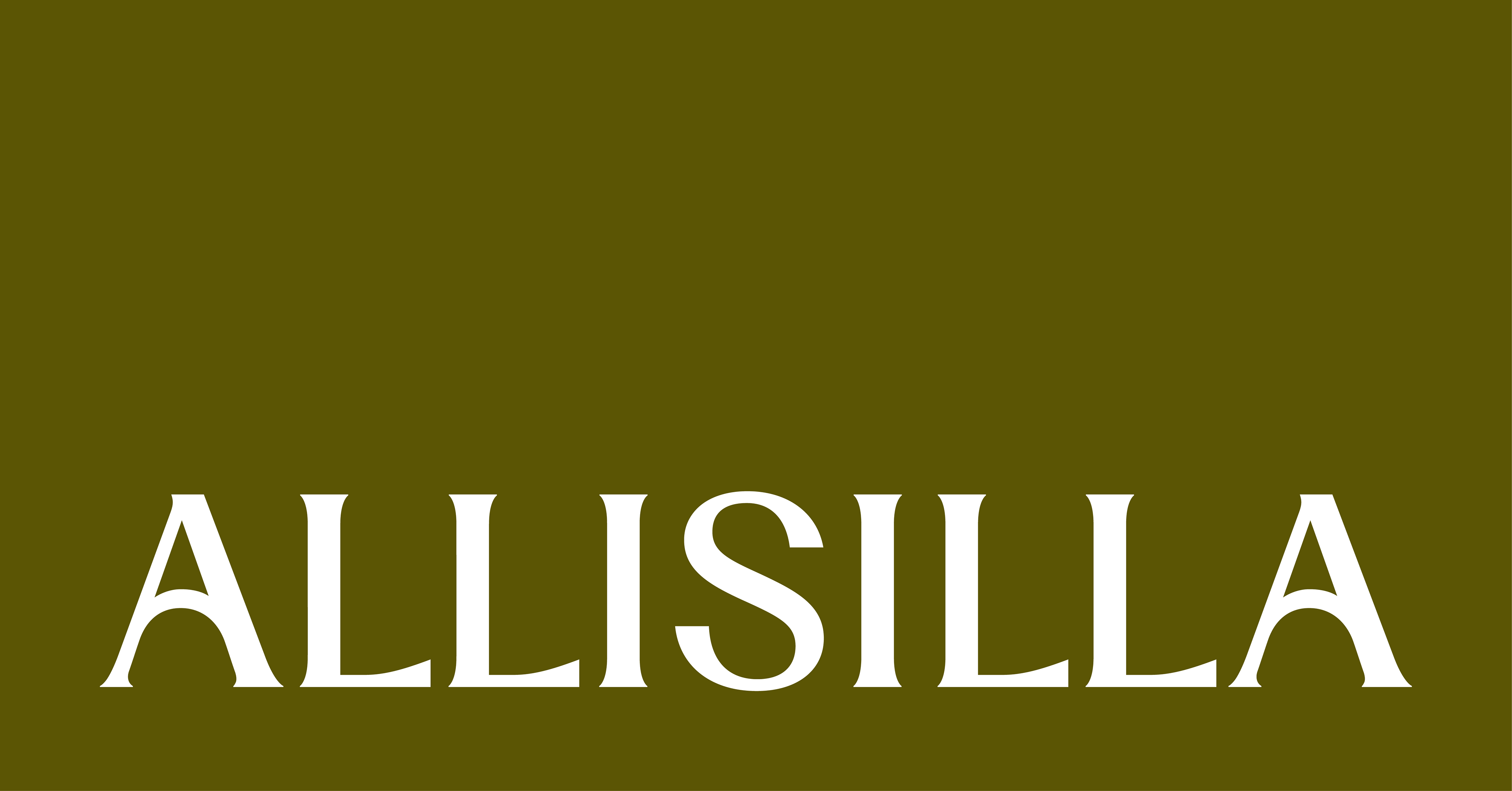
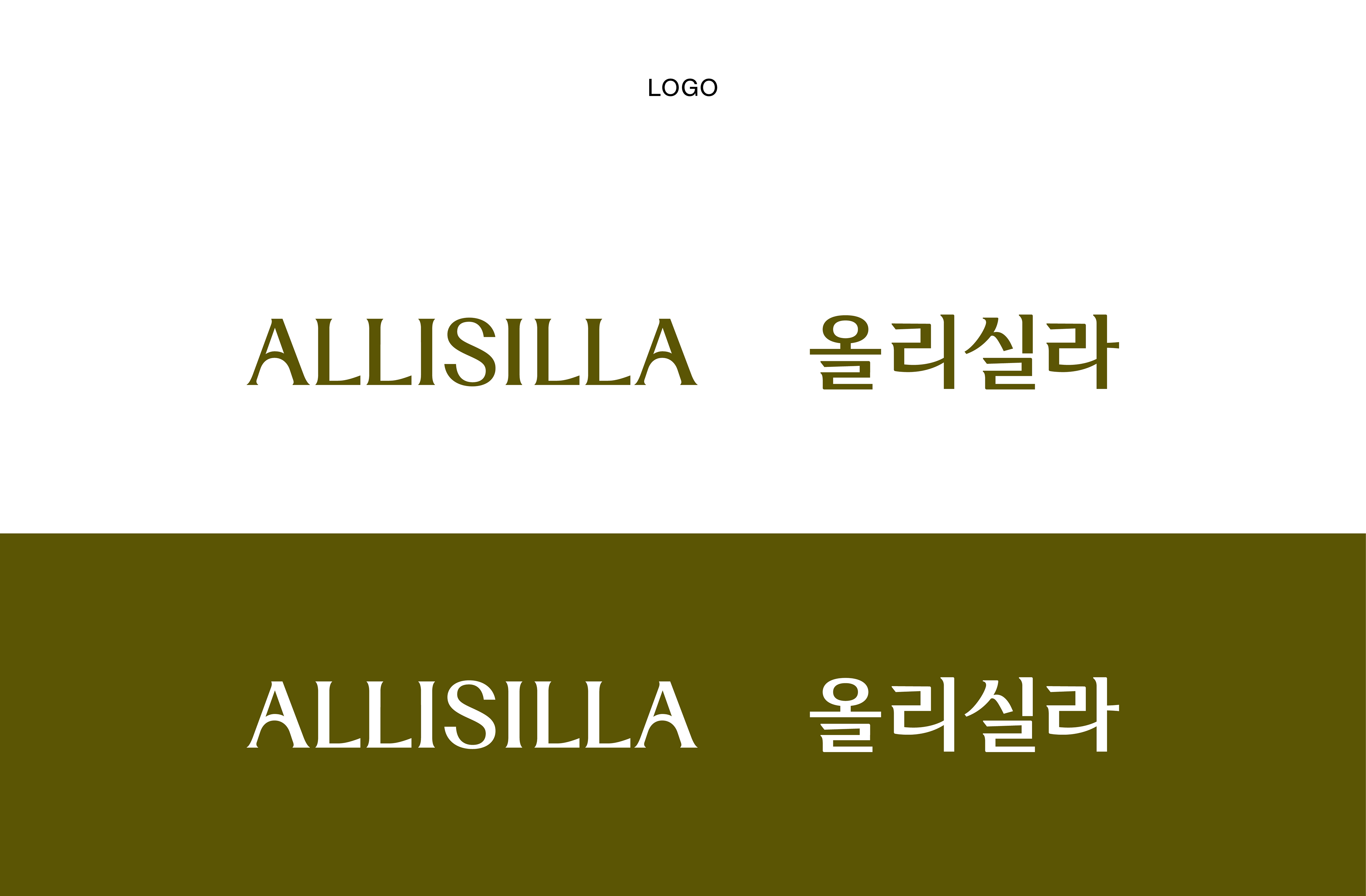
내부 구성원들과 함께 진행한 인터뷰와 워크숍을 통해 얻은 인사이트를 가지고 크리에이션을 거쳐 ‘Fulfilling Food, 몸과 마음을 북돋우는 일상충만식’이라는 브랜드 컨셉이 탄생했습니다. ‘SILLA’를 대칭 형태로 변형한 ALLISILLA라는 이름에는 신라그룹이 가진 헤리티지, 원물에 대한 자신감과 음식에 대한 진정성 있는 철학이 담겨 있습니다.
Through interviews and workshops with internal members, we derived insights that led to the creation of the brand concept, “Fulfilling Food: Nourishing Everyday Life.” The name ALLISILLA, a symmetrical transformation of SILLA, reflects Silla Group's heritage, confidence in their raw materials, and sincere philosophy towards food.


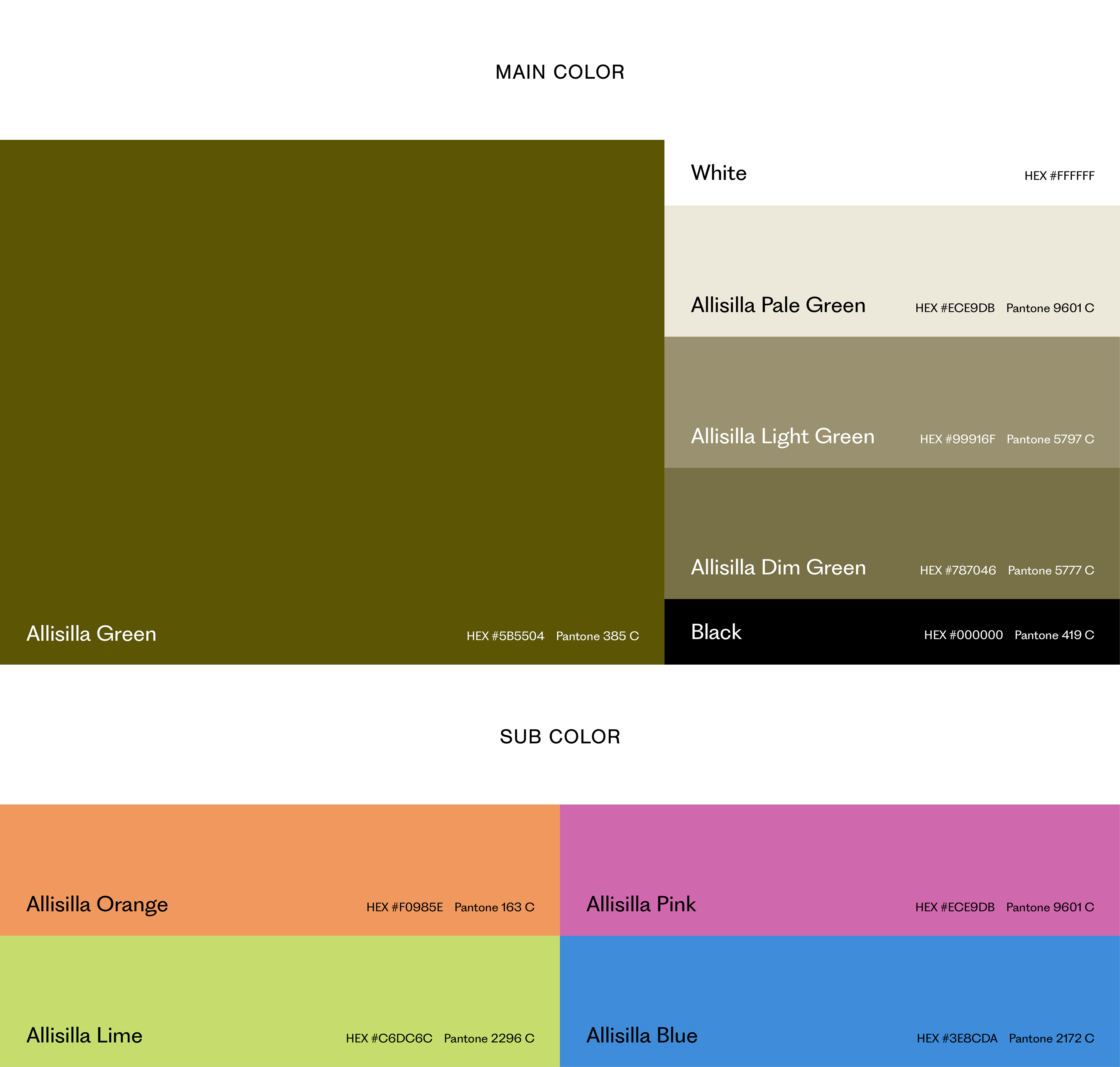
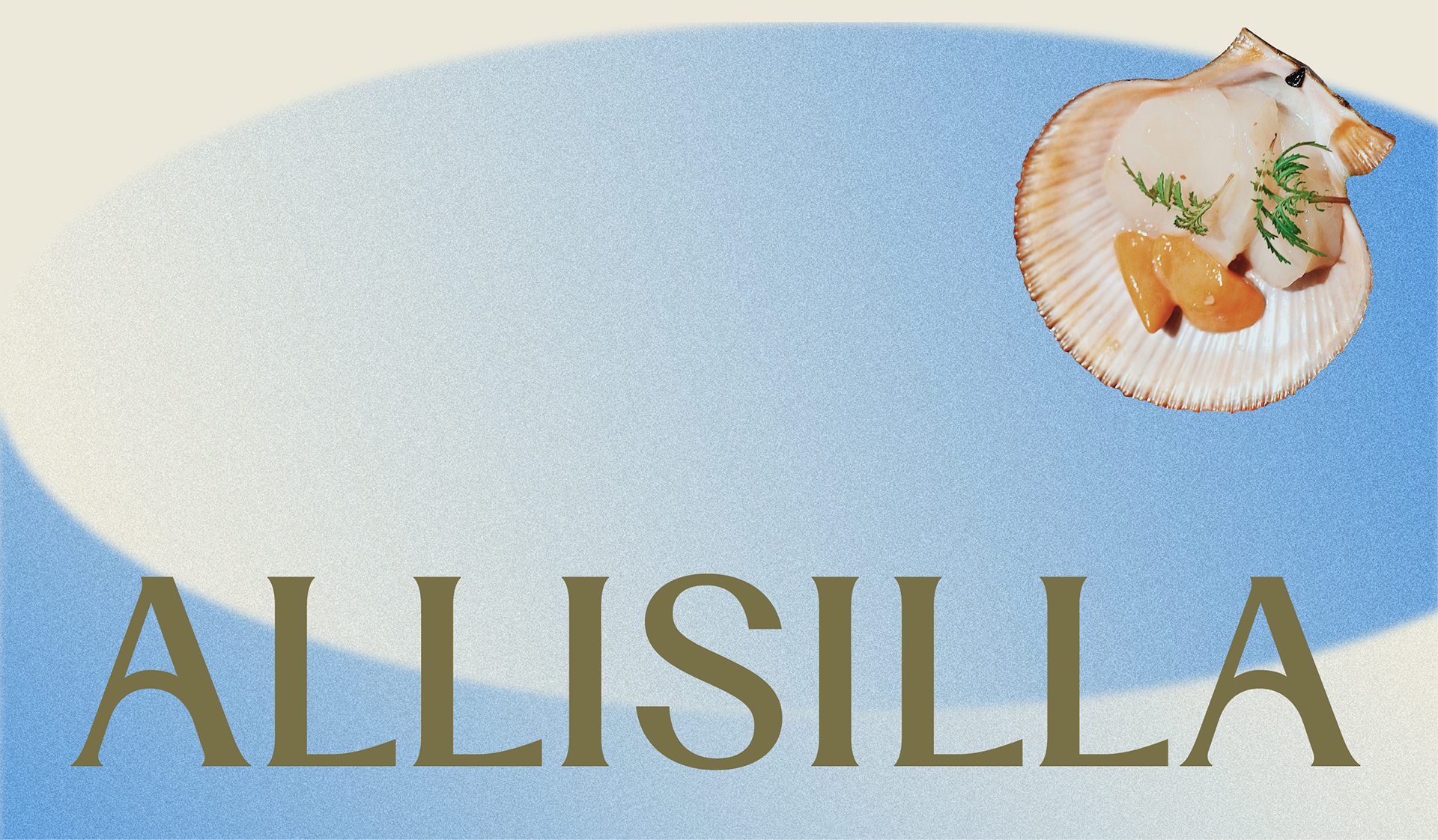
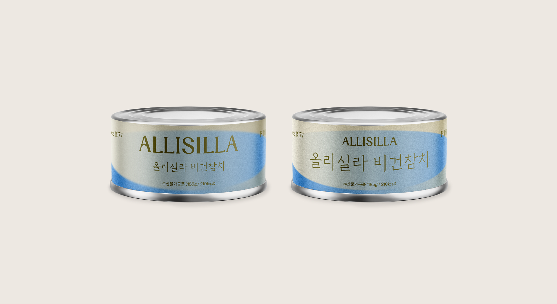
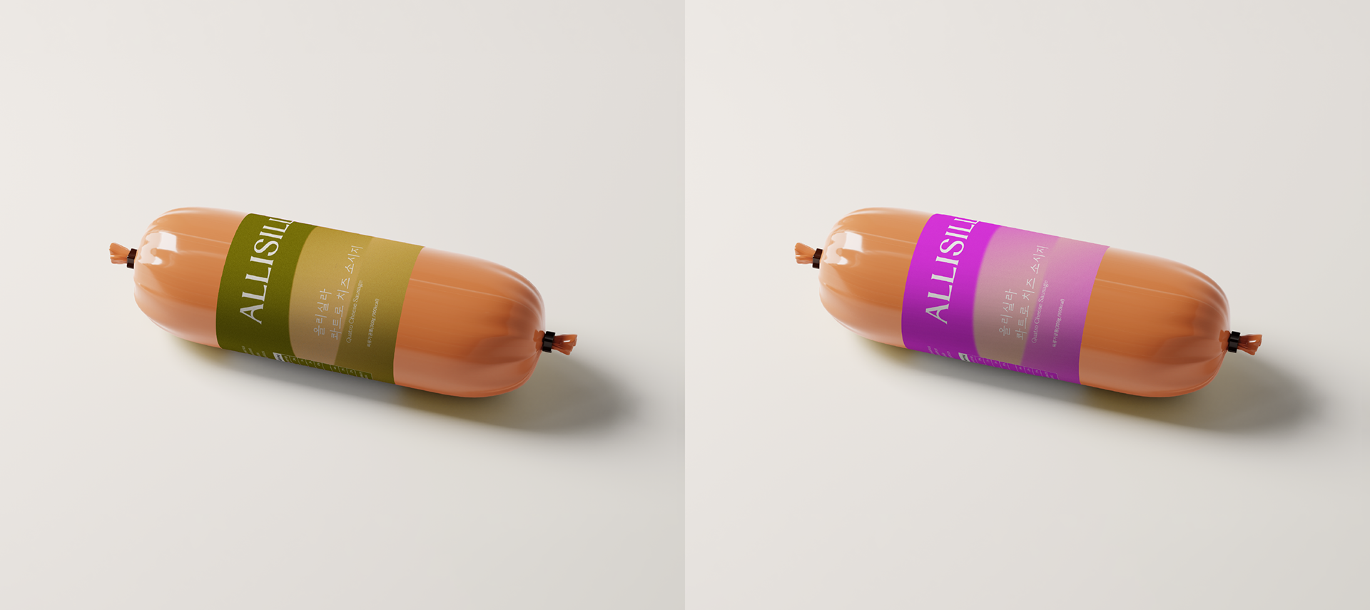
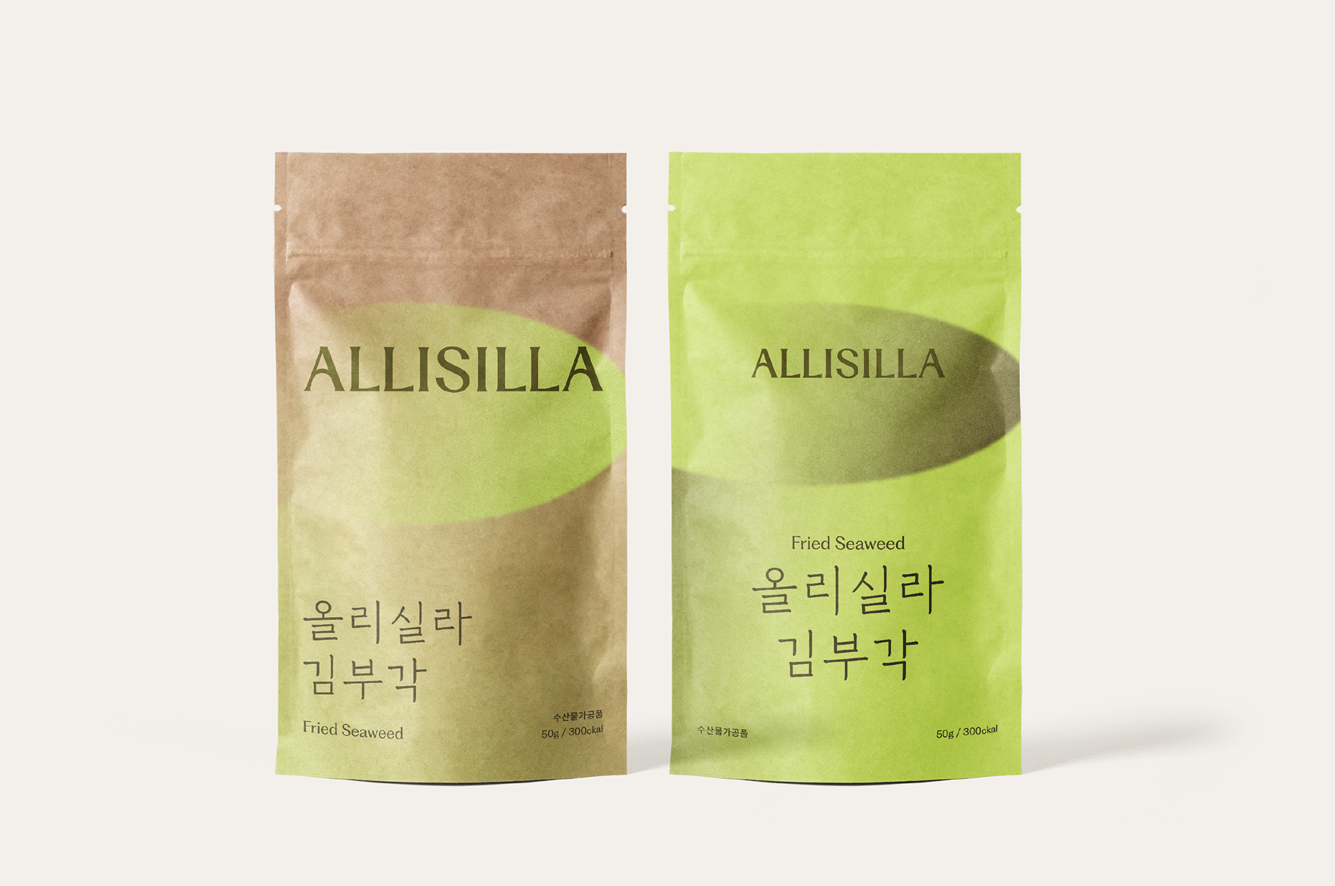
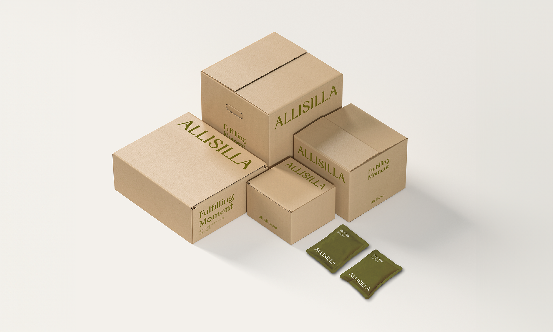
로움은 퀄리티 있는 식사로 채우는 충만한 순간, ‘Fulfilling Moment’를 디자인 컨셉으로 하여 좋은 식사로 마음까지 채워주는 올리실라의 진정성 있는 한 끼를 표현했습니다. 자연스럽고 곡선적인 획이 우아하고 따뜻한 느낌을 전달하는 워드마크 속 곡선은 SILLA 그룹 로고의 아치 형태를 연계한 ‘어센틱 아치’입니다. 어센틱 아치는 좋은 맛과 충만함을 ‘올림’의 의미와 함께 1977년부터 오랜 시간 업력을 쌓아온 신라 그룹의 음식에 대한 진정성, 사람과 사람을 잇는 신뢰의 철학을 상징합니다.
We focused on the concept of “Fulfilling Moment.” We presented enriching experiences provided by quality meals, reflecting ALLISILLA's commitment to heartfelt dining experiences that nourish both body and mind. The curves in the logotype, named ‘Authentic Arch,’ convey a sense of elegance and warmth with their smooth, flowing strokes. Inspired by the distinctive arch of the ‘A’ in the Silla Group logo, it symbolizes the uplifting experience of good taste and fulfillment, as well as Silla Group's genuine approach to food and their philosophy of trust that has connected people since 1977.

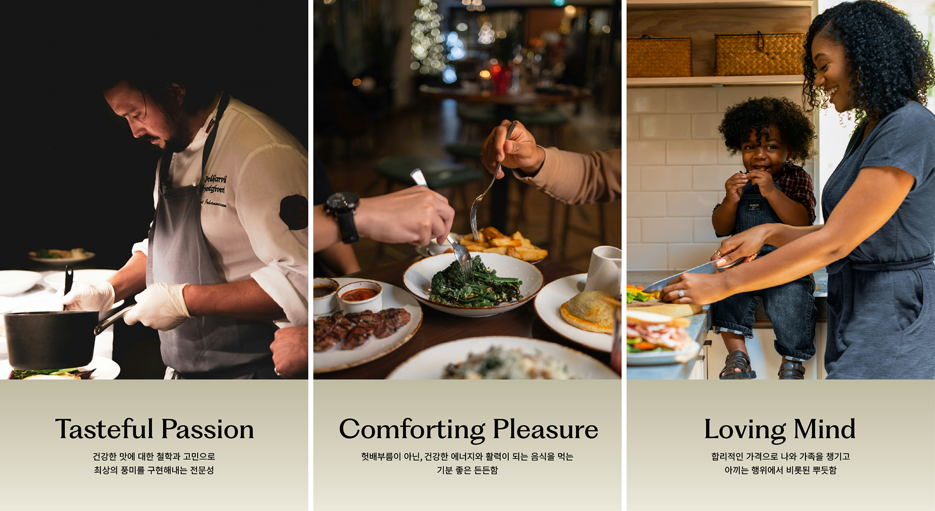
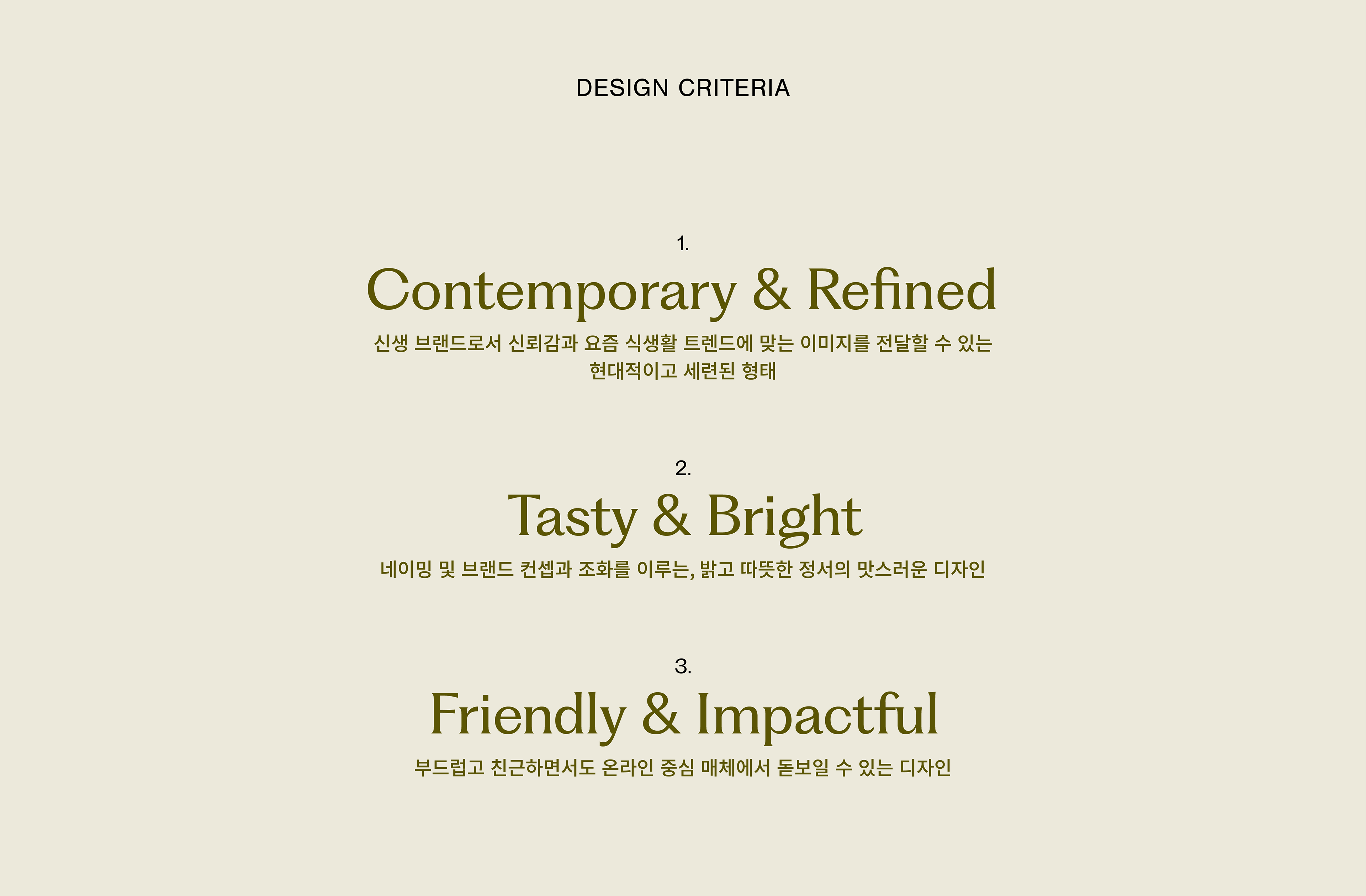
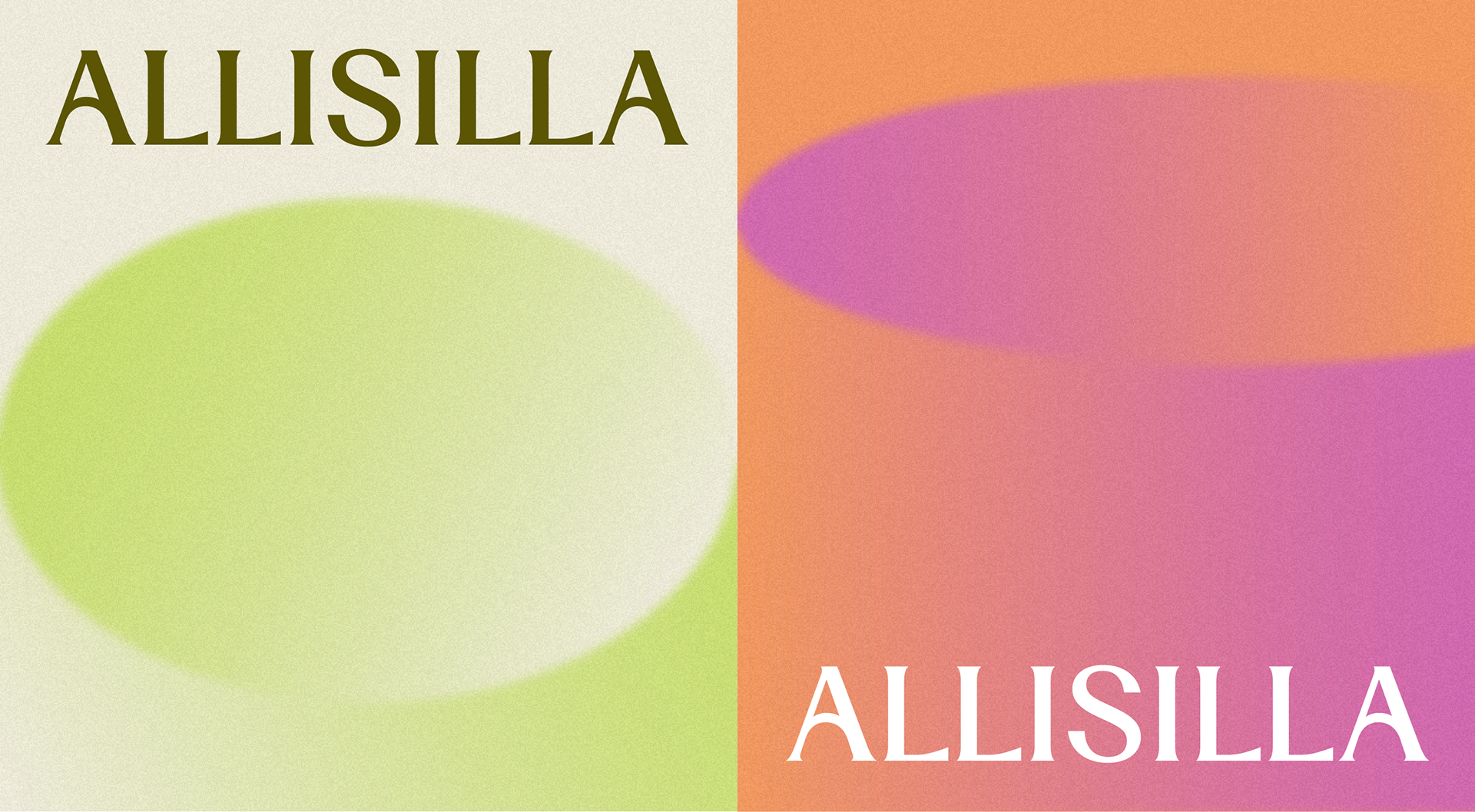
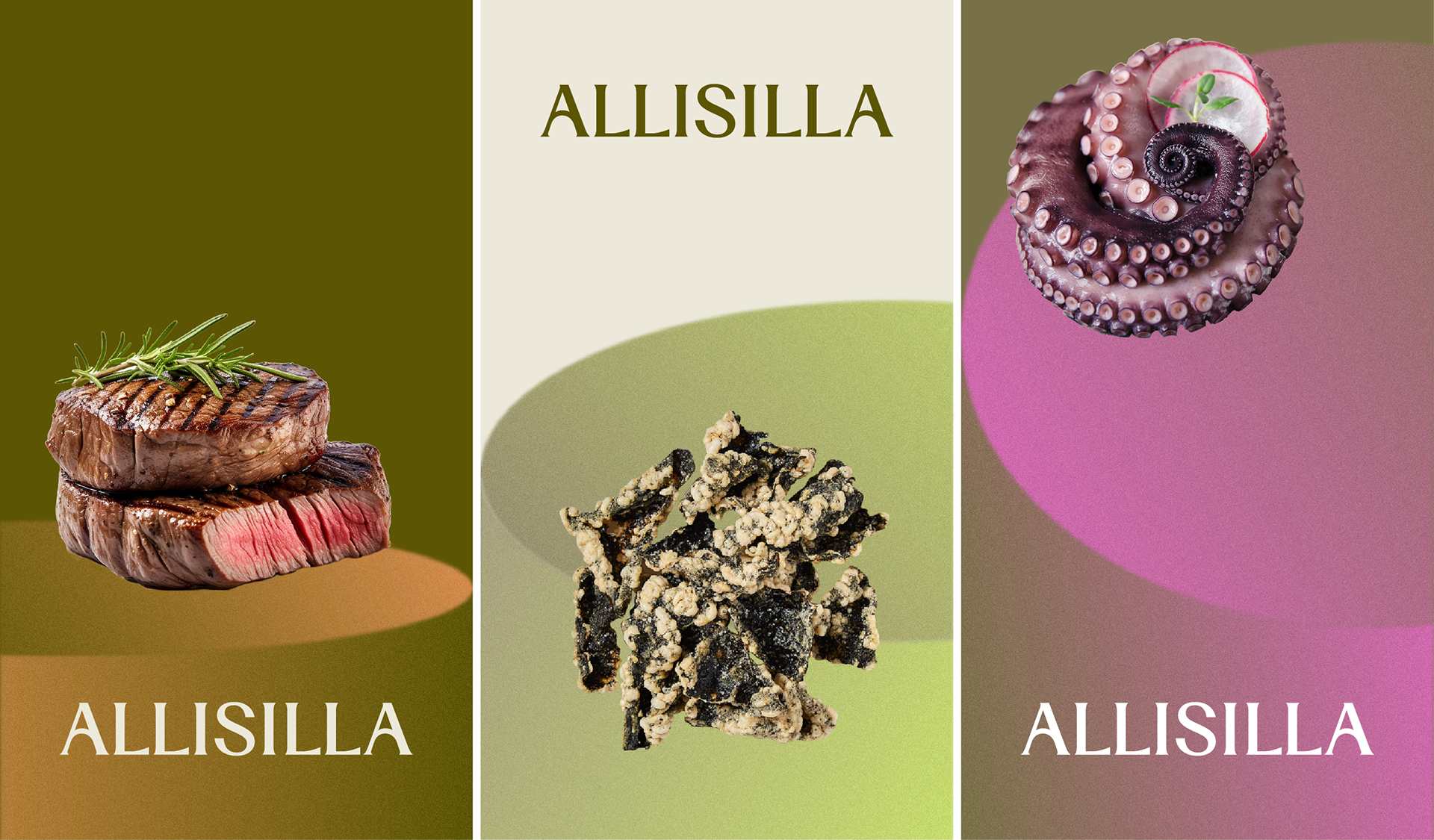
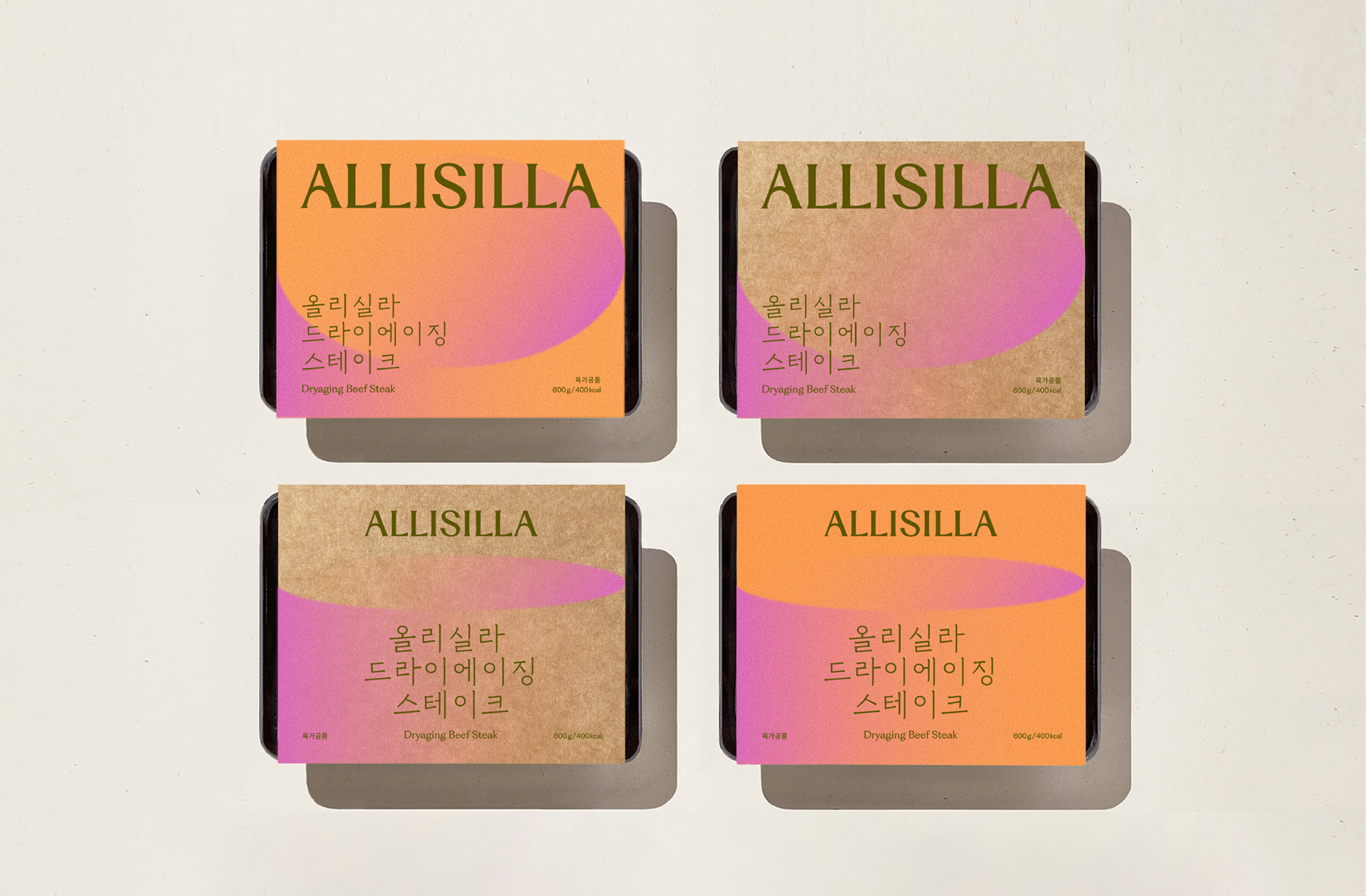
브랜드 컨셉과 이름의 이미지와 조화를 이룰 수 있도록, 밝고 따뜻한 정서의 식감 있는 디자인을 작업하고자 했습니다. 그릇에서 모티프를 얻은 원형과 그라디언트 텍스처를 활용하여 좋은 한 끼에서 오는 기쁨이 스며들듯 차오르는 순간을 표현했습니다. 요즘의 식생활을 반영한 온라인 중심의 브랜드답게, 연출된 원물과 요리 이미지는 최소화하고 그래픽을 중심으로 현대적인 무드로 전개했습니다.
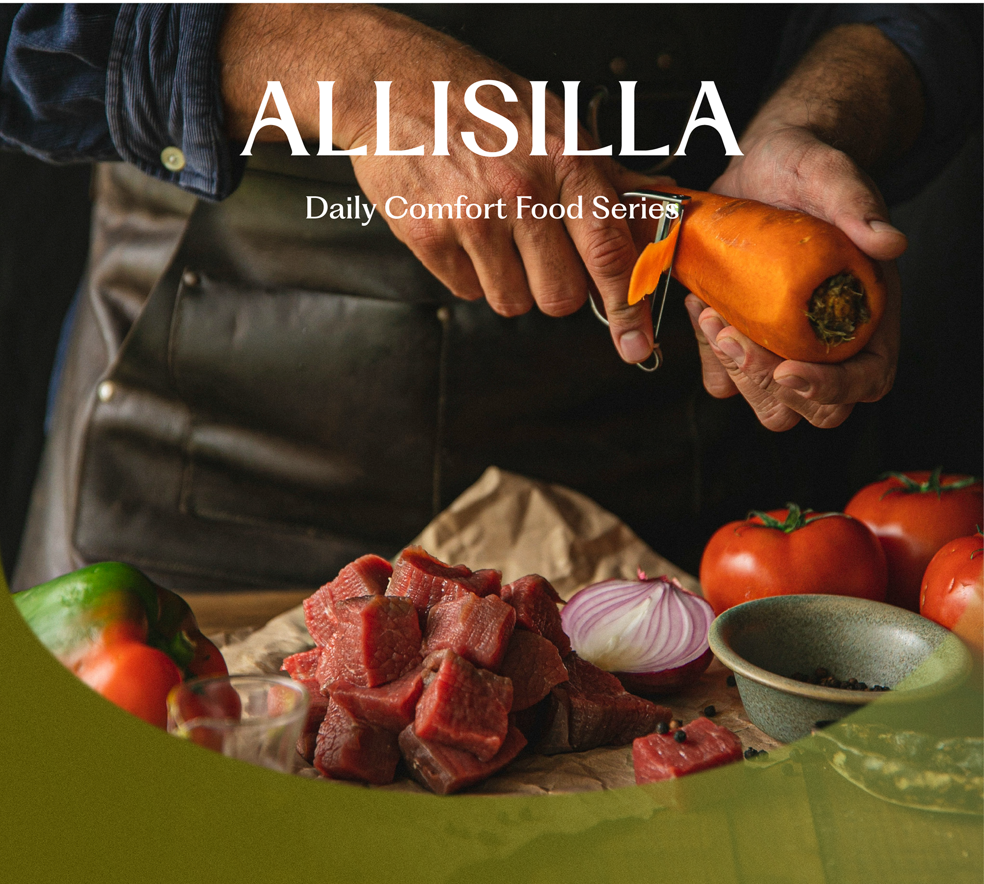
Our design aimed to harmonize the brand concept and the image of its name, creating a design that feels tactile, bright, and warm. Circular motifs inspired by dishes and gradient textures were used to express the joy that fills the moments of enjoying a good meal. And reflecting modern dietary habits and the brand's online focus, we minimized the use of sizzling pictures. Instead, we focused on graphics to present a contemporary mood.


2024
studio roam
studio roam